本篇將使用ECharts來介紹該如何將數據達到視覺化的效果
ECharts 是一個流行的開源 JavaScript 數據視覺化庫,由百度開發和維護。它旨在使開發者能夠輕鬆地創建各種互動性和吸引人的數據圖表,以可視化數據和信息。ECharts 擁有多種圖表類型,像是折線圖、柱狀圖、散點圖、圓餅圖、雷達圖、熱力圖、樹狀圖、地圖等等,而他在官網也提供了豐富的範例和文檔。
以下將介紹 ECharts 常用到的一些圖表類型
使用npm的方式:
npm install echarts --save
需要先在網頁上準備一個有設定好高度及寬度的DOM
<div id="canvas" style="width: 600px; height: 400px"></div>
接著需要取得那個DOM的位置,並對他進行初始化
const chartDom = document.getElementById('canvas');
const myChart = echarts.init(chartDom);
在設置完圖表內容的最後需要使用setOption()來顯示剛剛配置完的圖表
myChart.setOption(option);
再來介紹option裡面可以放置的基本內容
其中每項都還有很多的參數可以使用來配置圖表
option = {
		title: {
	    text: 'Title',
	    left: 'center'
	  },
		tooltip: {
	    trigger: 'item',
			formatter: "{b}: {c}"
	  },
	  xAxis: {
	    type: 'category',
	    data: ['A', 'B', 'C']
	  },
	  yAxis: {
	    type: 'value'
	  },
	  series: [
	    {
	      data: [120, 200, 80],
	      type: 'bar'
	    }
	  ]
	};
<template>
<div id="canvas" style="width: 600px; height: 400px"></div>
</template>
<script setup>
import { onMounted } from "vue";
import * as echarts from 'echarts/core';
import {
TitleComponent,
TooltipComponent,
LegendComponent
} from 'echarts/components';
import { PieChart } from 'echarts/charts';
import { LabelLayout } from 'echarts/features';
import { CanvasRenderer } from 'echarts/renderers';
echarts.use([
TitleComponent,
TooltipComponent,
LegendComponent,
PieChart,
CanvasRenderer,
LabelLayout
]);
onMounted(() => {
const chartDom = document.getElementById('canvas');
const myChart = echarts.init(chartDom);
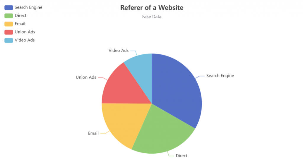
const option = {
title: {
text: 'Referer of a Website',
subtext: 'Fake Data',
left: 'center'
},
tooltip: {
trigger: 'item'
},
legend: {
orient: 'vertical',
left: 'left'
},
series: [
{
name: 'Access From',
type: 'pie',
radius: '50%',
data: [
{ value: 1048, name: 'Search Engine' },
{ value: 735, name: 'Direct' },
{ value: 580, name: 'Email' },
{ value: 484, name: 'Union Ads' },
{ value: 300, name: 'Video Ads' }
]
}
]
};
myChart.setOption(option);
});
</script>
<template>
<div id="canvas" style="width: 600px; height: 400px"></div>
</template>
<script setup>
import { onMounted } from "vue";
import * as echarts from 'echarts/core';
import {
TitleComponent,
TooltipComponent,
LegendComponent
} from 'echarts/components';
import { BarChart } from 'echarts/charts';
import { CanvasRenderer } from 'echarts/renderers';
echarts.use([TitleComponent, TooltipComponent, GridComponent, BarChart, CanvasRenderer]);
onMounted(() => {
const chartDom = document.getElementById('canvas');
const myChart = echarts.init(chartDom);
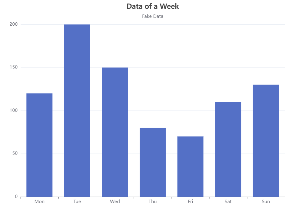
const option = {
title: {
text: 'Data of a Week',
subtext: 'Fake Data',
left: 'center'
},
tooltip: {
trigger: 'item'
},
xAxis: {
type: 'category',
data: ['Mon', 'Tue', 'Wed', 'Thu', 'Fri', 'Sat', 'Sun']
},
yAxis: {
type: 'value'
},
series: [
{
data: [120, 200, 150, 80, 70, 110, 130],
type: 'bar'
}
]
};
myChart.setOption(option);
});
</script>
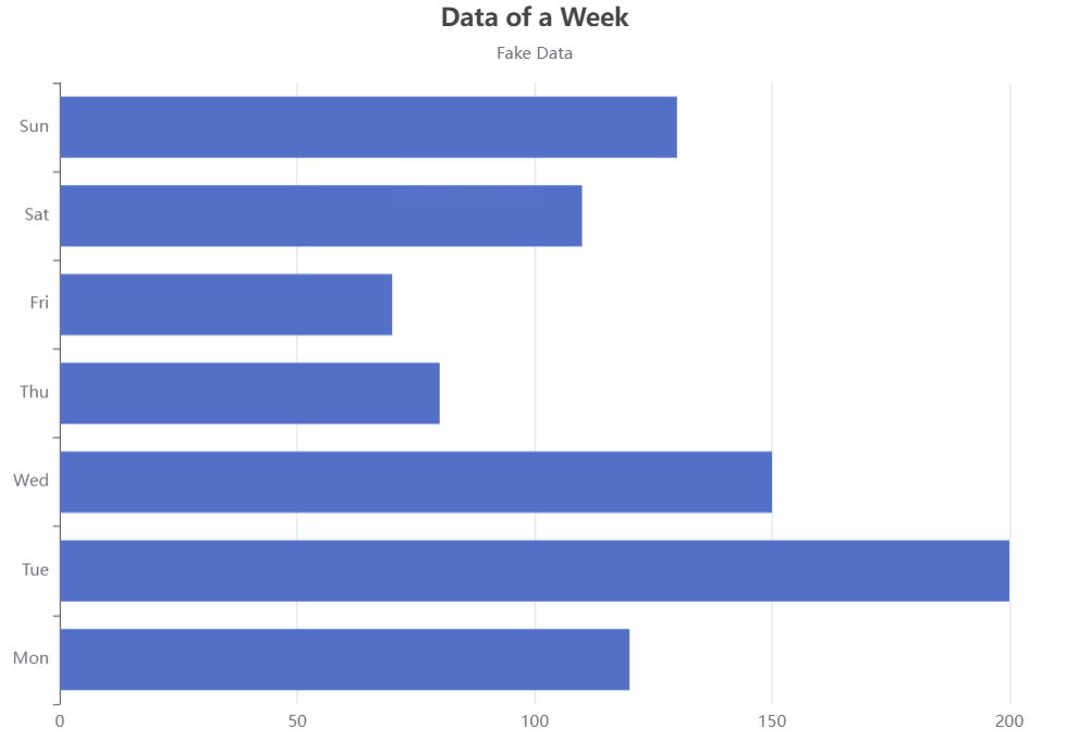
若是想要將長條圖翻轉,則可以將xAxis與yAxis的內容做交換
option = {
  title: {
	    text: 'Data of a Week',
	    subtext: 'Fake Data',
	    left: 'center'
	  },
	  tooltip: {
    trigger: 'item'
  },
   yAxis: {
    type: 'category',
    data: ['Mon', 'Tue', 'Wed', 'Thu', 'Fri', 'Sat', 'Sun']
  },
  xAxis: {
    type: 'value'
  },
  series: [
    {
      data: [120, 200, 150, 80, 70, 110, 130],
      type: 'bar'
    }
  ]
};
今天介紹了 ECharts 圖表的基本功能,除了以上介紹到的參數,還有很多參數可以使用度圖表進行配置,而除了圓餅圖及長條圖之外,也還有很多不同種類的圖表類型可以做使用。下一篇將介紹ECharts 圖表的進階功能