所有的開發第一步一定是通靈,喔不對,是分析需求。(≖‿ゝ≖)✧
你一定在想這個元件又沒什麼功能,是要寫個雞毛需求。( ・ิω・ิ)
其實你說得很對,不過這就和練習寫文件一樣,小東西不練習寫,大專案就更不可能寫惹。ԅ( ˘ω˘ԅ)
停用時會越跑越遠的按鈕。ᕕ( ゚ ∀。)ᕗ
越想嚕他,就跑得越遠,和你家的貓一樣。(._.`)
類似以下影片效果。( ´ ▽ ` )ノ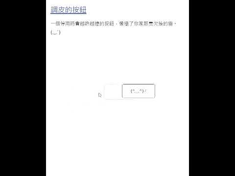
現在讓我們建立元件與文件檔案吧,檔案結構如下。
.
├─ docs
│  └─ components
│     └─ btn-naughty
│        └─ index.md           // 介紹元件並展示 examples 內容
└─ src
   └─ components
      └─ btn-naughty
         ├─ examples           // examples 列舉此元件的各種範例
         ├─ └─ basic-usage.vue // 元件基本用法範例
         └─ btn-naughty.vue    // 元件主體
首先是 Vue 元件的部份,很單純,就是先預留 Vue SFC 內容。
src\components\btn-naughty\btn-naughty.vue
<template>
  <div class="">
    調皮的按鈕
  </div>
</template>

<script setup lang="ts">
// #region Props
interface Props { }
// #endregion Props
const props = withDefaults(defineProps<Props>(), {});

// #region Emits
const emit = defineEmits<{}>();
// #endregion Emits

// #region Slots
defineSlots<{}>();
// #endregion Slots

// #region Methods
defineExpose({});
// #endregion Methods
</script>

<style scoped lang="sass">
</style>
#region 語法用來定義區塊名稱,就讓外部元件僅引入指定 region 內容。
src\components\btn-naughty\examples\basic-usage.vue
<template>
  <div class="flex flex-col gap-4 w-full border border-gray-300 p-6">
    <btn-naughty />
  </div>
</template>

<script setup lang="ts">
import { ref } from 'vue';

import BtnNaughty from '../btn-naughty.vue';
</script>
最後是元件介紹部分,先加入固定的基本內容。
docs\components\btn-naughty\index.md
---
description: 一個停用時會越嚕越遠的按鈕,像極了你家那隻欠揍的貓。(._.`)
---
<script setup>
import BasicUsage from '../../../src/components/btn-naughty/examples/basic-usage.vue'
</script>
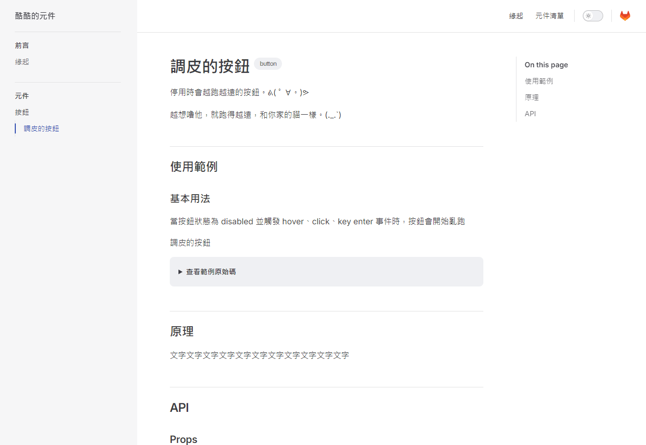
# 調皮的按鈕 <Badge type="info" text="button" />
停用時會越跑越遠的按鈕。ᕕ( ゚ ∀。)ᕗ
越想嚕他,就跑得越遠,和你家的貓一樣。(._.`)
## 使用範例
### 基本用法
當按鈕狀態為 disabled 並觸發 hover、click、key enter 事件時,按鈕會開始亂跑
<basic-usage/>
::: details 查看範例原始碼
<<< ../../../src/components/btn-naughty/examples/basic-usage.vue
:::
## 原理
文字文字文字文字文字文字文字文字文字文字文字
## API
### Props
<<< ../../../src/components/btn-naughty/btn-naughty.vue/#Props
### Emits
<<< ../../../src/components/btn-naughty/btn-naughty.vue/#Emits
### Methods
<<< ../../../src/components/btn-naughty/btn-naughty.vue/#Methods
### Slots
<<< ../../../src/components/btn-naughty/btn-naughty.vue/#Slots
路人:「怎麼一瞬間跑出這麼多內容。Σ(ˊДˋ;)」
鱈魚:「別怕別怕,讓我們一段一段來看吧。( ´ ▽ ` )ノ」
首先是最開頭的部分:
---
description: 一個停用時會越嚕越遠的按鈕,像極了你家那隻欠揍的貓。(._.`)
---
這個在 VitePress 中稱為 Frontmatter,主要用於描述頁面的資料,具體的設定如文件,以下舉幾個常用的值。
接著是 script 區塊。
<script setup>
import BasicUsage from '../../../src/components/btn-naughty/examples/basic-usage.vue'
</script>
Vitepress 可以在 Markdown 中使用 Vue 元件的功能,這一段表示我們使用了 Vue 的 setup script 並引入了 BasicUsage 元件。
最後就是本文的部分了。
# 調皮的按鈕 <Badge type="info" text="button" />

停用時會越跑越遠的按鈕。ᕕ( ゚ ∀。)ᕗ

越想嚕他,就跑得越遠,和你家的貓一樣。(._.`)

## 使用範例

### 基本用法

當按鈕狀態為 disabled 並觸發 hover、click、key enter 事件時,按鈕會開始亂跑

<basic-usage/>

::: details 查看範例原始碼
<<< ../../../src/components/btn-naughty/examples/basic-usage.vue
:::

## 原理

文字文字文字文字文字文字文字文字文字文字文字

## API

### Props

<<< ../../../src/components/btn-naughty/btn-naughty.vue/#Props

### Emits

<<< ../../../src/components/btn-naughty/btn-naughty.vue/#Emits

### Methods

<<< ../../../src/components/btn-naughty/btn-naughty.vue/#Methods

### Slots

<<< ../../../src/components/btn-naughty/btn-naughty.vue/#Slots
其實就是基本的 Markdown 語法,讓我們挑出比較特別的區塊解釋。
<basic-usage/>
這個如同 Vue template 的內容,表示使用 setup script 引入的元件。
至於 <<< 這個符號則是導入指定程式碼片段的意思,也就是說以下語法。
<<< ../../../src/components/btn-naughty/examples/basic-usage.vue
會完整的導入 src/components/btn-naughty/examples/basic-usage.vue 內容。
在最後面加上 #,表示只引入指定區塊,就是我們剛剛提到的 #region 語法。
以上我們完成元件介紹的基本內容了!◝(≧∀≦)◟
最後一步就是在 sidebar 中加入頁面連結,順便一起完成整體的網頁設定吧。
docs\.vitepress\config.mts
import { defineConfig } from 'vitepress'

// https://vitepress.dev/reference/site-config
export default defineConfig({
  title: "酷酷的元件",
  description: "打造各種奇怪的元件",
  themeConfig: {
    // https://vitepress.dev/reference/default-theme-config
    nav: [
      { text: '緣起', link: '/origin' },
      { text: '元件清單', link: '/components/' },
    ],

    sidebar: [
      {
        text: '前言',
        items: [
          { text: '緣起', link: '/origin' },
        ]
      },
      {
        text: '元件',
        link: '/components/',
        items: [
          {
            text: '按鈕',
            items: [
              { text: '調皮的按鈕', link: '/components/btn-naughty/' },
            ]
          },
        ]
      },
    ],

    socialLinks: [
      {
        icon: {
          svg: '<svg height="2404" viewBox="-.1 .5 960.2 923.9" width="2500" xmlns="http://www.w3.org/2000/svg"><path d="m958.9 442.4c1.1 26.1-2 52.1-9.2 77.2-7.1 25.1-18.3 48.8-33.1 70.3a240.43 240.43 0 0 1 -53.6 56.2l-.5.4-199.9 149.8-98.3 74.5-59.9 45.2c-3.5 2.7-7.4 4.7-11.5 6.1s-8.5 2.1-12.9 2.1c-4.3 0-8.7-.7-12.8-2.1s-8-3.4-11.5-6.1l-59.9-45.2-98.3-74.5-198.7-148.9-1.2-.8-.4-.4c-20.9-15.7-39-34.7-53.8-56.2s-26-45.3-33.2-70.4c-7.2-25.1-10.3-51.2-9.2-77.3 1.2-26.1 6.5-51.8 15.8-76.2l1.3-3.5 130.7-340.5q1-2.5 2.4-4.8 1.3-2.3 3.1-4.3 1.7-2.1 3.7-3.9 2-1.7 4.2-3.2c3.1-1.9 6.3-3.3 9.8-4.1 3.4-.9 7-1.3 10.5-1.1 3.6.2 7.1.9 10.4 2.2 3.3 1.2 6.5 3 9.3 5.2q2 1.7 3.9 3.6 1.8 2 3.2 4.3 1.5 2.2 2.6 4.7 1.1 2.4 1.8 5l88.1 269.7h356.6l88.1-269.7q.7-2.6 1.9-5 1.1-2.4 2.6-4.7 1.4-2.2 3.2-4.2 1.8-2 3.9-3.7c2.8-2.2 5.9-3.9 9.2-5.2 3.4-1.2 6.9-1.9 10.4-2.1 3.6-.2 7.1.1 10.6 1 3.4.9 6.7 2.3 9.7 4.2q2.3 1.4 4.3 3.2 2 1.7 3.7 3.8 1.7 2.1 3.1 4.4 1.3 2.3 2.3 4.8l130.5 340.6 1.3 3.5c9.3 24.3 14.6 50 15.7 76.1z" fill="#e24329"/><path d="m959 442.5c1.1 26-2 52.1-9.2 77.2s-18.4 48.9-33.2 70.4-32.9 40.5-53.7 56.2l-.5.4-199.9 149.8s-84.9-64.1-182.5-138l286.5-216.8c12.9-9.7 26.4-18.6 40.3-26.8 13.9-8.3 28.3-15.7 43-22.3 14.8-6.6 29.9-12.5 45.2-17.4 15.4-5 31-9.1 46.9-12.4l1.3 3.5c9.3 24.4 14.6 50.1 15.8 76.2z" fill="#fc6d26"/><path d="m480 658.5c97.6 73.7 182.6 138 182.6 138l-98.3 74.5-59.9 45.2c-3.5 2.7-7.4 4.7-11.5 6.1s-8.5 2.1-12.9 2.1c-4.3 0-8.7-.7-12.8-2.1s-8-3.4-11.5-6.1l-59.9-45.2-98.3-74.5s84.9-64.3 182.5-138z" fill="#fca326"/><path d="m480 658.3c-97.7 73.9-182.5 138-182.5 138l-198.7-148.9-1.2-.8-.4-.4c-20.9-15.7-39-34.7-53.8-56.2s-26-45.3-33.2-70.4c-7.2-25.1-10.3-51.2-9.2-77.3 1.2-26.1 6.5-51.8 15.8-76.2l1.3-3.5c15.9 3.3 31.5 7.4 46.9 12.4 15.3 5 30.4 10.8 45.2 17.5 14.7 6.6 29.1 14.1 43 22.3s27.3 17.2 40.3 26.9z" fill="#fc6d26"/></svg>',
        },
        link: 'https://gitlab.com/cod-public-projects/chill-component',
      },
    ],
  }
})
socialLinks 的 icon 除了使用內建的名稱以外,也可以使用 svg,像是目前的內容就是 GitLab 的 Logo。◝( •ω• )◟
沒有意外的話應該可以在左側的側欄中看到「調皮的按鈕」,點擊進入後可以看到以下內容。
接下來讓我們開始開發元件吧!( •̀ ω •́ )✧
以上程式碼已同步至 GitLab,大家可以前往下載:


 iThome鐵人賽
 看影片追技術