傳統的分析結果往往仰賴 Office 類工具或複雜報表,大量欄位和密密麻麻的數據,容易讓新手用戶感到無所適從,不知從何開始改善自己的飲食與健康。
人性化的健康 AI 分析頁設計,重點在於「資訊濃縮」與「視覺化」:用可愛的圖表、簡單的總結和明確的行動建議,讓每一位用戶不需要醫學或營養背景,也能一眼看懂重點、快速讀取個人健康趨勢,進而產生積極改變生活的動力。
先將 main.py 檔名改成 app.py(避免之後產生不必要的困擾)
AI_Nutri_Project/
├── app.py                # Flask 應用程式主程式
├── credentials.json      # Google OAuth 憑證
└── templates/
    ├── index.html        # 輸入/首頁 UI
    └── results.html      # 分析結果 UI
<div class="tabs">
<button class="tab-btn active" onclick="showTab('analysis')">
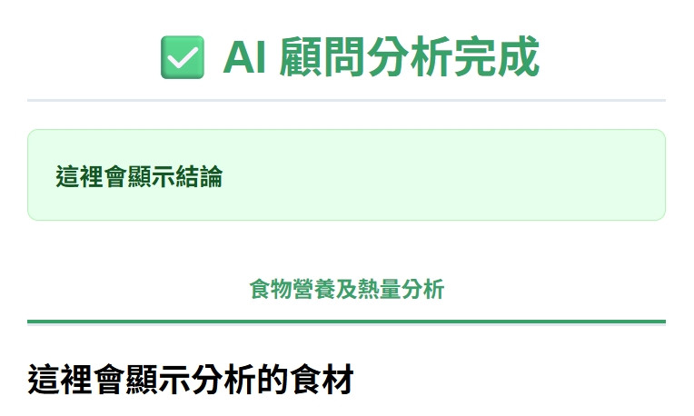
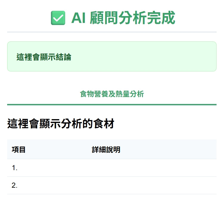
食物營養及熱量分析
</button>
</div>
<div id="analysis" class="tab-content active">
<h2>這裡會顯示分析的食材</h2>
</div>
  <table class="data-table">
          <thead>
            <tr>
              <th>項目</th>
              <th>詳細說明</th>
            </tr>
          </thead>
          <tbody>
            <tr>
              <td>1.</td>
              <td></td>
            </tr>
            <tr>
              <td>2.</td>
              <td></td>
            </tr>
          </tbody>
        </table>
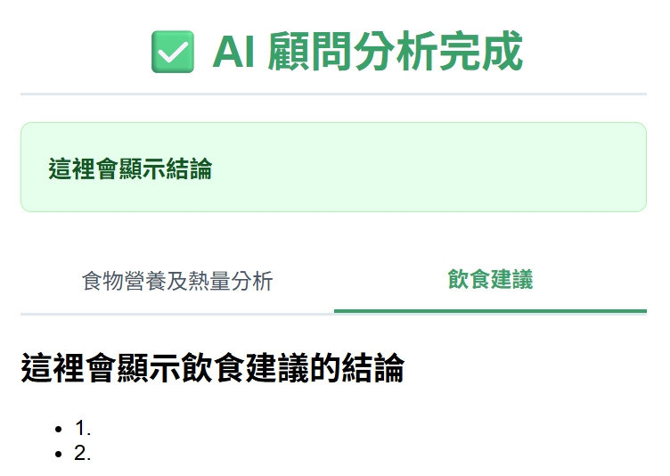
  <button class="tab-btn" onclick="showTab('advice')">飲食建議</button>
  <div id="advice" class="tab-content">
        <h2>這裡會顯示飲食建議的結論</h2>
        <ul>
          <li>1.</li>
          <li>2.</li>
        </ul>
      </div>
之後會再依照專案的需求,追加必要的功能,例如:儲存資料、查詢資料...等等
可參閱:


 iThome鐵人賽