Matt Harrison出版的Effective Visualization,詳細講解了如何使用Matplotlib繪製Pandas DataFrame。
受到該書的啟發,我們將在[Day21]及[Day22]改寫書中的一個例題,學習如何使用Matplotlib及Plotnine搭配Polars繪圖。
以下為書中原例繪圖: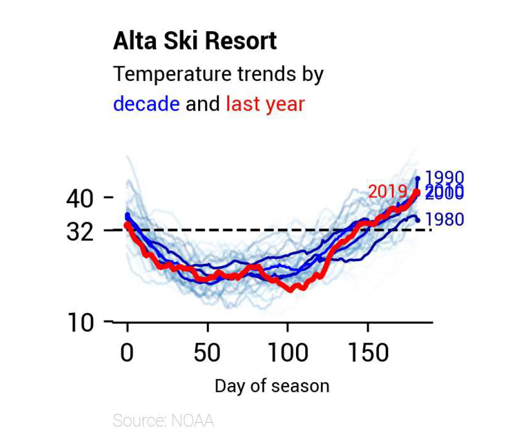
今天我們將先進行資料處理,為明後天的繪圖工作做好準備。
本日大綱如下:
HighlightText
import matplotlib.pyplot as plt
import polars as pl
import polars.selectors as cs
from highlight_text import ax_text
from matplotlib import colormaps

idx_colname = "DAY_OF_SEASON"
data_path = "alta-noaa-1980-2019.csv"
columns = ["DATE", "TOBS"]
改寫例題取自「"Line Plots"」中的「"Temperatures at Alta"」小節,所使用的資料可以由此連結下載。
Alta是Utah的滑雪勝地,我們的目的是希望觀察Alta在滑雪季中的溫度變化,需要取得資料集中的「"DATE"」及「"TOBS"」列:
YYYY-mm-dd的日期。此兩列預覽如下:
shape: (14_160, 2)
┌────────────┬──────┐
│ DATE       ┆ TOBS │
│ ---        ┆ ---  │
│ str        ┆ i64  │
╞════════════╪══════╡
│ 1980-01-01 ┆ 25   │
│ 1980-01-02 ┆ 18   │
│ 1980-01-03 ┆ 18   │
│ 1980-01-04 ┆ 27   │
│ 1980-01-05 ┆ 34   │
│ …          ┆ …    │
│ 2019-09-03 ┆ 73   │
│ 2019-09-04 ┆ 74   │
│ 2019-09-05 ┆ 65   │
│ 2019-09-06 ┆ 60   │
│ 2019-09-07 ┆ 64   │
└────────────┴──────┘
我們將資料處理的步驟封裝在tweak_df()中。
def tweak_df(
    data_path: str, columns: list[str], idx_colname: str = "DAY_OF_SEASON"
):
    return (
        pl.scan_csv(data_path)
        .select(columns)
        .with_columns(
            pl.col("DATE").str.to_datetime(),
            pl.col("TOBS").interpolate(),
        )
        .sort("DATE")
        .with_columns(
            # Caveat: Cannot be placed in the previous `with_columns()`
            # due to different statuses of `TOBS`.
            pl.col("TOBS")
            .rolling_mean(window_size=28, center=True)
            .alias("TMEAN"),
            get_season_expr(col="DATE", alias="SEASON"),
        )
        .with_columns(
            add_day_of_season_expr(
                col="DATE", group_col="SEASON", alias=idx_colname
            )  #
        )
        .collect()
    )
tweak_df()返回值預覽如下:
shape: (14_160, 5)
┌─────────────────────┬──────┬───────┬─────────────┬───────────────┐
│ DATE                ┆ TOBS ┆ TMEAN ┆ SEASON      ┆ DAY_OF_SEASON │
│ ---                 ┆ ---  ┆ ---   ┆ ---         ┆ ---           │
│ datetime[μs]        ┆ f64  ┆ f64   ┆ str         ┆ i64           │
╞═════════════════════╪══════╪═══════╪═════════════╪═══════════════╡
│ 1980-01-01 00:00:00 ┆ 25.0 ┆ null  ┆ Ski 1980    ┆ 0             │
│ 1980-01-02 00:00:00 ┆ 18.0 ┆ null  ┆ Ski 1980    ┆ 1             │
│ 1980-01-03 00:00:00 ┆ 18.0 ┆ null  ┆ Ski 1980    ┆ 2             │
│ 1980-01-04 00:00:00 ┆ 27.0 ┆ null  ┆ Ski 1980    ┆ 3             │
│ 1980-01-05 00:00:00 ┆ 34.0 ┆ null  ┆ Ski 1980    ┆ 4             │
│ …                   ┆ …    ┆ …     ┆ …           ┆ …             │
│ 2019-09-03 00:00:00 ┆ 73.0 ┆ null  ┆ Summer 2019 ┆ 125           │
│ 2019-09-04 00:00:00 ┆ 74.0 ┆ null  ┆ Summer 2019 ┆ 126           │
│ 2019-09-05 00:00:00 ┆ 65.0 ┆ null  ┆ Summer 2019 ┆ 127           │
│ 2019-09-06 00:00:00 ┆ 60.0 ┆ null  ┆ Summer 2019 ┆ 128           │
│ 2019-09-07 00:00:00 ┆ 64.0 ┆ null  ┆ Summer 2019 ┆ 129           │
└─────────────────────┴──────┴───────┴─────────────┴───────────────┘
程式分段說明如下:
pl.scan_csv()以lazy模式讀取資料集。pl.LazyFrame.select()選擇「"DATE"」及「"TOBS"」列。pl.LazyFrame.sort()進行升冪排序。pl.LazyFrame.with_columns():
window_size=28,觀察約一個月內的滾動變化。此外設定center=True,代表將所求值標示在window中間,而非最右端。pl.col("TOBS").rolling_mean(window_size=28, center=True).alias("TMEAN")
get_season_expr()中,目的是依據「"DATE"」列,為每行添加季節與年份資訊,如「"Ski 1980"」。
pl.when().then().otherwise()將「"DATE"」列依照月份分為「"Summer "」或「"Ski "」,五至十月為「"Summer "」,其它月份則為「"Ski "」。請留意此處的「"Summer "」及「"Ski "」最後有一個空白,是為了方便與後續pl.Expr.add()連接。pl.when().then().otherwise()將「"DATE"」列依照月份分為兩個年份,一至十月的話,使用該年年份,而十一及十二月,使用次年年份。請留意,年份會轉為pl.String型別。pl.Expr.add()將上述兩個pl.String相接。def get_season_expr(col: str = "DATE", alias: str = "SEASON") -> pl.expr:
return (
(
pl.when(
(pl.col(col).dt.month().is_between(5, 10, closed="both"))
)
.then(pl.lit("Summer "))
.otherwise(pl.lit("Ski "))
)
.add(
pl.when(pl.col(col).dt.month() < 11)
.then(pl.col(col).dt.year().cast(pl.String))
.otherwise(pl.col(col).dt.year().add(1).cast(pl.String))
)
.alias(alias)
)
pl.LazyFrame.with_columns()新增「"DAY_OF_SEASON"」列。其邏輯封裝在add_day_of_season_expr()中,目的是在以「"SEASON"」列為分組對象,分別計算各組內「"DATE"」列與最小值的相差天數。def add_day_of_season_expr(
col: str = "DATE",
group_col: str = "SEASON",
alias: str = "DAY_OF_SEASON",
) -> pl.expr:
return (
(pl.col(col) - pl.col(col).min())
.dt.total_days()
.over(group_col)
.alias(alias)
)
pl.LazyFrame.collect()實際開始讀取資料集。HighlightText由於明後兩天的內容都會使用到HighlightText,所以在此提前介紹。
HighlightText是一款可以調整Matplotlib中註釋屬性的套件,例如字體、字型大小及顏色等。由於Plotnine也是基於Matplotlib所開發的繪圖套件,所以也適用HighlightText。
我們將會使用ax_text()函數,其使用方式相當簡單,只要將想改變屬性的文字加上<>,並在highlight_textprops=中傳入一個列表,列表內為每一個<>所需要改變屬性的資訊,型別為字典。根據文件說明,所有可以使用關鍵字傳入matplotlib.text.Text的參數,都可以放入字典中。請注意,所提供的字典數目,必須與<>的數量一致。
以下程式修改自HighlightText於GitHub的範例:
import matplotlib.pyplot as plt
from highlight_text import ax_text

fig, ax = plt.subplots()
ax_text(
    x=0.5,
    y=0.5,
    s="The weather is <sunny>\nYesterday it was <cloudy>",
    highlight_textprops=[
        {"color": "blue"},
        {"color": "grey", "fontsize": 16},
    ],
    ax=ax,
)
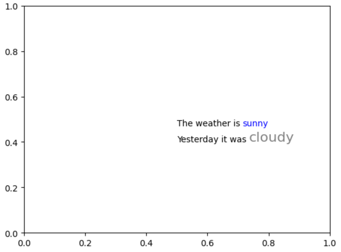
說明如下:
<sunny>,其所對應的屬性資訊為{"color": "blue"},所以「"sunny"」炫染為藍色。<cloudy>,其所對應的屬性資訊為{"color": "grey", "fontsize": 16},所以「"cloudy"」除了炫染為灰色外,字型大小也調整為16。註1:此例題已取得Matt同意進行改寫,其原始程式請參考連結。


 iThome鐵人賽