今天我們使用Plotnine搭配Polars來繪製Alta的歷年溫度變化圖。
本日大綱如下:
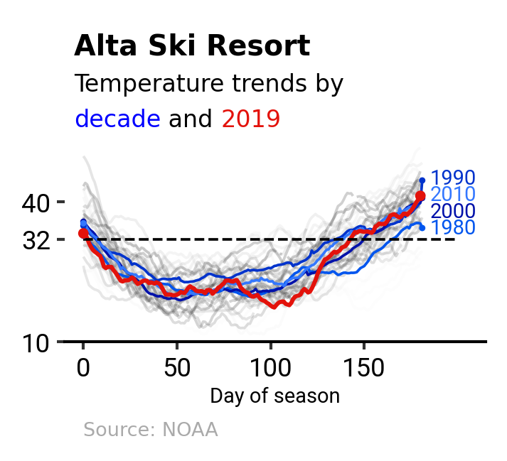
以下為本日作品預覽:
import polars as pl
import polars.selectors as cs
from highlight_text import ax_text
from matplotlib.axes import Axes
from matplotlib.figure import Figure

from plotnine import (
    aes,
    element_blank,
    element_text,
    geom_line,
    geom_point,
    geom_segment,
    geom_text,
    ggplot,
    labs,
    scale_color_cmap,
    scale_x_continuous,
    scale_y_continuous,
    theme,
    theme_classic,
)

data_path = "alta-noaa-1980-2019.csv"
columns = ["DATE", "TOBS"]
idx_colname = "DAY_OF_SEASON"
temp_colname = "temp"

heading_fontsize = 9.5
heading_fontweight = "bold"
subheading_fontsize = 8
subheading_fontweight = "normal"
source_fontsize = 6.5
source_fontweight = "light"
axis_fontsize = 7
axis_fontweight = "normal"
sub_props = {
    "fontsize": subheading_fontsize,
    "fontweight": subheading_fontweight,
}

grey = "#aaaaaa"
red = "#e3120b"
blue = "#0000ff"
建議使用uv安裝:
uv add plotnine
Plotnine以Matplotlib為基礎,可以說是Python中的ggplot2,讓我們能像畫家一樣,將素材逐步堆疊,最終融合為作品。
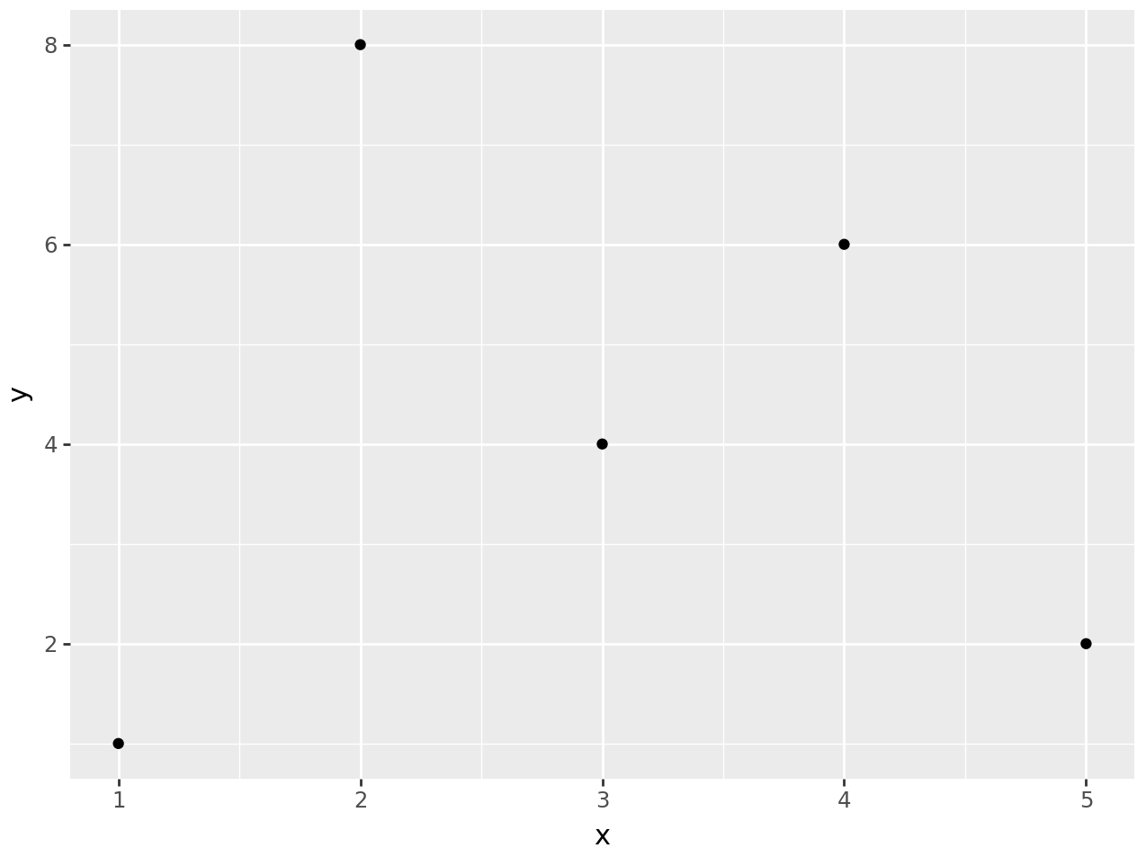
舉例來說,有一個df_demo dataframe如下:
import polars as pl
from plotnine import aes, geom_point, ggplot, theme_538

df_demo = pl.DataFrame(
    {
        "x": [1, 2, 3, 4, 5],
        "y": [1, 8, 4, 6, 2],
        "group": ["A", "B", "B", "C", "A"],
    }
)
shape: (5, 3)
┌─────┬─────┬───────┐
│ x   ┆ y   ┆ group │
│ --- ┆ --- ┆ ---   │
│ i64 ┆ i64 ┆ str   │
╞═════╪═════╪═══════╡
│ 1   ┆ 1   ┆ A     │
│ 2   ┆ 8   ┆ B     │
│ 3   ┆ 4   ┆ B     │
│ 4   ┆ 6   ┆ C     │
│ 5   ┆ 2   ┆ A     │
└─────┴─────┴───────┘
將df_demo的「"x"」及「"y"」列繪製為散佈圖:
(ggplot(data=df_demo, mapping=aes(x="x", y="y")) + geom_point())
簡單說明如下:
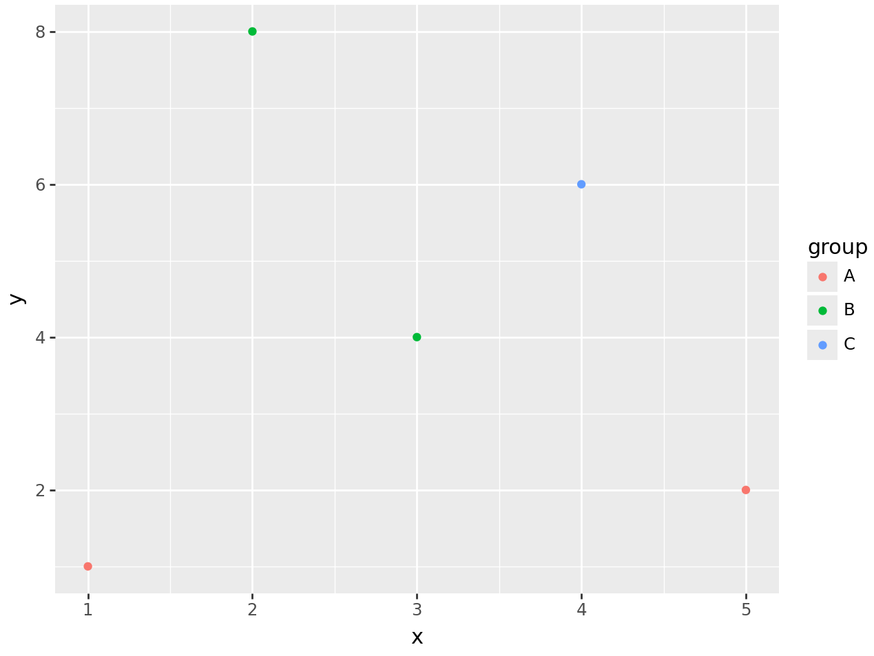
df_demo傳給data=,並使用aes()設定aesthetic與df_demo的映射關係後,傳給mapping=。這裡我們將x=及y=兩個aesthetic設定為df_demo的「"x"」及「"y"」列。此處需留意,在ggplot()設定的data=及mapping=將會作為全局預設值。+符號來串接各種函數。此處,我們將ggplot()加上geom_point(),Plotnine就能了解想繪製的圖片類型為散佈圖。如果我們想更進一步,依據「"group"」列來替每個圓點標上不同的顏色,可以映射「"group"」列為color= aesthetic:
(
    ggplot(data=df_demo, mapping=aes(x="x", y="y", color="group"))
    + geom_point()
)
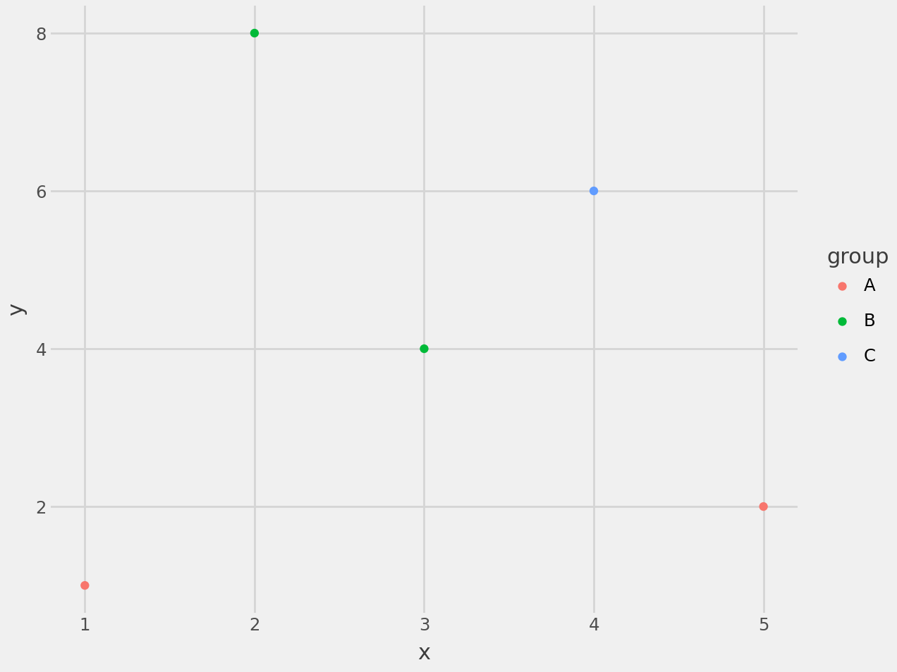
最後,如果想改變圖片預設風格,可以使用Plotnine提供的多種theme_*()函數,例如,使用theme_538():
(
    ggplot(data=df_demo, mapping=aes(x="x", y="y", color="group"))
    + geom_point()
    + theme_538()
)
我們將繪製圖片的步驟封裝在plot_temps()、themify()及add_ax_text()三個函數:
plot_temps()進行主要繪圖工作。themify()設定主題及微調圖表參數。add_ax_text():加上標題及各列列名。繪圖核心思想是透過指定不同的dataframe作為各種geom_*()的data=,並巧妙地將各列映射至aes()。
plot_temps()建構多個dataframe,並於稍後繪圖時指定為各繪圖函數的data=參數。
Ski season溫度建構season_temps dataframe:
pl.DataFrame.filter()篩選出「"SEASON"」列中含有Ski的行。pl.DataFrame.pivot()重塑_df。def plot_temps(
_df: pl.DataFrame, idx_colname: str = "DAY_OF_SEASON"
) -> ggplot:
season_temps = _df.filter(pl.col("SEASON").str.contains("Ski")).pivot(
"SEASON",
index=idx_colname,
values="TMEAN",
aggregate_function="first",
)
...
season_temps預覽如下:
season_temps=shape: (182, 41)
┌───────────────┬──────────┬───────────┬───┬───────────┬───────────┐
│ DAY_OF_SEASON ┆ Ski 1980 ┆ Ski 1981  ┆ … ┆ Ski 2018  ┆ Ski 2019  │
│ ---           ┆ ---      ┆ ---       ┆   ┆ ---       ┆ ---       │
│ i64           ┆ f64      ┆ f64       ┆   ┆ f64       ┆ f64       │
╞═══════════════╪══════════╪═══════════╪═══╪═══════════╪═══════════╡
│ 0             ┆ null     ┆ 30.357143 ┆ … ┆ 37.392857 ┆ 33.214286 │
│ 1             ┆ null     ┆ 29.821429 ┆ … ┆ 37.035714 ┆ 32.892857 │
│ 2             ┆ null     ┆ 29.285714 ┆ … ┆ 36.642857 ┆ 32.25     │
│ 3             ┆ null     ┆ 28.892857 ┆ … ┆ 36.392857 ┆ 31.142857 │
│ 4             ┆ null     ┆ 28.571429 ┆ … ┆ 36.071429 ┆ 30.357143 │
│ …             ┆ …        ┆ …         ┆ … ┆ …         ┆ …         │
│ 177           ┆ null     ┆ 35.464286 ┆ … ┆ 44.0      ┆ 39.285714 │
│ 178           ┆ null     ┆ 35.464286 ┆ … ┆ 44.464286 ┆ 39.964286 │
│ 179           ┆ null     ┆ 35.071429 ┆ … ┆ 44.607143 ┆ 40.464286 │
│ 180           ┆ null     ┆ 34.535714 ┆ … ┆ 44.142857 ┆ 41.25     │
│ 181           ┆ null     ┆ null      ┆ … ┆ null      ┆ null      │
└───────────────┴──────────┴───────────┴───┴───────────┴───────────┘
建構df_main dataframe:
pl.DataFrame.unpivot()重塑season_temps。pl.DataFrame.select()選擇及生成所需的三列。
idx_colname列。temp_colname列。def plot_temps(
_df: pl.DataFrame, idx_colname: str = "DAY_OF_SEASON"
) -> ggplot:
...
df_main = season_temps.unpivot(
(cs.starts_with("Ski") - cs.by_name("Ski 2019")),
index=idx_colname,
variable_name="year",
value_name=temp_colname,
).select(
idx_colname,
temp_colname,
pl.col("year").str.slice(-4).cast(pl.Int32),
)
df_main預覽如下:
shape: (7_098, 3)
┌───────────────┬───────────┬──────┐
│ DAY_OF_SEASON ┆ temp      ┆ year │
│ ---           ┆ ---       ┆ ---  │
│ i64           ┆ f64       ┆ i32  │
╞═══════════════╪═══════════╪══════╡
│ 0             ┆ null      ┆ 1980 │
│ 1             ┆ null      ┆ 1980 │
│ 2             ┆ null      ┆ 1980 │
│ 3             ┆ null      ┆ 1980 │
│ 4             ┆ null      ┆ 1980 │
│ …             ┆ …         ┆ …    │
│ 177           ┆ 44.0      ┆ 2018 │
│ 178           ┆ 44.464286 ┆ 2018 │
│ 179           ┆ 44.607143 ┆ 2018 │
│ 180           ┆ 44.142857 ┆ 2018 │
│ 181           ┆ null      ┆ 2018 │
└───────────────┴───────────┴──────┘
Ski season平均溫度建構df_decade dataframe:
idx_colname列。Ski season平均溫度。pl.concat()將四個dataframe依垂直方向合併為df_decade。def plot_temps(
_df: pl.DataFrame, idx_colname: str = "DAY_OF_SEASON"
) -> ggplot:
...
decades = [1980, 1990, 2000, 2010]
blues = ["#0055EE", "#0033CC", "#0011AA", "#3377FF"]
df_decade = pl.concat(
[
season_temps.select(
idx_colname,
pl.mean_horizontal(cs.contains(str(decade)[:-1])).alias(
temp_colname
),
pl.lit(b).alias("color"),
)
for b, decade in zip(blues, decades)
],
how="vertical",
)
df_decade預覽如下:
shape: (728, 3)
┌───────────────┬───────────┬─────────┐
│ DAY_OF_SEASON ┆ temp      ┆ color   │
│ ---           ┆ ---       ┆ ---     │
│ i64           ┆ f64       ┆ str     │
╞═══════════════╪═══════════╪═════════╡
│ 0             ┆ 32.704365 ┆ #0055EE │
│ 1             ┆ 32.156746 ┆ #0055EE │
│ 2             ┆ 31.875    ┆ #0055EE │
│ 3             ┆ 31.561508 ┆ #0055EE │
│ 4             ┆ 31.041667 ┆ #0055EE │
│ …             ┆ …         ┆ …       │
│ 177           ┆ 39.275    ┆ #3377FF │
│ 178           ┆ 39.639286 ┆ #3377FF │
│ 179           ┆ 40.092857 ┆ #3377FF │
│ 180           ┆ 40.653571 ┆ #3377FF │
│ 181           ┆ 41.428571 ┆ #3377FF │
└───────────────┴───────────┴─────────┘
建構df_decade_pts dataframe:
df_decade的「"color"」列進行分組,並收集各組中idx_colname及temp_colname列的第一及最後一行為pl.List。pl.DataFrame.explode()將idx_colname及temp_colname列擴展至整個dataframe。def plot_temps(
_df: pl.DataFrame, idx_colname: str = "DAY_OF_SEASON"
) -> ggplot:
...
df_decade_pts = (
df_decade.group_by(pl.col("color"), maintain_order=True)
.agg(
pl.col(idx_colname).first().append(pl.col(idx_colname).last()),
pl.col(temp_colname)
.first()
.append(pl.col(temp_colname).last()),
)
.explode(idx_colname, temp_colname)
)
df_decade_pts預覽如下:
shape: (8, 3)
┌─────────┬───────────────┬───────────┐
│ color   ┆ DAY_OF_SEASON ┆ temp      │
│ ---     ┆ ---           ┆ ---       │
│ str     ┆ i64           ┆ f64       │
╞═════════╪═══════════════╪═══════════╡
│ #0055EE ┆ 0             ┆ 32.704365 │
│ #0055EE ┆ 181           ┆ 34.357143 │
│ #0033CC ┆ 0             ┆ 34.851786 │
│ #0033CC ┆ 181           ┆ 44.535714 │
│ #0011AA ┆ 0             ┆ 35.719643 │
│ #0011AA ┆ 181           ┆ 40.77381  │
│ #3377FF ┆ 0             ┆ 35.380357 │
│ #3377FF ┆ 181           ┆ 41.428571 │
└─────────┴───────────────┴───────────┘
建構df_decade_annt dataframe:
decade_annts dataframe。使用pl.DataFrame.filter()找出idx_colname列最大的行數,接著使用pl.DataFrame.select()選擇temp_colname列後,先轉為pl.Series再轉為列表。decade_annts建構df_decade_annt,其內含有註釋所需的座標、顏色及標籤等資訊。def plot_temps(
_df: pl.DataFrame, idx_colname: str = "DAY_OF_SEASON"
) -> ggplot:
...
decade_annts = (
df_decade_pts.filter(
pl.col(idx_colname).eq(pl.col(idx_colname).max())
)
.select(temp_colname)
.to_series()
.to_list()
)
df_decade_annt = pl.DataFrame(
{
"x": [185] * len(decade_annts),
# adjust y position for better appearance
"y": [
decade_annts[0],
decade_annts[1] + 0.5,
decade_annts[2] - 3,
decade_annts[3],
],
"color": blues,
"label": decades,
}
)
df_decade_annt預覽如下:
shape: (4, 4)
┌─────┬───────────┬─────────┬───────┐
│ x   ┆ y         ┆ color   ┆ label │
│ --- ┆ ---       ┆ ---     ┆ ---   │
│ i64 ┆ f64       ┆ str     ┆ i64   │
╞═════╪═══════════╪═════════╪═══════╡
│ 185 ┆ 34.357143 ┆ #0055EE ┆ 1980  │
│ 185 ┆ 45.035714 ┆ #0033CC ┆ 1990  │
│ 185 ┆ 37.77381  ┆ #0011AA ┆ 2000  │
│ 185 ┆ 41.428571 ┆ #3377FF ┆ 2010  │
└─────┴───────────┴─────────┴───────┘
Ski season溫度建構ski_2019 dataframe:
season_temps中的idx_colname及「"Ski 2019"」列。def plot_temps(
_df: pl.DataFrame, idx_colname: str = "DAY_OF_SEASON"
) -> ggplot:
...
ski_2019 = (
season_temps.select(
idx_colname, pl.col("Ski 2019").alias(temp_colname)
).drop_nulls() # "DAY_OF_SEASON"=181, "temp"=null
)
ski_2019預覽如下:
shape: (181, 2)
┌───────────────┬───────────┐
│ DAY_OF_SEASON ┆ temp      │
│ ---           ┆ ---       │
│ i64           ┆ f64       │
╞═══════════════╪═══════════╡
│ 0             ┆ 33.214286 │
│ 1             ┆ 32.892857 │
│ 2             ┆ 32.25     │
│ 3             ┆ 31.142857 │
│ 4             ┆ 30.357143 │
│ …             ┆ …         │
│ 176           ┆ 38.607143 │
│ 177           ┆ 39.285714 │
│ 178           ┆ 39.964286 │
│ 179           ┆ 40.464286 │
│ 180           ┆ 41.25     │
└───────────────┴───────────┘
建構ski_2019_pts dataframe:
pl.concat()合併ski_2019的第一行及最後一行。def plot_temps(
_df: pl.DataFrame, idx_colname: str = "DAY_OF_SEASON"
) -> ggplot:
...
ski_2019_pts = pl.concat([ski_2019.head(1), ski_2019.tail(1)])
shape: (2, 2)
┌───────────────┬───────────┐
│ DAY_OF_SEASON ┆ temp      │
│ ---           ┆ ---       │
│ i64           ┆ f64       │
╞═══════════════╪═══════════╡
│ 0             ┆ 33.214286 │
│ 180           ┆ 41.25     │
└───────────────┴───────────┘
ggplot物件def plot_temps(
_df: pl.DataFrame, idx_colname: str = "DAY_OF_SEASON"
) -> ggplot:
...
return (
ggplot(mapping=aes(x=idx_colname, y=temp_colname))
# multiple grey lines
+ geom_line(
mapping=aes(color="factor(year)"),
data=df_main,
alpha=0.2,
size=0.5,
)
# 4 blue lines
+ geom_line(
mapping=aes(fill="factor(color)"),
data=df_decade,
color=df_decade["color"],
size=0.5,
lineend="round",
)
# 2019 red line
+ geom_line(
data=ski_2019,
color=red,
size=0.8,
lineend="round",
)
# 1 black dashed line for temp=32F
+ geom_segment(
mapping=aes(x=0, xend=200, y=32, yend=32),
size=0.5,
linetype="dashed",
)
# start and end dots for 4 blue lines
+ geom_point(
mapping=aes(x=idx_colname, y=temp_colname),
data=df_decade_pts,
color=df_decade_pts["color"],
size=0.2,
)
# start and end dots for 2019 red line
+ geom_point(
mapping=aes(x=idx_colname, y=temp_colname),
data=ski_2019_pts,
color=red,
size=1,
)
# annotations for 4 blue lines
+ geom_text(
mapping=aes(x="x", y="y", label="label"),
data=df_decade_annt,
color=df_decade_annt["color"],
size=axis_fontsize,
fontweight=axis_fontweight,
ha="left",
va="center",
)
+ labs(x="Day of season", y="")
+ scale_x_continuous(
breaks=[0, 50, 100, 150],
limits=(0, 200),
expand=(0, 10, 0, 15),
)
+ scale_y_continuous(
breaks=[10, 32, 40], limits=(10, 70), expand=(0, 0)
)
+ scale_color_cmap("Greys", guide=None)
)
分段說明如下:
ggplot物件,並指定mapping=aes(x=idx_colname, y=temp_colname)。Ski season溫度。此處的factor是Plotnine提供的功能,可以該「"year"」列視為pl.Categorical型別。geom_line()指定data=df_decade繪製十年平均Ski season溫度。此處的factor一樣可以將「"color"」列視為pl.Categorical型別。值得注意的是,color=df_decade["color"]是直接指定為df_decade的「"color"」列,這是因為color aesthetic已經在前一次geom_line()中使用,所以此處取巧地將「"color"」列映設為fill= aesthetic,再於aes外指定color=。geom_line()繪製2019年Ski season溫度。mapping=aes(x=0, xend=200, y=32, yend=32)繪製一條在32℉的橫線。Ski season溫度的線頭及線尾,加上小圓點強調。geom_point()在2019年Ski season溫度的線頭及線尾,加上小圓點強調。Ski season溫度加上標籤。color= aesthetic使用灰階色表。themify()呼叫theme_classic()作為基本主題後,再呼叫theme()進行細部微調:
def points_to_inches(points):
    return points / 72


def themify(p: ggplot) -> Figure:
    figsize = (160, 165)  # pts
    figsize_inches = [points_to_inches(dim) for dim in figsize]

    return (
        p
        + theme_classic()
        + theme(
            axis_line_y=element_blank(),
            axis_title_x=element_text(
                weight=axis_fontweight, size=axis_fontsize
            ),
            axis_title_y=element_text(
                weight=axis_fontweight, size=axis_fontsize
            ),
            axis_text_x=element_text(color="black"),
            axis_text_y=element_text(color="black"),
            dpi=300,
            figure_size=figsize_inches,
            aspect_ratio=2 / 3,
            text=element_text("Roboto"),
        )
    ).draw(show=False)
add_ax_text()使用HighlightText加上標題及各列列名。
def add_ax_text(ax: Axes) -> Axes:
    ax_text(
        s="<Alta Ski Resort>\n<Temperature trends by >\n<decade>< and ><2019>",
        x=-5,
        y=55,
        fontsize=heading_fontsize,
        ax=ax,
        va="bottom",
        ha="left",
        zorder=5,
        highlight_textprops=[
            {
                "fontsize": heading_fontsize,
                "fontweight": heading_fontweight,
            },
            sub_props,
            {"color": blue, **sub_props},
            sub_props,
            {"color": red, **sub_props},
        ],
    )

    ax.text(
        0,
        -10,
        "Source: NOAA",
        fontsize=source_fontsize,
        fontweight=source_fontweight,
        color=grey,
    )
    return ax
實際執行本日程式:
tweak_df()生成df dataframe。plot_temps()進行繪圖。themify()設定主題。fig.axes[0]取得ax(註1)。add_ax_text()添加標題及資料來源。df = tweak_df(data_path, columns, idx_colname)
p = plot_temps(df, idx_colname)
fig = themify(p)
ax = fig.axes[0]
ax = add_ax_text(ax)
fig
註1:這是一個非常實用的技巧,小弟寫過一篇部落格文章,說明從哪裡學到這個技巧。
個人部落格文章:Weekend Challenge – Recreating a Data Visualization with Polars and Plotnine。


 iThome鐵人賽