今天我們使用Matplotlib搭配Polars來繪製Alta的歷年溫度變化圖。
本日大綱如下:
以下為本日作品預覽: 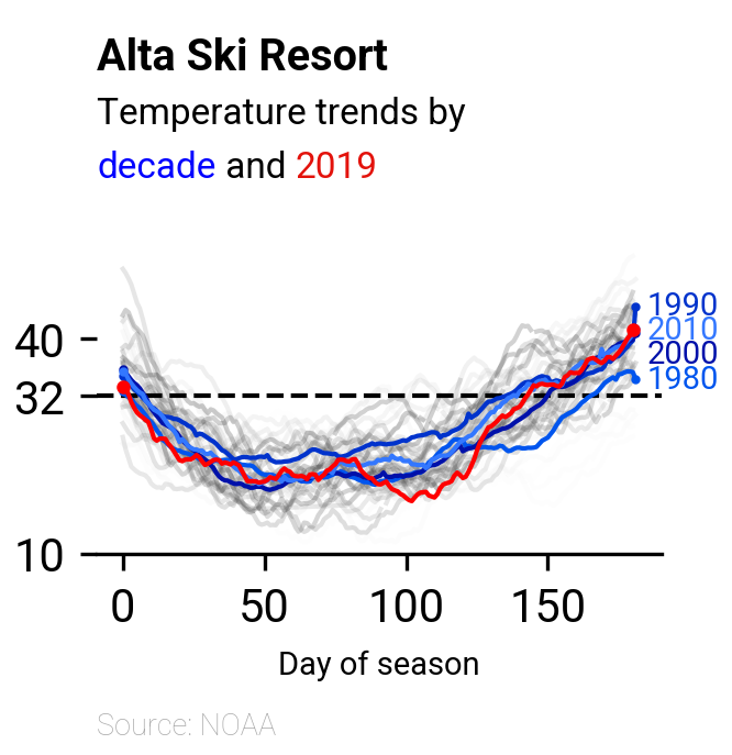
import matplotlib.pyplot as plt
import polars as pl
import polars.selectors as cs
from highlight_text import ax_text
from matplotlib import colormaps

idx_colname = "DAY_OF_SEASON"
data_path = "alta-noaa-1980-2019.csv"
columns = ["DATE", "TOBS"]
建議使用uv安裝:
uv add matplotlib
Figure與Axes是Matplotlib最關鍵的兩個物件。Figure就像是一張空白畫布,而Axes則是畫布上的小區塊。您可以選擇直接將素材繪製在Figure或是Axes上,我自己是習慣繪製在Axes上,方便微調局部參數。
我較常使用的作法是透過呼叫plt.subplots(),來同時取得Figure及Axes物件。因為一旦取得這兩個物件後,我們就可以進一步呼叫其所擁有的函數來繪製線條、加上註釋或調整圖片屬性。
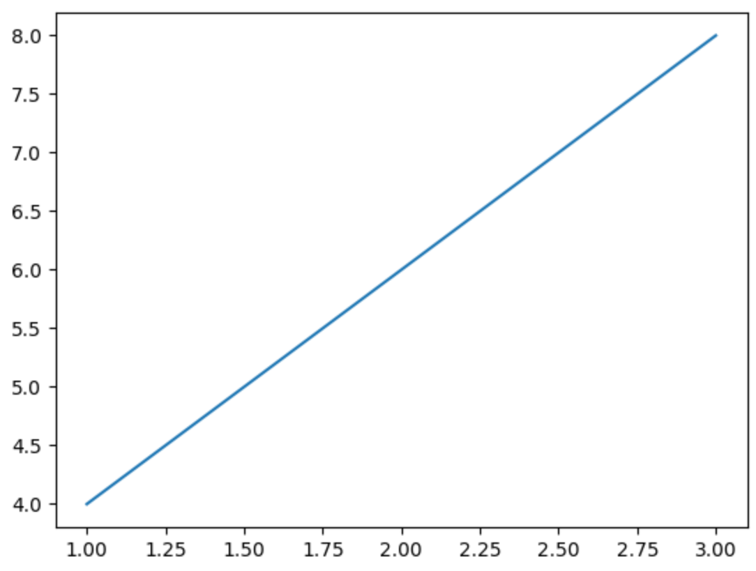
以ax.plot()為例,可以傳入兩個pl.Series並繪出連續的線圖:
df_demo = pl.DataFrame({"x": [1, 2, 3], "y": [4, 6 ,8]})
fig_demo, ax_demo = plt.subplots()
ax_demo.plot(df_demo["x"], df_demo["y"])
最後,全局的設定則多會呼叫plt下的函數來完成,例如plt.rcParams["font.family"] = "Roboto"可以將預設字體設定為Roboto。
我們將繪製圖片的步驟封裝在plot_temps()中。
核心思維是使用ax.plot(),繪製不同的x和y組合,每種組合皆為一條連續線段。
定義plot_temps()中會使用的變數。
為了方便辨識,我將cmap由「"Blues"」改為「"Grays"」。
def plot_temps(
    _df: pl.DataFrame, idx_colname: str = "DAY_OF_SEASON"
) -> pl.DataFrame:
    plt.rcParams["font.family"] = "Roboto"
    figsize = (160, 165)  # pts

    def points_to_inches(points):
        return points / 72

    figsize_inches = [points_to_inches(dim) for dim in figsize]

    heading_fontsize = 9.5
    heading_fontweight = "bold"
    subheading_fontsize = 8
    subheading_fontweight = "normal"
    source_fontsize = 6.5
    source_fontweight = "light"
    axis_fontsize = 7
    axis_fontweight = "normal"

    grey = "#aaaaaa"
    red = "#e3120b"
    blue = "#0000ff"
    cmap = colormaps.get_cmap("Grays")
    ...
使用plt.subplot_mosaic()作為圖片的基本佈局,可以快速建立多個Axes,並指定各Axes的高度比例。此處,我們建立三個Axes:
ax_title對應標題區。ax_plot對應主繪圖區。ax_note對應註腳區。其Axes間的高度比例可透過gridspec_kw={"height_ratios": [6, 12, 1]}設定。
def plot_temps(
    _df: pl.DataFrame, idx_colname: str = "DAY_OF_SEASON"
) -> pl.DataFrame:
    ...
    layout = [["title"], ["plot"], ["notes"]]
    fig, axs = plt.subplot_mosaic(
        layout,
        gridspec_kw={"height_ratios": [6, 12, 1]},
        figsize=figsize_inches,
        dpi=300,
        constrained_layout=True,
    )
ax_title針對ax_title,使用HighlightText調整文字大小、粗細及顏色等屬性。
def plot_temps(
    _df: pl.DataFrame, idx_colname: str = "DAY_OF_SEASON"
) -> pl.DataFrame:
    ax_title = axs["title"]
    ax_title.axis("off")
    sub_props = {
        "fontsize": subheading_fontsize,
        "fontweight": subheading_fontweight,
    }
    ax_text(
        s="<Alta Ski Resort>\n<Temperature trends by >\n<decade>< and ><2019>",
        x=0,
        y=0,
        fontsize=heading_fontsize,
        ax=ax_title,
        va="bottom",
        ha="left",
        zorder=5,
        highlight_textprops=[
            {
                "fontsize": heading_fontsize,
                "fontweight": heading_fontweight,
            },
            sub_props,
            {"color": blue, **sub_props},
            sub_props,
            {"color": red, **sub_props},
        ],
    )
ax_plot針對ax_plot進行四種操作:
Ski season溫度(2019年除外)。Ski season的平均溫度(2019年除外)。Ski season溫度。Ski season溫度建構season_temps dataframe:
pl.DataFrame.filter()篩選出「"SEASON"」列中含有「"Ski"」的行。pl.DataFrame.pivot()重塑表格。def plot_temps(
_df: pl.DataFrame, idx_colname: str = "DAY_OF_SEASON"
) -> pl.DataFrame:
ax = axs["plot"]
season_temps = _df.filter(pl.col("SEASON").str.contains("Ski")).pivot(
"SEASON",
index=idx_colname,
values="TMEAN",
aggregate_function="first",
)
...
season_temps預覽如下:
season_temps=shape: (182, 41)
┌───────────────┬──────────┬───────────┬───┬───────────┬───────────┐
│ DAY_OF_SEASON ┆ Ski 1980 ┆ Ski 1981  ┆ … ┆ Ski 2018  ┆ Ski 2019  │
│ ---           ┆ ---      ┆ ---       ┆   ┆ ---       ┆ ---       │
│ i64           ┆ f64      ┆ f64       ┆   ┆ f64       ┆ f64       │
╞═══════════════╪══════════╪═══════════╪═══╪═══════════╪═══════════╡
│ 0             ┆ null     ┆ 30.357143 ┆ … ┆ 37.392857 ┆ 33.214286 │
│ 1             ┆ null     ┆ 29.821429 ┆ … ┆ 37.035714 ┆ 32.892857 │
│ 2             ┆ null     ┆ 29.285714 ┆ … ┆ 36.642857 ┆ 32.25     │
│ 3             ┆ null     ┆ 28.892857 ┆ … ┆ 36.392857 ┆ 31.142857 │
│ 4             ┆ null     ┆ 28.571429 ┆ … ┆ 36.071429 ┆ 30.357143 │
│ …             ┆ …        ┆ …         ┆ … ┆ …         ┆ …         │
│ 177           ┆ null     ┆ 35.464286 ┆ … ┆ 44.0      ┆ 39.285714 │
│ 178           ┆ null     ┆ 35.464286 ┆ … ┆ 44.464286 ┆ 39.964286 │
│ 179           ┆ null     ┆ 35.071429 ┆ … ┆ 44.607143 ┆ 40.464286 │
│ 180           ┆ null     ┆ 34.535714 ┆ … ┆ 44.142857 ┆ 41.25     │
│ 181           ┆ null     ┆ null      ┆ … ┆ null      ┆ null      │
└───────────────┴──────────┴───────────┴───┴───────────┴───────────┘
接下來,使用迴圈搭配ax.plot(),將每年的溫度繪製成圖中的一條線:
def plot_temps(
    _df: pl.DataFrame, idx_colname: str = "DAY_OF_SEASON"
) -> pl.DataFrame:
    season_temps_index = season_temps[idx_colname]

    columns = season_temps.columns
    columns.remove(idx_colname)
    columns.remove("Ski 2019")
    for i, column in enumerate(columns):
        color = cmap(i / len(columns))
        ax.plot(
            season_temps_index,
            season_temps[column],
            color=color,
            linewidth=1,
            alpha=0.2,
            zorder=1,
        )
    ...
Ski season平均溫度於迴圈中巧妙地使用了selectors與pl.mean_horizontal()計算每十年的Ski season平均溫度,接著繪製成圖中的一條線,總共會有四條不同深淺的藍線:
def plot_temps(
    _df: pl.DataFrame, idx_colname: str = "DAY_OF_SEASON"
) -> pl.DataFrame:
    decades = [1980, 1990, 2000, 2010]
    blues = ["#0055EE", "#0033CC", "#0011AA", "#3377FF"]
    for decade, color in zip(decades, blues):
        match = str(decade)[:-1]  # 1980 -> "198", 2010 -> "201"
        decade_temps = season_temps.select(
            cs.contains(match)
        ).mean_horizontal()
        ax.plot(season_temps_index, decade_temps, color=color, linewidth=1)
        ...
接著,使用ax.text()在線尾加上年份,並使用ax.plot()在線的頭尾加上小圓點作為強調。
def plot_temps(
    _df: pl.DataFrame, idx_colname: str = "DAY_OF_SEASON"
) -> pl.DataFrame:
    for decade, color in zip(decades, blues):
        ...

        # add a label to the end of the line
        last_y_label = decade_temps.last()

        if decade == 2000:
            last_y_label -= 3
        elif decade == 2010:
            last_y_label -= 0.3

        ax.text(
            185,
            last_y_label,
            f"{decade}",
            va="center",
            ha="left",
            fontsize=axis_fontsize,
            fontweight=axis_fontweight,
            color=color,
        )
        # add dots to the start and end of the line
        ax.plot(
            season_temps_index.first(),
            decade_temps.first(),
            marker="o",
            color=color,
            markersize=1,
            zorder=2,
        )
        ax.plot(
            season_temps_index.last(),
            decade_temps.last(),
            marker="o",
            color=color,
            markersize=1,
            zorder=2,
        )
Ski season溫度2019年Ski season的計算與繪圖方式,與上一小節類似,目的是要以紅色強調「"2019"」為資料集中最新的一年。
def plot_temps(
    _df: pl.DataFrame, idx_colname: str = "DAY_OF_SEASON"
) -> pl.DataFrame:
    ...
    ski_2019 = season_temps.select(
        idx_colname, cs.by_name("Ski 2019")
    ).drop_nulls()
    ski_2019_index = ski_2019[idx_colname]
    ski_2019 = ski_2019.drop([idx_colname]).to_series()
    ax.plot(ski_2019_index, ski_2019, color="red", linewidth=1)
最後,一樣使用ax.plot()在線的頭尾加上小圓點作為強調。
def plot_temps(
    _df: pl.DataFrame, idx_colname: str = "DAY_OF_SEASON"
) -> pl.DataFrame:
    ...
    ax.plot(
        ski_2019_index.first(),
        ski_2019.first(),
        marker="o",
        color="red",
        markersize=2,
        zorder=2,
    )
    ax.plot(
        ski_2019_index.last(),
        ski_2019.last(),
        marker="o",
        color="red",
        markersize=2,
        zorder=2,
    )
微調圖中各項屬性。
def plot_temps(
    _df: pl.DataFrame, idx_colname: str = "DAY_OF_SEASON"
) -> pl.DataFrame:
    ...
    # remove spines
    for side in ["top", "left", "right"]:
        ax.spines[side].set_visible(False)

    # add the horizontal line at 32F
    ax.axhline(32, color="black", linestyle="--", linewidth=1, zorder=1)

    # set y ticks
    ax.set_yticks(ticks=[10, 32, 40])

    # set y limit
    ax.set_ylim([10, 55])

    # set x label
    ax.set_xlabel(
        "Day of season", fontsize=axis_fontsize, fontweight=axis_fontweight
    )
ax_note使用ax.text()標註資料來源。
def plot_temps(
    _df: pl.DataFrame, idx_colname: str = "DAY_OF_SEASON"
) -> pl.DataFrame:
    ...
    ax_notes = axs["notes"]
    # add source
    ax_notes.axis("off")
    ax_notes.text(
        0,
        0,
        "Source: NOAA",
        fontsize=source_fontsize,
        fontweight=source_fontweight,
        color=grey,
    )
    return _df
實際執行本日程式:
tweak_df()生成df dataframe。df.pipe()搭配plot_temps()進行繪圖。df = tweak_df(data_path, columns, idx_colname)
df.pipe(plot_temps, idx_colname)
個人部落格文章:Weekend Challenge - Effective Data Visualization with Polars and Matplotlib。


 iThome鐵人賽