上一篇我們已經設計好形象首頁,而這篇開始設計筆記管理頁面,這篇可能也會在被拆分成多個篇章,就看我的開發方向了~
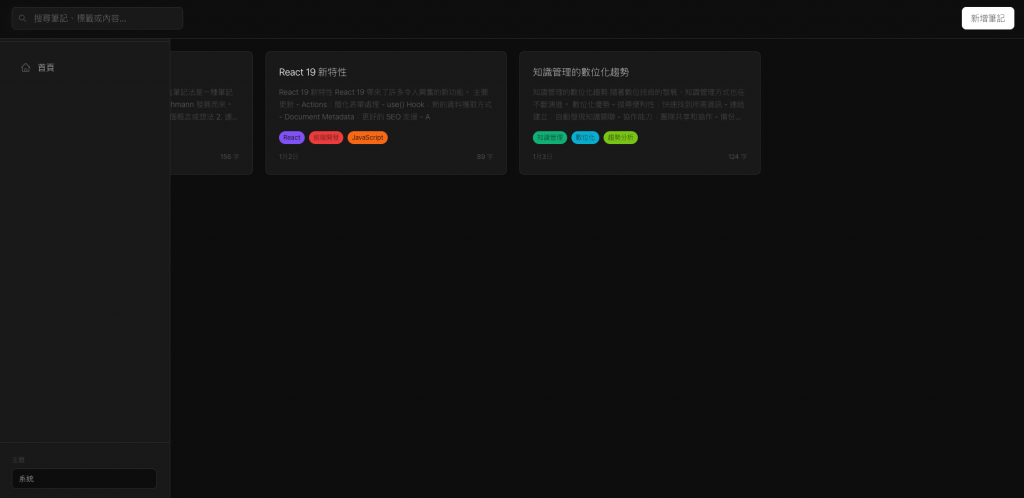
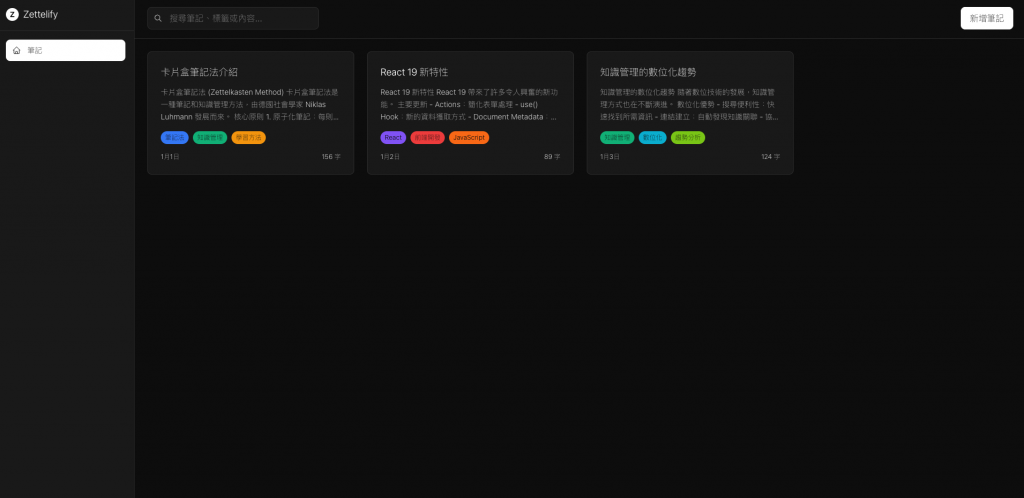
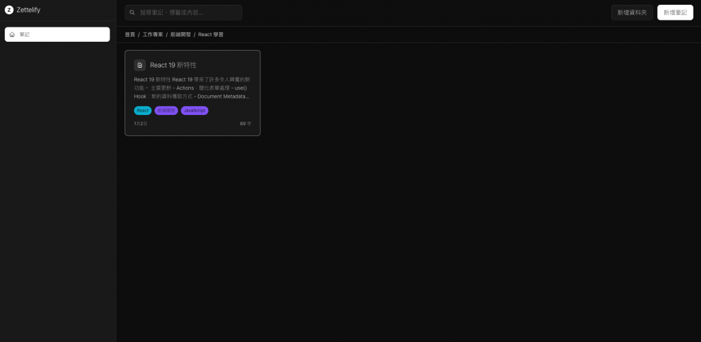
這邊我們來設定用戶的筆記管理頁面
應該要先有一個網格的筆記管理頁面
點擊後才跳轉到筆記編輯與查看頁面
且導覽列在左邊 上面不要有導覽列
像是中間有出現一些錯誤,遇到什麼錯誤就讓他修改什麼就好。
為啥我無法進入GET /notes頁面?
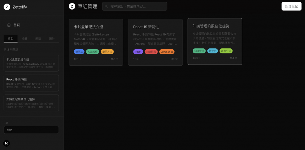
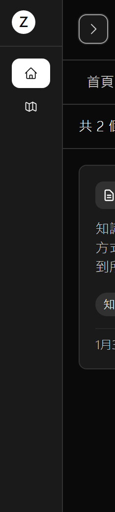
左邊導覽列 不需要首頁按鈕底下的資訊 只要首頁按紐
且在筆記管理中 首頁就是/notes 不應該在跳回/
且上方導覽列不要再有標題跟LOGO
1. 左邊導覽列要固定 不要跟著滑輪移動
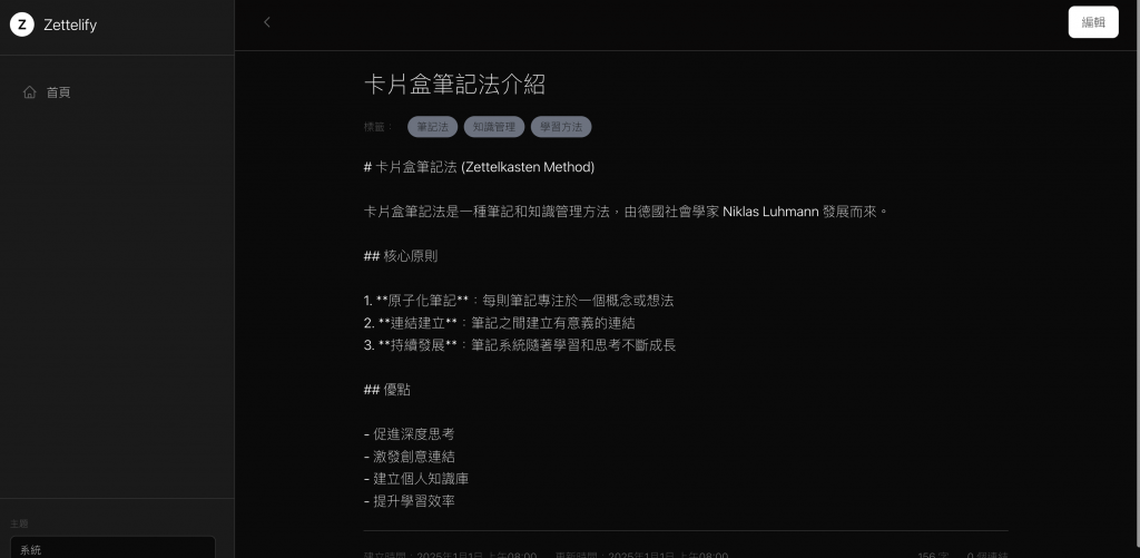
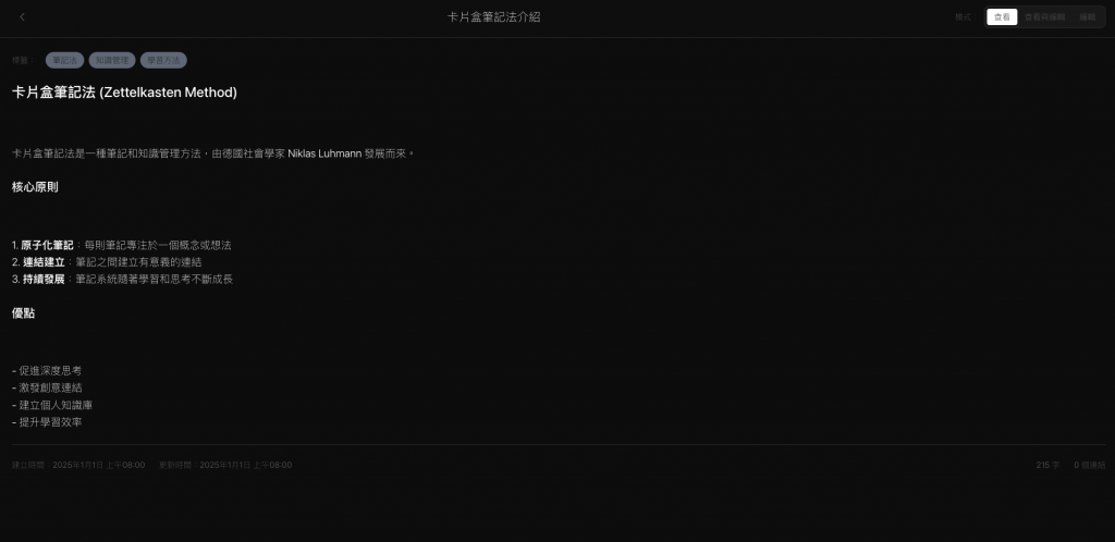
2. 查看編輯畫面 不需要左邊的導覽列
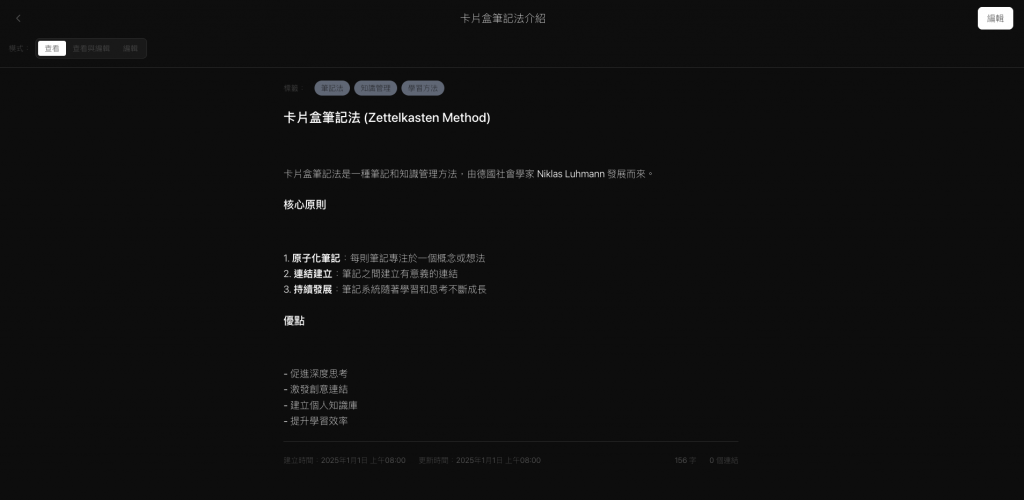
3. 查看編輯畫面 標題要在上面導覽列中間 且點一下就可以編輯
4. 查看與編輯 要做成swicth切換元件 (要有查看、查看與編輯、編輯)且靠左
5. 查看的地方 要轉化markdown格式
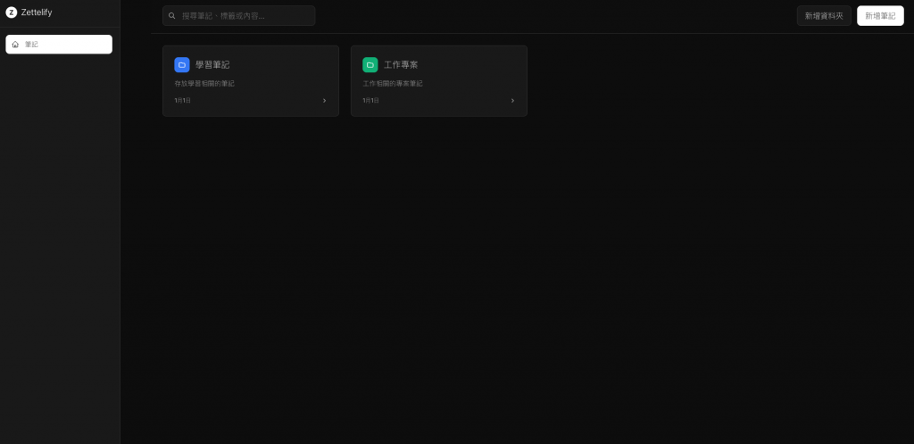
筆記管理 跟 查看與編輯頁面 排版都是獨立的
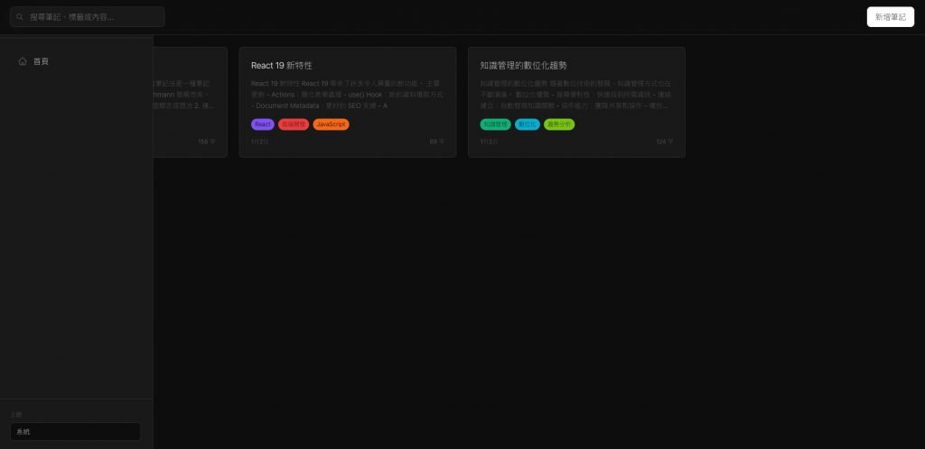
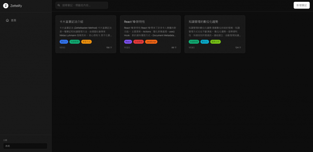
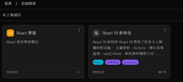
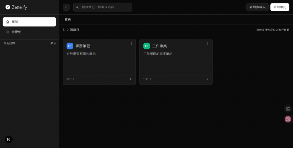
筆記管理
左邊為導覽列 上方導覽覽列只要搜尋 跟新增
查看與編輯頁面 上面導覽列只要有一排 現在是兩排 修正
查看與編輯模式 是要左邊編輯 右邊查看 兩個區塊
右上角 不需要再有編輯 也不需要儲存或取消
應該是修改後 即時同步修改
看起來要再開一個AI去修了,這樣就要同事開三個AI修改,那我們先來修改管理頁,編輯葉稍後修改。
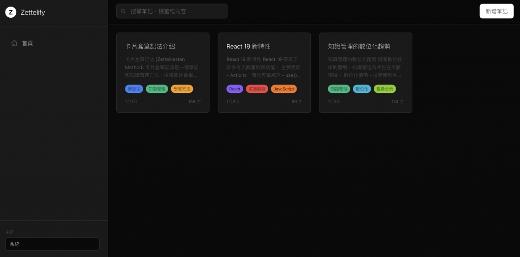
筆記管理頁面
左邊導覽列要在最上方
且內容區塊與上方導覽列跟 左邊導覽列重疊了 請修正
左邊導覽列寬度太大了,且我想要修正一下顏色標籤~
左邊導覽列 使用簡約風格 不需要太多的空間
且根據現在網頁位置 標記目前在的頁面
不需要下方主題選項
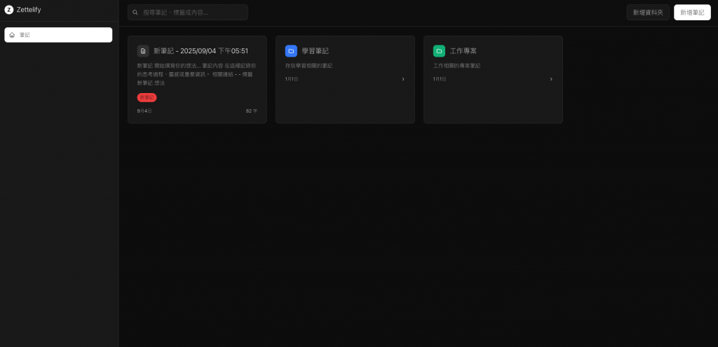
這邊我發現他新增筆記,並沒有任何反應所以我先實作新增筆記,但不串接DB。
實作新增筆記 但不串接DB
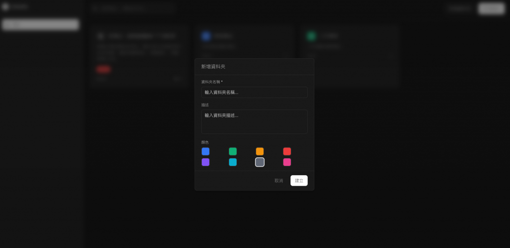
接著我希望是有那種資料夾系統,而且是資料夾中是可以放筆記跟資料夾,形成一個巢狀結構。
新增資料夾系統
資料夾系統 資料夾裡可以再放資料夾 或 筆記
但版型好像跑版了,並且新增資料夾,他就直接先新增,而沒辦法設定資料夾名稱與顏色等,且後續也沒辦法修改刪除,這邊我們就完整更新一下~
1. 左邊導覽列 跟右邊內容 中間怎麼有個區間
2. 資料夾新增時 要先有彈跳視窗 設定完才能新增
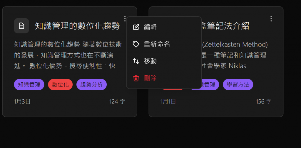
3. 資料夾要可以按右鍵編輯 參考Google雲端 所以右上角也要有三個點 可以設定 編輯 刪除
4. 所有類型都要可以拖拉 可以將筆記或資料夾 拖拉到自料夾中
但發現兩個問題,沒辦法編輯刪除筆記
http://localhost:3000/notes
筆記 資料夾 右上方都要有三個點點選單
可以編輯跟刪除與移動
移動可以做的向是作業系統的檔案移動 到其他資料夾樣是
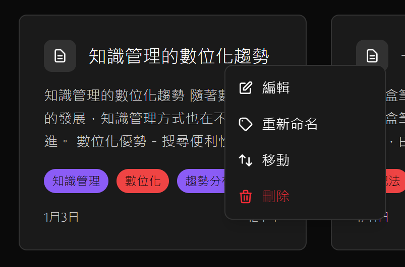
他現在變成直接右鍵編輯了,也不是不行,但右上角的按鈕我覺得還是要留著。
1. 滑鼠選取框線 根本不再滑鼠所選位置
2. 筆記 跟 資料夾 右上方要有三個點 就如同右鍵效果(右見效果保留)
依此類推,我要來開始小修改東西
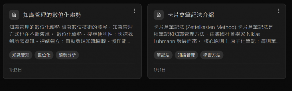
1. 日期保持在下方
2. 資料夾編輯可以定義說明
3. 移動為什麼沒有我新增的資料夾 且要顯示資料夾現在在的路徑
….
中間還有很多 什麼選取系統位置偏移拉,麵包屑顯示錯誤,無法拖移等等
比較多我是在做選取系統的優化
想做的像是Google雲端那樣
把每個文章都當作檔案拖移
並且我還修正了左邊導覽列,跟整體版型~
你只要跟他說要節約風的UIUX,
他就會把頁面的空間壓縮,
因為AI產生通常都會有很多空隙,
導致頁面感覺很壅擠,
所以UI絕對要優化~
最後改變Tag顏色問題
卡片Tag 都要用白色文字
所以要把背景 變成深色系
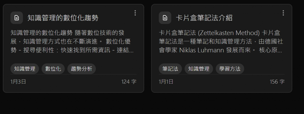
不用顯示幾個字
Tag 離分隔線要有點距離
修正導覽列問題
左邊導覽列 收起時 為什麼按鈕就沒有效果了 且不能點擊了
LOGO 的標題怎麼還突出去了
沒有對齊,且動畫也有問題,這邊只有等我公開才可以看到了~
最後改完差不多是這樣
雖然還有很多沒有修改完
這次做完了管理頁面,但沒有串儲存 所以都只是可以正常操作,管理,與動畫設計,讓大家知道管理頁面可以怎麼設計,希望有給大家好的方向~
最後我讓AI根據這頁做成一個Prompt 不確定能不能使用一次 達到做出此專案的等級。
# Zettelify Notes Management System - Complete UI/UX Prompt

## Project Overview
Create a modern note-taking application inspired by the Zettelkasten method, featuring hierarchical folder structure, drag-and-drop functionality, multi-selection operations, and advanced search capabilities.

## Technology Stack
- **Framework**: Next.js 15 (App Router)
- **Language**: TypeScript
- **Styling**: Tailwind CSS
- **Animations**: Framer Motion
- **State Management**: React Context + useReducer
- **Fonts**: Inter (sans-serif)
- **Icons**: Heroicons (SVG)

## Design System

### Color Palette (Monochromatic)

:root {
  --background: #0a0a0a;    /* Deep black background */
  --foreground: #ffffff;    /* Pure white text */
  --card: #1a1a1a;         /* Card background */
  --border: #333333;       /* Border color */
  --muted: #cccccc;        /* Secondary text */
  --accent: #e5e5e5;       /* Accent color */
  --subtle: #111111;       /* Subtle background */
}


### Design Principles
- **Minimalism**: Clean, uncluttered interface design
- **Monochromatic**: Black, white, and grayscale only
- **Modern**: Rounded corners, subtle shadows, smooth animations
- **Responsive**: Desktop and mobile optimized
- **Accessibility**: Clear visual hierarchy and contrast
- **Swiss Design**: Grid-based layouts, balanced spacing

### Typography
- **Primary Font**: Inter (sans-serif)
- **Weights**: Light (300), Regular (400), Medium (500)
- **Hierarchy**:
  - Headers: font-light, text-lg
  - Body: font-light, text-sm
  - Captions: font-light, text-xs

## Page Architecture

### 1. Overall Layout Structure

┌─────────────────────────────────────────────────────────┐
│ LeftSidebar (Collapsible) │ Main Content Area          │
│ ┌─────────────────────┐   │ ┌─────────────────────────┐ │
│ │ Logo (Z)            │   │ │ TopToolbar              │ │
│ │ Navigation Items    │   │ │ - Search Bar            │ │
│ │ Recent Access       │   │ │ - Action Buttons        │ │
│ └─────────────────────┘   │ └─────────────────────────┘ │
│                           │ ┌─────────────────────────┐ │
│                           │ │ BreadcrumbNavigation    │ │
│                           │ │ Home / Folder1 / Folder2│ │
│                           │ └─────────────────────────┘ │
│                           │ ┌─────────────────────────┐ │
│                           │ │ StatusBar               │ │
│                           │ │ Item Stats / Selection  │ │
│                           │ └─────────────────────────┘ │
│                           │ ┌─────────────────────────┐ │
│                           │ │ ItemsGrid               │ │
│                           │ │ [Card] [Card] [Card]    │ │
│                           │ │ [Card] [Card] [Card]    │ │
│                           │ └─────────────────────────┘ │
└─────────────────────────────────────────────────────────┘


### 2. Component Hierarchy

#### Main Page Component (`NotesGridPage`)

interface NotesGridPageProps {
  // Main container managing all sub-components
  // Handles global state and interactions
}


#### LeftSidebar Component
**Purpose**: Primary navigation and recent access history
**Features**:
- Collapsible sidebar (desktop: 64px collapsed, 256px expanded)
- Logo with "Z" icon in circular background
- Navigation items: Notes, Visual
- Recent access history (last 5 visited folders)
- Mobile overlay with backdrop blur

**Props**:

interface LeftSidebarProps {
  isOpen: boolean;
  onToggle: () => void;
  isCollapsed: boolean;
  onToggleCollapse: () => void;
}


#### TopToolbar Component
**Purpose**: Search functionality and primary actions
**Features**:
- Sidebar toggle button
- Search input with magnifying glass icon
- Add Folder button (secondary style)
- Add Note button (primary style)
- Mobile hamburger menu

**Props**:

interface TopToolbarProps {
  sidebarCollapsed: boolean;
  onToggleSidebar: () => void;
  searchQuery: string;
  onSearchChange: (query: string) => void;
  onAddFolder: () => void;
  onAddNote: () => void;
  sidebarOpen: boolean;
  onToggleSidebarOpen: () => void;
}


#### BreadcrumbNavigation Component
**Purpose**: Hierarchical navigation and drag-drop targets
**Features**:
- Clickable path segments
- Drag-drop support for moving items to any level
- Visual feedback for drop targets
- Home button for root navigation

**Props**:

interface BreadcrumbNavigationProps {
  selectedFolderId: string | null;
  activeFolders: Folder[];
  onSelectFolder: (folderId: string | null) => void;
  localDraggedItem: DragItem | null;
  localDropTarget: DropTarget | null;
  selectedItems: Set<string>;
  filteredItems: any[];
  onUpdateNote: (id: string, updates: any) => void;
  onUpdateFolder: (id: string, updates: any) => void;
  onClearSelection: () => void;
  onSetLocalDraggedItem: (item: any) => void;
  onSetLocalDropTarget: (target: any) => void;
}


#### StatusBar Component
**Purpose**: Contextual information and bulk actions
**Features**:
- Selection mode: Shows selected count and bulk actions
- Search mode: Shows search results count
- Drag mode: Shows current drag operation status
- Clear actions for search and selection

**Props**:

interface StatusBarProps {
  selectedItems: Set<string>;
  filteredItems: any[];
  searchQuery: string;
  localDraggedItem: DragItem | null;
  onClearSelection: () => void;
  onDeleteSelected: () => void;
  onMoveSelected: () => void;
  onClearSearch: () => void;
}


#### ItemsGrid Component
**Purpose**: Main content display with responsive grid
**Features**:
- Responsive grid: 1-4 columns based on screen size
- Empty state with call-to-action
- Selection box overlay
- Drag and drop handling

**Props**:

interface ItemsGridProps {
  filteredItems: (Note | Folder)[];
  selectedItems: Set<string>;
  localDraggedItem: DragItem | null;
  localDropTarget: DropTarget | null;
  selectionBox: SelectionBox | null;
  searchQuery: string;
  containerRef: React.RefObject<HTMLDivElement>;
  onMouseDown: (e: React.MouseEvent) => void;
  onMouseMove: (e: React.MouseEvent) => void;
  onMouseUp: () => void;
  onItemClick: (item: any) => void;
  onContextMenu: (e: React.MouseEvent, item: any) => void;
  onDragStart: (e: any, item: any) => void;
  onDragEnd: (e: any) => void;
  onDragOver: (e: any, item: any) => void;
  onDragLeave: (e: any) => void;
  onDrop: (e: any, item: any) => void;
  formatDate: (date: Date) => string;
  getTagColor: (tag: string) => string;
}


#### ItemCard Component
**Purpose**: Individual item display with rich interactions
**Features**:
- Type-specific icons (folder vs note)
- Content preview with text truncation
- Tag display (max 3 visible)
- Three-dot menu button
- Selection indicator
- Hover effects and animations

**Props**:

interface ItemCardProps {
  item: Note | Folder;
  index: number;
  selectedItems: Set<string>;
  localDraggedItem: DragItem | null;
  localDropTarget: DropTarget | null;
  onItemClick: (item: any) => void;
  onContextMenu: (e: React.MouseEvent, item: any) => void;
  onDragStart: (e: any, item: any) => void;
  onDragEnd: (e: any) => void;
  onDragOver: (e: any, item: any) => void;
  onDragLeave: (e: any) => void;
  onDrop: (e: any, item: any) => void;
  formatDate: (date: Date) => string;
  getTagColor: (tag: string) => string;
}


#### SelectionBox Component
**Purpose**: Visual feedback for multi-selection
**Features**:
- Dynamic rectangle overlay
- Blue border with semi-transparent background
- Positioned absolutely over grid

**Props**:
interface SelectionBoxProps {
  selectionBox: {
    startX: number;
    startY: number;
    endX: number;
    endY: number;
  } | null;
}


#### ContextMenu Component
**Purpose**: Right-click context actions
**Features**:
- Positioned at cursor location
- Animated appearance/disappearance
- Type-specific menu items
- Danger styling for destructive actions

**Props**:
interface ContextMenuProps {
  isOpen: boolean;
  onClose: () => void;
  position: { x: number; y: number };
  items: Array<{
    label: string;
    icon?: React.ReactNode;
    onClick: () => void;
    danger?: boolean;
  }>;
}


## Data Models

### Core Entities

#### Note Interface
interface Note {
  id: string;
  title: string;
  content: string;
  tags: string[];
  parentId: string | null; // null for root level
  createdAt: Date;
  updatedAt: Date;
  deletedAt?: Date; // soft delete
  wordCount: number;
  links: string[];
}


#### Folder Interface
interface Folder {
  id: string;
  name: string;
  parentId: string | null; // null for root folder
  createdAt: Date;
  updatedAt: Date;
  deletedAt?: Date; // soft delete
  description?: string;
  color?: string; // hex color for folder icon
}


#### Tag Interface
interface Tag {
  id: string;
  name: string;
  color: string;
  description?: string;
  createdAt: Date;
  usageCount: number;
}


#### Link Interface

interface Link {
  id: string;
  sourceNoteId: string;
  targetNoteId: string;
  linkType: 'related' | 'reference' | 'extension';
  strength: number;
  createdAt: Date;
}


### State Management

#### AppState Interface

interface AppState {
  theme: Theme;
  notes: Note[];
  folders: Folder[];
  tags: Tag[];
  links: Link[];
  selectedNoteId: string | null;
  selectedFolderId: string | null;
  searchQuery: string;
  isLoading: boolean;
}


#### AppContext Interface

interface AppContextType {
  state: AppState;
  dispatch: React.Dispatch<AppAction>;
  addNote: (note: Omit<Note, 'id' | 'createdAt' | 'updatedAt' | 'wordCount' | 'links'>) => string;
  updateNote: (id: string, updates: Partial<Note>) => void;
  deleteNote: (id: string) => void;
  addFolder: (folder: Omit<Folder, 'id' | 'createdAt' | 'updatedAt'>) => string;
  updateFolder: (id: string, updates: Partial<Folder>) => void;
  deleteFolder: (id: string) => void;
  addTag: (tag: Omit<Tag, 'id' | 'createdAt' | 'usageCount'>) => void;
  updateTag: (id: string, updates: Partial<Tag>) => void;
  deleteTag: (id: string) => void;
  addLink: (link: Omit<Link, 'id' | 'createdAt'>) => void;
  deleteLink: (id: string) => void;
  setSelectedNote: (id: string | null) => void;
  setSelectedFolder: (id: string | null) => void;
  setSearchQuery: (query: string) => void;
  setTheme: (theme: Theme) => void;
}


## User Experience Flow

### 1. Initial Load Experience
1. **Loading State**: Skeleton screens or loading indicators
2. **Data Population**: Load mock data or fetch from API
3. **Layout Rendering**: Progressive component mounting
4. **Animation Entry**: Staggered card animations

### 2. Navigation Flow
1. **Folder Navigation**: Click folder → update selectedFolderId → filter items
2. **Breadcrumb Navigation**: Click breadcrumb → navigate to parent folder
3. **Search Navigation**: Type query → filter items → update status bar
4. **Recent Access**: Click recent item → navigate to folder

### 3. Content Creation Flow
1. **Add Note**: Click "Add Note" → create new note → navigate to editor
2. **Add Folder**: Click "Add Folder" → open modal → create folder → update grid
3. **Quick Actions**: Right-click → context menu → select action

### 4. Content Management Flow
1. **Selection**: Click item → single selection OR Ctrl+click → multi-selection
2. **Bulk Operations**: Select multiple → status bar shows actions → execute
3. **Drag & Drop**: Drag item → visual feedback → drop on target → update parentId
4. **Context Actions**: Right-click → context menu → select action → execute

### 5. Search & Discovery Flow
1. **Search Input**: Type in search bar → real-time filtering
2. **Search Results**: Display filtered items → show result count
3. **Clear Search**: Click clear → reset to all items
4. **Search Scope**: Search title, content, and tags

## Interaction Patterns

### 1. Drag & Drop System
**Implementation**:
- HTML5 drag API with custom visual feedback
- Local state management for drag operations
- Drop zone highlighting with green border
- Prevention of invalid drops (folder into itself)

**Visual Feedback**:
- Dragged item: 50% opacity
- Drop target: Green border and background tint
- Invalid drop: Red border or no-drop cursor

### 2. Multi-Selection System
**Selection Methods**:
- **Click Selection**: Single click for individual selection
- **Ctrl/Cmd+Click**: Toggle selection state
- **Box Selection**: Mouse drag to create selection rectangle
- **Keyboard Selection**: Shift+click for range selection

**Visual Indicators**:
- Selected items: Blue border and checkmark icon
- Selection count: Displayed in status bar
- Bulk actions: Delete and move buttons

### 3. Context Menu System
**Trigger Methods**:
- Right-click on item
- Three-dot menu button
- Keyboard shortcut (context menu key)

**Menu Items**:
- **Edit**: Open item for editing
- **Rename**: Inline rename or modal
- **Move**: Folder selection modal
- **Delete**: Confirmation dialog

### 4. Search System
**Search Scope**:
- Note titles
- Note content
- Tag names
- Folder names and descriptions

**Search Features**:
- Real-time filtering
- Case-insensitive matching
- Partial string matching
- Search result highlighting

## Responsive Design

### 1. Breakpoint Strategy

/* Mobile First Approach */
sm: 640px   /* Small devices */
md: 768px   /* Medium devices */
lg: 1024px  /* Large devices */
xl: 1280px  /* Extra large devices */
2xl: 1536px /* 2X large devices */


### 2. Layout Adaptations

#### Desktop (≥1024px)
- **Sidebar**: Fixed, collapsible (256px/64px)
- **Grid**: 4 columns maximum
- **Spacing**: Generous padding and margins
- **Interactions**: Hover states and tooltips

#### Tablet (768px-1023px)
- **Sidebar**: Collapsible, overlay on mobile
- **Grid**: 2-3 columns
- **Spacing**: Moderate padding
- **Interactions**: Touch-optimized

#### Mobile (<768px)
- **Sidebar**: Full-screen overlay with backdrop
- **Grid**: 1-2 columns
- **Spacing**: Compact padding
- **Interactions**: Touch-first design

### 3. Component Responsiveness

#### LeftSidebar
- **Desktop**: Fixed positioning, smooth transitions
- **Mobile**: Overlay with backdrop blur, slide animation

#### ItemsGrid
- **Desktop**: 4-column grid with large cards
- **Tablet**: 3-column grid with medium cards
- **Mobile**: 1-2 column grid with compact cards

#### ItemCard
- **Desktop**: 200px minimum height, rich hover effects
- **Mobile**: Compact height, touch-friendly targets

## Animation System

### 1. Entry Animations

// Card entrance animation
const cardVariants = {
  hidden: { opacity: 0, y: 20 },
  visible: { opacity: 1, y: 0 },
  transition: { duration: 0.4, delay: index * 0.1 }
};


### 2. Interaction Animations

// Hover effects
const hoverVariants = {
  rest: { scale: 1, boxShadow: "0 0 0 rgba(0,0,0,0)" },
  hover: {
    scale: 1.02,
    boxShadow: "0 8px 25px rgba(0,0,0,0.15)"
  }
};


### 3. State Transitions

// Selection animation
const selectionVariants = {
  unselected: { borderColor: "transparent" },
  selected: { borderColor: "#3B82F6" }
};


### 4. Modal Animations

// Modal entrance
const modalVariants = {
  hidden: { opacity: 0, scale: 0.95 },
  visible: { opacity: 1, scale: 1 },
  exit: { opacity: 0, scale: 0.95 }
};


## Accessibility Features

### 1. Keyboard Navigation
- **Tab Order**: Logical tab sequence through all interactive elements
- **Focus Management**: Visible focus indicators
- **Keyboard Shortcuts**:
  - `Ctrl/Cmd + A`: Select all
  - `Delete`: Delete selected items
  - `Escape`: Close modals/clear selection
  - `Enter`: Activate focused element

### 2. Screen Reader Support
- **Semantic HTML**: Proper heading hierarchy and landmarks
- **ARIA Labels**: Descriptive labels for interactive elements
- **Live Regions**: Announce dynamic content changes
- **Alt Text**: Descriptive text for icons and images

### 3. Visual Accessibility
- **High Contrast**: Sufficient color contrast ratios
- **Focus Indicators**: Clear visual focus states
- **Text Scaling**: Support for browser zoom up to 200%
- **Motion Preferences**: Respect `prefers-reduced-motion`

## Performance Optimization

### 1. React Optimizations

// Memoization for expensive components
const ItemCard = React.memo(({ item, ...props }) => {
  // Component implementation
});

// Callback optimization
const handleItemClick = useCallback((item) => {
  // Handle click
}, [dependencies]);


### 2. Rendering Optimizations
- **Virtual Scrolling**: For large item lists (if needed)
- **Lazy Loading**: Load items as they come into view
- **Debounced Search**: Prevent excessive filtering operations
- **Memoized Calculations**: Cache expensive computations

### 3. Bundle Optimization
- **Code Splitting**: Lazy load non-critical components
- **Tree Shaking**: Remove unused code
- **Image Optimization**: Optimize and lazy load images
- **Font Loading**: Optimize font loading strategy

## Error Handling

### 1. Error Boundaries

class ErrorBoundary extends React.Component {
  // Catch and display errors gracefully
}


### 2. User-Friendly Messages
- **Network Errors**: "Unable to connect. Please check your connection."
- **Validation Errors**: Clear, actionable error messages
- **Permission Errors**: "You don't have permission to perform this action."

### 3. Fallback States
- **Loading States**: Skeleton screens and spinners
- **Empty States**: Helpful messages with call-to-action
- **Error States**: Retry buttons and error recovery options

## Testing Strategy

### 1. Unit Tests
- **Component Logic**: Test individual component behavior
- **Utility Functions**: Test helper functions and calculations
- **State Management**: Test reducer functions and context

### 2. Integration Tests
- **User Flows**: Test complete user interactions
- **Component Communication**: Test parent-child component interactions
- **State Updates**: Test state changes across components

### 3. End-to-End Tests
- **Critical Paths**: Test main user journeys
- **Cross-Browser**: Test on different browsers
- **Responsive**: Test on different screen sizes

## Implementation Checklist

### 1. Setup & Configuration
- [ ] Next.js 15 project setup
- [ ] TypeScript configuration
- [ ] Tailwind CSS setup
- [ ] Framer Motion installation
- [ ] ESLint and Prettier configuration

### 2. Core Components
- [ ] LeftSidebar component
- [ ] TopToolbar component
- [ ] BreadcrumbNavigation component
- [ ] StatusBar component
- [ ] ItemsGrid component
- [ ] ItemCard component
- [ ] SelectionBox component
- [ ] ContextMenu component

### 3. State Management
- [ ] AppContext setup
- [ ] Reducer implementation
- [ ] Mock data generation
- [ ] State persistence (localStorage)

### 4. Interactions
- [ ] Drag and drop implementation
- [ ] Multi-selection system
- [ ] Search functionality
- [ ] Context menu system
- [ ] Keyboard navigation

### 5. Responsive Design
- [ ] Mobile layout
- [ ] Tablet layout
- [ ] Desktop layout
- [ ] Touch interactions
- [ ] Responsive grid system

### 6. Animations
- [ ] Entry animations
- [ ] Hover effects
- [ ] State transitions
- [ ] Modal animations
- [ ] Loading states

### 7. Accessibility
- [ ] Keyboard navigation
- [ ] Screen reader support
- [ ] Focus management
- [ ] ARIA labels
- [ ] Color contrast

### 8. Performance
- [ ] Component memoization
- [ ] Callback optimization
- [ ] Bundle optimization
- [ ] Image optimization
- [ ] Lazy loading

### 9. Testing
- [ ] Unit tests
- [ ] Integration tests
- [ ] E2E tests
- [ ] Accessibility tests
- [ ] Performance tests

### 10. Polish
- [ ] Error handling
- [ ] Loading states
- [ ] Empty states
- [ ] Documentation
- [ ] Code review

## File Structure

src/
├── app/
│   ├── notes/
│   │   ├── page.tsx              # Main notes page
│   │   └── [id]/
│   │       └── page.tsx          # Individual note page
│   ├── globals.css               # Global styles
│   ├── layout.tsx                # Root layout
│   └── page.tsx                  # Home page
├── components/
│   ├── LeftSidebar.tsx           # Navigation sidebar
│   ├── TopToolbar.tsx            # Top toolbar
│   ├── BreadcrumbNavigation.tsx  # Breadcrumb navigation
│   ├── StatusBar.tsx             # Status bar
│   ├── ItemsGrid.tsx             # Items grid container
│   ├── ItemCard.tsx              # Individual item card
│   ├── SelectionBox.tsx          # Selection rectangle
│   ├── ContextMenu.tsx           # Right-click menu
│   ├── FolderModal.tsx           # Folder creation modal
│   ├── RenameModal.tsx           # Rename modal
│   ├── MoveModal.tsx             # Move items modal
│   └── EditFolderModal.tsx       # Edit folder modal
├── contexts/
│   └── AppContext.tsx            # Global state management
├── hooks/
│   ├── useDragAndDrop.ts         # Drag and drop logic
│   └── useDragCalculation.ts     # Drag calculations
├── types/
│   └── index.ts                  # TypeScript interfaces
└── utils/
    └── markdown.ts               # Markdown utilities

This comprehensive prompt provides everything needed to recreate the Zettelify notes page with all its features, interactions, and design elements. The modular approach ensures maintainability and scalability while the detailed specifications guarantee consistency across implementations.


 iThome鐵人賽
 看影片追技術