解釋數據最好的方式就是資料視覺化(Data Visualization)使人一目了然,今天一樣使用鳶尾花資料集來練習python常用的視覺化套件~ 參考網站
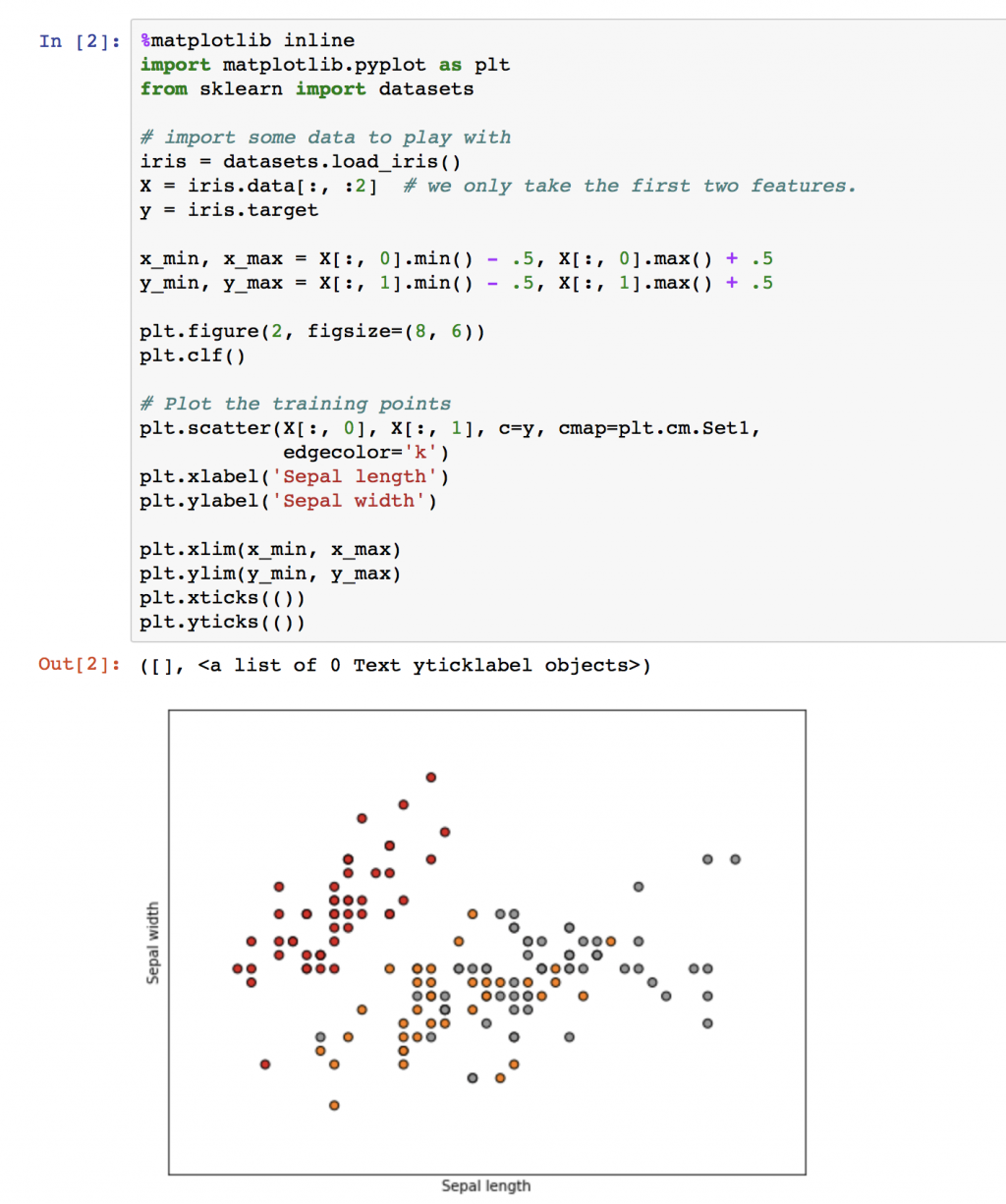
Matplotlib是python最常用的繪圖套件了它的功能很多這裡很容易找到你需要的範例,現在先針對鳶尾花前兩個特徵值畫散佈圖。可以發現二維圖下紅色點可以分開,但灰色與黃色是混合一起的。
import matplotlib.pyplot as plt
from sklearn import datasets

# import some data to play with
iris = datasets.load_iris()
X = iris.data[:, :2]  # we only take the first two features.
y = iris.target

x_min, x_max = X[:, 0].min() - .5, X[:, 0].max() + .5
y_min, y_max = X[:, 1].min() - .5, X[:, 1].max() + .5

plt.figure(2, figsize=(8, 6))
plt.clf()

# Plot the training points
plt.scatter(X[:, 0], X[:, 1], c=y, cmap=plt.cm.Set1,
            edgecolor='k')
plt.xlabel('Sepal length')
plt.ylabel('Sepal width')

plt.xlim(x_min, x_max)
plt.ylim(y_min, y_max)
plt.xticks(())
plt.yticks(())
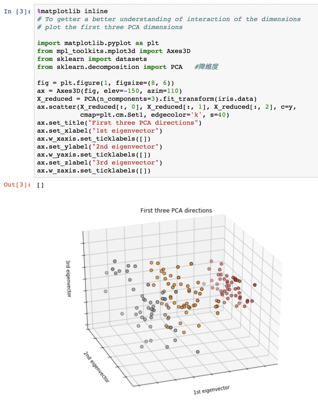
嘗試三維空間的散佈圖,先使用主成分分析(Principal components analysis,PCA)將原本四維空間減少到三維在繪圖。可以發現黃色點與灰色點在多增加一維空間下似乎有區分開的機會了。對矩陣還有一點印象的話,簡單說主成份分析是藉由 eigenvector 來尋找最容易分開資料點之間距離的界線。
# To getter a better understanding of interaction of the dimensions
# plot the first three PCA dimensions

import matplotlib.pyplot as plt
from mpl_toolkits.mplot3d import Axes3D
from sklearn import datasets
from sklearn.decomposition import PCA   #降維度

fig = plt.figure(1, figsize=(8, 6))
ax = Axes3D(fig, elev=-150, azim=110)
X_reduced = PCA(n_components=3).fit_transform(iris.data)
ax.scatter(X_reduced[:, 0], X_reduced[:, 1], X_reduced[:, 2], c=y,
           cmap=plt.cm.Set1, edgecolor='k', s=40)
ax.set_title("First three PCA directions")
ax.set_xlabel("1st eigenvector")
ax.w_xaxis.set_ticklabels([])
ax.set_ylabel("2nd eigenvector")
ax.w_yaxis.set_ticklabels([])
ax.set_zlabel("3rd eigenvector")
ax.w_zaxis.set_ticklabels([])
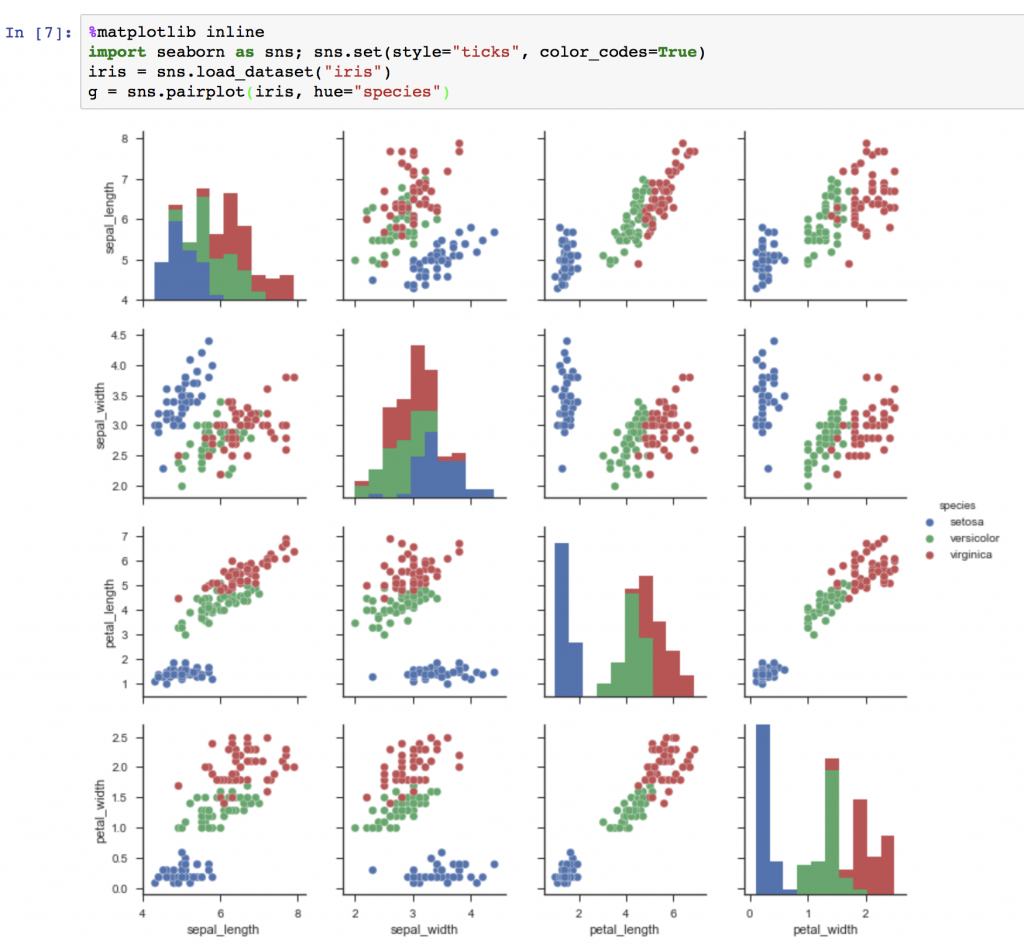
這邊要介紹個人覺得比較有設計感的繪圖套件seaborn相信對美感有要求的人一定會喜歡這個套件~
%matplotlib inline
import seaborn as sns; sns.set(style="ticks", color_codes=True)
iris = sns.load_dataset("iris")
g = sns.pairplot(iris, hue="species")
今天稍微了解一下這兩個繪圖套件,明天就來學習如何分類(Classification)~


 iThome鐵人賽