本系列同步發表在 個人部落格,歡迎大家關注~
接下來完整導覽選單的部份,最上方 Header 的部份使用 UserAccountsDrawerHeader,這是 Flutter 幫我們打造的 material Widget,來符合一致的 Material 風格。
UserAccountsDrawerHeader(
  decoration: BoxDecoration(
    color: Colors.blueGrey,
  ),
  accountName: Text("Bbson Lin"),
  accountEmail: Text("bobson801104@gmail.com"),
  currentAccountPicture: CircleAvatar(
    backgroundImage: NetworkImage(
      "https://avatars2.githubusercontent.com/u/18156421?s=400&u=1f91dcf74134827fde071751f95522845223ed6a&v=4",
    ),
  ),
  otherAccountsPictures: <Widget>[
    Icon(Icons.edit, color: Colors.white),
  ],
),
UserAccountsDrawerHeader 提供了幾個人性化的屬性,像是 accountName、accountEmail、currentAccountPicture ...等,只要將這些屬性填上你想要的 Widget 就行了。
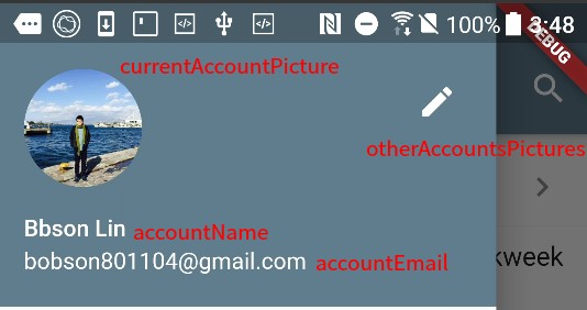
導覽選單部份是用幾個 ListTile 做出來的,我們在 title 屬性多加了圖示。
ListTile(
  title: Row(
    children: <Widget>[
      Icon(Icons.power_settings_new),
      SizedBox(width: 24.0),
      Text("Sign out"),
    ],
  ),
  onTap: () async {
    await showDialog(
      context: context,
      barrierDismissible: false,
      builder: (context) => AlertDialog(
        content: Text("Are you sure to exit current account."),
        actions: <Widget>[
          FlatButton(
            child: Text("Cancel"),
            onPressed: () => Navigator.pop(context),
          ),
          FlatButton(
            child: Text("OK"),
            onPressed: () => Navigator.pushNamedAndRemoveUntil(
                context, "/login", ModalRoute.withName('/')),
          ),
        ],
      ),
    );
  },
),
其實目前看起來已經是有點小小的冗長(30行),若是好幾個都這樣寫,不光是看起來難過,之後維護修改起來也不容易。
解決的方法,就是自己再封裝 Widget,之後可以重複利用,如同 UserAccountsDrawerHeader 一般。
lib/components/drawer_tile.dart
import 'package:flutter/material.dart';

class DrawerTile extends StatelessWidget {
  const DrawerTile({
    Key key,
    this.icon,
    this.text = "",
    this.onPressed,
  }) : super(key: key);

  final Icon icon;
  final String text;
  final Function onPressed;

  @override
  Widget build(BuildContext context) {
    return ListTile(
      title: Row(
        children: <Widget>[
          icon,
          SizedBox(width: 24.0),
          Text(text),
        ],
      ),
      onTap: onPressed ?? () {},
    );
  }
}
個人習慣放自定義的 Widget 在 components 目錄裡面,DrawerTile 單純的封裝 ListTile 並把一些屬性定義出來 icon、text、onPressed。
封裝完畢之後我們就可以非常簡易的作些使用,像是
...

DrawerTile(
  icon: Icon(Icons.trending_up),
  text: "Trending",
  onPressed: () {
    print("Head to Trending Page");
  },
),
DrawerTile(
  icon: Icon(Icons.settings),
  text: "Setting",
  onPressed: () {
    print("Head to Setting Page");
  },
),

...
--
成果
搜尋頁面 Flutter 內也有提供 showSearch 及搭配的 SearchDelegate。
渲染出來的頁面是符合 Material Design - Expandable search 的設計。
--
那就來實際使用看看吧~
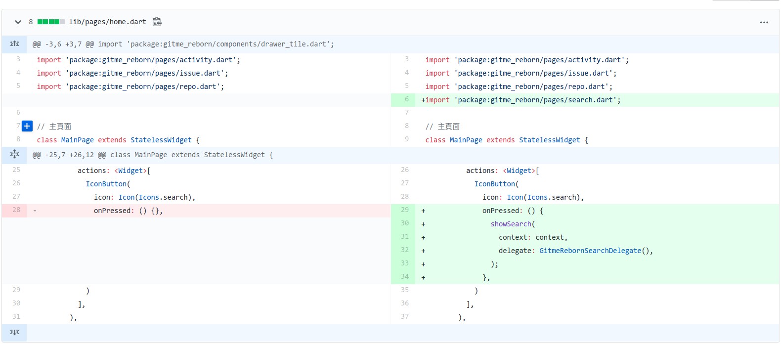
首先,要在按下搜尋按鈕時調用 showSearch。
接下來,來實現搜尋頁,搜尋頁跟前面的其他頁面程式碼上會有點小不同。
這邊需直接繼承 SearchDelegate 來實現搜尋頁。
lib/pages/search.dart
import 'package:flutter/material.dart';

enum SearchTypes {
  repos,
  users,
}

// Use(Extends) SearchDelegate for Search Page
class GitmeRebornSearchDelegate extends SearchDelegate {
  SearchTypes _searchType = SearchTypes.repos;

  @override
  ThemeData appBarTheme(BuildContext context) => Theme.of(context); // AppBar 主題

  @override
  List<Widget> buildActions(BuildContext context) { // AppBar 右側
    return [
      IconButton(
        icon: Icon(Icons.clear),
        onPressed: () {
          query = "";
        },
      ),
      PopupMenuButton(
        onSelected: (SearchTypes type) {
          _searchType = type;
          showSuggestions(context);
        },
        itemBuilder: (BuildContext context) {
          return [
            CheckedPopupMenuItem<SearchTypes>(
              value: SearchTypes.repos,
              checked: _searchType == SearchTypes.repos,
              child: const Text("Search Repos"),
            ),
            CheckedPopupMenuItem<SearchTypes>(
              value: SearchTypes.users,
              checked: _searchType == SearchTypes.users,
              child: const Text("Search Users"),
            ),
          ];
        },
      ),
    ];
  }

  @override
  Widget buildLeading(BuildContext context) { // AppBar 左側
    return IconButton(
      icon: Icon(Icons.arrow_back),
      onPressed: () {
        close(context, null);
      },
    );
  }

  @override
  Widget buildResults(BuildContext context) { // 搜尋結果
    return SearchRepoResult();
  }

  @override
  Widget buildSuggestions(BuildContext context) { // 搜尋建議
    if (query == "") {
      switch (_searchType) {
        case SearchTypes.repos:
          return Container(
            width: MediaQuery.of(context).size.width,
            padding: EdgeInsets.all(32.0),
            child: Column(
              crossAxisAlignment: CrossAxisAlignment.center,
              mainAxisSize: MainAxisSize.max,
              children: <Widget>[
                Text(
                  "Search Repos",
                  style: TextStyle(
                    fontStyle: FontStyle.italic,
                    color: Theme.of(context).textSelectionColor,
                  ),
                ),
              ],
            ),
          );
        case SearchTypes.users:
          return Container(
            width: MediaQuery.of(context).size.width,
            padding: EdgeInsets.all(32.0),
            child: Column(
              crossAxisAlignment: CrossAxisAlignment.center,
              mainAxisSize: MainAxisSize.max,
              children: <Widget>[
                Text(
                  "Search Users",
                  style: TextStyle(
                    fontStyle: FontStyle.italic,
                    color: Theme.of(context).textSelectionColor,
                  ),
                ),
              ],
            ),
          );
        default:
      }
    }
    return Center(child: Text("Search for $query ..."));
  }
}

class SearchRepoResult extends StatelessWidget {
  ... (略)
}
直接看完這麼長的程式碼可能有點霧煞煞,我們可以來看渲染出來的頁面,與其對應的關係。
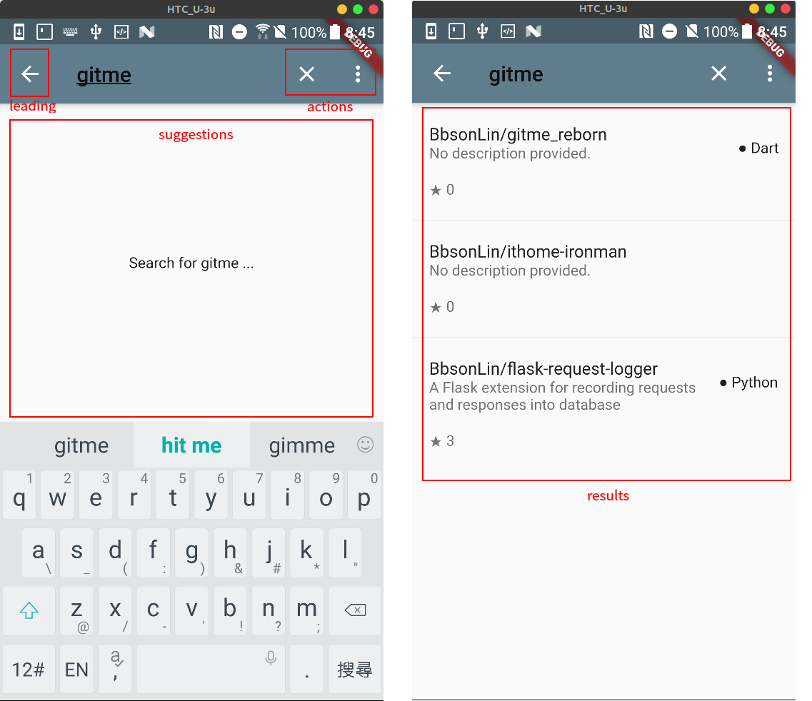
對應後可以看得出 GitmeRebornSearchDelegate 裡 buildActions 函數就是建構紅框 actions。
依此類推 leading(buildLeading), suggestions(buildSuggestions) 和 results(buildResults) 。
小提醒:
SearchDelegate只是個抽象類別,本身沒實現 buildActions 等函數,一定需要自己實現搜尋的 Delegate。- 調用
showSearch時要帶入 delegate 屬性的是自己實現的GitmeRebornSearchDelegate,並非SearchDelegate,否則會跳出紅色錯誤頁面。- Flutter 為何會這麼設計,原因之一無非是更彈性一點,你可以建構自己的 actions 區,又不失風格一致性。
--
成果
參考

 看影片追技術