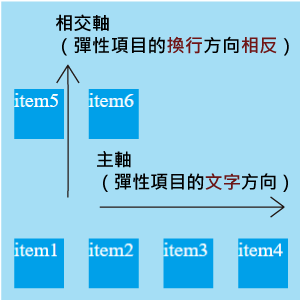
上一篇在談論到相交軸時,提到:「彈性項目單行的數量多到超過容器,你想要讓它換行,它就會以相交軸的方向換行。」所以接下來就會介紹換行的屬性
.container {
    flex-wrap: nowrap | wrap | wrap-reverse;
}
預設:nowrap (不換行)
英文小幫手:wrap 的意思是包、纏繞,然而 line wrap 就是"換行"的意思。
所以 nowrap 就是不換行,wrap-reverse 就是換行 + 相反(換行方向相反)。
<style>
  .container {
    display: flex;
    flex-wrap: nowrap; /*改變屬性值來看看變化*/
    width: 240px;
    height: 240px;
    background-color: #a5def5;
  }
  .item{
    margin: 10px;
    width: 40px;
    height: 40px;
    background-color: #00A0E9;
    color: white;
  }
</style>
<body>
  <div class="container">
    <div class="item">item1</div>
    <div class="item">item2</div>
    <div class="item">item3</div>
    <div class="item">item4</div>
    <div class="item">item5</div>
    <div class="item">item6</div>
  </div>
</body>
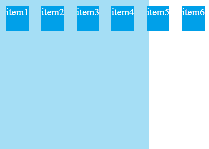
在 W3C 的規範裡,彈性項目預設是 nowrap 不換行的,所以要是彈性項目無法放入主軸,就算有設定彈性項目的尺寸,彈性項目還是會被壓縮至極限小(彈性項目裡內容的最小寬度)。如果壓縮到極限小再不行,就會突破彈性容器。
flex-wrap: nowrap不換行為預設值,可以看到每個 item 的寬度都被壓縮到文字的內容最小寬度,而且突破了彈性容器。
flex-wrap: wrap要換行。彈性容器因為受 align-content(這個屬性之後會提到)的預設值為 stretch (拉伸、伸展的意思)的影響,彈性項目會試圖填滿彈性容器,並且平均分配在容器中。
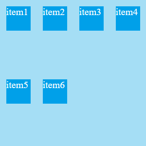
或許你會對這樣的分配方式有疑問?為什麼換行空格這麼大?但因為我有在彈性容器設定長寬各 240px,讓你看看在彈性項目沒設定尺寸時被拉伸的狀況會有多明顯
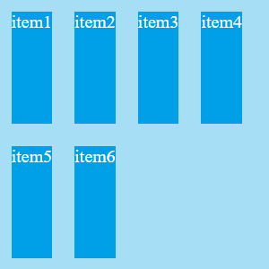
flex-wrap: wrap-reverse換行相反,如果你還記得軸向,換行的方向就是相交軸的方向,讓換行的方向相反,也是讓相交軸相反。
.container {
    flex-flow: flex-direction + flex-wrap;
}
預設:row nowrap
顧名思義就是 flex-direction 和 flex-wrap 的屬性寫在一起。
資料來源:


 iThome鐵人賽
 看影片追技術