接下來幾個屬性都和對齊有關,其中 justify-content 這個屬性擅長於操控"主軸上彈性項目的分布",非常適合拿來調整內容。
注意:justify-items 和 justify-self 不屬於 flexbox 的屬性。(忘記可以回顧第四天)
.container {
    justify-content: flex-start | center | flex-end | space-between | space-around | space-evenly
}
預設:flex-start
英文小幫手:
justify 有調整、對齊的意思(專注於主軸)content 內容的意思,所以操控時會專注於所有的內容物(彈性項目)做調整start 開頭center 中間end 尾巴space-between 將空白空間分配在東西之間space-around 將空白空間分配在東西兩側space-evenly 將空白剩下的空間均勻分配
<style>
  .container {
    display: flex;
    justify-content: flex-start; /*改變屬性值來看看變化*/
    width: 240px;
    height: 240px;
    background-color: #a5def5;
  }
  .item{
    margin: 10px;
    width: 40px;
    height: 40px;
    background-color: #00A0E9;
    color: white;
  }
</style>
<body>
  <div class="container">
    <div class="item">item1</div>
    <div class="item">item2</div>
    <div class="item">item3</div>
    <div class="item">item4</div>
    <div class="item">item5</div>
    <div class="item">item6</div>
  </div>
</body>
接下來會分為兩 part 來各別說明
(下以皆已 flex-direction: row;(預設)的情況舉例,如果還加上 column 和 reverse 等等屬性值小心不要搞混主軸的方向。)
對齊的方式以 主軸 為準
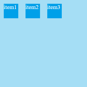
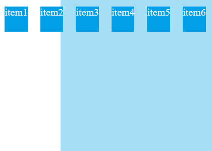
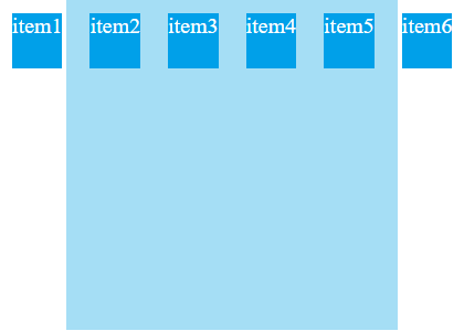
justify-content: flex-start;
預設,對齊主軸的開頭
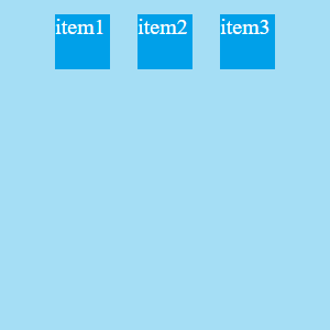
justify-content: center;
對齊主軸的中間(常用來做置中處理)
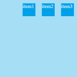
justify-content: flex-end;
對齊主軸的尾巴(這不就是常見的右上導覽列嗎)
看起來好像很簡單,但如果數量多、遇到換行的問題,是不是會出現不一樣的變化?
現在不做換行,預設 flex-wrap:nowrap;,對齊的原理一樣,裡面的彈性項目會被壓縮,甚至突破彈性容器,這時候如果善用 overflow 這個屬性,就可以變成有卷軸的導覽項目列表等等。
justify-content: flex-start; (預設)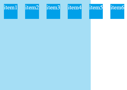
justify-content: center;

justify-content: flex-end;
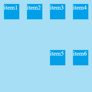
如果我要換行?就加上 flex-wrap: wrap;,對齊方式還是一樣,不過每一行會有自己的對齊軸線,不是只有第一行才會對齊。
justify-content: flex-start;(預設)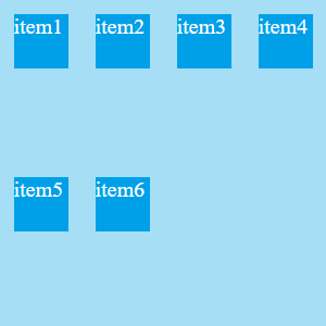
justify-content: center;
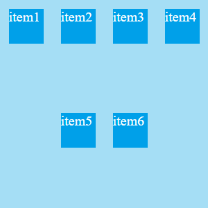
justify-content: flex-end;
數量多時分佈本來就超出容器,所以就會以定義中對齊的位置為準,從中可以發現一些不那麼重要但是特別的特性
對齊的方式同樣以主軸為準
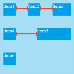
justify-content: space-between;
彈性項目對齊主軸"頭部",如果可以換行,最後一個則對齊尾巴;剩下的塞滿並且平均分配空隙。

justify-content: space-around;
彈性項目對齊主軸"中間",占完彈性項目後,每個彈性項目左右兩側的空隙平均分配。
justify-content: space-evenly;
彈性項目對齊主軸"中間",佔完彈性項目後,剩下的空隙平均分配

因為只有 space-between 要求要從頭部對齊,所以只有它會像是不換行的 flex-start,其他則是從中間對齊。
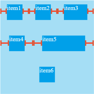
如果可以換行,排列原理應該會明顯許多,加上等長線讓等長的方式更加明顯(我把item3拉長以便觀察)
justify-content: space-between;
很常使用這個屬性把兩堆東西分到兩側
justify-content: space-around;
justify-content: space-evenly;
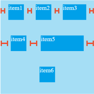
如果你有仔細的看,會發現 space-evenly 的計算上會受到我在彈性項目加的 margin:10px; 影響,而出現兩側所占空間較狹窄的現象,它在計算空間時並不會把 margin 算進去,如果換成 padding 就不會有這個問題。
注意:如果你是看 MDN 裡面 justify-content 的 syntax(語法)(MDN justify content),也會發現有一大堆的屬性值可以用,但總歸來說都是屬於 Box Alignment Module,並不是所有的屬性值都屬於 Flexbox Module 。
資料來源:


 iThome鐵人賽
 看影片追技術