接下來幾個屬性都和對齊有關,其中 align-content 這個屬性擅長於操控"相交軸上彈性項目的分布",也非常適合拿來調整內容。
如果你對於 justify-content 已經熟悉,相信 align-content 很快就能上手,因為兩者之間主要差別在於操控方向不同。
.container {
    align-content: stretch | flex-start | center | flex-end | space-between | space-around | space-evenly
}
預設:stretch
英文小幫手:
align 有調整、對齊的意思(專注於相交軸)content 內容的意思,所以操控時會專注於所有的內容物(彈性項目)做調整stretch 有拉伸、伸展的意思start 開頭center 中間end 尾巴space-between 將空白空間分配在東西之間space-around 將空白空間分配在東西兩側space-evenly 將空白剩下的空間均勻分配
<style>
.container {
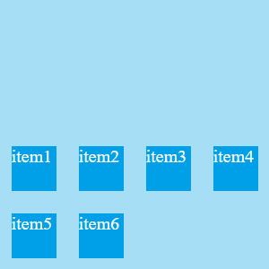
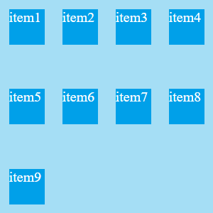
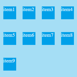
display: flex;
align-content: stretch; /*改變屬性值來看看變化*/
width: 240px;
height: 240px;
background-color: #a5def5;
}
.item{
margin: 10px;
width: 40px;
height: 40px;
background-color: #00A0E9;
color: white;
}
</style>
<body>
<div class="container">
<div class="item">item1</div>
<div class="item">item2</div>
<div class="item">item3</div>
<div class="item">item4</div>
<div class="item">item5</div>
<div class="item">item6</div>
</div>
</body>
接下來會分為兩 part 來各別說明
如果沒設定尺寸,預設 stretch 會將彈性項目額外的空間平均分配,彈性項目會被拉撐占滿整個彈性容器。
然而如果你的彈性項目有設尺寸,就會發現它就會把間距拉很開。
彈性項目沒有尺寸的情形: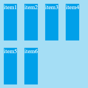
設定尺寸時: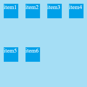
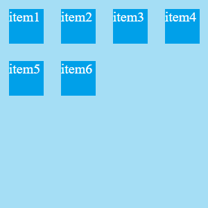
align-content: flex-start
對齊相交軸的開頭
align-content: center
對齊相交軸的中間(常用來做置中處理)
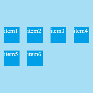
align-content: flex-end
對齊相交軸的尾巴
對齊的方式同樣以相交軸為準。然而和 justify-content 的差別在於分佈對齊時,因為會以行為單位做分佈,所以相交軸上的同一行會一起做分佈對齊。
align-content: space-between
彈性項目對齊相交軸"頭部",最後一個則對齊尾巴,剩下的塞滿並且平均分配空隙。
align-content: space-around
彈性項目對齊相交軸"中間",占完彈性項目後,每個彈性項目左右兩側的空隙平均分配。
align-content: space-evenly
彈性項目對齊相交軸"中間",佔完彈性項目後,剩下的空隙平均分配
是不是覺得 space-around 和 space-evenly 非常的像呢?如果忘記了可以回顧 第八天 我在 justify-content 上畫的空白分配線XD
資料來源:


 iThome鐵人賽
 看影片追技術