接下來幾個屬性都和對齊有關,其中 align-items 這個屬性擅長於操控"相交軸上彈性項目的對齊位置",也非常適合拿來調整內容。
如果你對於 justify-content 和 align-content 已經熟悉,相信 align-items 很快就能上手,因為屬性值的概念都大同小異,差別就在於屬性的作用對像從 "content" 變成 "items"。
.container {
    align-items: stretch | flex-start | center | flex-end | baseline
}
預設:stretch
英文小幫手:
align 有調整、對齊的意思(專注於相交軸)items 項目的意思,有 s 代表複數,不要忘了加 s;對彈性容器內所有的彈性項目做位置調整stretch 有拉伸、伸展的意思start 開頭center 中間end 尾巴baseline 基線,通常代表的是文字的底部,規範有提供圖片來說明 baseline 的位置在淺藍色的那條線上
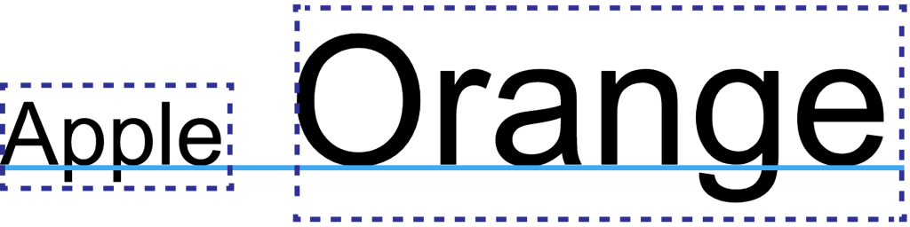
圖片來源:CSS Inline Layout Module Level 3
<style>
  .container {
    display: flex;
    align-items: stretch; /*改變屬性值來看看變化*/
    flex-wrap: wrap;
    width: 240px;
    height: 240px;
    background-color: #a5def5;
    margin: 120px;
  }
  .item{
    margin: 10px;
    width: 40px;
    height: 40px;
    background-color: #00A0E9;
    color: white;
  }
  .item2{
    margin: 10px;
    width: 40px;
    height: 80px;
    background-color: #00A0E9;
    color: white;
    line-height: 40px;
  }
  .item3{
    margin: 10px;
    width: 40px;
    /* height: 80px; */
    background-color: #00A0E9;
    color: white;
  }
</style>
<body>
  <div class="container">
    <div class="item">item1</div>
    <div class="item">item2</div>
    <div class="item2">item3</div>
    <div class="item">item4</div>
    <div class="item3">item5</div>
    <div class="item">item6</div>
  </div>
</body>
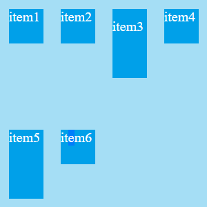
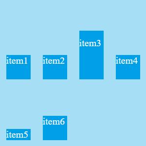
align-items 有點類似 justify-content,差別只在於作用方向不同,可以將所有彈性項目對齊相交軸上的某個線。為了讓特性更明顯,我拿掉了第五個 item 的高度,還有在增加第三個 item 的高度並且加上 line-height 來增加文字的高度。
align-items: stretch
拉伸,如果彈性項目沒有設定尺寸就會被"拉伸",但如果都有的話就不會被拉伸,然後就會長的和 flex-start 一樣,這就是為什麼會有人好奇寫了 flex-start 卻都沒有變化。
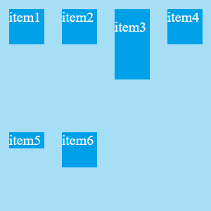
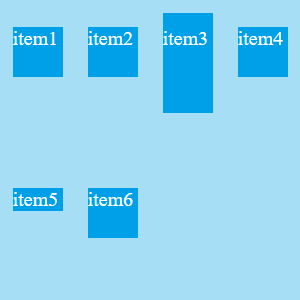
align-items: flex-start
對齊相交軸,彈性行最頂的那條線
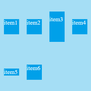
align-items: center
對齊相交軸,彈性行的平均中間
align-items: flex-end
對其相交軸,彈性行最底的那條線
align-items: baseline
對齊基線,第一行文字的最底下那條線會相互對齊(我有在 item3 加上 line-height:40px,讓它每一行的文字都會佔有這麼40px這麼高)
一個是 content,一個是 items,就字面上就足以表明他們操控對象的身分。
align-content 屬性會操控整個內容(content),並且在相交軸上以項目來做對齊,所以會發現同一行彈性項目的對齊方式都在那行的空間裡,像是在為整體位置做調整,而不是在對齊一條線。
align-items 屬性會操控彈性行中的每個彈性項目(items),並且在相交軸上的彈性行內設定某條假想彈性線來做對齊
我想最明顯的就是在定義屬性值 center 的時候了,align-content:center 時,所有彈性內容會以對齊"彈性容器的中間"為準。然而 align-items:center 時,所有的彈性項目都會對齊"它所在的那個彈性行的中線",而不是整個容器的中間。
資料來源:


 iThome鐵人賽
 看影片追技術