Day 1 介紹了用CSS 偽元素的方式放大縮小變寬去做連結特效。傳送門
今天也選了幾個button的特效,使用位移的方式,簡單使用CSS特性就可以。
先來看看成果!
| 1.換字效果 | 2.箭頭按鈕 | 3.發光按鈕 |
|---|---|---|
 |
 |
 |
全部的button 基本設定:
button{
  position: relative;
  cursor: pointer;
  border: 0;
  padding:0;
  background: $bg; //SCSS 自定義顏色:#16A085
  vertical-align: middle;
  display: flex;
  margin-bottom: 20px;
  width: 210px;
  height: 45px;
  line-height: 45px;
  border-radius: 45px;
  transition: 0.3s;

  &:before, &:after {
    content: '';
    position: absolute;
    transition:.3s;
  }
}
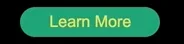
使用:CSS( transition & 偽元素、top)
原理:移動位置
因為偽元素全部下了position:absolute 一開始先讓他位置下移一點,然後背景顏色隱藏。等到hover時候再讓他現身~
直接上code :
//html
<button class="btn1" data-content="Click Me!">
Learn More</button>

//SCSS
.btn1{
  justify-content: center;
  &:before{
    content:attr(data-content);
    width: 100%;
    top: 50%; //讓他在button的下方
    color: transparent; //先讓他隱藏
  }
  &:hover{
    color: transparent;
    &:before{
      top: 0; //hover後往上跑
      color: $color; //往上跑的瞬間現出原形!
    }
  }
}
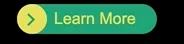
使用:CSS( transition & 偽元素、transform)
原理:移動位置
網路上看到很喜歡的一個Hover按鈕,研究了一下做出我的版本~其實也是偽元素移動位置就可以做到!只是位置要稍微計算一下。
首先是HTML的部分,其實就是button裡面需要:
用span行內元素做一個球
裡面再包一個hover後會出現的箭頭的尾巴先隱藏
用border-top和right旋轉做的箭頭
然後是字。
用span行內元素就可以排成一排,不用flex了。(但因為其他button需要我還是有下~)
//html
<button class="btn2">
  <span class="round">
    <span class="arrow"></span>
  </span>
  <span class="text">Learn More</span>
</button>
CSS的部分,球的直徑和button的寬度要一樣,才可以讓他好像是一體的樣子。所有要素的變化:
球 hover後→變寬 (width: 100%)
箭頭 hover後→ 往右邊移
箭頭的尾巴(隱藏) hover後→ 出現
然後是字 hover後→ 換顏色
上code! 按照我喜歡的方式,會把註解和說明直接寫在裡面~
//html
<button class="btn2">
  <span class="round">
    <span class="arrow"></span>
  </span>
  <span class="text">Learn More</span>
</button>

//SCSS
.btn2{
  span{
    line-height: $round-width;
		//line-height跟按鈕寬度一樣的話,文字就會上下置中了~
    transition: 0.35s;

		//球球的樣式
    &.round{
      width: $round-width;
      height: $round-width;
      border-radius: $round-width;
//radius本來下50%, 但hover後會變很怪,因為長度已經變了
//所以直接用數字寫死
      background-color: $color;

			//箭頭尾巴
      .arrow{
        width: 20px;
        height: 3px;
        background: transparent; //先隱藏
        position: absolute;
        left: 20px;
        top: 50%;
        transform: translateX(-50%);
//top50%後再變形-50%往上推回自己寬度的一半,就是置中啦

				//箭頭用偽元素做
        &:before{
          content: '';
          position: absolute;
          transition:.3s;
          top: -193%; //這個top是我慢慢對的,才會跟尾巴合體
          left: 0px;
          width: 10px;
          height: 10px;
					//用border做出右上括弧的樣子再旋轉變成箭頭
          border-top: solid 3px $bg;
          border-right: solid 3px $bg;
          transform: rotate(45deg);
        }
      }
    }

    &.text{
      position:absolute;
      top:0;
      left: calc(#{$round-width} + 10px);
			//讓文字往右邊推一個球直徑的距離再多一點
			//#{}是SCSS安插變數的寫法
      transition: 0.5s;
      }
  }

//hover來囉!
  &:hover{
    .round{
    width: 100%;
		//hover後就讓球球跟button一樣寬

      .arrow{
        background: $bg;//讓箭頭尾巴現身
        left: 30px;//現身的同時再往右邊推一點

          &:before{
            left: 8px;//箭頭也往右邊推一點,才有向右的動態
         }
        }
      }
    .text{
      color: $bg;//讓文字換個顏色
    }
  }
}
這一個button 花了我一些時間,主要是不知道什麼要素要用什麼樣的位置安排。
用position: absolute就快很多!
成品我很喜歡~
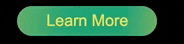
使用:CSS(background position)
原理:背景移動位置
這個其實也可以使用為元素移動位置做,但發光的物體用漸層會更細緻。
然後也藉機進入下一個重點~CSS的主菜:Animation
button雖然可以直接hover讓背景換位置就好,但當你滑鼠移開時,光線又會反方向刷回去,實在沒有很好看~所以直接使用Animation讓他永遠是從左邊往右邊刷過去~
//html
<button class="btn3">Learn More</button>

//scss
.btn3{
  justify-content: center;
  background: linear-gradient(97deg, rgba(22,160,133,1) 0%, rgba(243,199,83,1) 31%, rgba(22,160,133,1) 81%);
  background-position: 125%;
	//調整到我想要光線出現的位置再往左邊讓他看不到
  background-size: 200% auto;
	//背景大小2倍才好移動位置~

    &:hover {
      animation: shine 2s infinite;
			//hover後馬上上名稱為“shine”的animation~
		}
}

//動畫在這裡啦
@keyframes shine {
  to {
    background-position: -70%;
		//調整到我想要光線結束的地方
  }
}
明天會用Animation做特效~
今天的code 放在這裡
也介紹下我很喜歡的漸層工具
上述的code&效果:
https://codepen.io/Jintos/pen/rolim
https://codepen.io/kathykato/pen/rZRaNe?editors=1100
https://codepen.io/larrygeams/pen/pdchG?editors=1100
有任何錯誤或意見請批評指教


 iThome鐵人賽
 看影片追技術