上篇大致上介紹了一下於 css vs React Native 的 flexbox 差異
這篇主要就是實際上的運用了!
之所以叫盒子,就是要將彈性項目(子項目)放入這個盒子裡面也就是容器,所以擁有 display:flex 屬性的標籤會是彈性項目們(子項目們)的容器(爸爸)。
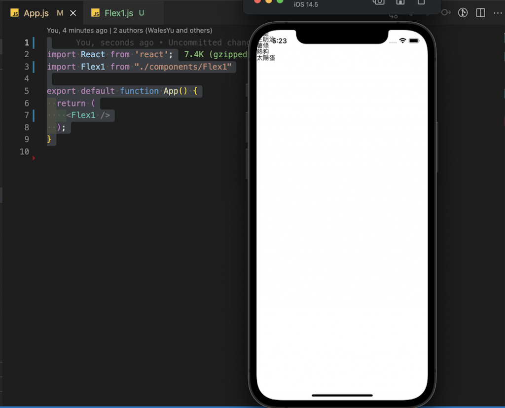
看一下下面的 code
<View style={{ display: flex }}>
  <Text>漢堡<Text>小黃瓜</Text></Text>
  <Text>三明治</Text>
  <Text>薯條</Text>
  <Text>熱狗</Text>
  <Text>太陽蛋</Text>
</View>
卡卡我是這樣分的
爸爸(View)- display: flex
孩子們(漢堡/三明治/薯條/熱狗/太陽蛋) - 就是放在爸爸裡面的元件
孫子(小黃瓜)跟他們的爸爸住一起(漢堡)
補充一下:
原生及就已經寫上style
display:flex
所以不需要重複再寫唷!
記得我們在 Day 6 所建立的 flex1.js 我們於此檔案的 styleseet 的 container 寫入以下
const styles = StyleSheet.create({
    container: {
        flex: 1,
        //flex 決定此元素在頁面可用的區域,切成幾塊1 = 1塊,所以一整塊都是此元素的
        backgroundColor: 'pink',
        //backgroundColor 背景色
        alignItems: 'center',
        //alignItems 子項目對齊方式()
        justifyContent: 'center',
        //justifyContent 子項目對齊方式(主軸)
    },
});
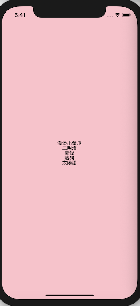
flex: 1 // 整個畫面只切一塊
backgroundColor: 'pink' // 背景色區塊就是代表盒子的區塊
justifyContent: 'center' // 孩子們主軸對齊方式
alignItems: 'center' // 孩子們次軸對齊方式
以上設定將孩子們集中在中間嚕!
大致上有這些元素
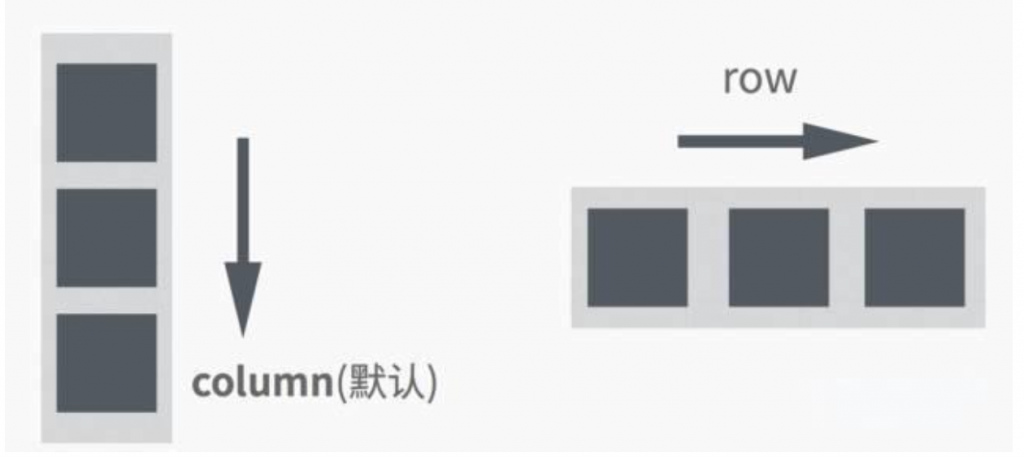
# 排列方向:
flexDirection: 'column' || 'row'
# 主軸對齊(爸爸):
justifyContent: 'flex-start' || 'flex-end' || 'center' || 'space-around' || 'space-between'
# 交叉軸對齊(爸爸):
alignItems: 'stretch' || 'flex-start' || 'flex-end' || 'center'
# 交叉軸子項目對齊(孩子):
alignSelf: 'flex-start' || 'flex-end' || 'center' || 'stretch' || 'auto'
# 換行(爸爸):
flexWrap: 'nowrap' || 'wrap' || 'wrap-reverse'
# Define relative fluidity of an element(爸爸):
flex: number (e.g. 1, 1/2)
#當空間不足,子項目長大縮小(子):
flexGrow/flexShrink: 1 || 0
下圖為nowrap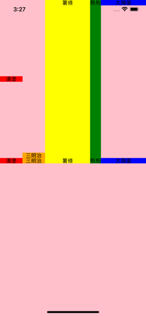
下圖為 wrap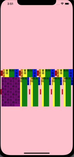
下圖為 row 水平排列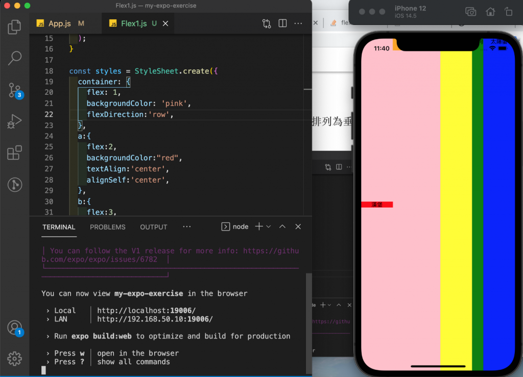
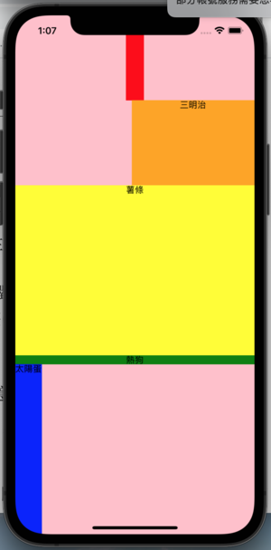
下圖為 column 垂直排列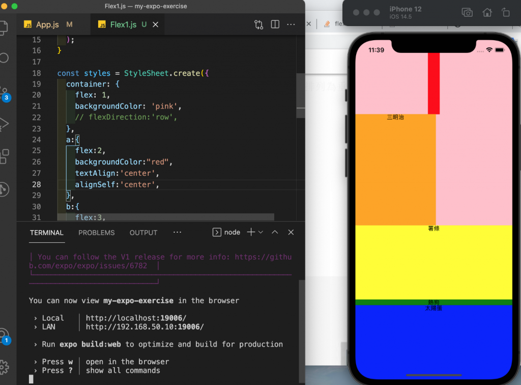
Day 7 done 希望大家有更了解 flexbox XD


 iThome鐵人賽
 看影片追技術