這篇想和大家聊聊,如何用Flex的相關屬性控制CSS grid的排列位置
和Flex能用的屬性大致上一樣,但多了justify-self和justify-content
也多了align和justify的縮寫place
可用的語法能分成以下三種:
控制「水平方向」
控制「垂直方向」
縮寫
那我們就來看該如何操作它們吧!
首先,我們先看一下HTML和CSS的代碼
HTML:
<div class="grid_container">
    <div class="box box_self_2"></div>
    <div class="box box_self"></div>
    <div class="box"></div>
    <div class="box"></div>
    <div class="box"></div>
    <div class="box box_self_2"></div>
    <div class="box"></div>
    <div class="box box_self"></div>
</div>
CSS:
.grid_container {
    display:grid;
    grid-template-columns:60px 60px 60px 60px; /* 也可寫成repeat(4, 60px) */
    grid-template-rows:35px 35px; /* 也可寫成repeat(2, 35px) */
}
.box {
    background-color:rgb(238, 164, 44);
    width:40px;
    height:20px;
}
.box_self {
    /* 稍後示範self的時候會用到 */
}
.box_self_2 {
    /* 稍後示範align-self:baseline的時候會用到 */
}
Justify-items
Justify-items是用來控制網格「內元素」的「水平方向」的對齊位置
可用屬性有以下四種:
讓我們看以下範例
CSS:
.grid_container {
    justify-items:stretch | start | end | center;
}
結果如下圖所示:
Stretch是預設值,會往水平方向將內元素全部填滿
如果你有設置width,則不會起作用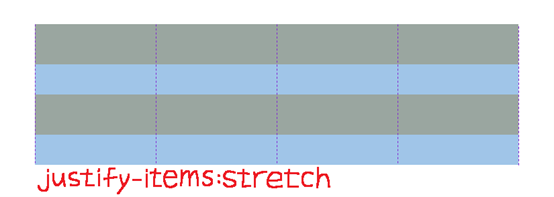
從水平方向的「起點」開始排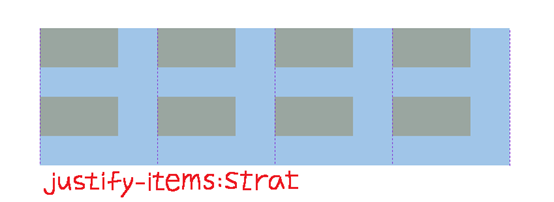
從水平方向的「終點」開始排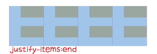
排在「起點」和「終點」的中間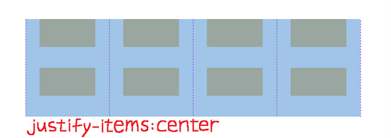
Justify-self
Justify-self和justify-items的功能一樣,但它是針對「單一」對象
可用屬性有以下四種:
讓我們看以下範例
CSS:
(注意:這裡的box_self只有box_2和box_8有)
.box_self {
	width:auto; /* 想測試stretch請記得加這行 */
    justify-self:stretch | start | end | center;
}
結果如下圖所示:
Stretch是預設值,box_self會往水平方向將內元素全部填滿
如果你有設置width,則不會起作用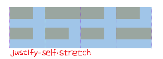
box_self會從水平方向的「起點」開始排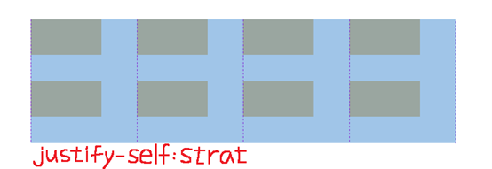
box_self會從水平方向的「終點」開始排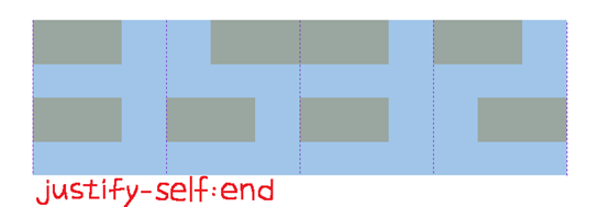
box_self會排在「起點」和「終點」的中間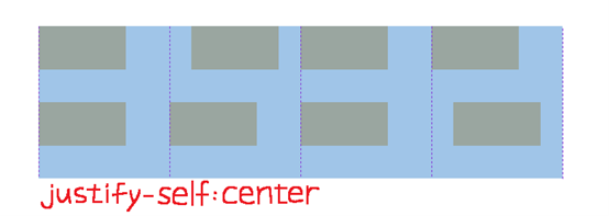
justify-content
justify-content是用來控制網格「本身」的「水平方向」的對齊位置
可用屬性有以下六種:
讓我們看以下範例
CSS:
.grid_container {
    justify-content:start | end | center | space-around | space-between | space-evenly;
}
結果如下圖所示:
從水平方向的「起點」開始排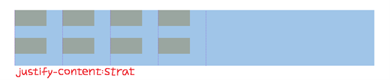
從水平方向的「終點」開始排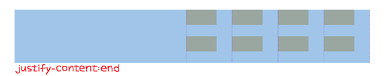
排在「起點」和「終點」的中間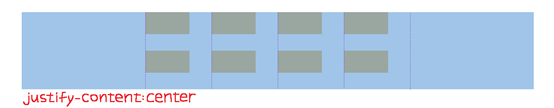
Space-around是平均分配「網格」位置,但左右兩側的間距會較小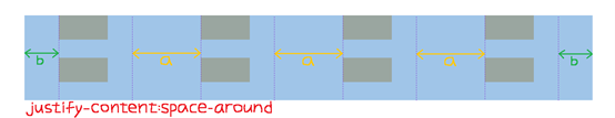
Space-between是平均分配「網格」位置,但左右兩側會貼齊起點、終點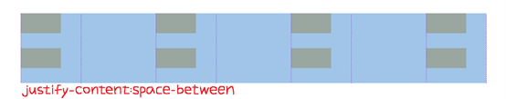
Space-evenly是「網格」和「左右兩側」的間距皆相同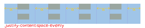
align-items
和jusitfy-items的用法類似,都是用來控制網格「內元素」,但align-items它是用來控制「垂直方向」的對齊位置
可用屬性有以下五種:
font-size:25px,在.box_self內設font-size:unset)
讓我們看以下範例
CSS:
.grid_container {
    align-items:stretch | start | end | center | baseline;
}
.box {
    font-size:25px; /* 想測試baseline請記得加這行 */
}
.box_self {
    font-size:unset; /* 想測試baseline請記得加這行 */
}
結果如下圖所示:
Stretch是預設值,會往垂直方向將內元素全部填滿
如果你有設置height,則不會起作用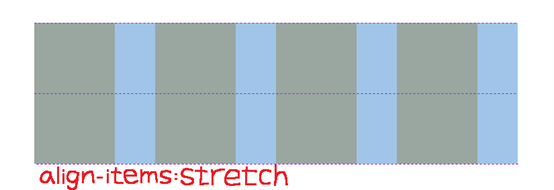
從垂直方向的「起點」開始排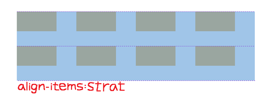
從垂直方向的「終點」開始排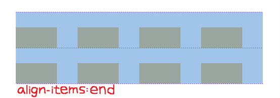
排在「起點」和「終點」的中間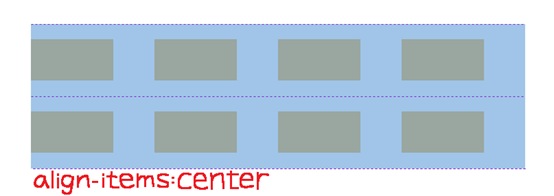
baseline都是以「字體下方」去做對齊
要測試請記得在**.box內設font-size:25px,在.box_self**內設font-size:unset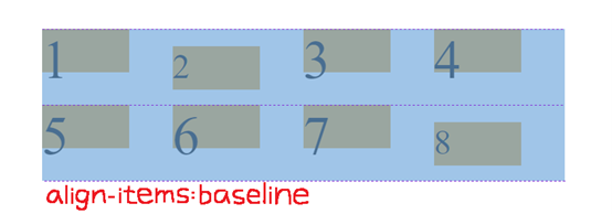
align-self
align-self和align-item的功能一樣,但它是針對「單一」對象
可用屬性有以下五種:
font-size:30px)
讓我們看以下範例
CSS:
.box_self {
    height:auto; /* 想測試stretch請記得加這行 */
    align-self:stretch | start | end | center | baseline;
	font-size:25px; /* 想測試baseline請記得加這行 */
}
.box_self_2 {
    align-self:baseline; /* 想測試baseline請記得加這行 */
}
結果如下圖所示:
Stretch是預設值,box_self會往垂直方向將內元素全部填滿
如果你有設置height,則不會起作用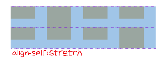
box_self會從垂直方向的「起點」開始排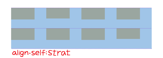
box_self會從垂直方向的「終點」開始排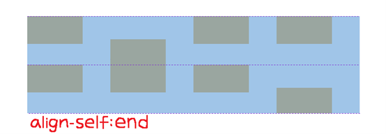
box_self會排在「起點」和「終點」的中間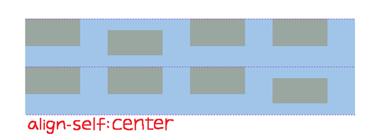
box_self會排在「字體下方」
想測試請記得在.box_self內設font-size:25px,並在.box_self_2內設align-self:baseline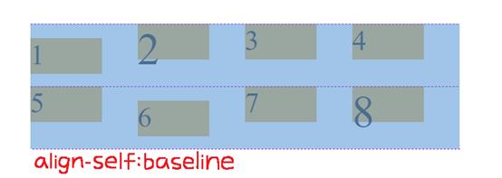
align-content
和justify-content的用法相似,都是用來控制網格「本身」,但align-content它是用來控制「垂直方向」的對齊位置
可用屬性有以下六種:
讓我們看以下範例
CSS:
.grid_container {
    align-content:start | end | center | space-around | space-between | space-evenly;
}
結果如下圖所示:
從垂直方向的「起點」開始排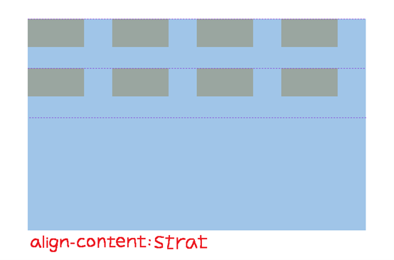
從垂直方向的「終點」開始排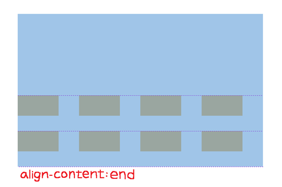
排在「起點」和「終點」的中間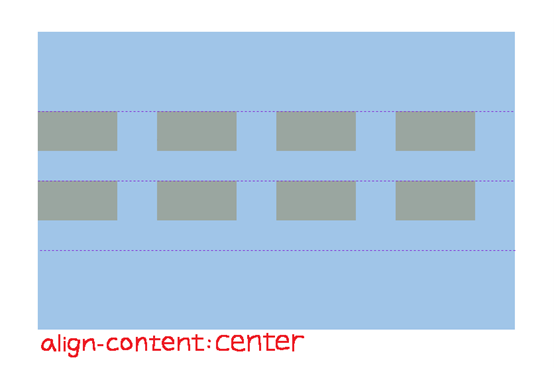
Space-around是平均分配「網格」的位置,但上下兩側的間距會較小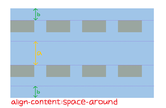
Space-between是平均分配「網格」的位置,但上下兩側會貼齊垂直方向的起點、終點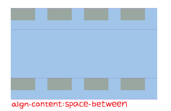
Space-evenly是「網格」和「上下兩側」的間距皆相同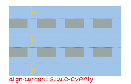
Place-items
Place-items是align-items和justify-items的縮寫
寫的順序為place-items:align-items 「空格」 justify-items
讓我們看以下範例
CSS:
.grid_container {
    place-items:center end;
}
結果如下圖所示:
垂直方向為center,水平方向為end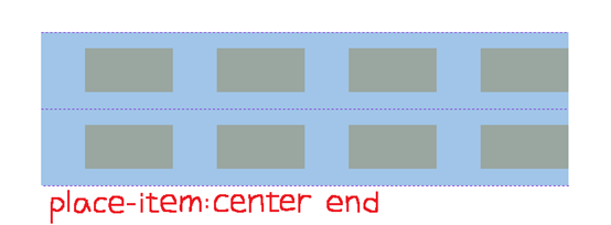
Place-self
Place-self是align-self和justify-self的縮寫
寫的順序為place-self:align-self 「空格」 justify-self
讓我們看以下範例
CSS:
.box_self {
    place-self:center end;
}
結果如下圖所示:
垂直方向為center,水平方向為end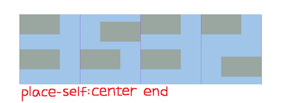
Place-content
Place-content是align-content和justify-content的縮寫
寫的順序為place-content:align-content 「空格」 justify-content
讓我們看以下範例
CSS:
.grid_container {
    place-content:center space-around;
}
結果如下圖所示:
垂直方向為center,水平方向為space-around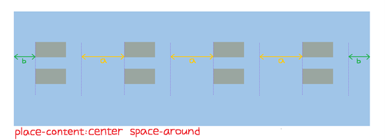
以上就是用和Flex相關的屬性去控制grid的介紹
有人會問,為什麼grid可以用justify-item和justify-self,而Flex不行?
這個我決定放在下篇(Day 8)和各位解釋原因,並示範替代方案來展現justify-self的效果,想了解的明天記得來看喔!
希望大家看完Day 6和這篇,能夠對grid的操作更加了解
如果還不會Flex,也歡迎去Day 5看一下相關介紹喔!
只要會了grid和Flex,並學會同時使用,保證沒有什麼網頁是你刻不出來的!
參考資料:
https://css-tricks.com/snippets/css/complete-guide-grid/#prop-justify-items


 iThome鐵人賽
 看影片追技術