雖然昨天已經介紹了如何在你的網頁中實作 Color System,但嚴格上來說今天才算是這系列第一篇的實作,畢竟 Color 只涵蓋了 CSS 的部分,並且是需要應用在網頁跟各個 UI 元件上的,而 Typograhy 則是一個完整的 UI 元件了,會涵蓋到 HTML 架構、CSS 樣式,還有一些 JS 的邏輯。
而實作使用到的技術會是 以 React 為基礎配上 TypeScript 的型別系統,在 CSS 處理上用 Tailwind CSS 來加速開發,最後則是使用 Storybook 來 Demo 給大家看。
想先看 Code 或是 Demo 的由此去
Github Repo: ithelp-ui-demo
Live Demo: Storybook
那以下就來講解實作流程跟技術細節啦!
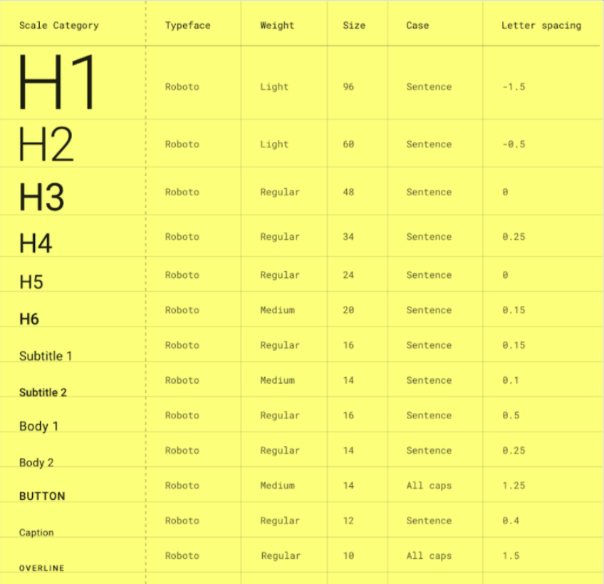
開始前先複習一下 Material-UI 那邊的 Typography(忘記它是什麼的也可以看 Day 07 - Design System — 前端工程師也該知道的那些事 回顧):
老樣子來反思一下:「我們真的需要 Typography 嗎?」
其實答案真的很有可能是不用,如果是小網站其實像這樣全域改寫一下原生 HTML Tag 的值就好了,特意去做一個 Typography 可能有點殺雞焉用牛刀。
h1 {
    font-size: 3rem; /* 48px */
    font-weight: 600;
    line-height: 1.5;
    letter-spacing: 0.1em;
  }
  h2 {
    font-size: 2.25rem; /* 36px */
    font-weight: 600;
    line-height: 1.5;
    letter-spacing: 0.1em;
  }
  h3 {
    font-size: 1.875rem; /* 30px */
    font-weight: 500;
    line-height: 1.5;
    letter-spacing: 0.05em;
  }
  h4 {
    font-size: 1.75rem; /* 28px */
    font-weight: 500;
    line-height: 1.5;
    letter-spacing: 0.05em;
  }
  h5 {
    font-size: 1.5rem; /* 24px */
    font-weight: 500;
    line-height: 1.5;
    letter-spacing: 0.025em;
  }
  h6 {
    font-size: 1.375rem; /* 22px */
    font-weight: 500;
    line-height: 1.5;
    letter-spacing: 0.025em;
  }
  p {
    font-size: 1rem; /* 16px */
    font-weight: 400;
    line-height: 0;
    letter-spacing: 0;
  }
  span {
    font-size: 0.8125rem; /* 13px */
    font-weight: 400;
    line-height: 0;
    letter-spacing: 0;
  }
  caption {
    font-size: 0.75rem; /* 12px */
    font-weight: 400;
    line-height: 0;
    letter-spacing: 0;
  }
基本上就是看系統複不複雜、設計有沒定義出超過原生 HTML Element 數量的層級,或是需不需要應對各式各樣的情境,像是換行、Ellipsis(過長變成 ... )等等。
大原則是:DRY(Don't Repeat Yourself)
當你覺得你一直在重複寫很多類似的設定時,就是時候把他們抽出來整理成可複用的元件了!
而 Typography 就是來應對各式各樣關於文字的情境,因此如果情境太少,像上面那樣處理即可,但如果是大型系統的話,Typography 就絕對是必要的,文字的處理沒有統一的話,之後 Debug 會要一個個修修到死。
實作方式會按照在 Day 04 - 行前說明 — 談談元件化開發與開發流程 講到的元件開發流程:Spec → Interface → Implement,從理論走入實踐!
但其實 Spec 是在釐清需求的部分,需求主要是看公司產品和跟 PM 怎麼談,而這系列重點在於元件本身的觀念跟實作,在這邊就先不去琢磨那部分。
因此在這邊和之後的實作流程都會是按照基本元件會被預期的功能來定義介面,再來實作元件跟樣式。
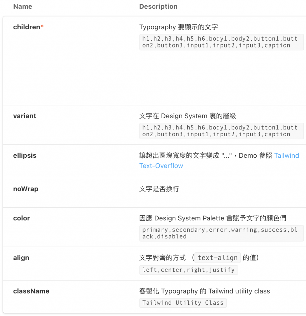
先介紹一下 Typography 基本的介面會包含什麼:
寫成 TypeScript 會像這樣:
export interface TypographyProps {
  align?: TypographyAlignType;
  children: ReactNode;
  className?: string;
  color?: ColorType;
  ellipsis?: boolean;
  noWrap?: boolean;
  variant?: TypographyVariant;
}
很明顯的屬性這邊就不介紹了,但可以細部介紹一下 TypographyAlignType、ColorType 和 TypographyVariant 是怎麼定義的。
而因為使用 Tailwind 的 utility class,所以要做的只是寫出 Props 和 Utility Class 的鍵值對,像是文字對齊方向(Text-Align),就可以像下面這樣寫,拿 TypographyAlignType 當 props: align 的型別,之後只要丟 'left' ~ 'justify' 就可以成功改變 Typography 的 Text Align 了。
export const TypographyAlign = {
  left: "text-left",
  center: "text-center",
  right: "text-right",
  justify: "text-justify",
};

export type TypographyAlignType = keyof typeof TypographyAlign;

<Typography align="left">Text Align</Typography>
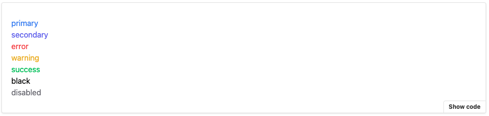
Color 和其他的 Props 都可以參照這個方式去定義,而在 Color 這邊則是以 500 為基準去使用 Tailwind 內建的 Palette,這邊只是大致列一下文字在網頁中會有的顏色情境,當然 Design System 更完整的網頁會把它定義得更詳細,但之後也只是在擴充 Color 而已。
而因應其他地方也都會用到這些顏色,因此就把它抽出來,讓其他元件需要顏色時也可以引用。
// /system/typings.ts
export const Color = {
  primary: "text-primary-500",
  secondary: "text-secondary-500",
  success: "text-success-500",
  error: "text-error-500",
  warning: "text-warning-500",
  black: "text-black-500",
  disabled: "text-gray-500",
};

export type ColorType = keyof typeof Color;
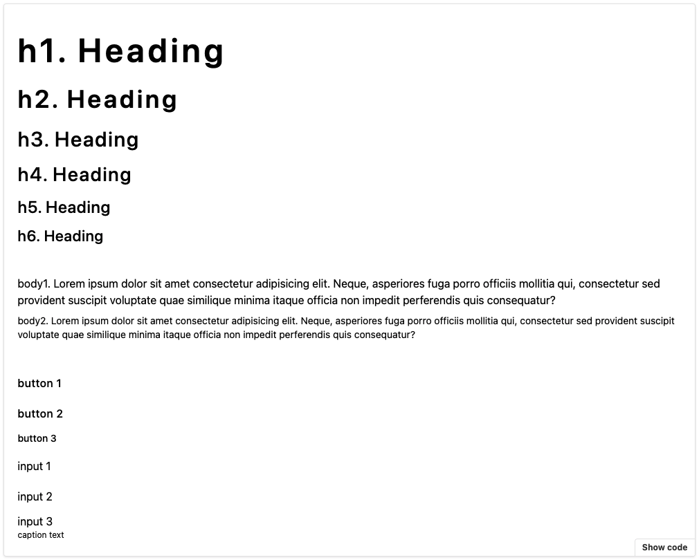
最後則是將 Typography 會有的層級透過 TypographyVariantType 定義出來,而非原生 HTML 有的層級再透過 TypographyVariant 去給值。
export type TypographyVariantType =
  | `h${1 | 2 | 3 | 4 | 5 | 6}`
  | `button${1 | 2 | 3}`
  | `input${1 | 2 | 3}`
  | `body${1 | 2}`
  | "caption";

export const TypographyVariant = {
  body1: "text-base	font-normal	tracking-normal	leading-6",
  body2: "text-sm font-normal	tracking-normal leading-5",
  button1: "text-base font-medium	tracking-wide	leading-10",
  button2: "text-base	font-medium	tracking-wide	leading-8",
  button3: "text-sm font-medium	tracking-normal leading-6",
  input1: "text-base font-normal tracking-normal leading-10",
  input2: "text-base font-normal tracking-normal leading-8",
  input3: "text-base font-normal tracking-normal leading-6",
}
原生 HTML 有的就照上面提到的直接覆寫就好,而其餘非原生層級就像 Align 和 Color 那樣去指派個別的 Utility Class。
根據不同層級需要設定的屬性主要有 大小 (font-size)、粗細 (font-weight)、行高 (line-height)、字距 (letter-spacing) 等等。
能把層級當作 Props 使用後,接著要實作將這些 Variant 轉換成真正的 HTML Tag 的 getComponentFromVariant:
export type TypographyComponent =
  | `h${1 | 2 | 3 | 4 | 5 | 6}`
  | "p"
  | "span"
  | "label"
  | "div"
  | "caption";

function getComponentFromVariant(
  variant: TypographyVariantType
): TypographyComponent {
	if (variant.startsWith("caption")) {
	    return "caption";
	  }

  if (variant.startsWith("h")) {
    return variant as TypographyComponent;
  }

  if (variant.startsWith("body")) {
    return "p";
  }

  return "span";
}
轉換的規則是:variant 是 caption 就先配到 caption, h 開頭的也配對到原生的 h1~h6,而 body 系列的都當成 p,除此之外都是 span。
把介面跟實作細節講完後,Typography 的實作其實相對單純,就是把 Props 都丟下去而已。
以下分兩個部分來講解:
1. 根據 Variant 來 Render 不同的 HTML Tag
用 getComponentFromVariant 來將 variant 轉換成對應的 HTML Tag,並以此當作 React 的 Component 來 Render,而轉換規則就如上面介紹的那樣。
2. CSS 相關的 Props
主要是當成 TypographyColor、TypographyAlign、TypographyVariant 這些鍵值對(Key-Value Pair)物件的 Key,以此來拿到 Value 定義好的 Tailwind utility class。
像是 TypographyAlign["left"] 就會對應到 "text-left" 這個 utility class
export const Typography: React.FC<TypographyProps> = (props) => {
  const {
    align = "left",
    children,
    className,
    color = "black",
    ellipsis = false,
    noWrap = false,
    variant = "body1",
  } = props;

  const Component = getComponentFromVariant(variant) as any;

  return (
    <Component
			className={`
	      ${color ? TypographyColor[color] : ""}
	      ${align ? TypographyAlign[align] : ""}
	      ${ellipsis ? "overflow-ellipsis overflow-hidden" : ""}
	      ${noWrap ? "whitespace-nowrap" : ""}
	      ${className ? className : ""}
	      ${variant ? TypographyVariant[variant] : ""}
	      `}
    >
      {children}
    </Component>
  );
};
至此就完成 Typography 的實作啦!
大家可以在這玩玩看不同的 Props 變化,像這樣: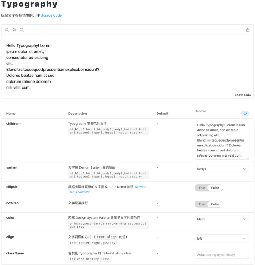
在這邊不得不推坑一下 Storybook 是一個很方便 Demo 元件的工具,不用再讓大家為了共用元件在專案裡找翻天,就算找到了還要確認符不符合當前的需求。
有了 Storybook 後,直接引入寫一個小 Demo 就可以一目瞭然!
當然設定上還是有些小坑啦,但那就之後有機會再跟大家說哩!
Typograhpy 就這樣介紹完啦!其實講解 Code 還有挺多眉角要注意,很怕沒有好好傳達到自己想講的眉角的,所以如果在實作上有哪裡不清楚的都歡迎留言告訴我!
而這裡其實還沒牽扯到太多的 JS 互動,所以也還挺單純的,但還是一樣比起實作,更重視能讓大家知道實作一個 UI 元件的流程,以及大概理解一下 Typography 這個挺重要但容易被會忽略的文字超集合元件!
如果覺得對你有幫助的話,希望大家可以不吝在 Github Repo 上給個 Star ><
明天要介紹的是 Icon 這個元件的實作,實作流程差不多,但我認為把它實作出來背後的概念還挺有趣的,那就明天見啦!


 iThome鐵人賽
 看影片追技術