
上一篇有提到可以對單一個元件,把我們客製好的顏色傳到 props 裡
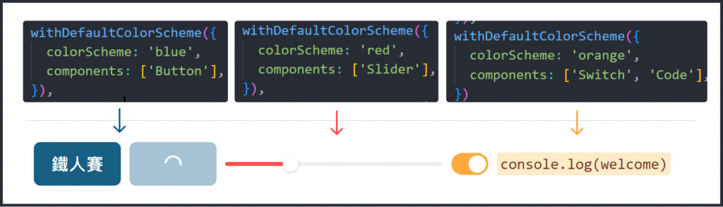
如果每個按鈕都要使用同樣的主題色,除了一個一個元件套用外,我們可以使用 Theme Extension 中 withDefaultColorScheme 去更改元件預設的 colorScheme
import { extendTheme, withDefaultColorScheme } from '@chakra-ui/react'

const customTheme = extendTheme(
  withDefaultColorScheme({
    //要套用的 colorScheme
    colorScheme: 'blue',
    //寫下要更改的元件
    components: ['Button'],
  }),
  //同時可以套用不同顏色在不同的元件上
  withDefaultColorScheme({
    colorScheme: 'orange',
    components: ['Alert', 'Table'],
  }),
)

const theme = extendTheme(
  customTheme,
  withDefaultColorScheme({
    //要套用的 colorScheme
    colorScheme: 'blue',
    //寫下要更改的元件
    components: ['Button'],
  }),
  //同時可以套用不同顏色在不同的元件上
  withDefaultColorScheme({
    colorScheme: 'red',
    components: ['Slider'],
  }),
  //在陣列裡,可以同時指定多個元件
    withDefaultColorScheme({
    colorScheme: 'orange',
    components: ['Switch', 'Code'],
  })
);
Variant
簡單介紹下 Variant 在 Chakra UI 通常的運用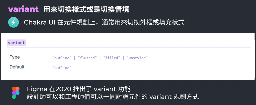
我們可以指定某個元件的 variant
<Button variant="outline" >鐵人賽</Button>
也可以使用 withDefaultVariant 去設定哪些元件要套用預設的 variant
 withDefaultVariant({
    variant: 'outline',
    components: ['Input', 'NumberInput'],
  }),
  withDefaultVariant({
    variant: 'filled',
    components: ['Button'],
  })

在 Chakra UI 中,大部分元件都有規劃好 size,通常預設為 md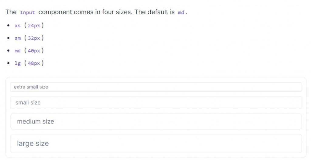
可以通過 withDefaultSize 方法來更改預設
 withDefaultSize({
    size: 'lg',
    components: ['Button', 'Badge'],
  }),
更改元件的預設 props ,可以利用這方法同時更改數個屬性
 withDefaultProps({
    defaultProps: {
      variant: 'outline',
      size: 'lg',
    },
    components: ['Button'],
  }),
不過之後會介紹如何 override 整個元件的樣式, withDefaultProps 可以看狀況使用。
本篇把 Theme Extension 有的方法介紹完拉

 看影片追技術