大家好,歡迎來到跟我一起學習HTML&CSS網頁設計吧系列文章,今天是第20天,要分享介紹的網頁的靈活排版-FlexBOX,內容也偏多喔。
今天是第一篇,要來解說基本概念,也會實作畫面讓大家看效果。
每篇都會有簡單上手的實作內容,邀請大家一起來練習。
FlexBOX的全名為「Flexible Box Layout Module」,故其名思義,是個彈性版面主打的工具;也是現在css流行的版面編輯排版屬性。
在使用FlexBOX時,他可以伸縮每一個小方塊(放文字、圖片等),在網頁空間足夠時,增長以填充未使用之區域,或者縮小調整版面以利使用者觀賞網站。方向上幾乎都可以完美配合,包含由左往右排列、由右往左排列、由上往下排列、由下往上排列,垂直或水平方向都可以滿足。
我們要有一個index.html檔案,並且在這之中,加入一些flexBOX所需之元素。
這是我在body中添加的
    <div class="container">
        <div class="item">我是第1格</div>
        <div class="item">我是第2格</div>
        <div class="item">我是第3格</div>
        <div class="item">我是第4格</div>
        <div class="item">我是第5格</div>
        <div class="item">我是第6格</div>
    </div>
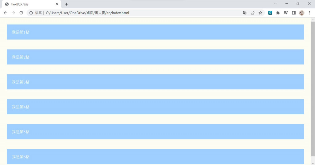
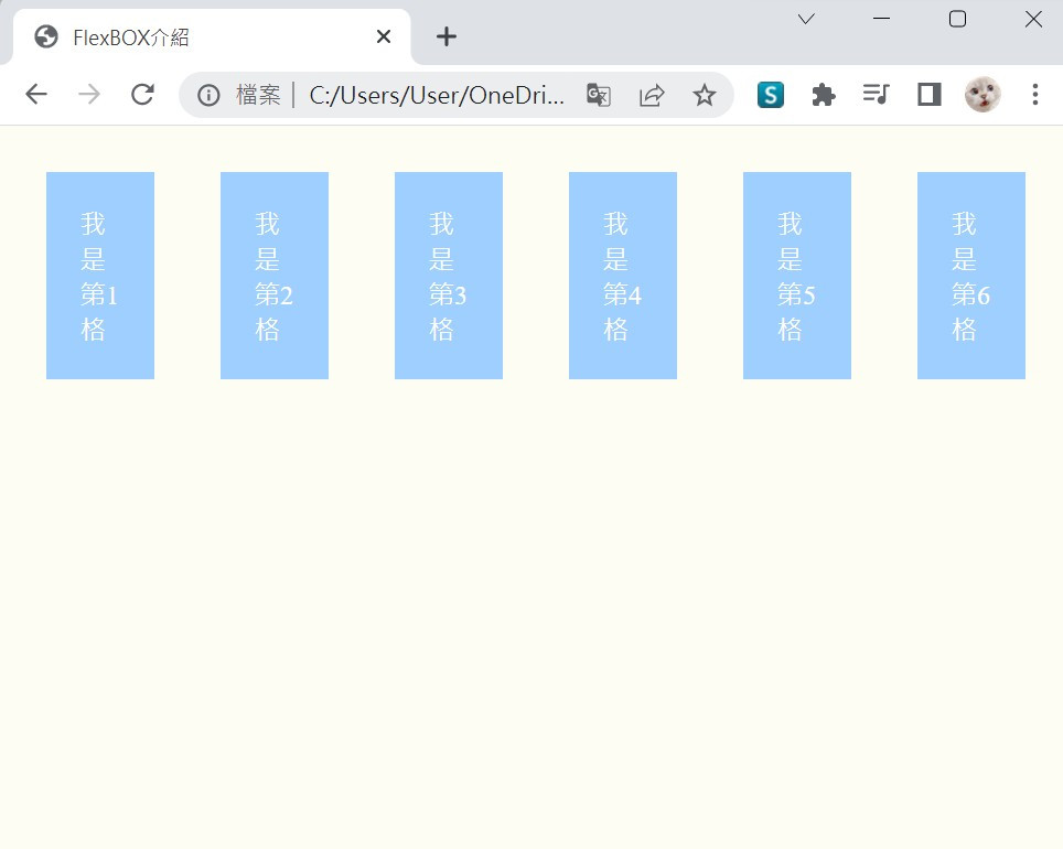
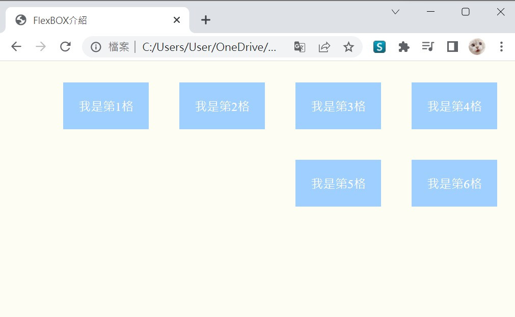
並且在css中,給上了一些背景顏色、文字顏色、編距離
.item {
    color: #fff;
    background: rgb(159, 207, 255);
    padding: 20px;
    margin: 20px;
}
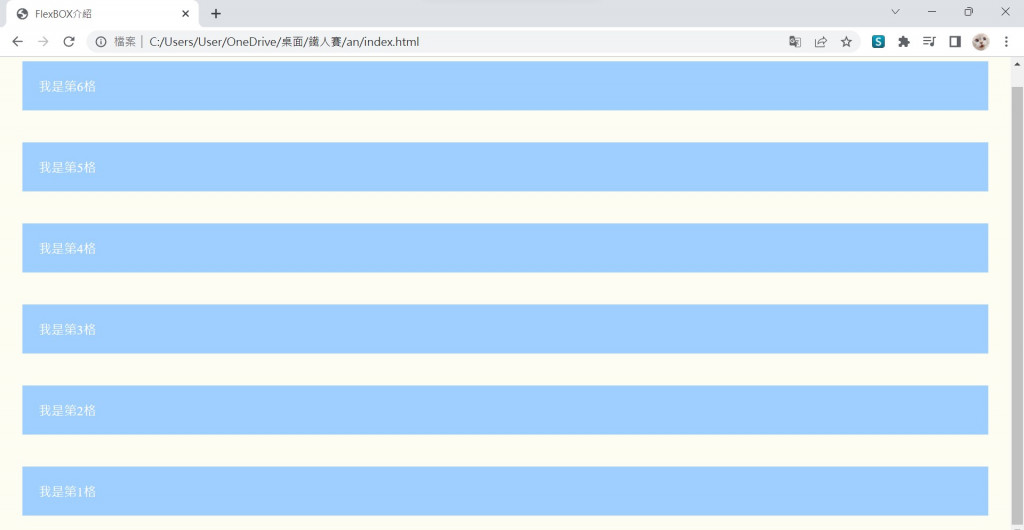
呈現如下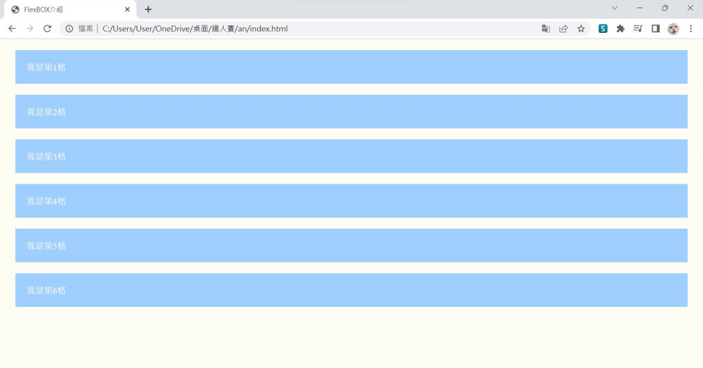
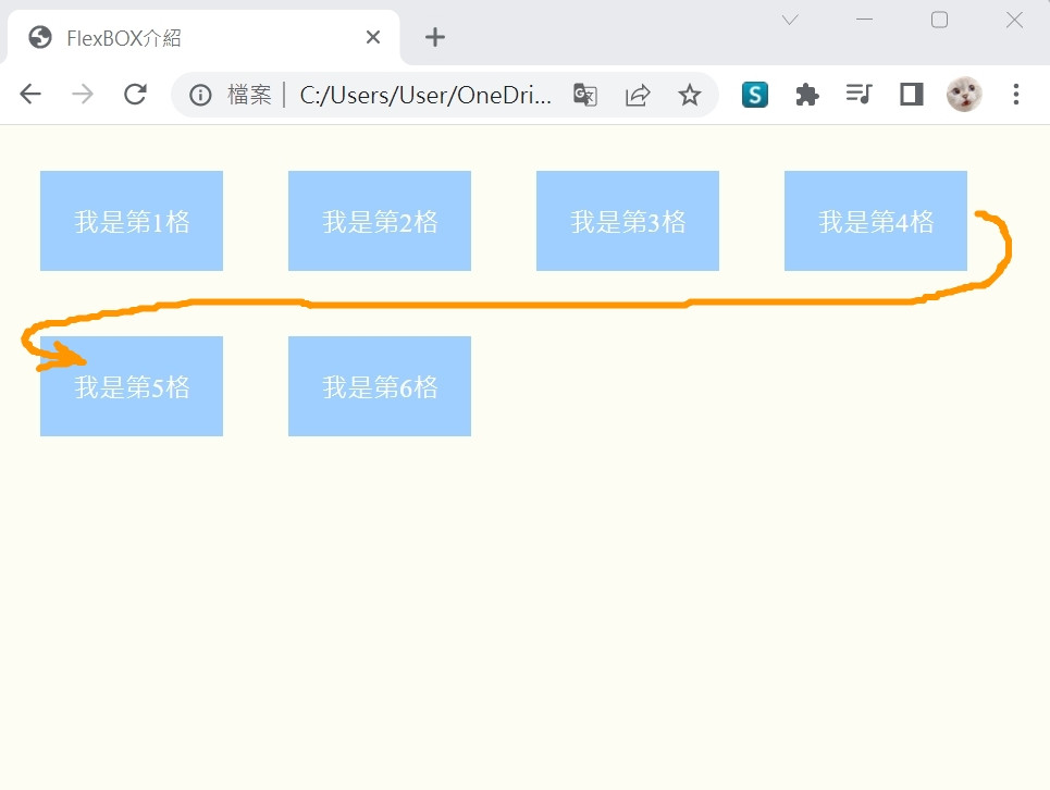
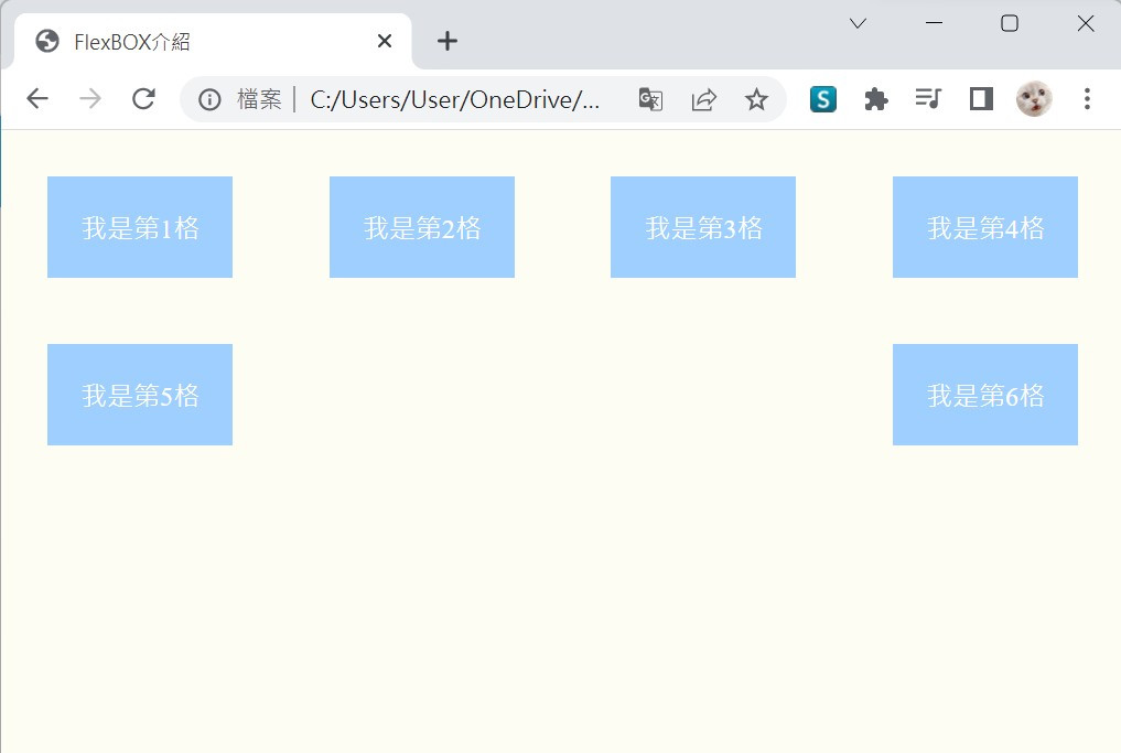
接下來我們在css檔案中,在父元素(class="container")中,添寫
.container {
    display: flex;
}
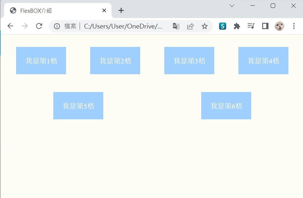
網頁受到display: flex設定,會將子元素自動排列成預設flex-direction: row,由左往右排列。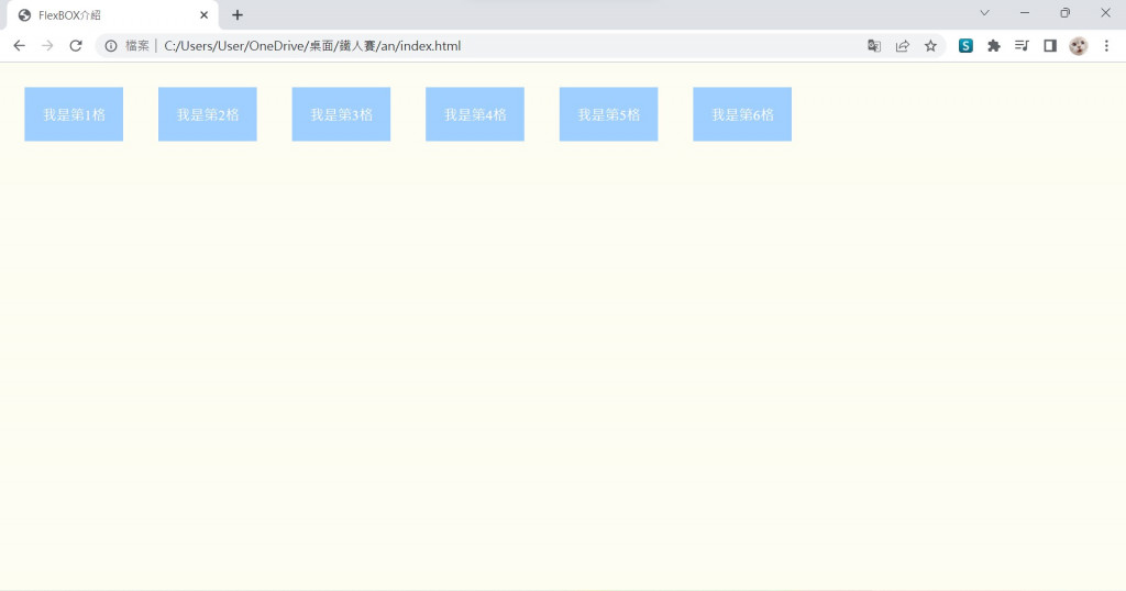
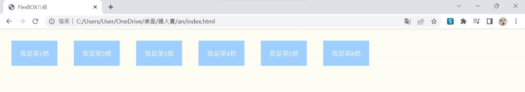
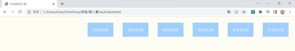
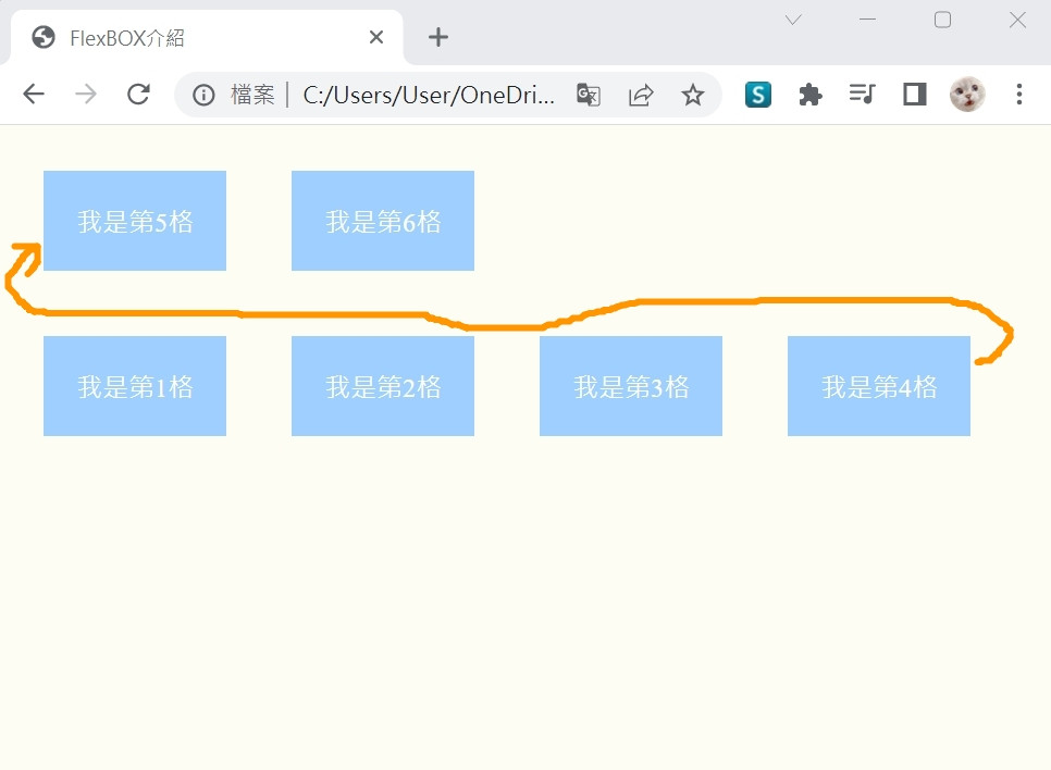
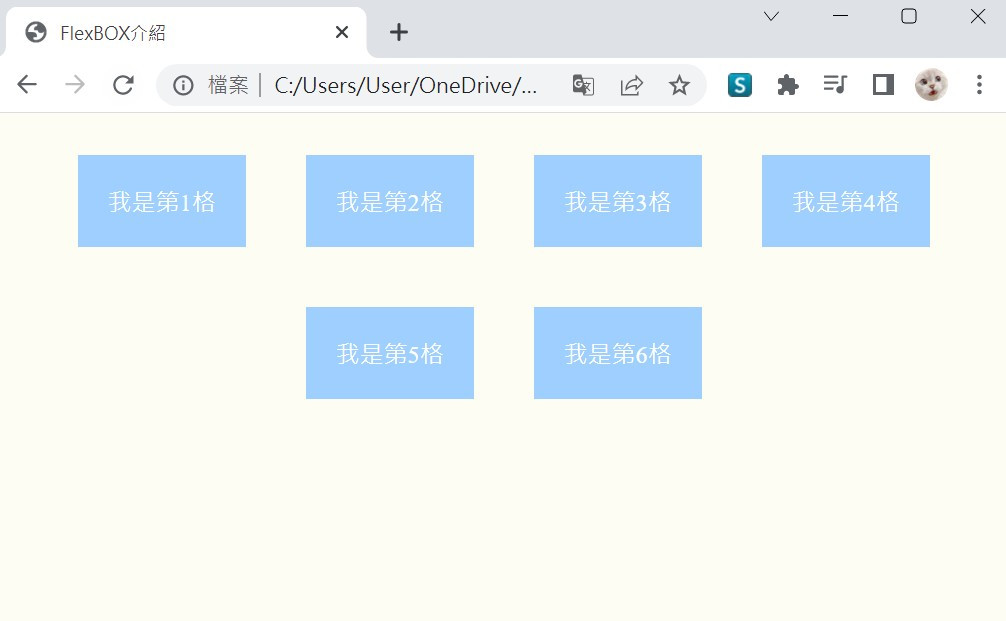
我們也可以改變flex-direction的方向性(注意格子的順序)
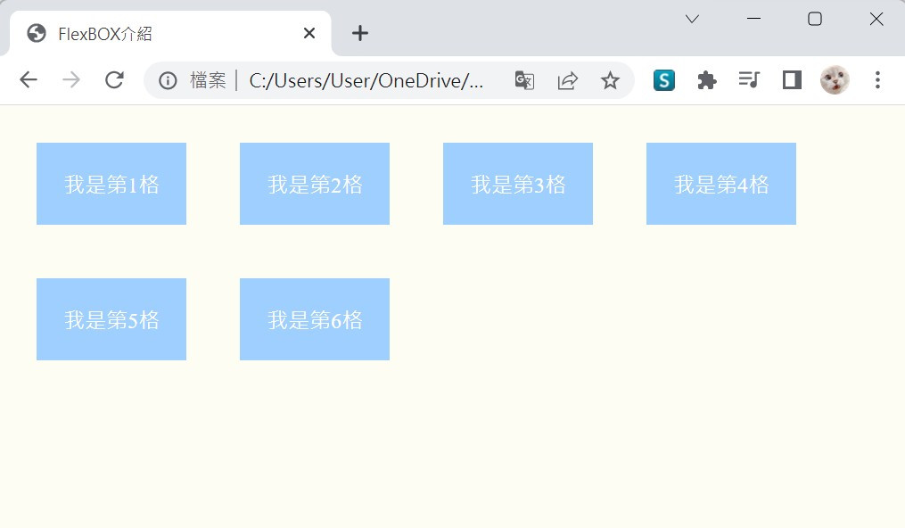
有時候,因為我們縮小了螢幕的寬度,又或著放大了螢幕的長度,調整了螢幕成為不一樣的尺寸。
這時,這個功能超好用的!
他可以依據使用者的狀態去改變的排法,讓多出來子元素的換到下一行。
.container {
    display: flex;
    flex-direction: row;
    flex-wrap: wrap;
}
flex-wrap 就是換行的屬性
他有三種常見可設定的值
這邊使用到的屬性是「justify-content」,關於水平對齊以下呈現示範(附上大螢幕與小螢幕尺寸的結果)
flex-start (為預設值) 呈現靠左側對齊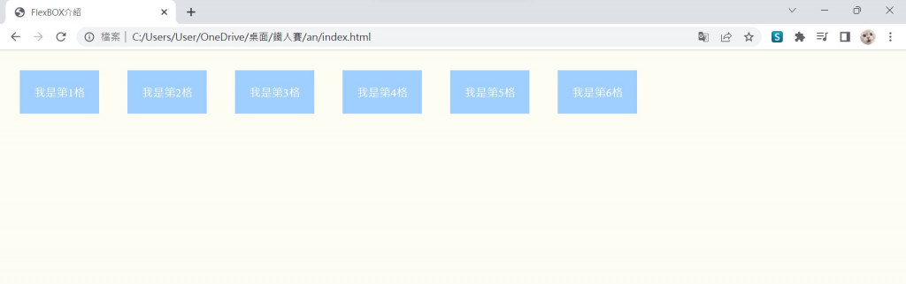
center 就是置中的意思啦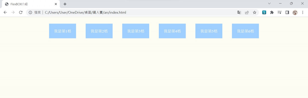
flex-end 相反於flex-start,呈現靠右側對齊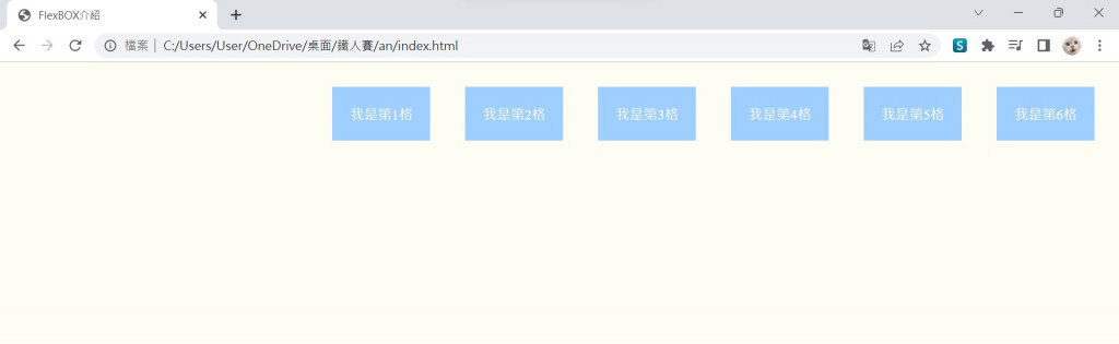
space-around 分散於(水平)螢幕畫面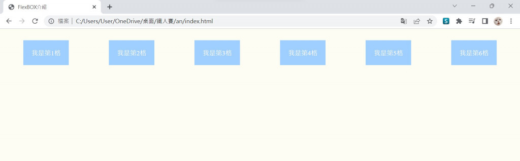
space-between 靠左靠右一起對齊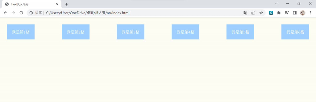
好多方便彈性空間可以使用喔,使用FlexBOX讓畫面更整齊潔淨了 我覺得自動換行那邊非常實用,當然其他的也很讚啦,明天繼續介紹更多有用技巧,掰掰881
參考網站: https://www.w3.org/TR/css-flexbox-1/#intro
參考書: 網頁美編的救星! 零基礎也能看得懂的 HTML & CSS 網頁設計


 看影片追技術