使用Card顯示單個主題的內容和操作,也是作為進入更深層次細節或導航的切入點,例如音樂專輯或即將到來的假期的詳細資訊。
呈現Cards可以是一起顯示在網格、垂直列表等,通常Card的layout和大小size取決於其內容,沒有一種正確的或是製定的方法來製作Card。

每種都提供相同的可讀性和功能,因此使用的型別僅取決於APP風格。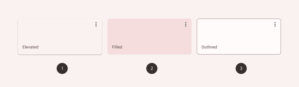
API and source code:
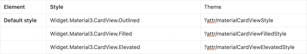
<com.google.android.material.card.MaterialCardView
    ...
    style="?attr/materialCardViewFilledStyle">

    ...

</com.google.android.material.card.MaterialCardView>
<com.google.android.material.card.MaterialCardView
    ...
    style="?attr/materialCardViewElevatedStyle">

    ...

</com.google.android.material.card.MaterialCardView>
MaterialCardView 在沒有設定style時會預設Outlined Cardstyle。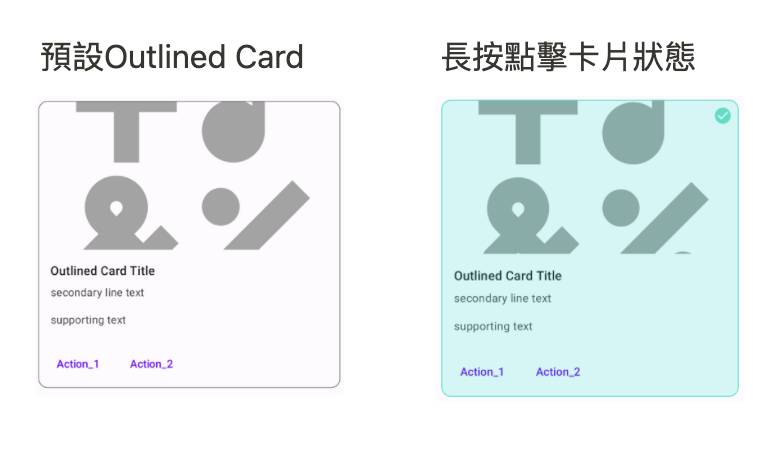
上圖當長按點擊卡片時,它會顯示一個選中的圖標並改變它的顏色,至於顏色可以到專案主題res/values/themes.xml去調整想要的顏色。
長按點擊卡片需在xml新增
<com.google.android.material.card.MaterialCardView
            android:id="@+id/card"
            .....
			android:clickable="true"
			android:focusable="true"
			android:checkable="true">

            .....

        </com.google.android.material.card.MaterialCardView>
activity新增 setOnLongClickListener
card.setOnLongClickListener {
    card.setChecked(!card.isChecked)
    true
}
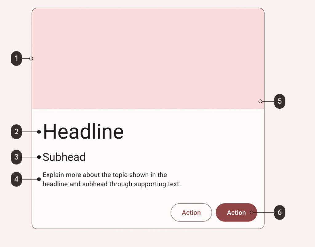
<com.google.android.material.card.MaterialCardView
            android:id="@+id/card"
            android:layout_width="match_parent"
            android:layout_height="wrap_content"
			android:clickable="true"
			android:focusable="true"
			android:checkable="true"
            android:layout_margin="8dp">

            <LinearLayout
                android:layout_width="match_parent"
                android:layout_height="wrap_content"
                android:orientation="vertical">

                <ImageView
                    android:layout_width="match_parent"
                    android:layout_height="194dp"
                    android:scaleType="centerCrop"
                    app:srcCompat="@drawable/ic_emoji_symbols_24" />

                <LinearLayout
                    android:layout_width="match_parent"
                    android:layout_height="wrap_content"
                    android:orientation="vertical"
                    android:padding="16dp">

                    <!-- Title, secondary and supporting text -->
                    <TextView
                        android:layout_width="wrap_content"
                        android:layout_height="wrap_content"
                        android:text="Outlined Card Title"
                        android:textAppearance="?attr/textAppearanceTitleMedium" />

                    <TextView
                        android:layout_width="wrap_content"
                        android:layout_height="wrap_content"
                        android:layout_marginTop="8dp"
                        android:text="secondary line text"
                        android:textAppearance="?attr/textAppearanceBodyMedium"
                        android:textColor="?android:attr/textColorSecondary" />

                    <TextView
                        android:layout_width="wrap_content"
                        android:layout_height="wrap_content"
                        android:layout_marginTop="16dp"
                        android:text="supporting text"
                        android:textAppearance="?attr/textAppearanceBodyMedium"
                        android:textColor="?android:attr/textColorSecondary" />

                </LinearLayout>

                <!-- Buttons -->
                <LinearLayout
                    android:layout_width="wrap_content"
                    android:layout_height="wrap_content"
                    android:layout_margin="8dp"
                    android:orientation="horizontal">

                    <com.google.android.material.button.MaterialButton
                        style="?attr/borderlessButtonStyle"
                        android:layout_width="wrap_content"
                        android:layout_height="wrap_content"
                        android:layout_marginEnd="8dp"
                        android:text="Action_1" />

                    <com.google.android.material.button.MaterialButton
                        style="?attr/borderlessButtonStyle"
                        android:layout_width="wrap_content"
                        android:layout_height="wrap_content"
                        android:text="Action_2" />
                </LinearLayout>

            </LinearLayout>

        </com.google.android.material.card.MaterialCardView>


 看影片追技術