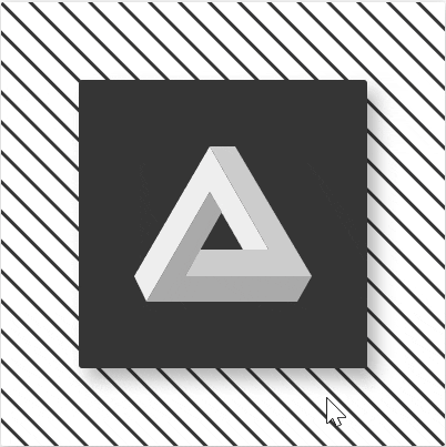
今天我們來實作Day #17,潘洛斯三角形為存在於二維空間的三角形,而在現實世界中不可能存在的物體。
CodePen: https://codepen.io/stevetanus/pen/QWrOmry
div(class="frame")
  div(class="stripes")
    - for(let i=0; i<29; i++)
      div(class=`stripe`)
  div(class="square")
    svg(class="triangle")
      polygon(class="left" points="0,117 68,0 121,93 98,93 68,41 11,140")
      polygon(class="right" points="68,0 91,0 160,117 46,117 59,93 121,93")
      polygon(class="bottom" points="68,41 79,59 46,117 160,117 147,140 11,140")
.stripes裡面有29條線,產生斜線的背景.square包住SVG.triangle則為潘洛斯三角,.left為左側三角形,.right為右側三角形,.bottom為底部三角形,紅色圓圈圈起的地方為points的起點。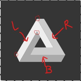
潘洛斯三角的SVG較難,可直接參考作者程式碼。
.stripes {
  position: relative;
  top: -67px;
  left: -100px;
  width: 600px;
  rotate: 45deg;
.stripes旋轉45度,寬度為600px超過.frame的對角線,往上推移67px,往左推移100px,讓其中心線與.frame的左上斜角平行(這邊感覺需要點數學計算)。
.stripe {
    background: #353535;
    width: 600px;
    height: 3px;
    margin-bottom: 16px;
  }
.stripe每條斜線高度為3px,有下面的margin,產生斜線背景的效果。
將.frame的overflow: hidden拿掉,可以看得比較清楚。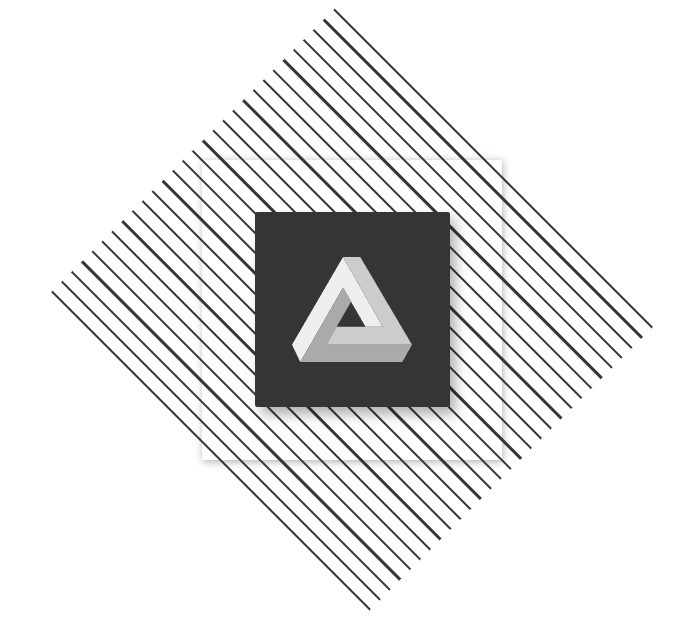
.square{
  width: 260px;
  height: 260px;
  top: 70px;
  left: 70px;
  .triangle{
    position: absolute;
    width: 160px;
    height: 140px;
    top: 60px;
    left: 50px;
    }
SVG限制在寬160px、高140px的元素之中,上面推60px(140+60+60=260),左邊推50px(160+50+50=260),剛好在.square中間。
  .left {
    fill: #eee;
    transition: all .5s ease-in-out;
  }

  .right {
    fill: #ccc;
    transition: all .5s ease-in-out;
  }

  .bottom {
    fill: #aaa;
    transition: all .5s ease-in-out;
  }

  &:hover {
    .left {
      fill: #C5E02B
    }
    .right {
      fill: #418BE0
    }
    .bottom {
      fill: #E02514
    }
  }
#eee、#ccc、#aaa顏色越來越深,讓從左到右到下面的三角形看起來有漸進的區別,在hover時,分別變為類似綠、藍、紅的顏色。
HTML
| 目標 | 屬性 |
|---|---|
| 潘洛斯三角 | 三個高深的<polygon points=""/> |
| CSS | |
| 目標 | 屬性 |
| ------------- | ------------- |
| 斜線背景 | .stripes父層中rotate: 45deg、top、right調整位置,.stripe子層設定height、margin-bottom |
| 綠藍紅色票 | #C5E02B #418BE0 #E02514 |
| 白灰色票 | #eee #ccc #aaa |
好的~各位今天認識了潘洛斯三角,在現實中為不可能的三角,又多了點知識呢!


 看影片追技術