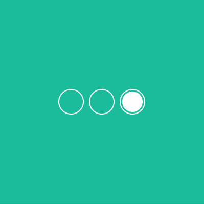
在我們瀏覽網站時,可能會看到購物網站、風景網站等等使用slider來切換圖片,最常見的應該就是三個小點~
今天我們就來實作Day #19
CodePen: https://codepen.io/stevetanus/pen/ZEovLgy
<div class="frame">
  <div class="center">
    <input type="radio" name="rd" id="check-1">
    <label for="check-1" class="circle" id="c1"></label>
    <input type="radio" name="rd" id="check-2">
    <label for="check-2" class="circle" id="c2"></label>
    <input type="radio" name="rd" id="check-3">
    <label for="check-3" class="circle" id="c3"></label>
    <div class="active"></div>
	<div class="bg"><div>
  </div>
</div>
.center內有三個radio button(input:radio),分別給予id: check-1、check-2、check-3,與id對應著有三個label,最後有.active白色圓球跟.bg三色背景。
在HTML中input type="radio會製作出一顆選擇按鈕,而在給予這個input特定的id(像是id="check-1"),我們可以用label for="check-1來指定為這顆按鈕的標籤(文字或圖樣等等),這樣在點選label或是input都會選擇到輸入框,在radio button的話就會變成勾選狀態。
input[type="radio"] {
  display: none;
}
這是使用[attribute*=value]的屬性選擇器。input[type="radio"]選擇input tag包含有type="radio"屬性的元素,將所有radio button顯示移除。
CSS屬性選擇器: https://www.w3schools.com/cssref/sel_attr_contain.asp
.circle {
  // 使border不會超過設定的寬長
  box-sizing: border-box;
  position: absolute;
  z-index: 5;
  top: 175px;
  left: 115px;
  width: 50px;
  height: 50px;
  border: 2px solid #fff;
  border-radius: 50%;
  cursor: pointer;
}
// 減去圓形,相距第一個圓框10px
#c2 {
  left: 175px;
}
// 減去圓形,相距第二個圓框10px
#c3 {
  left: 235px;
}
.circle為所有標籤(label)的class,每個標籤都是一個圓框,總共加起來170px(50+10+50+10+50),所以第一個圓框left: 115px(115*2+170=400)會讓三個圓框置中。
.active {
  position: absolute;
  z-index: 10; //高過於.circle
  width: 40px;
  height: 40px;
  background: #fff;
  border-radius: 50%;
  top: 180px;
  left: 120px;
  transition: all 1s ease; // trs
}

#check-1:checked ~ .active {
  translate: 0px;
}
#check-2:checked ~ .active {
  translate: 60px;
}
#check-3:checked ~ .active {
  translate: 120px;
}
#為id選擇器,:checked是可以判斷radio被選取的偽元素(checkbox也可),~為所有後面元素選擇器。check-1:checked ~ .active選擇的是當check-1的radio勾選時,其所有後面的.actvie都會translate: 0px。以此類推,第二個radio勾選時,白球會跑到中間的圓框,第三個radio勾選時,白球會跑到最後的圓框,動畫時間為1秒。
checkbox的妙用: https://www.casper.tw/css/2013/10/07/css-chechbox/
.bg {
  position: absolute;
  width: 400px;
  height: 400px;
  top: 0;
  left: 0;
  background: #3498db; // 紫色
  border-left: 400px solid #9b59b6; // 藍色
  border-right: 400px solid #1abc9c; // 綠色
  transition: all 1s ease;
  translate: 0px;
}

#check-1:checked ~ .bg {
  translate: 0px;
}
#check-2:checked ~ .bg {
  translate: -400px; //向左400px,顯示藍色
}
#check-3:checked ~ .bg {
  translate: -800px; //向左800px,顯示綠色
}
border讓背景有三面,當radio被勾選時,後面的.bg會依照勾選的按鈕而移動,動畫時間也是1秒。
HTML
| 目標 | 屬性 |
|---|---|
| radio button | input:radio#特定id、label for="特定id" |
| CSS | |
| 目標 | 屬性 |
| ------------- | ------------- |
| 樣式選擇器 | [attribute*=value] |
| id選擇器 | # |
| 後面元素選擇器 | ~ |
| checkbox、radio勾選狀態 | :checked |
| 背景變換 | border-left、border-right |
30個CSS選擇器: https://code.tutsplus.com/zh-hant/tutorials/the-30-css-selectors-you-must-memorize--net-16048
如果想要把CSS發揮得好,選擇器真的是蠻重要的課題呢~
在這邊推薦一個CSS遊戲叫做CSS Diner,從遊戲中學習選擇器的運用。我是從hannnahTW寫的5個學習CSS的遊戲分享所得知的,裡面有更多的從遊戲學CSS的分享,也歡迎大家去挑戰!

 看影片追技術