
我們昨天練習了搜尋功能,學到如何使用漸變效果、將 select 預設箭頭移除改用圖片顯示並取消點擊事件。
今天練習部分是卡片元件,那麼開始今天的練習吧!
pc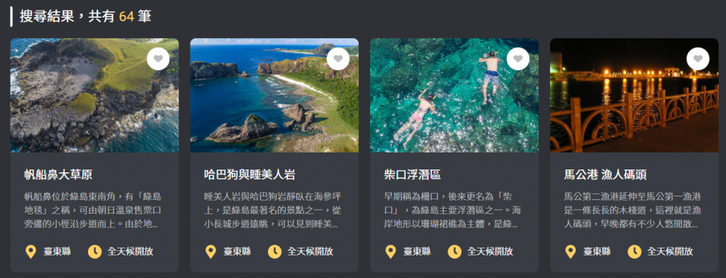
pad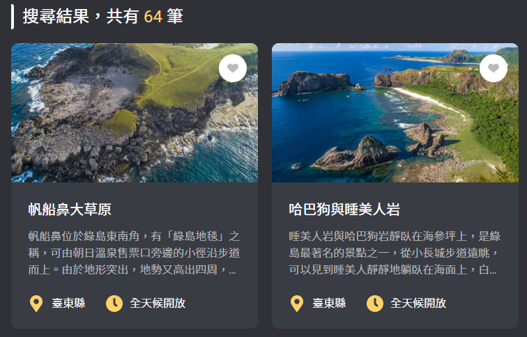
mobile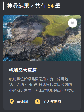
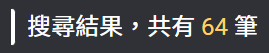
白色線條與文字左右排版,線條寬 4px,高度因外層 flex 特性內層會等高(文字撐高),右上及右下有圓角。
<div class="flex">
  <div class="w-1 rounded-r bg-white"></div>
  <h2 class="...">
    搜尋結果,共有<span class="..."> 64 </span>筆
  </h2>
</div>
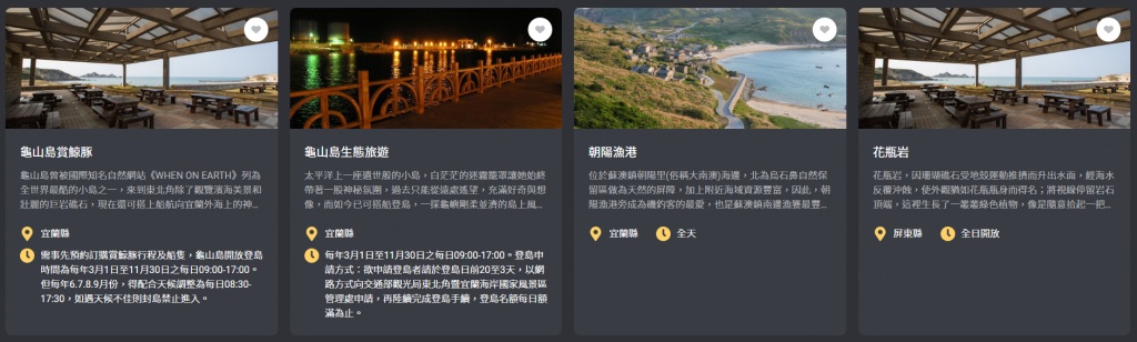
mobile 單個一列、pad-768px 兩個一列、pad-1024px 三個一列、pc 四個一列且間距皆為 20px。
<ul
  class="... grid grid-cols-1 gap-5 md:grid-cols-2 lg:grid-cols-3 xl:grid-cols-4"
>
  ...
</ul>
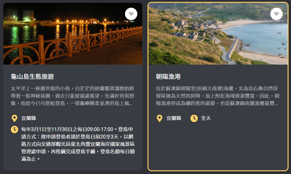
a 標籤,外框有 10px 的圓角,圖片外層要給 overflow-hidden 才會有圓角效果。grid 特性使卡片等高,當卡片有背景色而內容多寡不一定相同,要給 h-full 將背景顏色撐滿。外框且裡面圖片會放大,要給 overflow-hidden 才不會因為放大導致超出範圍,200px,內層使用 h-full,外層去決定高度並加上 object-cover 將圖片撐滿避免變形。<a
href="javascript:;"
class="group block h-full overflow-hidden rounded-[10px] bg-gray-200 duration-300 hover:ring hover:ring-primary"
>
<div class="h-[200px] overflow-hidden">
<img
src="..."
alt="..."
class="h-full w-full object-cover duration-300 group-hover:scale-110"
/>
</div>
</a>
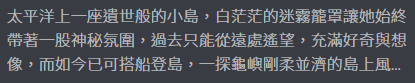
每個景點的文字描述數量不同,設計的描述最多呈現三行,若文字超過時會以 ... 呈現。
安裝 Tailwind CSS - line-clamp 的插件,終端機輸入 npm install -D @tailwindcss/line-clamp。
tailwind.config.js 的 plugins 加上 require('@tailwindcss/line-clamp'),。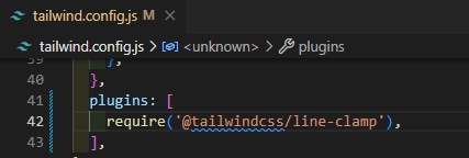
package.json 檔可以查看是否安裝成功。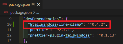
使用 line-clamp-3 即可達到我們要的效果。
文字粗細為 300。
.line-clamp-3 {
  overflow: hidden;
  display: -webkit-box;
  -webkit-box-orient: vertical;
  -webkit-line-clamp: 3;
}
<p class="... font-light line-clamp-3">
  ...
</p>
左右排版,文字超過寬度會自動斷行,左右間距 30px,上下間距 12px。頂部對齊。300。<div class="... flex flex-wrap gap-x-7.5 gap-y-3">
<div class="flex items-start">
<img
src="..."
alt="..."
/>
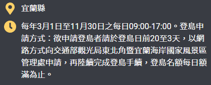
<span class="... font-light">宜蘭縣</span>
</div>
<div class="flex items-start">
<img src="..." alt="..." />
<span class="... font-light">每年3月1日至11月30日之每日09:00-17:00。登島申請方式:欲申請登島者請於登島日前20至3天,以網路方式向交通部觀光局東北角暨宜蘭海岸國家風景區管理處申請,再陸續完成登島手續,登島名額每日額滿為止。</span>
</div>
</div>

定位,上面、右邊距離皆為 16px。40px 的白色圓形。fill 變更顏色且在整個圓形中間。<li class="relative">
<button
type="button"
class="group absolute top-4 right-4 flex h-10 w-10 items-center justify-center rounded-full bg-white"
>
<svg
class="fill-gray-100 duration-300 group-hover:fill-primary"
>
</svg>
</button>
</li>
整張卡片是 a 標籤,當按鈕包在 a 標籤裡,點擊按鈕會直接跳轉網頁,所以按鈕與 a 標籤要在同一層。
<!-- 錯誤層級 -->
<li>
  <a href="javascript:;" class="...">
    <button type="button" class="..."></button>
  </a>
</li>
<!-- 正確層級 -->
<li>
  <a href="javascript:;" class="..."></a>
  <button type="button" class="..."></button>
</li>
整體區塊在中間,按鈕與下拉選單左右排版且間距 10px。
<div class="... flex justify-center gap-x-2.5">
  ...
</div>

按鈕寬高固定 48px,左右箭頭 icon 在按鈕中間,滑鼠停留平滑改變背景顏色。
<a
  href="javascript:;"
  class="... flex h-12 w-12 items-center justify-center bg-gray-200 duration-300 hover:bg-gray-400"
>
  <img src="..." alt="上一頁" />
</a>
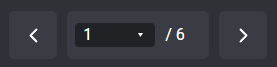
80px 且在區塊中間,移除 select 的預設外框及下拉箭頭並取消圖片點擊事件。定位在 select 中間。<div class="... flex items-center">
<div class="relative">
<select
class="... w-20 appearance-none outline-none"
>
...
</select>
<img
src="..."
alt="下箭頭"
class="pointer-events-none absolute top-1/2 right-3 -translate-y-1/2"
/>
</div>
<span class="ml-2.5 text-white">/ 6</span>
</div>
rounded-{t|r|b|l} 分邊給圓角效果。overflow-hidden 才會有圓角效果。overflow-hidden 避免放大時超出範圍。object-cover 可以將圖片撐滿避免變形。line-clamp-{行數} 限制文字顯示行數。flex-wrap 自動斷行。items-start 將元素向頂部對齊。


 iThome鐵人賽
 看影片追技術