製作專案的時候,如果可以跟使用者互動,或許對於彼此的信任度有加分效果,這時候提示視窗是一個很好的選擇!
例如:進入活動首頁可以用彈窗說明活動內容折扣方案,引起使用者瞬間的購物慾望,這樣網頁就有幫需求方達到生意興榮的效果;或是訂單送出有溫馨提醒:訂單已經送出了唷!使用者也會相對安心許多。甚至...寫文章過程中,按右下角「儲存草稿」,出現一個彈跳視窗溫柔地跟我說:儲存成功!這樣也是好的互動,避免出現美麗的誤會。
Sweetalert2 是一個流行的 JavaScript 插件,用於創建美觀且高度可自訂的彈出式對話框 alert 和模態對話框 modal,可以取代 Window.alert()、Window.confirm() 和 window.prompt(),比原生的彈跳視窗更加美觀且有更高的可變性。
SweetAlert2
https://sweetalert2.github.io/#download
一樣使用 npm 安裝。
npm install sweetalert --save
指令下完送出完成安裝後,可以在 package.json 看到套件名稱和安裝版本。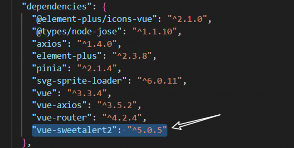
開始的方法一樣有 2 種:全域註冊 || 按需引入
在 main.js 引入
import { createApp } from 'vue'
import App from './App.vue'
import './index.css'

import VueSweetalert2 from 'vue-sweetalert2';
import 'sweetalert2/dist/sweetalert2.min.css';

const app = createApp(App)

app.use(VueSweetalert2);

app.mount('#app');
如果專案評估後會很大,建議可以使用按需引入,這樣可以讓專案瘦身也達到想要的目標。
按需引入是在 .vue 中引入,也就是只要需要用到的地方都要用一次 import,當然也可以抽共用變成全域狀態。
// ES6 Modules or TypeScript
import Swal from 'sweetalert2'
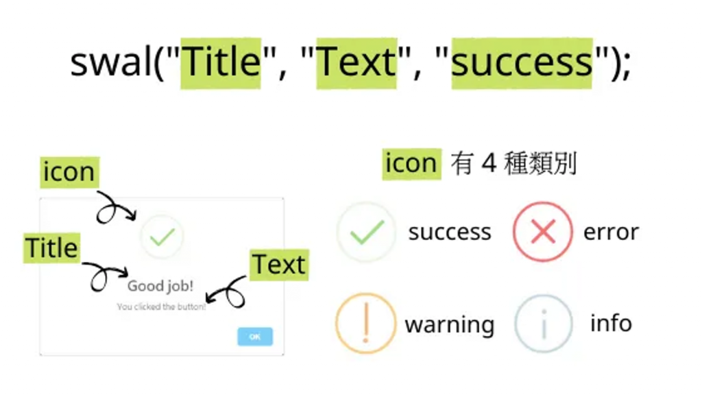
SweetAlert2 的語法,swal("標題", "內文", “success”);。swal 的第一個參數為 title 的文字,第二個參數為 text 的文字,第三個參數是 icon 的類別。
function showMessage() {
  swal("Good job!", "You clicked the button!", "success");
}
從官網的 DEMO 可以知道他的主要客製化來自配置項,以下是配置項說明 by 官方文件
| 配置項參數 | 參數說明 |
|---|---|
| title | 彈出窗口的標題 |
| titleText | 彈出窗口的標題,作為文本。有助於避免 HTML 注入 |
| text | 彈出框的描述。如果 text 和 html 參數同時提供,html 將被使用 |
| icon | 彈出窗口的圖標。SweetAlert2 帶有 5 個內置圖標,將顯示相應的圖標動畫:警告,錯誤,成功,信息和問題。它可以放在 “icon” 下的數組中,也可以作為函數的第三個參數傳遞 |
| iconColor | 用於更改圖標的顏色 |
| toast | 是否應將警報視為 toast 通知。(該選項通常與位置參數和計時器結合使用。) |
| input | 輸入字段類型,可以是文本,電子郵件,密碼,號碼,電話,範圍,文本區域,選擇,單選,複選框,文件和 url |
| width | 彈出窗口寬度,包括填充 (box-sizing: border-box)。可以在任何CSS單位 (px, em/rem, %) |
| padding | 彈出窗口填充。可以在任何 CSS 單位 (px, em/rem, %) |
| color | 標題、內容和頁腳的顏色(CSS color屬性)。默認顏色是 “#545454” |
| background | 彈出窗口背景(CSS背景屬性)。默認的背景是'#fff’ |
| position | 彈出窗口位置,可以是top, top-start, top-end,center, center-start, center-end, bottom, bottom-start,或 bottom-end |
| timer | 彈出窗口的自動關閉定時器。單位為 ms(毫秒) |
| timerProgressBar | 如果設置為 true,計時器將在彈出窗口的底部有一個進度條。大多數情況下,這個功能是有用的 toast |
| showConfirmButton | 如果設置為 false,將不會顯示 “確認” 按鈕。 |
| showDenyButton | 如果設置為 true,將顯示 “拒絕” 按鈕。它可以是有用的,當你想要一個彈出 3 個按鈕 |
| showCancelButton | 如果設置為 true,將顯示 “取消” 按鈕,用戶可以單擊該按鈕來取消模態 |
| confirmButtonText | 使用此更改 “確認” 按鈕上的文本 |
| confirmButtonColor | 使用此命令更改 “Confirm” 按鈕的背景顏色。默認顏色是 #3085d6 |
| denyButtonColor | 使用此命令更改 “拒絕” 按鈕的背景色。默認顏色是 #dd6b55 |
| cancelButtonColor | 使用此命令更改 “取消” 按鈕的背景色。默認顏色是 #aaa |
搭配上面的表格,幾乎已經符合需求方的客製化內容,當然這只是我比較常使用到的配置項,還有更多設定可以到官方文件中挖呀~挖呀~挖~
接下來就來分享一下自己比較常使用的應用:
如果專案中很多地方會用到,可以試著抽共用後,需要用到的頁面再引入,以下是把套件抽出在獨立 js ,需要用到的地方再解構引入。
建立一個新的 .js ,可以命名為 sweetAlert.js。
import Swal from 'sweetalert2'

export default {
    typicalType(title, text, icon, showConfirmButton) {
        return Swal.fire({
            title,
            text,
            icon,
            showConfirmButton,
            confirmButtonText: `Continue → `,
            confirmButtonColor: '#224772',
            timer: showConfirmButton === true ? '' : 1500
        })
    },
    twoLayerCheckType() {
        return Swal.fire({
            title: 'Are you sure?',
            text: "You won't be able to revert this!",
            icon: 'warning',
            showCancelButton: true,
            confirmButtonColor: '#546f89',
            cancelButtonColor: '#224772',
            confirmButtonText: 'Yes, delete it!'
        })
    }
}
用 import 引入套件,看哪一個 .vue 需要用到就引入在套用 fn 名稱即可。
<script setup>
...
import Swal from 'sweetalert2'
import sweetAlert from '@/mixin/sweetAlert'

...
function deleteAllTodoItem() {
  if (!todos.value.length) {
    return sweetAlert.typicalType('注意', '目前無任務可以刪除', 'error', `Continue → `)
  }
  sweetAlert.twoLayerCheckType().then((result) => {
    if (result.isConfirmed) {
      localStorage.removeItem('todoList')
      todos.value = []
      sweetAlert.typicalType('完成', '已完成刪除動作', 'success', false)
    } else if (result.isDenied) {
      console.log('取消')
    }
  })
}
</script>
電商的後台或是前台使用者要變更相關資料的時候,可以套用 input 進行綁定並且透過 axios 更新資料庫內容。
<template>
    ...
    <div class="modal-footer">
        <button type="button" class="btn btn-outline-secondary" data-bs-dismiss="modal">
            取消
        </button>
        <button type="button" class="btn btn-primary" @click="editProduct">
            編輯
        </button>
    </div>
</template>

<script setup>
...
import Swal from "sweetalert2";
import axios from "axios";
const { VITE_APP_URL, VITE_APP_PATH } = import.meta.env;

function editProduct() {
    Swal.fire({
        title: '新增產品資訊',
        input: 'text',
        confirmButtonText: '儲存',
        inputPlaceholder: '請輸入產品資訊'
    }).then((result) => {
        console.log(result)
        if (result.isConfirmed) {
            updateProduct();
            Swal.fire('Saved!', '', 'success');
        } else if (result.isDenied) {
            Swal.fire('Changes are not saved', '', 'info');
        }
    })
}

function updateProduct() {
    let url = `${base_url}/api/${api_path}/admin/product`;
    let method = 'post';
    if (!this.isNew) {
        method = 'put';
        url = `${base_url}/api/${api_path}/admin/product/${this.tempProduct.id}`;
    }
    axios[method](url, { "data": this.tempProduct })
        .then(res => {
            alert(res.data.message)
            this.getProductList();
            productModal.hide();
        })
        .catch(err => {
            console.log(err.response);
            alert(err.response.data.message);
        })
}
</script>
大家應該有感覺...一路走來的套件很像都輪番上陣,確實...目前的應用中幾乎可以交替使用到,例如:


 iThome鐵人賽
 看影片追技術