
今天我們把bootstrap utilities學完,那我們開始吧!
bootstrap 的Spacing utilities 提供我們能夠快速設置響應式間距例如padding或是margin的通用類別。
關於margin與padding可以看這篇文章margin & padding - 金魚都能懂的CSS必學屬性
寫法是:m-*(margin)或p-*(padding)(*為 t(上),b(下), s(左), e(右), x(左右), y(上下),auto(自動,常用在margin的水平置中), 如果不寫方向就是上下左右都有 ),數值預設有 0~5(可以調整 $spacers Sass map 變數自定義)。
它的$spsacer變數預設如下:
$spacer: 1rem;  //16px
$spacers: (
  0: 0,
  1: $spacer * .25,  //4px
  2: $spacer * .5,  //8px
  3: $spacer,  //16px
  4: $spacer * 1.5, //24px
  5: $spacer * 3,  //48px
);
照上面設置的話,我們可以得出,例如: .mb-3就是margin-bottom:16px;的意思。
而spacer屬性是支持響應式的(這點針對響應是設計非常方便),寫法是這樣:(屬性-斷點-數值),
例如:.mt-2.mt-sm-5,就是在小於576px是呈現margin-top:8px;,而在瀏覽器寬度576px以上是margin-top:48px;。
我們可以使用.mx-auto來使物件水平置中(記得物件要設寬度,不然沒效,因為它需要把剩下的空間分給兩邊的邊距)
負值margin要在sass中啟用才可以用,寫法是在所需大小前面加上n,例如:.mt-n1
意思是這樣:
.mt-n1 {
  margin-top: -0.25rem !important;
}
當外層容器是display: grid 或display: flex時,我們可以使用gap屬性指定子物件之間的間距。
寫法是:.gap-*(* 為0~5,此數值依據為$spacer)。
範例程式碼:
<div class="grid gap-3">
  <div class="p-2 g-col-6">Grid item 1</div>
  <div class="p-2 g-col-6">Grid item 2</div>
  <div class="p-2 g-col-6">Grid item 3</div>
  <div class="p-2 g-col-6">Grid item 4</div>
</div>
效果如圖: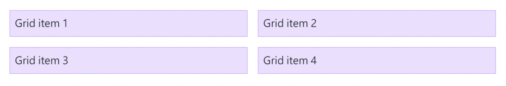
row-gap屬性用來指定子物件之間的垂直距離,寫法是:.row-gap-*(*為 0~5)。
範例程式碼:
<div class="grid gap-0 row-gap-3">
  <div class="p-2 g-col-6">Grid item 1</div>
  <div class="p-2 g-col-6">Grid item 2</div>
  <div class="p-2 g-col-6">Grid item 3</div>
  <div class="p-2 g-col-6">Grid item 4</div>
</div>
效果如圖: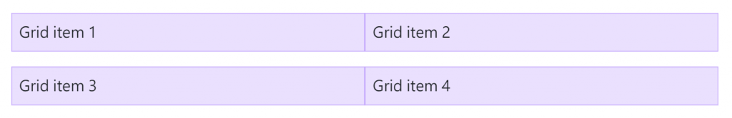
column-gap屬性用來指定子物件之間的水平距離,寫法是:.column-gap-*(*為 0~5)。
範例程式碼:
<div class="grid gap-0 column-gap-3">
  <div class="p-2 g-col-6">Grid item 1</div>
  <div class="p-2 g-col-6">Grid item 2</div>
  <div class="p-2 g-col-6">Grid item 3</div>
  <div class="p-2 g-col-6">Grid item 4</div>
</div>
效果如圖: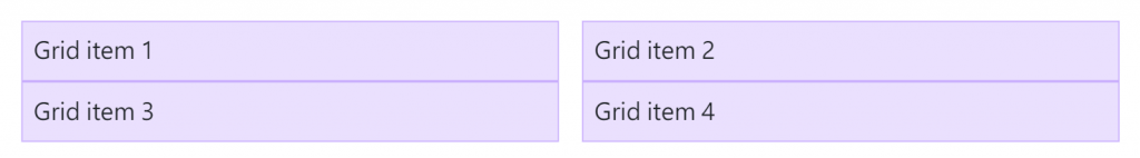
bootstrap 的text屬性用來設置文字的對齊、樣式、大小、粗細、換行、行高等。
用簡單的class就可以使文本對齊,寫法是:.text-*(* 為 center(置中), start(靠左), end(靠右))。
它也支持響應式,寫法是:.text-斷點-*,例如我要手機版文字置中,桌面板文字靠左就寫 .text-center.text-lg-start。
text-wrap屬性可以指定當文字長度超出容器時的換行狀態,寫法是:.text-wrap(換行),.text-nowrap(不換行,直接讓文字超出去)。
一般text-wrap會以單詞來換行,如果使用.text-break就可以不用等到一個完整的單詞就可以換行。它是透過設定 word-wrap: break-word 和 word-break: break-word預防長文破壞元件的排版。
範例程式碼:
<p class="text-break">mmmmmmmmmmmmmmmmmmmmmmmmmmmmmmmmmmmmmmmmmmmmmmmmmmmmmmmmmmmmmmmmmmmmmmmmmmmmmmmmmmmmmmmmmmmmmmmmmmmm</p>
效果是:
上面範例如果不加.text-break是不會換行的,因為單詞沒有結束(是用空格區分單詞的)。
使用.text-lowercase(轉成小寫),.text-uppercase(轉成大寫),.text-capitalize(每個單字首字母大寫)。
使用font-size類別可以輕鬆改變字體大小,寫法是:.f-*(* 為 1~6,大小對應 .h1–.h6),但跟 .h1–.h6不一樣的是,font-size類別只有改變大小,而 .h1–.h6還會改變 font-weight與 line-height。
如果要自定義數值大小的話可以修改 $font-sizes 變數 Sass map。
變數預設如下:
$font-size-base:              1rem; // Assumes the browser default, typically `16px`

$h1-font-size:                $font-size-base * 2.5;
$h2-font-size:                $font-size-base * 2;
$h3-font-size:                $font-size-base * 1.75;
$h4-font-size:                $font-size-base * 1.5;
$h5-font-size:                $font-size-base * 1.25;
$h6-font-size:                $font-size-base;

$font-sizes: (
  1: $h1-font-size,
  2: $h2-font-size,
  3: $h3-font-size,
  4: $h4-font-size,
  5: $h5-font-size,
  6: $h6-font-size
);
我們可以使用.fw-*改變font-weight 或 .fst-*改變font-style。
範例程式碼:
<!--font-weight:700;-->
<p class="fw-bold">Bold text.</p>
<!--font-weight:bolder;-->
<p class="fw-bolder">Bolder weight text (relative to the parent element).</p>
<!--font-weight:600;-->
<p class="fw-semibold">Semibold weight text.</p>
<!--font-weight:500;-->
<p class="fw-medium">Medium weight text.</p>
<!--font-weight:400;-->
<p class="fw-normal">Normal weight text.</p>
<!--font-weight:300;-->
<p class="fw-light">Light weight text.</p
<!--font-weight:lighter;-->
<p class="fw-lighter">Lighter weight text (relative to the parent element).</p>
<p class="fst-italic">Italic text.</p>
<p class="fst-normal">Text with normal font style</p>
效果: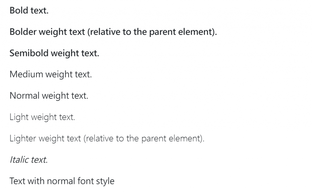
我們可以使用.lh-1(line-hight:1rem;),.lh-sm(line-hight:1.25rem;),.lh-base(line-hight:1.5rem;)以及 .lh-lg(line-hight:2rem;)設置行高。
我們可以使用 .font-monospace把字體設置成等寬字體。
範例程式碼:
<p class="font-monospace">This is in monospace</p>
效果:
在link中使用Reset color屬性,可以使它繼承父元素的text color。
使用Text decoration屬性可以指定文字的裝飾,寫法是:.text-decoration-* (* 為 underline(下底線),line-through(刪除線),none(無裝飾,常用在llink))。範例程式碼:
<p class="text-decoration-underline">This text has a line underneath it.</p>
<p class="text-decoration-line-through">This text has a line going through it.</p>
<a href="#" class="text-decoration-none">This link has its text decoration removed</a>
效果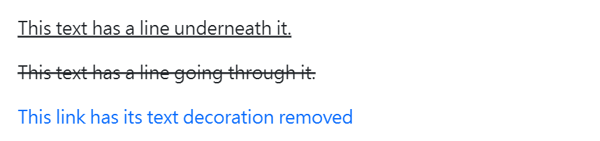
使用Vertical align可以輕鬆指定物件的垂直對齊方式,但只能影響diaplay 是 inline、inline-block、inline-table、和table 元素。
範例程式碼:
<span class="align-baseline">baseline</span>
<span class="align-top">top</span>
<span class="align-middle">middle</span>
<span class="align-bottom">bottom</span>
<span class="align-text-top">text-top</span>
<span class="align-text-bottom">text-bottom</span>
效果:
使用.visible or .invisible可以隱藏物件但不影響排版(如果是.d-none就會直接把該物件移除掉,進而影響排版)。

 iThome鐵人賽
 看影片追技術