在昨天我們嘗試做出一個簡單的 Linear Regression 模型,不過想必你也會想知道,如果今天模型的輸入並不是只有單一的 ,那該怎麼撰寫這樣的程式。
今天我們會使用波士頓房價預測資料來帶大家認識實際上我們應該會怎麼做這樣的 Multiple Regression,又會遇到哪些問題。
在波士頓房價預測資料集只有 506 筆資料,當中包含了許多的輸入參數,這邊直接擷取資料集的說明。
CRIM: per capita crime rate by townZN: proportion of residential land zoned for lots over 25,000 sq.ft.INDUS: proportion of non-retail business acres per townCHAS: Charles River dummy variable (= 1 if tract bounds river; 0 otherwise)NOX: nitric oxides concentration (parts per 10 million)RM: average number of rooms per dwellingAGE: proportion of owner-occupied units built prior to 1940DIS: weighted distances to five Boston employment centresRAD: index of accessibility to radial highwaysTAX: full-value property-tax rate per $10,000PTRATIO: pupil-teacher ratio by townB: 1000(Bk - 0.63)^2 where Bk is the proportion of blacks by townLSTAT: % lower status of the populationMEDV: Median value of owner-occupied homes in $1000's如果我們把每個參數對輸出之間的關係化成散佈圖,會像底下的樣子。
圖片直接看會有點小,建議直接把圖打開來看,放大會比較明顯。

接下來的實作建議在 jupyter notebook 或是 Google Colab 當中運作會比較方便。
在接下來的實作我們會需要
先來考慮一下現在變成兩個輸入參數的例子吧!
這裡我們就先挑 RM 跟 AGE 這兩個參數當成 以及
。模型的定義一樣十分簡單,就是單純的
。
首先,底下是這次會使用到的 library,就先 import 進來吧。
import numpy as np
import matplotlib.pyplot as plt
from matplotlib import cm
import pandas as pd
接下來我們先處理資料的讀取吧!這部分跟昨天相比會是比較新的內容。
我們會透過 pandas 直接到卡內基美隆大學的網站直接下載資料集。
如果我們打開這個網站的話,你會發現前面有一些敘述性的內容,包含資料集的簡單描述,以及每個參數的意義。不過這幾行並不是我們需要用到的資訊,所以先移除掉。
這對應到底下的
skiprows=22
此外,這裡的資料是透過多個空格隔開,與一般的 csv 格式不同。因此需要特別指定 sep。\s 表示空格,而 + 表示可以有很多個。
data_url = "http://lib.stat.cmu.edu/datasets/boston"
raw_df = pd.read_csv(data_url, sep="\s+", skiprows=22, header=None)
有了資料之後,接下來要取出參數的部分以及輸出的部分,也就是取出 。
不過這裡的資料一開始長相會怪怪的,像是同一列的資料會被切成兩列。

所以每次我們要取出兩個列。
如此一來這些數字組合再一起就是 了。
如果我們只拿第二列的第三個數字,那就會拿到 。
因此實作上會像底下這個樣子取出 。
x = np.hstack([raw_df.values[::2, :], raw_df.values[1::2, :2]])
y = raw_df.values[1::2, 2]
n = len(y)
因為這次我們要看的 只有
RM 跟 AGE,也就是資料中的第 5, 6 行。因此底下我們就把相對應的行取出來變成 。
x0 = x[:, 5] # RM
x1 = x[:, 6] # AGE
接下來的步驟就跟昨天的單變數 Linear Regression 相同了!我們需要設定 epochs , learning rate , 參數初始值 。
直接沿用昨天的設定如下。
lr = 0.000001
epochs = 1000
a, b, c = 0, 0, 0
要記得現在我們的模型假設變成了
,因此會有
三個參數喔!
Loss Function 就跟昨天相同,使用 MSE Loss。也順便開一個 list 用於紀錄每個 epoch 的 Loss。

Losses = []
def Loss(y, y_pred):
    return np.sum((y - y_pred) ** 2) / (2 * n)
訓練的流程一樣是
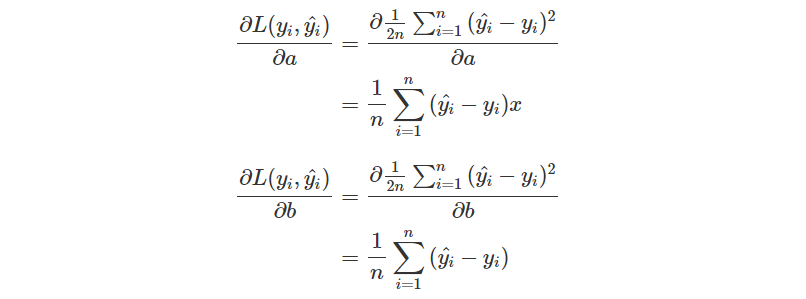
因為模型的定義是
偏微,會多一個
偏微則會多一個
如果有點忘記的話,底下是過去的推導過程,可以試著再推一次。
for i in range(epochs):
    y_pred = a*x0 + b*x1 + c
    loss = Loss(y, y_pred)
    Losses.append(loss)
    da = np.sum(x0 * (y_pred - y)) / n
    db = np.sum(x1 * (y_pred - y)) / n
    dc = np.sum(y_pred - y) / n
    a = a - lr * da
    b = b - lr * db
    c = c - lr * dc
    print(f'epoch {i}\tLoss: {loss}\ta: {a}\tb: {b}\tc: {c}')
當我們訓練完之後,你可以看一下 Loss Function 的結果與你的預期是否相同。在這裡我們觀察到 Loss 有很好地在下降。
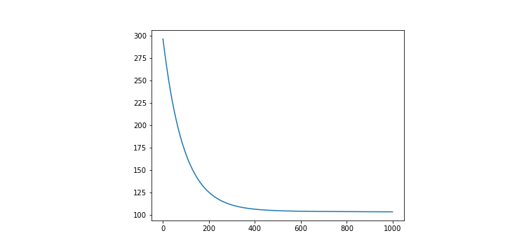
最終的到的 分別是
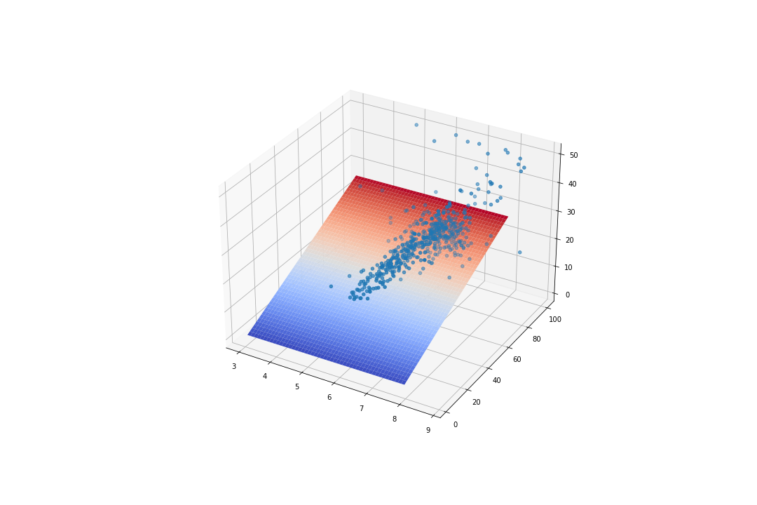
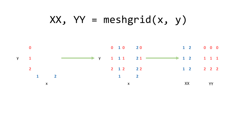
昨天我們只有一個變數,因此可以繪製在平面座標上,不過現在我們有兩個參數了,那就會需要改成在立體座標上。
在 Matplotlib 當中要畫圖時很多時候都是給定兩個 list 分別表示 。現在變成立體的情況下那就會需要給
。
分別先找出 的最大最小值當成我們要關注的範圍。
MINx0, MAXx0 = int(np.min(x0)), int(np.max(x0))
MINx1,MAXx1 = int(np.min(x1)), int(np.max(x1))
接下來要新增一個能夠畫 3D 圖片的畫布,因此跟過去直接使用 plt.plot() 有些不同。
fig = plt.figure()
ax = fig.add_subplot(projection='3d')
另外我自己為了美觀,稍微調整了一下畫布的大小。
fig.set_figheight(10)
fig.set_figwidth(30)
接下來就可以開始畫圖了!首先我們先把原本的資料點給畫上去吧!
跟之前一樣,我們的資料點都會是以散佈圖的形式畫上去,因此使用 scatter()。
ax.scatter(x0, x1, y)
最後的曲線就比較麻煩了。
當固定 的時候,會有許多的
可以選擇,因此在這裡要給定的
並不會只是單純的把
MINx0~MAXx0 當中的數值已一定的間隔格開,而是會有數組這樣隔開的序列。
舉例來說
假如,
那麼我們要給定的參數會像是底下的樣子。
x_range = np.arange(MINx0, MAXx0, 0.1)
y_range = np.arange(MINx1, MAXx1, 0.1)
X, Y = np.meshgrid(x_range, y_range)
最後就剩下 了。可以直接套用上定義
。
Z = a*X + b*Y + c
接下來就可以丟給 ax 把曲面繪製出來。這裡刻意加上一個 cmap 參數,只是希望畫出來的圖形顏色好看一點。
ax.plot_surface(X, Y, Z, cmap = cm.coolwarm)
plt.show()
你同樣可以試著去調整一下各種參數,甚至是架構本身,去觀察看看在不同的狀況下會得出怎樣不同的結論。我認為這十分值得嘗試的。
完整的 Code 放在 Github 上,可以參考看看。
回歸到這篇文章的主軸,我們想討論的是當輸入的參數越來越多的時候,我們會怎麼去調整模型的表示方式。
一如 Day03 提及,當參數數量增加,單純使用像是單變數或是多變數的表示方式往往並不方便。
例如如果現在有四個參數,假使只考慮一次方的線性組合,也會有
這五個參數。更不用說在波士頓資料集當中還有 13 個參數之多。
但改變 Notation 並不會改變原始的概念,所以我們接下來做的,不過是把每個參數都集中在向量與矩陣當中,所以不用太過擔心。
現在讓我們試著把全部的 13 個參數都拿進來看看。而模型的假設我們依舊維持最基本的型態。

但這樣描述實在過於麻煩,把全部的參數除了 以外都以向量
表示,而
~
可以用一個
來表示,其中
表示資料的數量。

新的模型表示方式就從而誕生。
與過去相同,我們需要先引入一些函式庫,然後下載資料集、處理 、設定超參數,這些事前工作都與過去相同,你可以試著自己完成看看,或是單純看底下的程式。
引入函式庫。
import numpy as np
import matplotlib.pyplot as plt
from matplotlib import cm
import pandas as pd
下載與處理資料
data_url = "http://lib.stat.cmu.edu/datasets/boston"
raw_df = pd.read_csv(data_url, sep="\s+", skiprows=22, header=None)
x = np.hstack([raw_df.values[::2, :], raw_df.values[1::2, :2]])
y = raw_df.values[1::2, 2]
labels = ['CRIM','ZN','INDUS','CHAS','NOX','RM','AGE','DIS','RAD','TAX','PTRATIO','B','LSTAT','MEDV']
n = len(y)
features = x.shape[1] # 接下來設定 W 會使用到
設定 Hyperparameters
lr = 0.00001
epochs = 1000
設定 Loss
Losses = []
def Loss(y, y_pred):
    return np.sum((y - y_pred) ** 2) / (2 * n)
一如既往我們可以選擇都從 0 開始。不過這次我們希望用一個 來表達整個參數,所以會稍稍不一樣。
W = np.zeros((features, 1))
c = 0
接下來同樣是一個迴圈,重新複習一下步驟。
計算偏微分的地方比較需要注意,對於最後的常數 以外的參數,如同前面所說,對
偏微分,結果會多一個
在前面。
而現在全部參數都用 來表示,自然就可以推論成對
做偏微分,結果會多一個
在前面。
如果忘記的話,再看一次這個推導過程。
此外,想要做矩陣向量的內積,你需要使用 np.dot()。
for i in range(epochs):
    y_pred = np.dot(x, W) + c
    loss = Loss(y, y_pred)
    Losses.append(loss)

    dW = np.array([np.sum(W[i] * (y_pred - y)) / n for i in range(len(W))]).reshape(len(W), 1)
    dc = np.sum(y_pred - y) / n

    W = W - lr * dW
    c = c - lr * dc
    print(f'epoch {i}\tLoss: {loss}')
其實用上了矩陣之後還可以更容易讀懂且簡略,是個十分好用的表示方式。
一如既往,我們會想要檢查看看訓練出來的模型是否會跟預期的一樣,能讓誤差越來越小。
plt.plot([i for i in range(epochs)], Losses)
這裡同樣也得出一個看起來還不錯的圖形,也就是 Loss 有確實在下降,並且有趨於收斂。
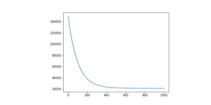
不過因為輸入的變因多達 13 個,並沒有一個 14 維的表示方式可以直接視覺化呈現。這也是在告訴我們當資料的變因越來越大的時候,往往並沒有一個十分直覺的方法能夠評估好壞。
因此我們會盡可能找出一些數值關係,試圖去評估他,就像是這裡的 Loss Function 在做的事情。
最終的 Code 放在 Github 上,可以參考看看。
到這邊,我們看過了單變數以及多變數的 Regression 問題,也成功從十分簡單的單變數表示改變成了矩陣向量的表示方式。
當表示方法改變成了矩陣向量,許多的操作看起來會比較簡單明瞭,也不需要花過多的時間一行一行刻參數的偏微分與更新,而是可以直接計算或套用迴圈。
非常推薦大家不要完全相信我的話,而是動手下去嘗試做過一遍。當你發現做出來的結果與預期相同時,你可以試著修改參數看看在其他狀況下有怎樣的變化。而如果與預期不同,那又會是因為什麼原因所造成。


 iThome鐵人賽