在前幾天我們看到了關於房價預測的線性迴歸問題,接著提到如何定義模型、判斷好壞、更新模型。在這一篇文章我們會實際以 Python 跑過一次線性迴歸。
接下來的實作建議在 jupyter notebook 或是 Google Colab 當中運作會比較方便。
在接下來的實作我們會需要
如果你還沒安裝這些,建議可以選擇到 Google Colab 上運行。
首先我們的資料 分別以 numpy array 表示如下,並且取得資料的數量
。
import numpy as np
x = np.array([498, 523, 550, 834, 980, 1250, 1430, 1700, 1780, 1900, 2100])
y = np.array([100, 150, 200, 210, 300, 290, 340, 293, 350, 290, 285])
n = len(x)
之所以在這裡不是用一般的 list 而是 numpy array 是因為待會我們要對它做運算,例如加法和乘法。因為期待加法和乘法能夠是一一對應每個元素操作,所以用一般的 list 是不行的。
之前提過機器學習的三個步驟
首先我們定義 這樣的函數。接下來評估好壞的 Loss Function 設定成小修改後的 MSE。

def Loss(y, y_pred):
    return np.sum((y - y_pred) ** 2) / (2 * n)
最後在調整參數的部分需要設定 參數初始值 以及 Learning Rate 。這裡我們分別設定 。
至於更新到甚麼狀態下需要停下來,理想上當然會是期待斜率為 0 的時候停下,不過在實作上這種狀況可說是幾乎不會遇到,所以更多情況是設定一個 epoch ,也就是經過多少輪更新後會停下來。這裡我們先設定 1000 個 epoch。
lr = 0.000001
epochs = 1000
a, b = 0, 0
更新參數的部分就會是有一個迴圈,每次我們會先計算出模型的輸出 ,或是我在 code 當中的
y_pred。
y_pred = a*x + b
接下來透過剛剛實作的 Loss 函數取得整體的 Loss,讓我們可以進一步評估模型更新的狀況。
loss = Loss(y, y_pred)
再來就是要取得兩個參數的偏微分了!回顧一下昨天的推導過程。
不過我們有稍微修改了一下 Loss Function,所以會少掉前面的 2 倍,也就是
因為我們使用了 numpy array,所以一切操作就會簡單許多。
+,-,*,/的操作都會自動對應元素操作np.sum()可以直接把所有元素總和加總
da = np.sum(x * (y_pred - y)) / n
db = np.sum(y_pred - y) / n
有了偏微分的結果,那就可以去更新參數了。

a = a - lr * da
b = b - lr * db
把整個更新流程整理整理,就是底下這個迴圈了!底下多了一個輸出,方便觀察運作是否正常。
for i in range(epochs):
    y_pred = a*x + b
    loss = Loss(y, y_pred)
    da = np.sum(x * (y_pred - y)) / n
    db = np.sum(y_pred - y) / n
    a = a - lr * da
    b = b - lr * db
    print(f'epoch {i}\tLoss: {loss}\ta: {a}\tb: {b}')
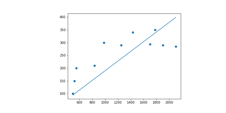
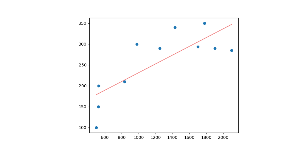
最後如果只是看到數字的話也許沒甚麼感覺,所以把結果畫在圖上看看吧!
這裡要使用的是 Matplotlib。
一開始先畫上資料點,由於只是點,所以對應到 scatter 這種畫圖方式。
import matplotlib.pyplot as plt
plt.scatter(x, y)
接下來再把預測出來的線畫出來,直接使用 plot 就可以了!
plt.plot([x for x in range(498, 2101)], [a*x + b for x in range(498, 2101)])
在 Matplotlib 當中要畫圖時很多時候都是給定兩個 list 分別表示 。
所以像是 scatter 就可以直接指定 和
這兩個 list。
而預測的直線則需要自己把 跟
找出來。由於資料的
範圍在
之間,因此這裡直接製作一個從
到
的 list。至於
的部分就只是單純把找出來的
套上
。
整體來說在畫圖的部分總結如下。
import matplotlib.pyplot as plt
plt.scatter(x, y)
plt.plot([x for x in range(498, 2101)], [a*x + b for x in range(498, 2101)])
plt.show()
epoch 999 Loss: 2445.6961741413174 a: 0.18974689200010145 b: 0.021732900571557866
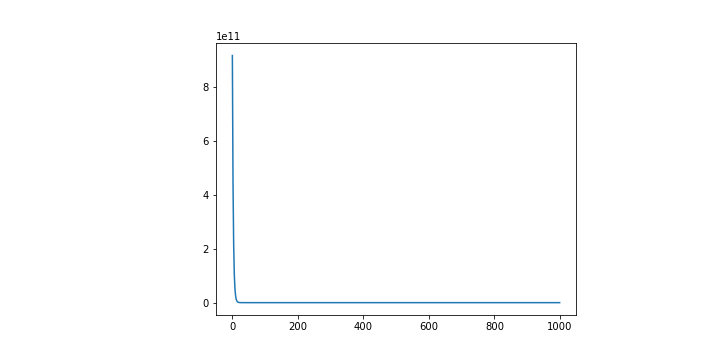
其實往往在訓練的過程當中我們也會想要去看整體的 Loss 究竟有沒有好好地減少,所以會把計算出來的 Loss 都記錄在一個 list 當中,並且也做成圖如下。
plt.plot([i for i in range(epochs)], Losses)
plt.show()
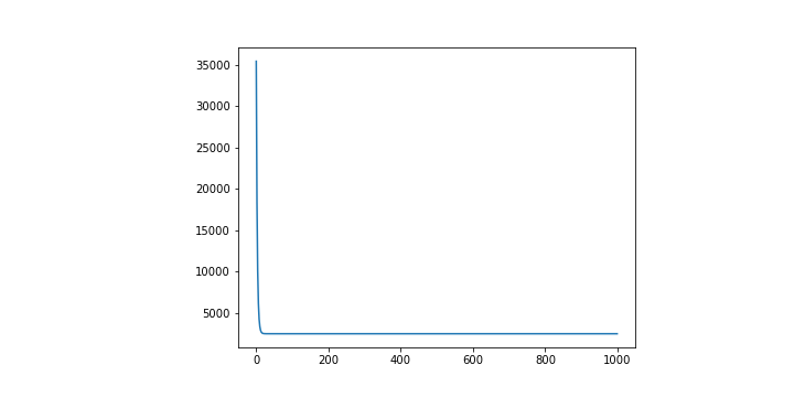
這是還蠻理想的狀況,能看到雖然一開始 Loss 相當大,但是隨著訓練,Loss 隨之變小。
這裡最終的 Code 就放在 Github 上,可以看看最終的樣子。
其實這一條線跟我在第二天舉的例子當中給的線是不一樣的。這一條線其實是用數學的方法直接求出來的直線,因為在這種簡單的線性迴歸其實算是簡單的問題。
不過在成功以上面的程式執行完,看到很棒的 Regression 結果之後,你心中應該要存在一些疑問的。
因為在這個過程當中有很多突然告訴你這樣做的事情。舉例來說,參數的初始值。又或者是 Loss Function 乃至於模型的定義,為什麼要這樣做。
這些因素都會影響到最終模型呈現出來的結果。我們也許先把 Loss Function 以及模型定義放一邊,畢竟一開始就是想要討論比較簡單的狀況所以這樣設定,那麼其他這些參數的設定呢?
超參數 Hyperparameter 包含了 參數初始值 、 Learning Rate 和 epoch 都是會影響到最終模型長相的因素。
你可以試著調整看看這些參數,然後看看最終的結果有沒有什麼不一樣的地方。
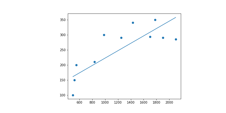
情境 1: 把初始值都設成 100,同樣的 code 會得到的 分別會是
和
。與上面的程式相比,他的線條比較向上,或是說
比較大。
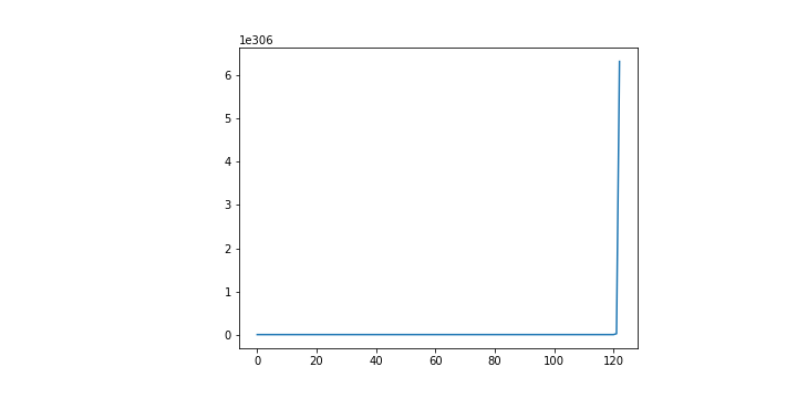
情境 2: 激進一點把初始值都設定成 1000,同樣的 code 會得到的 會超乎想像的是
和
。
很奇怪吧,那甚至連斜率的正負都顛倒了。
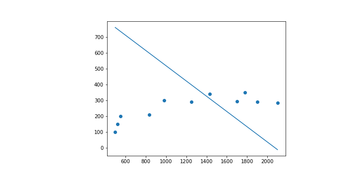
而且這個情況下的 Loss 居然是收斂的。
情境 3: 若是把原本的 code 的 Learning Rate 提高 10 倍。你會發現甚至會完全訓練不起來,因為 Loss 一直掉不下來。
欸,很奇怪吧。
前面我們明明提了那麼多,看起來也有數學佐證,為什麼會出現這樣的問題?
在這裡我們可以有很多很多的疑問想要提出,請先謹記並不是任意選一些數字,機器學習就會跟魔法一般完成一切,給你一個滿意的答案。
在後續的文章我們會更加深入提及這些問題,也希望透過這篇文章你能夠知道如何建構一個 Linear Regression Model,以及 Gradient Descent 的問題。