這個實作主要功能為根據Checkbox勾選的狀態來決定按鈕的開或關,有些時候我們希望確保使用者在勾選之前不會按下按鈕,就會先將按鈕暫時關閉,等Checkbox勾選後再把按鈕打開,下面我們就來看看如何實作。
為此我們需要一個方法:
button.setEnabled();
這個方法可以根據放入的boolean值決定按鈕開關。true代表打開按鈕,false代表關閉按鈕。
MainActivity:
public class MainActivity extends AppCompatActivity {

    //定義變數check
    private boolean check;
    CheckBox checkBox;
    Button button;
    @Override
    protected void onCreate(Bundle savedInstanceState) {
        super.onCreate(savedInstanceState);
        setContentView(R.layout.activity_main);

        //綁定元件和變數
        checkBox=findViewById(R.id.checkBox);
        button=findViewById(R.id.button);

        //一開始還沒勾選時先將按鈕關閉
        button.setEnabled(false);

        //checkBox監聽器
        checkBox.setOnCheckedChangeListener(new CompoundButton.OnCheckedChangeListener() {
            @Override
            public void onCheckedChanged(CompoundButton compoundButton, boolean b) {

                //將b傳給check,check為true或是false時將觸發相對應的功能
                check=b;
                if(check==true)
                {
                    Toast.makeText(MainActivity.this,"已勾選 '我同意以上條款'", Toast.LENGTH_SHORT).show();
                    button.setEnabled(check);
                }
                else
                {
                    Toast.makeText(MainActivity.this,"請勾選 '我同意以上條款'", Toast.LENGTH_SHORT).show();
                    button.setEnabled(check);
                }
            }
        });
    }
}
activity_main.xml:
<?xml version="1.0" encoding="utf-8"?>
<androidx.constraintlayout.widget.ConstraintLayout xmlns:android="http://schemas.android.com/apk/res/android"
    xmlns:app="http://schemas.android.com/apk/res-auto"
    xmlns:tools="http://schemas.android.com/tools"
    android:layout_width="match_parent"
    android:layout_height="match_parent"
    tools:context=".MainActivity">

    <CheckBox
        android:id="@+id/checkBox"
        android:layout_width="136dp"
        android:layout_height="50dp"
        android:text="我同意以上條款"
        android:background="@drawable/linestyle"
        app:layout_constraintBottom_toBottomOf="parent"
        app:layout_constraintEnd_toEndOf="parent"
        app:layout_constraintHorizontal_bias="0.352"
        app:layout_constraintStart_toStartOf="parent"
        app:layout_constraintTop_toTopOf="parent"
        app:layout_constraintVertical_bias="0.464" />

    <Button
        android:id="@+id/button"
        android:layout_width="wrap_content"
        android:layout_height="50dp"
        android:text="確定"
        app:layout_constraintBottom_toBottomOf="parent"
        app:layout_constraintEnd_toEndOf="parent"
        app:layout_constraintHorizontal_bias="0.735"
        app:layout_constraintStart_toStartOf="parent"
        app:layout_constraintTop_toTopOf="parent"
        app:layout_constraintVertical_bias="0.463" />

</androidx.constraintlayout.widget.ConstraintLayout>
成果: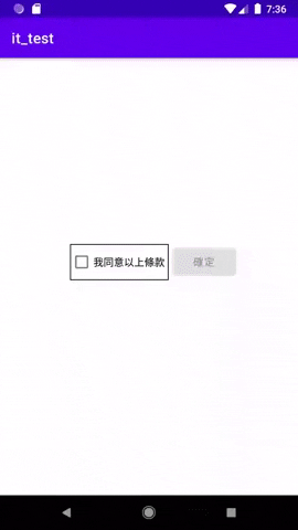
題外話,如何在各元件中加入框線,也是利用客製化的方法。
我們在drawable中新增一個xml檔。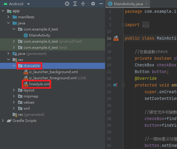
再來就是與之前客製化按鈕的方式一樣,設計自己想要的邊框線,加上各種屬性,放在drawable裡自己設計的xml檔中(本例以黑色框線為例)。
<?xml version="1.0" encoding="utf-8"?>
<selector xmlns:android="http://schemas.android.com/apk/res/android">
    <item>
        <shape
            android:shape="rectangle">
            <corners
                android:radius="0dip" />
            <stroke
                android:width="1dip"
                android:color="#FF000000" />
        </shape>
    </item>
</selector>
然後再參閱之前的方法套用到元件上就實作完成了。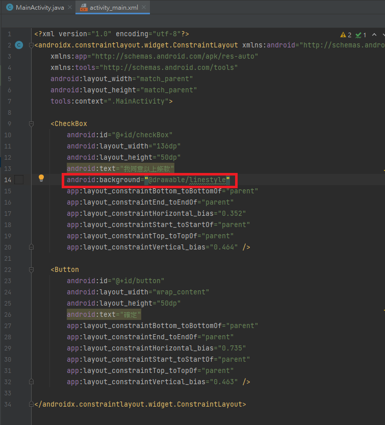


 iThome鐵人賽
 看影片追技術