今天繼續來介紹bootstrap元件
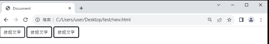
要創建一個基本的 Bootstrap 按鈕,可以使用以下三種HTML結構
<button type="button" class="btn">按鈕文字</button>
<input type="button" class="btn btn-primary">按鈕文字</input>
<a type="button" class="btn btn-primary">按鈕文字</a>
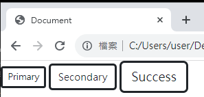
Bootstrap 提供了多個按鈕類別,用於定義按鈕的不同樣式和用途,下面是一些常用的按鈕類別
.btn-sm:大按鈕
.btn-lg:小按鈕
<button type="button" class="btn btn-sm">Primary</button>
<button type="button" class="btn ">Secondary</button>
<button type="button" class="btn btn-lg">Success</button>
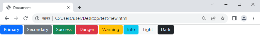
.btn-primary:主要按鈕,通常用於突出顯示主要操作。
.btn-secondary:次要按鈕,用於次要操作或取消操作。
.btn-success:成功按鈕,表示成功操作,通常是綠色。
.btn-danger:危險按鈕,表示危險或刪除操作,通常是紅色。
.btn-warning:警告按鈕,用於提醒操作或警告。
.btn-info:信息按鈕,用於顯示信息或提示。
.btn-light:亮色按鈕,具有淺色背景,用於較淺的主題。
.btn-dark:深色按鈕,具有深色背景,用於較暗的主題。
<button type="button" class="btn btn-primary">Primary</button>
<button type="button" class="btn btn-secondary">Secondary</button>
<button type="button" class="btn btn-success">Success</button>
<button type="button" class="btn btn-danger">Danger</button>
<button type="button" class="btn btn-warning">Warning</button>
<button type="button" class="btn btn-info">Info</button>
<button type="button" class="btn btn-light">Light</button>
<button type="button" class="btn btn-dark">Dark</button>
如果今天按鈕要設計成不填滿背景顏色,那就要用.btn-outline-*
<button type="button" class="btn btn-outline-primary">Primary</button>
<button type="button" class="btn btn-outline-secondary">Secondary</button>
<button type="button" class="btn btn-outline-success">Success</button>
<button type="button" class="btn btn-outline-danger">Danger</button>
<button type="button" class="btn btn-outline-warning">Warning</button>
<button type="button" class="btn btn-outline-info">Info</button>
<button type="button" class="btn btn-outline-light">Light</button>
<button type="button" class="btn btn-outline-dark">Dark</button>


 iThome鐵人賽
 看影片追技術