您在瀏覽其他網站時,是否常常被突如其來的彈跳視窗惹到心煩呢?不論是廣告、強迫訂閱、最新資訊…等,網頁常常使用彈跳視窗來宣傳。雖然惱人,但無法否認使用者確實被吸引到了,並且被迫看了好幾秒的廣告內容 ── 本日的篇章中,我們要實作的便是彈跳視窗的切版!
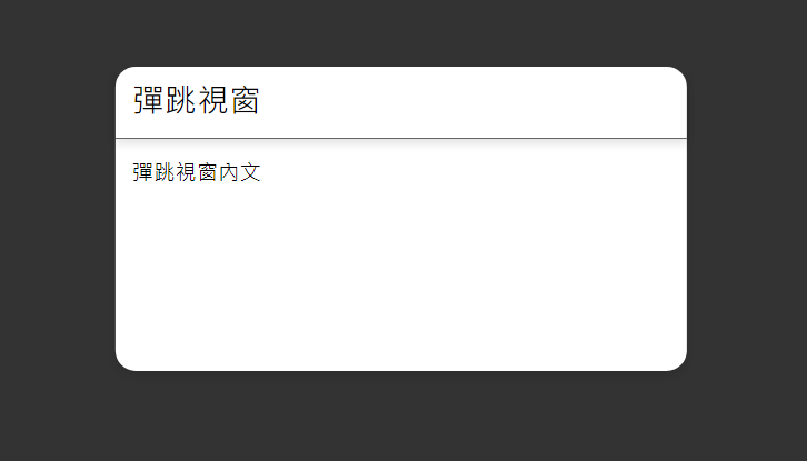
下面的彈跳視窗範例圖是不是您想起了些不好的回憶啊?haha。
彈跳視窗範例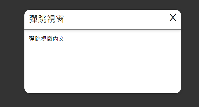
切回正題,實作教學開始:
<!DOCTYPE html>
<html lang="en">
<head>
    <meta charset="UTF-8">
    <meta name="viewport" content="width=device-width, initial-scale=1.0">
    <title>popout</title>
</head>
<body>
</body>
</html>
我們同樣選用Jack Sharkey 所撰寫的CSS初始化包來作引入:
<link rel="stylesheet" href="init.min.css">
這裡我們會將網頁拆成兩大區塊,一個是網頁的內文;一個是彈跳視窗的section。
<body>
      <!-- 網頁內文 -->
    <button class="pop-button">彈跳視窗</button>

    <section class="pop-out">
        <!-- popout screen -->
    </section>
</body>
我們在網頁的content中放置了一個button元件,之後我們會在JS的部分寫道:「當button被點擊時,彈跳視窗就會pop出來」
這裡,我們先對 .pop-button 做一些初始化 & 設計:
你各位可以建立一個新的 style.css 檔案或寫在 <style> 標籤裡
.pop-button {
    font-size: 1.5rem;
    padding: 1%;
    border: solid black 2px;
    font-weight: bold;
    transition: background-color .5s ease;
    border-radius: 20px;
}
.pop-button:hover {
    background-color: black;
    color: white;
    transition: background-color .5s ease;
}
上頭的 transition: background-color .5s; 語法,所代表的是:當按鈕狀態改變時,為其附加一個延遲的效果。
而我們寫的效果是:當我們鼠標移動到按鈕上方時,按鈕的顏色會從黑色慢慢變成白色。
首先,要先做一個滿版的視窗,這裡使用到 width:100%、height: 100vh、position:absolute 語法來達成滿版的效果。
.pop-out {
    width: 100%;
    height: 100vh;
    background-color: rgba(0, 0, 0, 0.8);
    position: absolute;
    top: 0;
    left: 0;
}
做完以後,便會有一層黑黑的薄膜完全覆蓋到頁面:background-color: rgba(0, 0, 0, 0.8);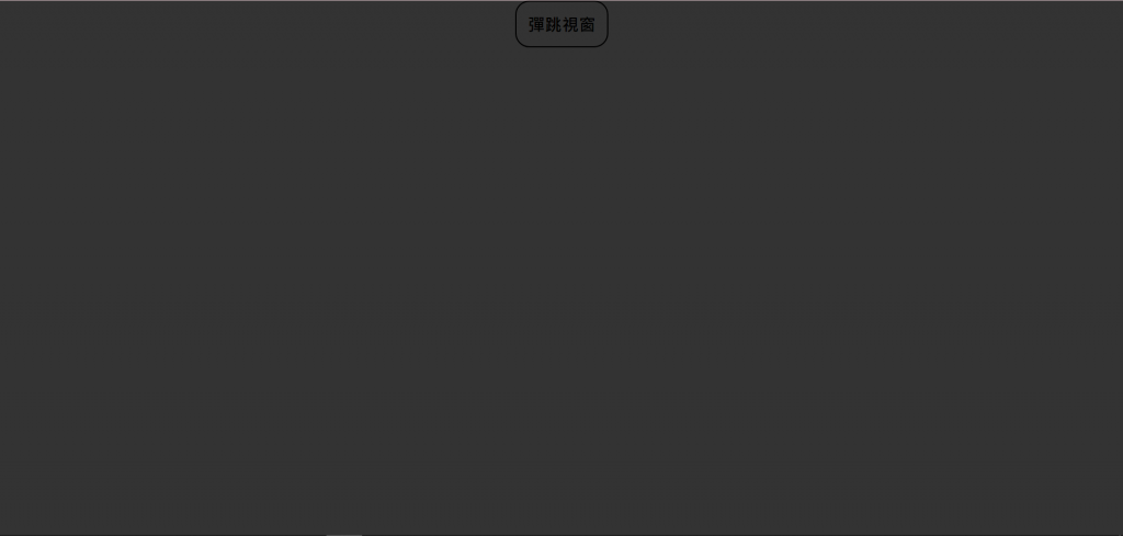
在 .pop-out 的section中加入彈跳視窗的內文:
<section class="pop-out">
        <div class="pop-out-panel">
            <div class="panel-header">
                <div class="panel-container">
                    彈跳視窗
                </div>
            </div>
            <div class="panel-content">
                <div class="panel-container">
                    彈跳視窗內文
                </div>
            </div>
        </div>
    </section>
.pop-out-panel 的整體樣式:.pop-out-panel {
min-width:425px;
min-height: 30vh;
background-color: white;
border-radius: 15px;
}
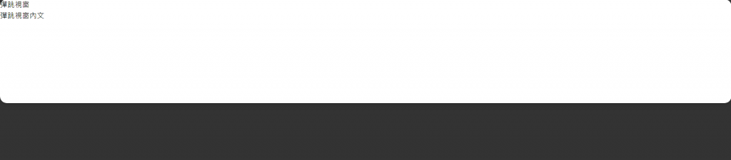
這裡先解釋一下為什麼會出現滿版的情況,第一次看到我也是覺得霧沙沙,相當疑惑:
在此處,我們對panel設定了一個min-width:425px的語法,實際上有達成。但由於在HTML文本中,panel裡所存放的元件全都是一個滿版的 <div> 元件,因此才造成這樣的結果。
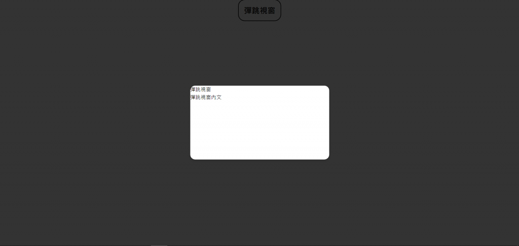
所以接下來,我們要定位panel,並使其置中:
.pop-out-panel {
    min-width:425px;
    min-height: 30vh;
    background-color: white;

    position: absolute;
    top: 50%;
    left: 50%;
    transform: translate(-50%,-50%);
}
繼續定義panel的樣式:
.panel-header {
    font-size: 1.5rem;
    font-weight: bold;
    padding: 2% 0;
    border-bottom: solid rgba(53, 53, 53, 0.756) 1px;
    box-shadow: 0 4px 6px rgba(0, 0, 0, 0.1);
}
.panel-content {
    padding: 3% 0;
}
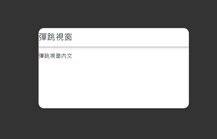
這裡我們也要設定panel的container,防止內部元件(如文字)直接貼緊邊框:
.panel-container {
    padding-left:3%;
    padding-right:3%;
}
而後在 .panel-header 裡加一顆關閉視窗按鈕:
<div class="panel-header">
    <div class="panel-container">
        彈跳視窗
    </div>
    <button class="panel-button"><i class="fa-solid fa-x"></i></button>
</div>
按鈕的樣式:
.panel-button {
    position: absolute;
    right: 0;
    top: 0;
    padding-top: 2%;
    padding-right: 3%;
}
這個部分,您可以邪惡一點,把按鈕設計得小到讓人按不到,嘻嘻。
再來我們要撰寫JavaScript的部分了。
使用jQuery的click函式建立兩個點擊事件。
進場動畫設計:
duration:0.5秒display:block
duration:0.5秒可以參考,退場動畫:
duration:0.5秒panel opacity:0
// 點擊彈跳視窗按鈕,使用GSAP顯示彈跳視窗
$(".pop-button").click(function () {
    gsap.to(".pop-out", { duration: 0.5, opacity: 1, display: "block" });
    gsap.fromTo(".pop-out-panel",{y:"20%"},{y:"-50%",duration:0.5,ease:"power"})
});

// 點擊彈跳視窗的關閉按鈕,使用GSAP隱藏彈跳視窗
$(".panel-button").click(function () {
    gsap.to(".pop-out", { duration: 0.5, opacity: 0, display: "none" });
});
當然,也可以為點擊 ESC 加上事件。
$(document).keydown(function (e) {
    if (e.key === "Escape") {
        gsap.to(".pop-out", { duration: 0.5, opacity: 0, display: "none" });
    }
});
以下是完整javascript程式碼:
這裡我做了一個小優化,讓關閉pop-out的程式碼宣告成一個函式,這麼做的目的是因為,執行關閉動作的程式碼已經出現太多次了,頗沒有效率。
再來,如果我們之後要對關閉動作的添增新的特效,需要改的程式碼數量太多了,將其宣告為函數可以使整體變得更整潔、更方便。
$(".pop-out").hide();

function closePop () {
    gsap.to(".pop-out", { duration: 0.5, opacity: 0, display: "none" });
}

// 點擊彈跳視窗按鈕,使用GSAP顯示彈跳視窗
$(".pop-button").click(function () {
    gsap.to(".pop-out", { duration: 0.5, opacity: 1, display: "block" });
    gsap.fromTo(".pop-out-panel",{y:"20%"},{y:"-50%",duration:0.5,ease:"power"})
});

// 點擊彈跳視窗的關閉按鈕,使用GSAP隱藏彈跳視窗
$(".panel-button").click(function () {
    closePop();
});

$(document).keydown(function (e) {
    if (e.key === "Escape") {
        closePop();
    }
});
如果要更改退場動畫時,只要更動 closePop()即可!
以上,便是今天彈跳視窗,是不是很簡單呢?期待您也能為您的網頁添增煩死人的彈跳視窗廣告呢!
明天的篇章將會介紹頁頂,也是網頁切版常見的應用之一,那麼,我們明天見!


 iThome鐵人賽
 看影片追技術