在 React Native 中,使用的單位尺寸是獨立像素(density-independent pixels)簡稱dp,不是真實的物理像素 physical pixels(px)。dp是一種抽象單位,用於幫助確保界面在不同密度的螢幕上保持一致的尺寸。舉例來說,如果設定一個字體大小為16dp,實際在屏幕上的大小可能會根據設備的像素密度而有所不同。而React Native提供了PixelRatio,可以讓我們精確的處理像素轉換。
get():獲取裝置的像素比例(px和dp之間的比例)。
const ratio = PixelRatio.get();
console.log(ratio);  // 例如:3
常見比例
getFontScale(): 裝置上字體縮放比例。
返回 1 表示使用者沒有在系統上調整字體大小。
getPixelSizeForLayoutSize(number): dp轉換為px。
其實就是pixelratio.get() * 你輸入的number
roundToNearestPixel: 將px值四捨五入到最接近的dp值。
根據裝置的像素比率選擇合適解析度的圖片:
const App = () => {
    let imageSrc;
    const ratio = PixelRatio.get();

    if (ratio <= 1) {
      imageSrc = require('./path/to/image@1x.png');
    } else if (ratio <= 2) {
      imageSrc = require('./path/to/image@2x.png');
    } else {
      imageSrc = require('./path/to/image@3x.png');
    }

    return (
      <Image source={imageSrc} style={{width: 100, height: 100}} />
    );
}
我們使用PixelRatio.get()獲取裝置的像素比例。根據該比例,我們選擇相應的圖片資源,然後使用Image組件顯示該圖片。
細邊框:
在一些情境中,我們可能想要一個非常細的邊框,但由於像素密度的差異,直接設定 borderWidth: 1 沒辦法達到期望的效果。這時就可以使用 PixelRatio 解決這個問題:
    const styles = StyleSheet.create({
    thinBorder: {
      borderWidth: 1 / PixelRatio.get(),
    },
  });
我們用1/PixelRatio.get() 獲取最細邊框(1px)
效果比較:
<View style={styles.thinBorder}>
<View style={styles.normalBorder} />

thinBorder: {
  width: 100,
  height: 100,
  borderColor: "#000",
  borderWidth: 1 / PixelRatio.get(),
  marginBottom: 10,
},
normalBorder: {
  width: 100,
  height: 100,
  borderColor: "#000",
  borderWidth:1,
}
iPhone 14 Pro:上方1px,下方1dp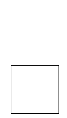
更細緻的字體比例控制:
上一篇<Text/>有提到allowFontScaling屬性可以讓字體隨著系統比例放大,而用PixelRatio,我們可以更精確地控制並調整字體的大小。
例如,透過PixelRatio獲取系統的字體縮放比例,接著再依此比例調整設計稿中所定義的基礎字體大小。
import React from 'react';
import { View, Text, PixelRatio, StyleSheet } from 'react-native';

export default function App() {
  // 獲取裝置的字體縮放比例
  const fontScale = PixelRatio.getFontScale();

  // 設計稿中的基礎字體大小
  const designFontSize = 20;

  // 根據字體縮放比例調整字體大小
  const adjustedFontSize = designFontSize * fontScale;

  return (
    <View style={styles.container}>
      <Text style={{ fontSize: adjustedFontSize }}>
        我是應用中的標題
      </Text>
      <Text style={styles.body}>
        以下是一些內容...
      </Text>
    </View>
  );
}

const styles = StyleSheet.create({
  container: {
    flex: 1,
    justifyContent: 'center',
    alignItems: 'center',
  },
  body: {
    marginTop: 20,
    fontSize: 16,
  },
});
除了用PixelRatio選取合適解析度圖片外,如果想要圖片自適應依照螢幕寬度調整比例,我們可以用React Native的Dimensions。透過Dimensions獲取螢幕的尺寸來動態的調整圖片大小。
例如:有一張寬440px、高330px的圖片,我們希望圖片寬100%,高度保持比例:
import React from 'react';
import { View, Image, StyleSheet, Dimensions } from 'react-native';

export default function App() {
  const screenWidth = Dimensions.get('window').width;
  const imageRatio = 440 / 330;  // 圖片的原始寬高比
  const imageHeight = screenWidth / imageRatio;

  return (
    <View style={styles.container}>
      <Image
        source={require('./src/Taipei_101_Mall_view_2019.jpg')}
        style={{ width: screenWidth, height: imageHeight }}
        resizeMode="contain"
      />
    </View>
  );
}

const styles = StyleSheet.create({
  container: {
    flex: 1,
    justifyContent: 'center',
    alignItems: 'center',
  }
});
在此範例中,我們首先用Dimensions獲取螢幕的寬度。接著,利用圖片的原始寬和高計算其高寬比,再根據這比例計算新的高度。這樣,不論裝置的尺寸如何,圖片都將保持原始的高寬比。

 iThome鐵人賽
 看影片追技術