在進行資料分析時,首要的任務之一是掌握資料的分布特徵與整體趨勢。密度圖(Density Plot)特別適合用於連續型資料,因為它將離散樣本點平滑化,形成連續曲線,幫助我們直觀地觀察集中區域、可能的多峰結構,以及偏態與長尾特徵。這能讓研究者快速判斷資料是否符合常態分布假設,或是否需要進一步轉換與調整。
相較之下,若資料屬於離散型(例如計數或類別變數),則密度圖並非最佳工具,長條圖(Histogram)或條形圖(Bar Chart)會更合適。這是因為離散資料的特性在於明確的分組或頻數,而不是連續變化的分布。
因此,在資料分析的初始階段,釐清變數屬性(連續或離散)並繪製合適的分布圖,是一個標準且必要的步驟。這不僅能幫助研究者快速理解資料結構,也能避免在方法選擇上產生誤導,進而提升後續統計推論與建模的可靠性。
當面對多群組(如不同音樂類型 genre)時,密度圖可以疊放或分面,迅速比較各群形狀差異;接著再用 ggdist::geom_dotsinterval() 把「具體點的存在感」與「分布/區間」加上,形成既直觀又資訊密度高的組合視覺。
library(ggplot2)
library(dplyr)
library(ggdist)
本文使用 spotify(欄位含 popularity、genre),以 popularity 為例展示由「整體 → 分群 → 精煉六大類」的視覺化流程。
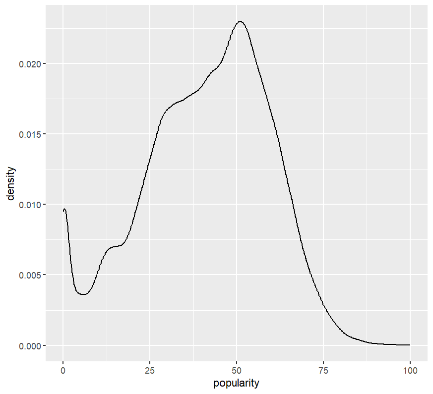
# Basic density
ggplot(spotify, aes(x = popularity)) +
  geom_density()
# Overlay by group
ggplot(spotify, aes(x = popularity, color = genre)) +
geom_density()
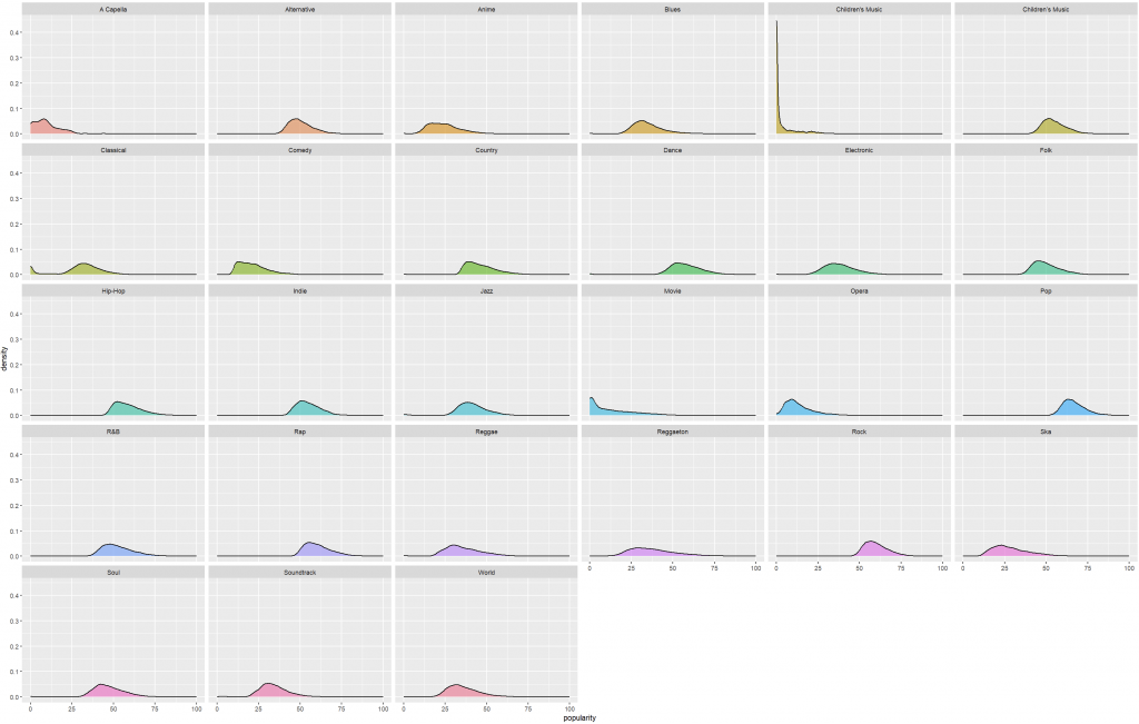
# Facet(避免重疊干擾)
ggplot(spotify, aes(x = popularity, fill = genre)) +
geom_density(alpha = 0.6) +
facet_wrap(~ genre) +
theme(legend.position = "")
目的:聚焦在 Q1–Q3(IQR) 內常見的受眾區段,避免極端值主導排序。
這邊需要注意:若你的分析目標是「整體熱門度」,不應用 IQR 篩;若是想看「常態受眾的典型分布」,IQR 切法是合理的。
q <- quantile(spotify$popularity, probs = c(0.25, 0.75), na.rm = TRUE)
top_genres <- spotify %>%
filter(popularity >= q[1], popularity <= q[2]) %>%
count(genre, sort = TRUE) %>%
slice_head(n = 6) %>%
pull(genre)
spotify_2 <- spotify %>% filter(genre %in% top_genres)
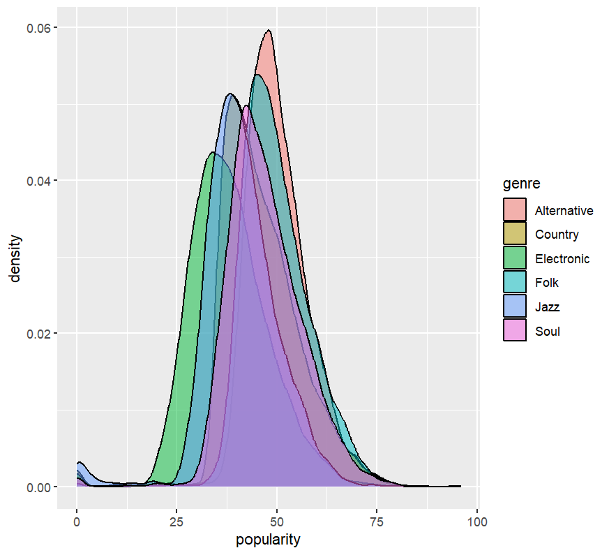
# 檢視六大類的疊放密度
ggplot(spotify_2, aes(x = popularity, fill = genre)) +
geom_density(alpha = 0.5)
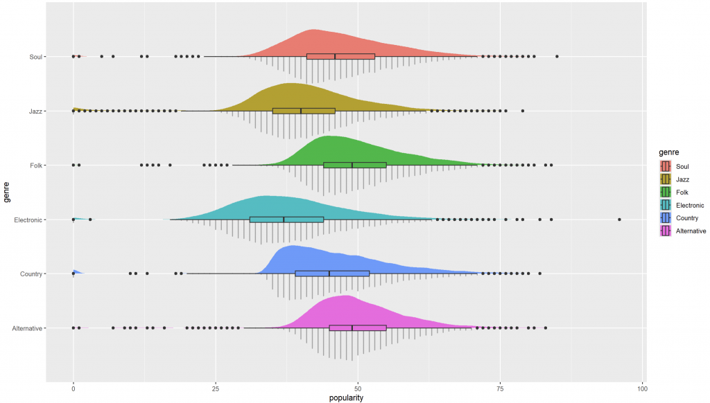
geom_dotsinterval() 呈現「點 + 分布」的細節geom_dotsinterval() 把樣本點堆成形狀(dots),並可搭配 slab(密度/機率體)與區間(如中位數±IQR)。
# 基本 dotsinterval(單群)
ggplot(spotify_2, aes(x = popularity)) +
  geom_dotsinterval()

# 分群到 y 軸
ggplot(spotify_2, aes(x = popularity, y = genre)) +
  geom_dotsinterval()
建立單一真相來源的順序向量,y 軸只反轉一次,legend 不反轉:
levels_top_down <- c("Soul","Jazz","Folk","Electronic","Country","Alternative")
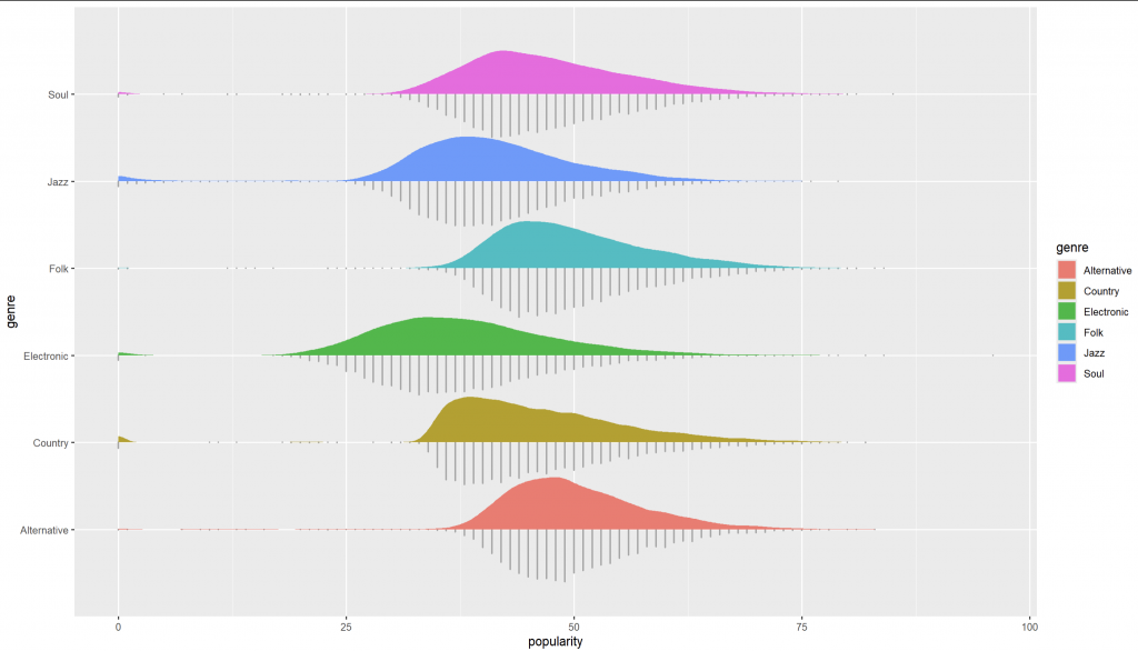
ggplot(spotify_2, aes(x = popularity, y = genre, fill = genre)) +
geom_dotsinterval(side = "bottom", scale = 0.6) +
stat_slab(scale = 0.6) +
scale_y_discrete(limits = rev(levels_top_down)) + # 只反 y 軸
scale_fill_discrete(limits = levels_top_down) # legend 不反
ggplot(spotify_2, aes(x = popularity, y = genre, fill = genre)) +
  geom_dotsinterval(side = "bottom", scale = 0.6) +
  stat_slab(scale = 0.6) +
  geom_boxplot(width = 0.1) +
  scale_y_discrete(limits = rev(levels_top_down)) +
  scale_fill_discrete(limits = levels_top_down)
如何觀察圖形:
geom_dotsinterval():把「樣本存在感」與「分布結構」融合;要讓 slab 依數值上色,用 slab_fill。levels_top_down 同步 legend 與 y 軸(只反轉 y)。This post demonstrates an EDA workflow for Spotify tracks using popularity as an example. We begin with density plots to understand overall and group-wise distributional shapes—location, skewness, tails, and potential multimodality—without being biased by binning. To focus on typical listeners, we optionally select the interquartile range (Q1–Q3) and identify the six most frequent genres; this IQR filter is reasonable for “typical audience” analyses but should be avoided if the goal is overall popularity. We then enrich the visualization using ggdist::geom_dotsinterval() to combine dot stacks (showing actual observations) with slabs (smoothed densities) and boxplots (summary statistics). We clarify a common pitfall: to color the slab by a continuous variable or a threshold, map to slab_fill = after_stat(...) rather than fill. For consistent ordering between the y-axis and legend, define a single source of truth for factor levels and reverse only the y-axis. Finally, we highlight ggplot2 4.0.0 theme features to centralize discrete palette settings via the theme, ensuring consistent styling across multiple plots.

