在資料探索與視覺化的過程中,常常需要進一步「凸顯特定的資料」。這種凸顯不僅在資料分析時能幫助我們快速找到重點,當要展示給其他人看時,更能讓觀眾一眼捕捉到我們想強調的資訊。
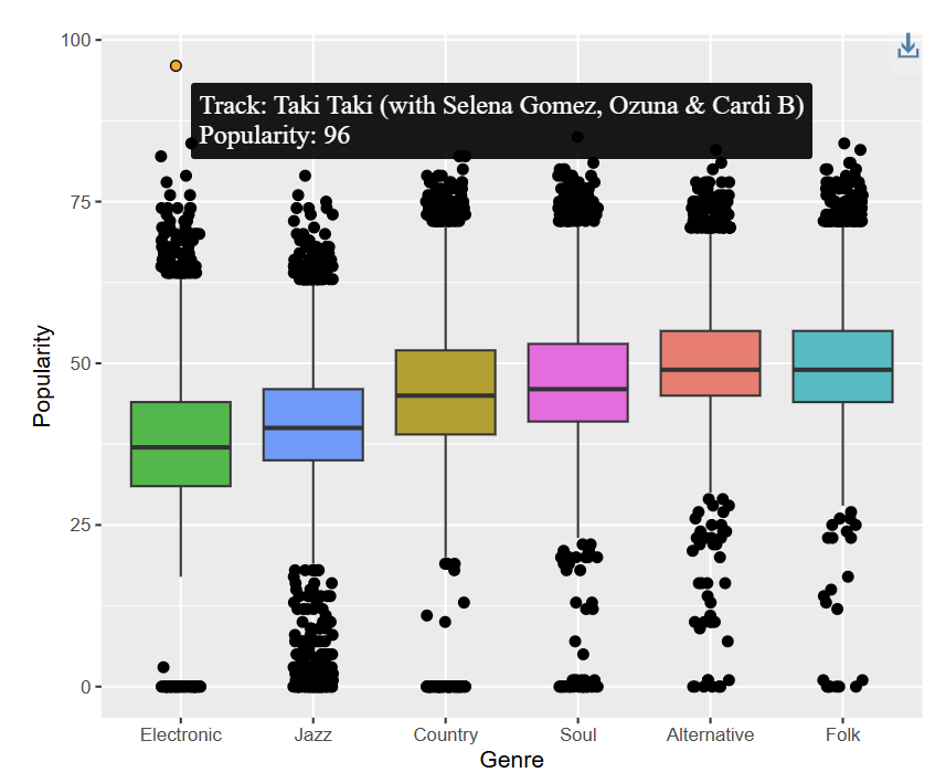
在這篇文章中,我將分享兩個 R 的套件:gghighlight 與 ggiraph,它們分別能幫助我們在靜態與互動式圖形中達成資料凸顯的效果,上圖就是透過 ggiraph 讓我們可以觀察那些曲目屬於該類型音樂中,在受歡迎程度的離散值可以互動,點擊該位置可以知道對應的曲目。
首先,我們可以透過 gghighlight 來選出特定條件的資料。以下範例是觀察 danceability 與 popularity 的關係,並將 danceability > 0.7 的歌曲(適合配合跳舞曲目)凸顯出來。
ggplot(spotify_2,
       aes(x = danceability,
           y = popularity,
           color = genre)) +
  geom_point() +
  gghighlight(danceability >0.7, calculate_per_facet = TRUE) +
  facet_wrap(~ genre)
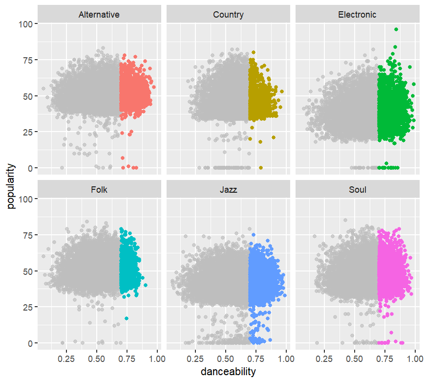
這樣的圖能讓我們在不同的 genre 中,一眼就看到「哪些歌舞感特別強」並與受歡迎程度之間的分布。
然而,靜態圖只能看到資料的大致樣貌,如果我們想在滑鼠移動到某個點時,馬上知道它是哪一首歌,就可以結合 ggiraph 的 geom_point_interactive()。
以下範例改成探索 valence 與 popularity,並凸顯 valence > 0.67 的歌曲,再透過互動點顯示歌曲名稱:
Inter_p2 <- ggplot(spotify_2,
         aes(x = valence,
             y = popularity,
             color = genre)) +
  geom_point() +
  gghighlight(valence >0.67, calculate_per_facet = TRUE) +
  facet_wrap(~ genre) +
  geom_point_interactive(aes(tooltip = track_name_clean,
                             data_id = track_name_clean),
                         size = 3)

# Draw interactive plot
girafe(ggobj = Inter_p2)
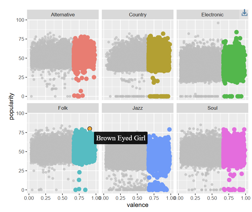
執行後,當我們將滑鼠移動到凸顯的點上時,就能即時看到歌曲名稱。這對於音樂資料的探索來說非常實用,因為我們常常需要快速確認是哪一首歌偏離常態。
最後,如果希望把互動圖形分享給其他人,可以透過 saveWidget() 直接輸出成 HTML 檔案。
saveWidget(girafe(ggobj = Inter_p3,
                  width_svg = 5,
                  height_svg = 3),
           paste0(gg_path, "Inter_p3.html"))

這樣產生的 HTML 檔可以直接在瀏覽器開啟,也能分享給團隊或嵌入到簡報裡。
凸顯資料,是從「單純繪圖」走向「精準傳遞資訊」的重要一步。
在日常的數據分析中,凸顯特定資料不只是「好看」,而是能直接影響決策與行動。以 Spotify 為例,假設我們在一個龐大的音樂資料庫中,快速凸顯出「高 danceability 且高 popularity」的歌曲,那麼這些歌極可能就是舞曲清單的核心候選;反之,如果一首歌的 valence 與 energy 都很高,但 popularity 卻異常低落,這可能代表這首歌沒有被足夠行銷推廣,卻潛在具有爆紅的條件。
換個角度,對於音樂行銷團隊而言,這種凸顯技巧就像是 雷達系統:
找到「應該紅卻還沒紅」的潛力歌單。
鎖定「極端離群」的歌曲,分析為什麼在 genre 中特別突出(例如一首小眾曲風卻爆紅)。
協助推薦系統將「凸顯條件」轉化成個人化的推薦依據。
gghighlight 幫助我們在靜態圖中快速標出特定條件的點。
ggiraph 則進一步提供互動性,讓我們在資料探索與報告展示中能更直觀地理解每個數值背後的意義。
對於像 Spotify 這樣包含多個音樂特徵與受歡迎程度的資料集,這些技巧不僅讓我們能快速辨識「哪些歌曲特別突出」,也讓分享成果時更具說服力。
Highlighting specific data points is an essential step in moving from visualization to insight. In this article, we demonstrate how to emphasize notable records in music datasets using the R packages gghighlight and ggiraph. With gghighlight, we can easily mark subsets of data—such as songs with high danceability or valence—within static plots, allowing patterns to stand out across different genres. By extending this approach with ggiraph, we add interactivity: hovering over points reveals details such as track names, helping analysts quickly identify exceptional songs. Finally, we show how interactive outputs can be exported to HTML for sharing or embedding. These techniques are not only useful for exploratory data analysis but also provide strong communication value in presentations, enabling audiences to focus on the most relevant details. Beyond music analytics, the ability to highlight data has broad applications in fields such as clinical research, e-commerce, and marketing, where detecting outliers or hidden opportunities can guide strategic decisions.


 iThome鐵人賽