在ggplot2 中, aes 的option 本身有label 這個option 可以選擇. 但是, 可能會因為標籤之間的距離太接近的關係, 而有重疊不美觀的狀況, 今天將介紹ggrepel()這個套件, 並改善標籤在圖上重疊的問題. 今天範例的目標是: 在一張散點圖上,同時看見三位熱門藝術家的「前 10 首熱門歌」在 受歡迎程度 (popularity) 與 可舞性 (danceability) 的分布,並且讓標籤清楚可讀。
先抓整體 popularity 的 第 1 四分位數 (Q1) 到 第 3 四分位數 (Q3) 的「中段」歌曲。
這樣做可以避開極端熱門或極不熱門曲目,讓不同類型或藝術家的差異不會被兩端的極端值蓋過。
在中段範圍中,挑出出現數量最多的前三位藝術家,作為代表樣本。
對每位代表藝術家,再依 popularity 各取前 10 首歌,作為我們要標示在圖上的焦點曲目。
這個流程的核心,是先「控制資料的複雜度與極端值」,再把注意力放在「同一比較尺標下的代表人物」。在展示或討論時,這種分層過濾能讓讀者更快抓到重點。
q <- quantile(spotify$popularity, probs = c(0.25, 0.75), na.rm = TRUE)

top_artist_name <- spotify %>%
  filter(popularity >= q[1], popularity <= q[2]) %>%
  count(artist_name, sort = TRUE) %>%
  slice_head(n = 3) %>%
  pull(artist_name)

spotify_4 <- spotify %>%
  filter(artist_name %in% top_artist_name)

top10_tracks <- spotify_4 %>%
  drop_na(popularity) %>%
  group_by(artist_name) %>%
  slice_max(order_by = popularity, n = 10, with_ties = FALSE) %>%
  arrange(artist_name, desc(popularity), .by_group = TRUE) %>%
  ungroup()
with_ties = FALSE 可保證每位藝術家最多10 首;若希望同分也全納入,可改 TRUE(但每組會超過 10)。
若資料中同一首歌有多版本,想去重可在 group_by() 後加上:
top10_tracks <- top10_tracks %>% distinct(artist_name, track_name, .keep_all = TRUE)
ggplot(data = top10_tracks,
aes(x = popularity,
y = danceability,
label = track_name)) +
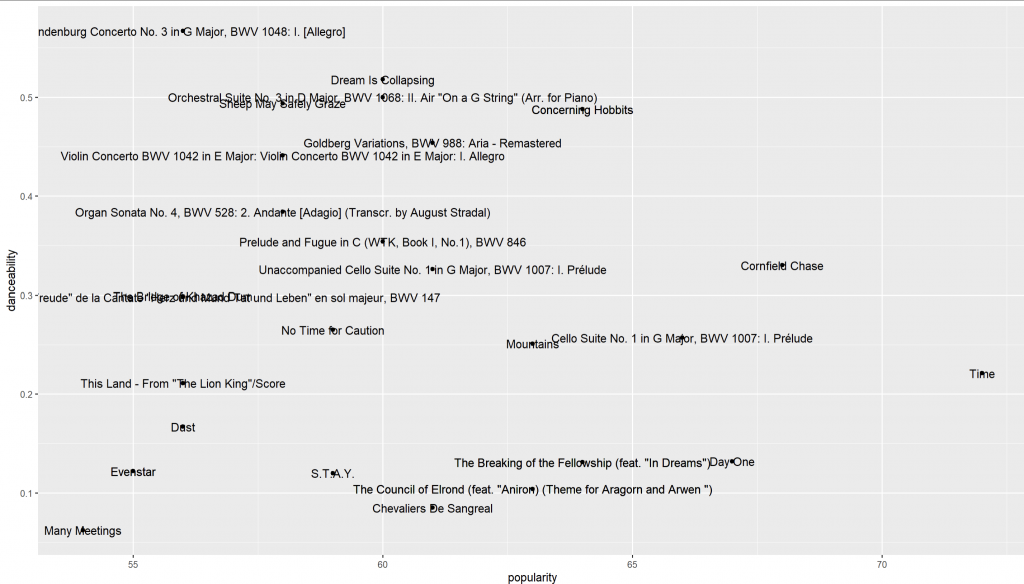
geom_point() +
geom_text()
geom_text_repel() 自動閃避ggplot(data = top10_tracks,
aes(x = popularity,
y = danceability,
label = artist_name)) +
geom_point() +
geom_text_repel(box.padding = 0.5)
geom_text_repel() 會在不改變資料點位置的前提下,自動幫文字找不重疊的位置。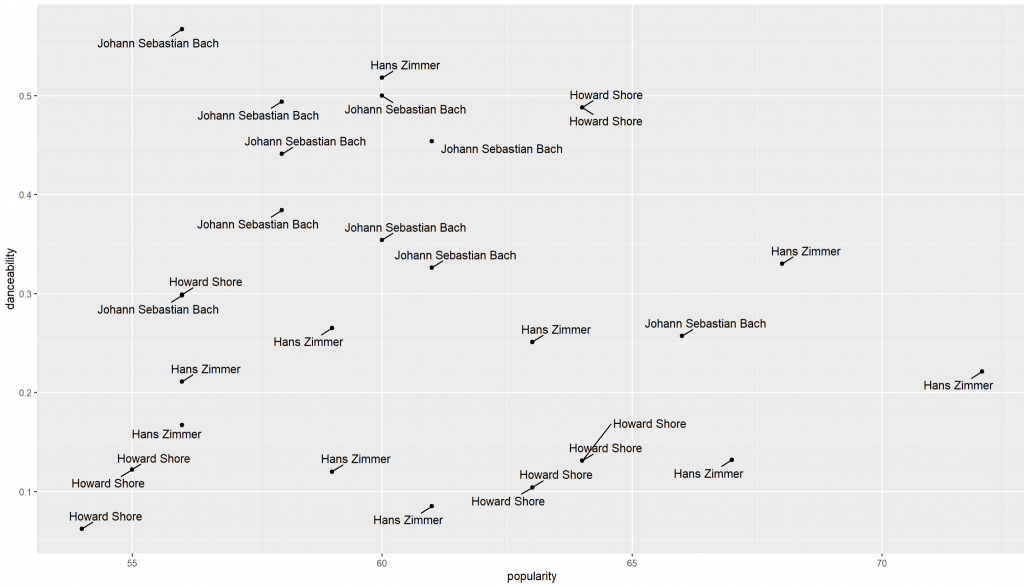
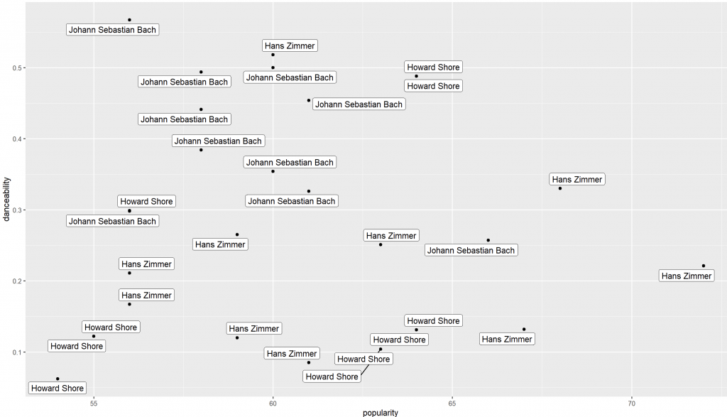
geom_label_repel() 加底框,閱讀更穩ggplot(data = top10_tracks,
aes(x = popularity,
y = danceability,
label = artist_name)) +
geom_point() +
geom_label_repel()
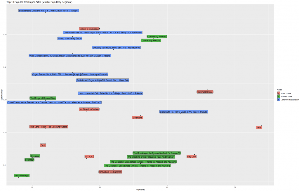
artist_name 區分;track_name(歌曲);ggplot(data = top10_tracks,
aes(x = popularity,
y = danceability,
fill = artist_name,
label = track_name)) +
geom_point() +
geom_label_repel(max.overlaps = Inf,
size = 4,
box.padding = 0.1) +
labs(x = "Popularity",
y = "Danceability",
fill = "Artist",
title = "Top 10 Popular Tracks per Artist (Middle-Popularity Segment)")
小技巧:
如果仍覺得太擠,可以只標 每位藝術家前 3 首,其餘只保留點:
top3_labeled <- top10_tracks %>% group_by(artist_name) %>% slice_head(n = 3)然後
geom_point(data = top10_tracks)+geom_label_repel(data = top3_labeled, ...)。或使用
ggrepel::min.segment.length = 0讓連線更短、更靈活。
同一藝術家的 10 首熱門歌,是否都適合跳舞?
例如 Hans Zimmer 的配樂多半 danceability 偏低,但也可能有個別曲目(如較節奏感強的動作場景配樂)拉高。
Popularity觀察,前 10 首是否都集中在 80+?若是,代表該藝術家熱門曲目尾端也很強。
斜率意象:若某藝術家點雲呈現「越熱門越可舞」的趨勢,可能指向市場偏好與音樂設計的互動關係。
geom_text_repel()、什麼時候用 geom_label_repel()?geom_text_repel()
geom_label_repel() 有底色框較醒目top3_labeled 技巧)ggrepel 能大幅提升標籤可讀性,但請留意資訊節制(別把整張圖變成「文字海」);This article demonstrates how to use the ggrepel package to solve overlapping label issues in scatter plots. Using Spotify data, the analysis focuses on tracks within the middle quartile of popularity, selecting the top three artists with the most songs and extracting their ten most popular tracks. Different labeling methods are compared: the default geom_text() often results in clutter, while geom_text_repel() automatically adjusts positions to prevent overlap, and geom_label_repel() adds background boxes for better readability. The refined version highlights track names with artist-based coloring and adjusted parameters. Overall, ggrepel enhances clarity and allows effective visualization without overwhelming the audience.


 iThome鐵人賽