
昨天我們從 CSV 匯入一路玩到資料清理、篩選與統計分析,
終於來到最後一天啦!!
說實話,這 30 天的挑戰真的不簡單。
從變數、迴圈、函式、Numpy 一路學到資料分析!謝謝你我的堅持!
今天要帶你進入資料分析最迷人的部分——視覺化 (Data Visualization)。
畢竟,數字再多、表格再完整,都比不上「一張圖」來得一目了然。
我們會從最基本的 df.plot() 開始,
到進階的 seaborn 圖表實作,一步步帶你實作!
讓你不只看懂資料,還能讓資料自己開口說話
這篇也會是我們的完賽篇喔~
df.plot() 開始昨天整理、清理資料已經完成,現在就是把資料「畫」出來的時候了!
Pandas 本身就整合了繪圖功能,一行 .plot() 就能將資料變成圖表。
它是建立在 Matplotlib 上的,
幾乎能畫出所有常見圖表:折線圖、長條圖、直方圖、箱形圖、餅圖、散點圖…
透過 kind 參數,可以切換不同圖表類型:
| 圖表類型 | kind 參數值 | 說明 |
|---|---|---|
| 折線圖 | 'line' |
預設值,適合連續數據 |
| 長條圖 | 'bar' |
顯示各分類的比較 |
| 橫條圖 | 'barh' |
長條圖的橫向版本 |
| 直方圖 | 'hist' |
顯示數據分布情形 |
| 盒狀圖 | 'box' |
顯示數據離群值與四分位數 |
| 核密度圖 | 'kde' 或 'density' |
類似平滑版直方圖 |
| 區域圖 | 'area' |
顯示隨時間變化的累積量 |
| 餅圖 | 'pie' |
顯示比例關係 |
| 散點圖 | 'scatter' |
顯示兩個變數之間的關係 |
| 六角圖 | 'hexbin' |
類似散點圖,但適合大量資料點 |
續昨天的csv檔案,
假設我們要用製造商的欄位去畫長條圖:
data['Manufacturer'].value_counts().plot(kind='bar')
輸出: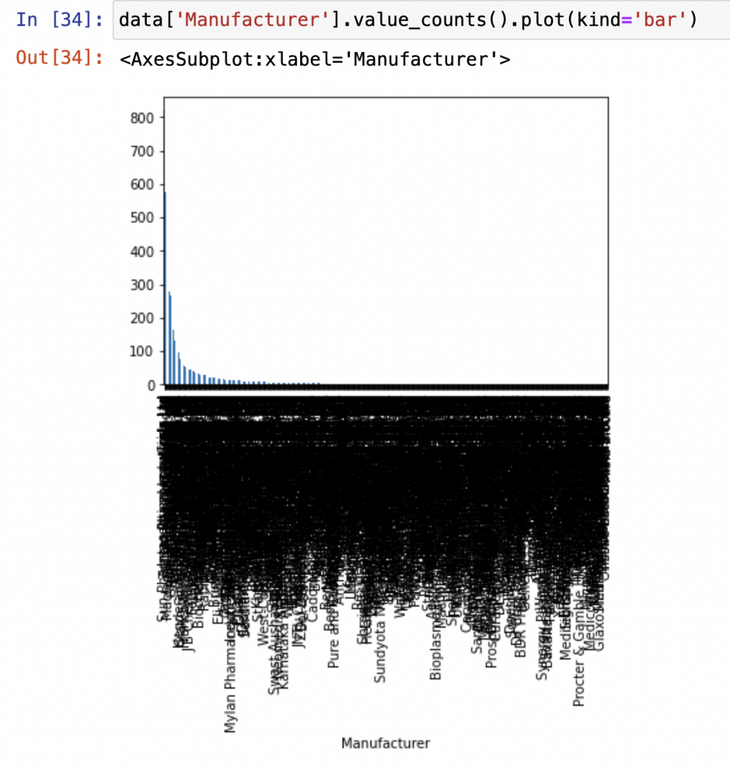
或是畫圓餅圖:
data['Manufacturer'].value_counts().plot(kind='pie')
輸出: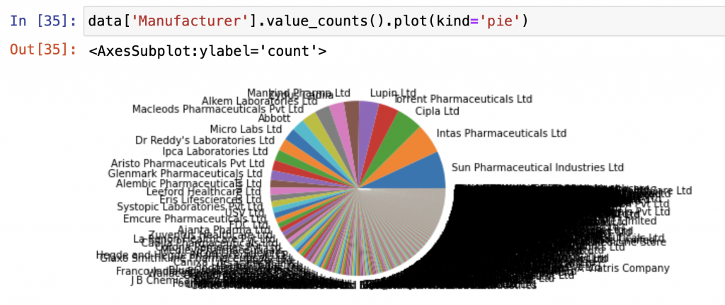
你會發現圖表整個「密密麻麻」!!!!!!!
幾乎每個廠商都擠在一起、標籤重疊到看不清楚。
這就是資料分析常見的新手陷阱之一!
當你的資料筆數很多、分類又太多時,直接畫整張圖反而會「失焦」——
資訊太多,反而什麼都看不見!
重點是要聚焦重點!
我們通常只會取前幾名或特定條件的資料來視覺化,
像是這樣:
data['Manufacturer'].value_counts().head(10).plot(kind='pie')
輸出: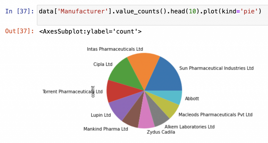
這樣一來,圖表就會乾淨清楚,
也更容易看出誰是最主要的製造商或市場佔比。
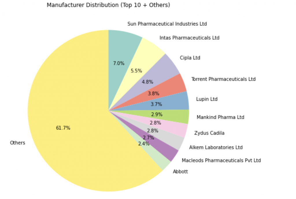
或是換一種方式:
只取 前 10 名製造商,剩下的歸類成 "Others":
import matplotlib.pyplot as plt

# 取前 10 名製造商
top10_manufacturers = data['Manufacturer'].value_counts().nlargest(10)

# 其餘製造商數量合併成 "Others"
others = data['Manufacturer'].value_counts().iloc[10:].sum()
top10_manufacturers["Others"] = others

# 畫圓餅圖
plt.figure(figsize=(8,8))
top10_manufacturers.plot.pie(
    autopct='%1.1f%%',
    startangle=90,
    counterclock=False,
    colormap='Set3'
)
plt.ylabel("")
plt.title("Manufacturer Distribution (Top 10 + Others)")
plt.show()
輸出:
輸出:
好啦~剛剛我們已經用 df.plot() 畫出了最基本的圖表。
但如果你覺得那種圖「有點樸素」,
想要顏色更漂亮、排版更精緻、細節更好控制——
那你一定要認識 Seaborn!
這個套件就像是 Matplotlib 的「高級外掛」,
能用更簡潔的語法畫出專業等級的統計圖。
如果你還沒安裝過 seaborn,可以先在終端機執行:
pip install seaborn
接著在程式中匯入模組:
import pandas as pd
import seaborn as sns
import matplotlib.pyplot as plt
接下來,我會選出幾個適合分析的重點來練習:
我們先來看看哪 10 種副作用最常出現。
這裡會用到我們昨天學過的 value_counts(),
搭配 Seaborn 畫出長條圖!
import seaborn as sns
import matplotlib.pyplot as plt

# 統計最常見的副作用
plt.figure(figsize=(10, 5))
side_effects = data['Side_effects'].str.split(', ')
all_side_effects = [effect for effects in side_effects for effect in effects]
side_effect_counts = pd.Series(all_side_effects).value_counts().head(10)

# 畫長條圖
sns.barplot(
    x=side_effect_counts.values,
    y=side_effect_counts.index,
    palette='viridis'
)
plt.title('Top 10 Most Common Side Effects', fontsize=14)
plt.xlabel('Count')
plt.ylabel('Side Effect')
plt.xticks(rotation=45)
plt.show()
輸出: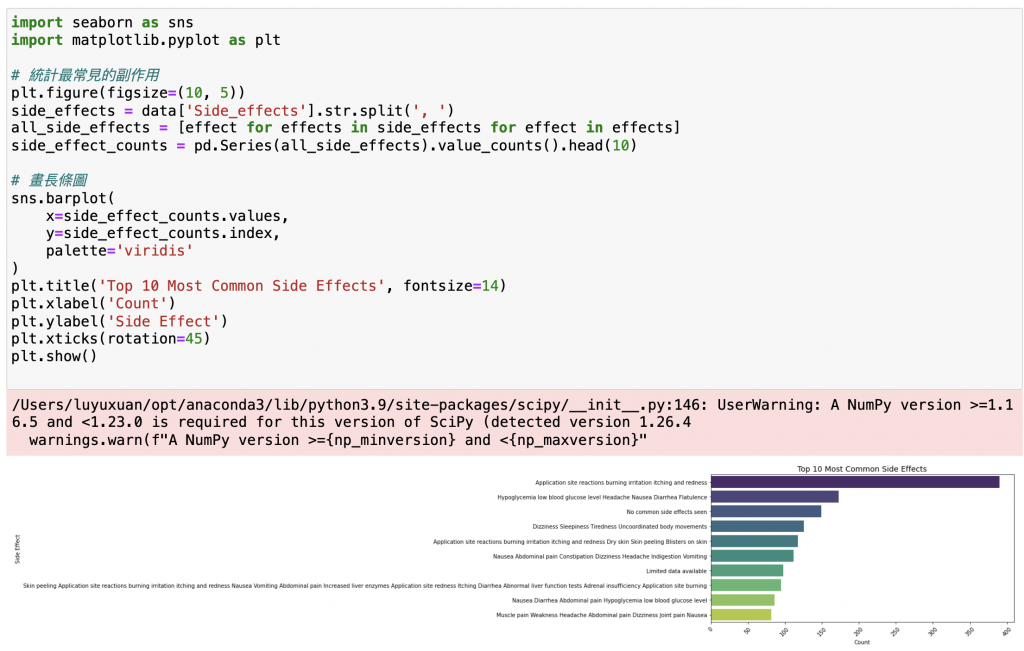
說明:
str.split(', '):把多個副作用拆開成清單。value_counts():統計每個副作用出現次數。sns.barplot():繪製水平長條圖。palette='viridis':設定配色(Seaborn 內建主題色之一,可以去網站上查不同配色喔!)。接下來,
我們想同時比較「好評 / 普通 / 差評」的前 10 名藥品。
這就要用到 Seaborn 的多圖組合功能。
# 取出 Top 10 資料
top_excellent_reviews = data.nlargest(10, 'Excellent Review %')[['Medicine Name', 'Excellent Review %']]
top_average_reviews   = data.nlargest(10, 'Average Review %')[['Medicine Name', 'Average Review %']]
top_poor_reviews      = data.nlargest(10, 'Poor Review %')[['Medicine Name', 'Poor Review %']]

# 建立三張子圖
fig, axes = plt.subplots(1, 3, figsize=(24, 10))

# Excellent Reviews
sns.barplot(
    x='Excellent Review %',
    y='Medicine Name',
    data=top_excellent_reviews,
    palette='crest',
    ax=axes[0]
)
axes[0].set_title('Top 10 Medicines with Highest Excellent Reviews', fontsize=14)
axes[0].set_xlabel('Excellent Review %')
axes[0].set_ylabel('Medicine Name')

# Average Reviews
sns.barplot(
    x='Average Review %',
    y='Medicine Name',
    data=top_average_reviews,
    palette='mako',
    ax=axes[1]
)
axes[1].set_title('Top 10 Medicines with Highest Average Reviews', fontsize=14)
axes[1].set_xlabel('Average Review %')
axes[1].set_ylabel('')

# Poor Reviews
sns.barplot(
    x='Poor Review %',
    y='Medicine Name',
    data=top_poor_reviews,
    palette='rocket',
    ax=axes[2]
)
axes[2].set_title('Top 10 Medicines with Highest Poor Reviews', fontsize=14)
axes[2].set_xlabel('Poor Review %')
axes[2].set_ylabel('')

plt.tight_layout()
plt.show()
輸出: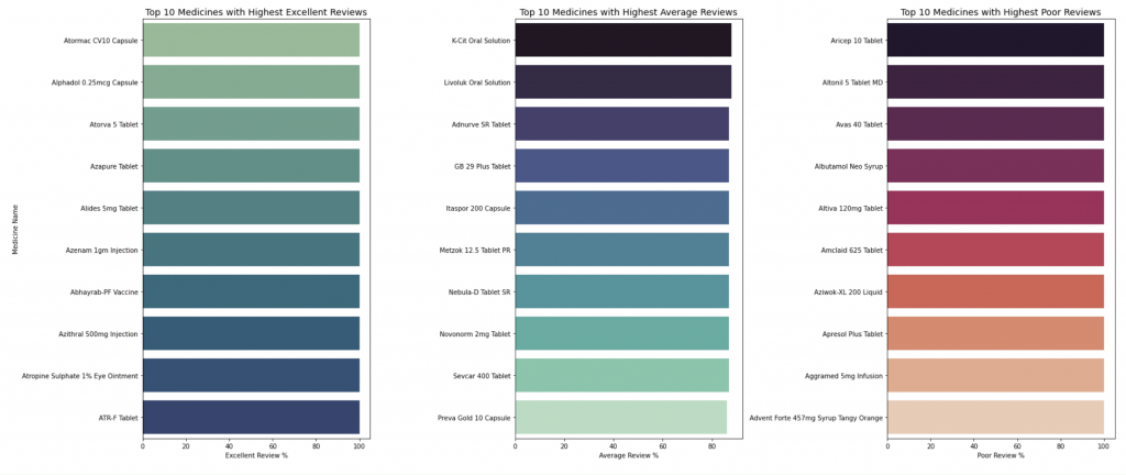
# 篩選 Excellent Review % > 95 的藥品
excellent_pills = data[data['Excellent Review %'] > 95]

# 統計各製造商出現次數(也就是哪幾間公司最常生產高好評藥品)
excellent_manufacturer_counts = excellent_pills['Manufacturer'].value_counts().head(10)

# 畫長條圖
plt.figure(figsize=(12,6))
sns.barplot(
    x=excellent_manufacturer_counts.values,
    y=excellent_manufacturer_counts.index,
    palette='crest'
)
plt.title('Top 10 Manufacturers with Most Highly Rated Medicines (>95% Excellent Review)', fontsize=14)
plt.xlabel('Number of Highly Rated Medicines')
plt.ylabel('Manufacturer')
plt.show()
輸出: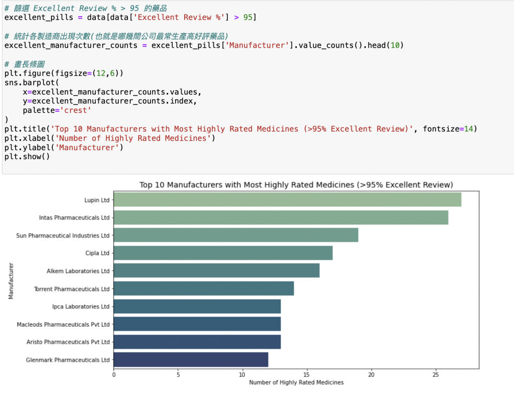
# Top 10 most common compositions
top_compositions = data['Composition'].value_counts().head(10)

plt.figure(figsize=(12, 7))
sns.barplot(y=top_compositions.index, x=top_compositions.values, palette="magma")
plt.title('Top 10 Most Common Compositions')
plt.xlabel('Number of Medicines')
plt.ylabel('Composition')
plt.show()
輸出: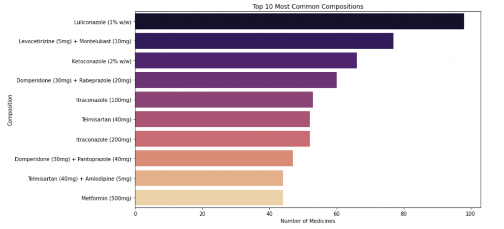
可以看出
# Top 10 manufacturers by number of medicines
top_manufacturers = data['Manufacturer'].value_counts().head(10)

plt.figure(figsize=(12, 7))
sns.barplot(y=top_manufacturers.index, x=top_manufacturers.values, palette="viridis")
plt.title('Top 10 Manufacturers by Number of Medicines')
plt.xlabel('Number of Medicines')
plt.ylabel('Manufacturer')
plt.show()
輸出: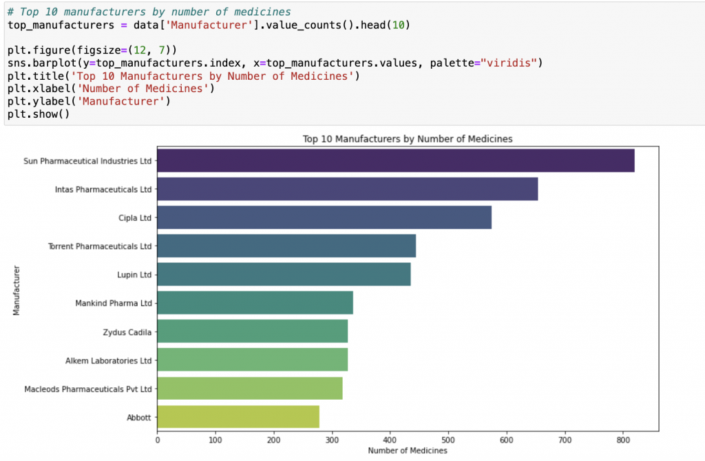
終於!!!我完賽了!!!
回想這三十天,真的像是在和自己賽跑,
每天都戰戰兢兢,充滿挑戰,但更多的是成就感與喜悅。
開賽前,我就已經預先存了大約十二天的文章草稿,
但每天在發文前我都會不停修修改改,
覺得哪裡可以再補充、練習題還不夠、概念解釋得不夠完整……
每篇文章我大約都花了五到六個小時才完成。
有時候,甚至睡前會突然忘記今天有沒有發文,
立刻跳起來打開電腦確認日期……這種緊張又專注的感覺,其實也蠻奇妙的!!
(附上我的Notion,我都是先在Notion打好草稿再貼到IThome)
真的很感謝每一位點進來的讀者!!
雖然這個主題上網已經有許多大神文章,但對我來說,
參加鐵人賽不是為了比誰厲害,
而是為了實現對自己的承諾——
「如果自己有能力,就去幫助需要幫助的人。」
這三十天,我不只是在寫程式文章,
更是在練習如何用清楚、生活化的方式把抽象概念傳達給別人。
若讀者能因為我而理解、甚至願意動手練習,
對我而言,比任何掌聲都還令人滿足!
完成這個鐵人賽,我想對自己說:
謝謝你沒有放棄,謝謝你堅持每天打開電腦打上萬字,
即使累到眼睛快睜不開!
也想對每位讀者說:希望這三十天的文章,
能給你一點信心、一點勇氣、一點靈感,
讓你在程式的世界裡少迷路、成就感多一些!!
這三十天雖然辛苦,但每一分努力都值得,
因為我做到了——完成了對自己的承諾,
也把這份承諾傳遞給你!
完賽了!心裡滿滿感恩,也期待下一個挑戰的到來!!
我是Sharon,下台一鞠躬~

 iThome鐵人賽