
今天的封面主角是 HTML5,我看 HTML5 的 LOGO 形象,很像一個盾牌的形狀,中間寫一個數字 5,所以我就把它畫成超人的形象了! ─=≡Σ((( つ•̀ω•́)つ
今天不廢話了,直接回到主題!Box-sizing 跟 Overflow! ─=≡Σ((( つ•̀ω•́)つ
了解盒模型的四個基本組成「內容、內部間距、邊框、外部間距」後,在設定元素的長寬尺寸時,你會發現某些屬性實際上會佔據額外空間。這會導致尺寸計算變得麻煩,因此我們可以使用 box-sizing 屬性來更改元素的尺寸計算方式。
box-sizing: content-box;(預設值)
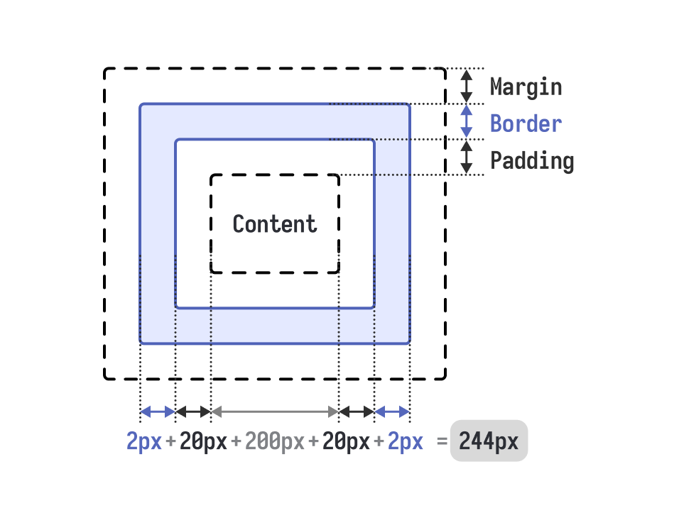
預設情況下,設定 width 和 height 只會計算「內容區域」,「內部間距、邊框、外部間距」則不列入尺寸的計算,這會使邊框與內部間距增加元素的實際總尺寸:
.content-box {
    box-sizing: content-box;  /* 預設值 */
    width: 200px;
    padding: 20px;
    border: 2px solid #333;
    /* 實際總寬度 = 200px + 40px(padding) + 4px(border) = 244px */
}
box-sizing: border-box; (建議設定)
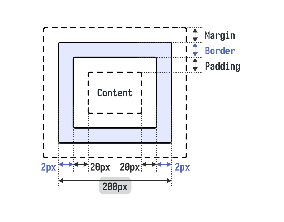
設定後,width 和 height 的計算會包含「內容區域+內部間距+邊框」,而「外部間距」仍不列入計算。這使元素尺寸的計算變得更直觀方便:
.border-box {
    box-sizing: border-box;
    width: 200px;
    padding: 20px;
    border: 2px solid #333;
    /* 總寬度就是 200px,內容區域會自動調整為 156px */
}
實際使用上,通常會直接設定全域為 border-box,讓尺寸計算更直觀!
* {
    box-sizing: border-box;
}
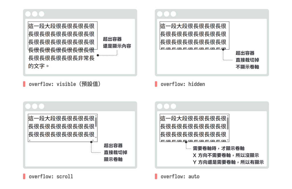
當元素設定 width、height 和 padding 後,若元素內容超出外容器的大小,內容會「溢出」容器邊界。此時,我們可以選擇「裁切」溢出內容或使用「捲軸」來處理超出的部分。舉例來說,當一個設定了固定寬高的容器中,放入過多文字或圖片時,內容就會超出容器中。
<div class="container">
  這一段大段很長很長很長很長很長很長很長很長很長很長很長很長很長很長很長很長很長很長很長很長很長很長很長很長很長很長非常長的文字。
</div>
.container {
  width: 200px;
  height: 80px;
  border: 1px solid #333;
}

遇到這種情況,CSS 提供 overflow 屬性來控制內容溢出的處理方式。
overflow: visible(預設值)
內容會完全顯示,即使超出容器邊界也不會被裁切。
.container {
  /* 溢出的內容會顯示在容器外面 */
  overflow: visible;
}
overflow: hidden
隱藏所有溢出容器邊界的內容。
.container {
  /* 溢出的內容會被完全隱藏 */
  overflow: hidden;
}
overflow: scroll
無論內容是否溢出,都會顯示捲軸。
.container {
  /* 總是顯示水平和垂直捲軸 */
  overflow: scroll;
}
overflow: auto
只有當內容溢出時才顯示捲軸,這是最常用的設定。
.container {
  /* 需要時才顯示捲軸 */
  overflow: auto;
}
可以使用 overflow-x 和 overflow-y 分別控制水平和垂直方向的溢出處理:
.container {
  width: 200px;
  height: 80px;
  overflow-x: hidden;  /* 水平方向隱藏溢出內容 */
  overflow-y: auto;    /* 垂直方向需要時顯示捲軸 */
}

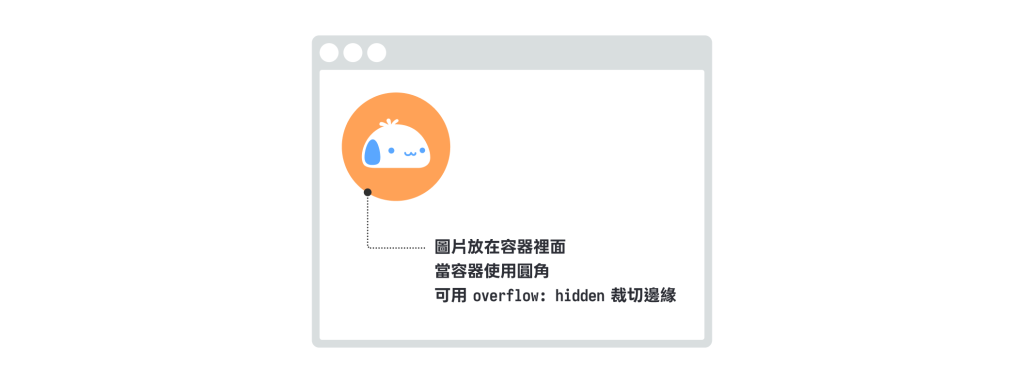
圖片裁切效果:使用 overflow: hidden 搭配圓角,可以製作圓形圖片的裁切效果。
<div class="image-crop">
  <img src="https://picsum.photos/300/500">
</div>
.image-crop {
  width: 200px;
  height: 200px;
  overflow: hidden;
  border-radius: 50%;   /* 搭配圓角製作圓形頭像 */
  img {
    width: 100%;
    height: 100%;
    object-fit: cover;  /* 圖片填滿容器,且不會變形 */
  }
}
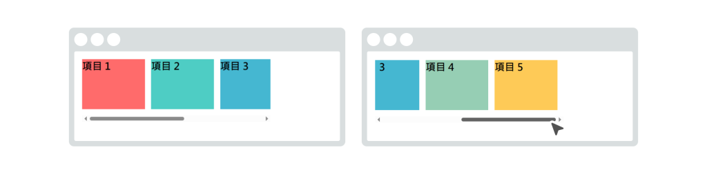
水平捲動清單:製作水平捲動的內容清單。
<div class="horizontal-scroll">
    <div class="item" style="background-color: #ff6b6b;">項目 1</div>
    <div class="item" style="background-color: #4ecdc4;">項目 2</div>
    <div class="item" style="background-color: #45b7d1;">項目 3</div>
    <div class="item" style="background-color: #96ceb4;">項目 4</div>
    <div class="item" style="background-color: #feca57;">項目 5</div>
</div>
.horizontal-scroll {
  width: 300px;
  height: 100px;
  overflow-x: auto;
  overflow-y: hidden;
  white-space: nowrap;  /* 防止內容換行 */
}
.horizontal-scroll .item {
  display: inline-block;
  width: 100px;
  height: 80px;
  margin-right: 10px;
}
本章探討了盒模型的基礎概念,包括內容區域、內部間距、邊框和外部間距四個組成部分。其中,關於元素的間距設定在網頁排版中被廣泛使用,將這兩種間距的特性,總結成表格:

除了以上間距外,你現在能夠:
box-sizing 屬性來控制元素尺寸的計算方式overflow 相關屬性處理內容溢出的情況掌握這些技巧後,你能夠更精確地控制網頁元素的佈局和排版,建立結構清晰且視覺美觀的網頁設計。 ─=≡Σ((( つ•̀ω•́)つ




 iThome鐵人賽
 看影片追技術