
在昨天順利完成色卡的大圖展開與圖片下載後,核心功能(採集光珠、月度色卡、時光相簿)已全部完成。然而目前的網頁一開啟就直接顯示微光瓶,缺乏了情境帶入感與操作引導。
今天的目標是為《微光採集瓶》打造首頁導覽:
為了營造安靜、沉穩的氛圍,我們在專案根目錄的 index.html 的 <head> 中引入 Google Fonts(思源宋體與 EB Garamond 襯線字體):
<link rel="preconnect" href="https://fonts.googleapis.com">
<link href="https://fonts.googleapis.com/css2?family=Noto+Serif+TC:wght@300;400;600;700&family=EB+Garamond:ital@0;1&family=Noto+Sans+TC:wght@400;500&display=swap" rel="stylesheet">
打開 src/components/GemJar.vue,在 <script setup> 宣告控制首頁與主畫面切換的響應式狀態:
// 控制是否停留在首頁導覽(預設開啟)
const showLanding = ref(true)
當 showLanding 為 true 時展示導覽首頁;點擊按鈕設為 false 後,即可進入原本的微光瓶主畫面。
<template> 建立首頁結構在主容器的最上方加入 landing-page 區塊,並使用 v-if="showLanding" 與 v-else 將首頁與收集主體隔開:
<template>
  <div class="page-wrap">

    <!-- ============ 首頁  ============ -->
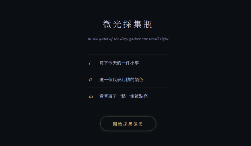
    <div v-if="showLanding" class="landing-page">
      <h1 class="landing-title">微光採集瓶</h1>
      <p class="landing-quote">in the quiet end of the day, gather one small light</p>

      <!-- 三步核心操作引導 -->
      <div class="landing-steps">
        <div class="landing-step">
          <span class="step-num">i</span>
          <p>寫下今天的一件小事</p>
        </div>
        <div class="landing-step">
          <span class="step-num">ii</span>
          <p>選一個代表心情的顏色</p>
        </div>
        <div class="landing-step">
          <span class="step-num">iii</span>
          <p>看著瓶子一點一滴被點亮</p>
        </div>
      </div>

      <!-- 進入按鈕 -->
      <button class="btn-enter" @click="showLanding = false">開始採集微光</button>
    </div>

    <!-- ============ 瓶子收集畫面 ============ -->
    <template v-else>
      <!-- 瓶身、調色盤、相簿彈窗等主要功能維持原樣 ... -->
    </template>

  </div>
</template>
在 <style scoped> 尾部加入首頁的 CSS 樣式:
/* ---------------------------------
   首頁樣式
--------------------------------- */
.landing-page {
  display: flex;
  flex-direction: column;
  align-items: center;
  text-align: center;
  padding: 36px 8px 10px;
  animation: driftIn 0.9s ease;
}

.page-wrap {
  max-width: 480px;
  margin: 0 auto;
  display: flex;
  flex-direction: column;
  align-items: center;
  text-align: center;
  width: 100%;
  min-height: 100vh;
  padding: 20px 16px;
  box-sizing: border-box;
}

@keyframes driftIn {
  from {
    opacity: 0;
    transform: translateY(10px);
  }
  to {
    opacity: 1;
    transform: translateY(0);
  }
}

.landing-title {
  font-family: var(--serif, 'Noto Serif TC', serif);
  font-weight: 300;
  letter-spacing: 6px;
  font-size: 1.7rem;
  margin: 0 0 14px;
  color: var(--mist, #d8d4e6);
}

.landing-quote {
  font-family: var(--serif-en, 'EB Garamond', serif);
  font-style: italic;
  color: var(--mist-dim, #8d88a8);
  font-size: 0.95rem;
  letter-spacing: 0.3px;
  margin: 0 0 38px;
  line-height: 1.9;
}

/* 核心三步導覽區塊 */
.landing-steps {
  display: flex;
  flex-direction: column;
  gap: 1px;
  width: 100%;
  max-width: 280px;
  margin-bottom: 40px;
  border-top: 1px solid rgba(255, 255, 255, 0.08);
}

.landing-step {
  display: flex;
  align-items: baseline;
  gap: 16px;
  padding: 16px 4px;
  text-align: left;
  border-bottom: 1px solid rgba(255, 255, 255, 0.08);
}

.step-num {
  font-family: var(--serif-en, 'EB Garamond', serif);
  font-style: italic;
  font-size: 0.95rem;
  color: var(--gold, #e6c683);
  flex-shrink: 0;
  width: 18px;
}

.landing-step p {
  margin: 0;
  font-family: var(--serif, 'Noto Serif TC', serif);
  font-size: 0.88rem;
  color: var(--mist, #d8d4e6);
  font-weight: 300;
  letter-spacing: 0.3px;
}

/* 進入按鈕與動態呈現 */
.btn-enter {
  position: relative;
  background: transparent;
  color: var(--gold, #e6c683);
  border: 1px solid rgba(230, 198, 131, 0.35);
  padding: 13px 40px;
  border-radius: 999px;
  font-family: var(--serif, 'Noto Serif TC', serif);
  font-size: 0.85rem;
  letter-spacing: 3px;
  cursor: pointer;
  transition: all 0.4s ease;
  animation: starPulse 3.2s ease-in-out infinite;
}

.btn-enter:hover {
  background: rgba(230, 198, 131, 0.08);
  border-color: var(--gold, #e6c683);
}

@keyframes starPulse {
  0%, 100% {
    box-shadow: 0 0 6px rgba(230, 198, 131, 0.15);
  }
  50% {
    box-shadow: 0 0 20px rgba(230, 198, 131, 0.4);
  }
}
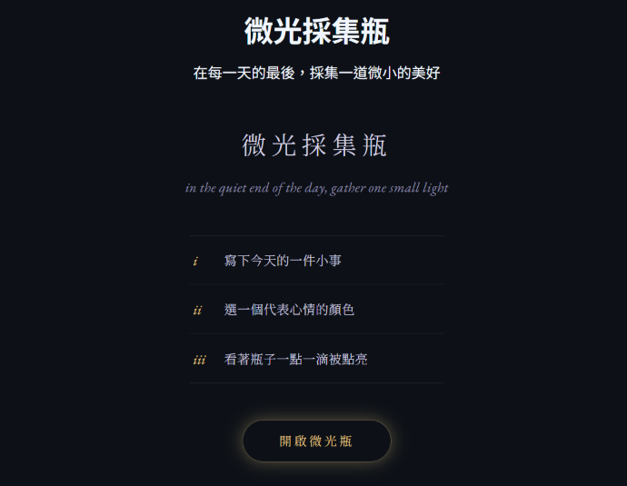
在第一次重新整理瀏覽器的時候,我發現首頁上出現了兩個標題:
而後我馬上想起這是因為在最一開始,這個專案只有一個畫面,所以我將標題寫在 App.vue 裡面:
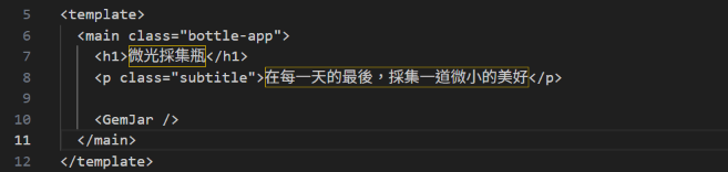
這樣一來,外層 App.vue 的全域標題就和新加入的 landing-page 標題同時渲染出來,導致一個頁面有兩個標題。
為了解決這個問題,我調整了元件的職責分工:
App.vue 變回原始容器:將 App.vue 內的 <header> 標題與副標題全部移除,只保留 <GemJar/> 元件的掛載,不干涉內層頁面的視覺。GemJar.vue 的 <template v-else> 最上方。如此一來,在首頁(showLanding = true)時能維持乾淨的導覽視覺;而點擊「開啟微光瓶」進入主畫面(showLanding = false)後,原有的標題也能正常出現,順利解決了畫面重疊的錯誤。
今天完成了《微光採集瓶》的首頁導覽,也重新調整了整個專案的視覺風格,讓網站從一開始就有完整的情境與氛圍。
明天 (Day 24)將繼續完善首頁與主畫面的視覺一致性,並加入頁面之間的轉場動畫,讓整體操作更加流暢。



 iThome鐵人賽
 看影片追技術