
給奧客:波波力那貝貝魯多,就你在那囉囉唆唆(開玩笑)
Material UI 提供可組合的 React UI 元件,用來處理畫面與操作介面。
MUI 提供現成的 React UI 元件,Tailwind CSS 提供用來組合樣式的 CSS 類別,Tailwind 讓我們在 className 裡組合排版、間距與顏色。
| MUI | Tailwind CSS | |
|---|---|---|
| 提供 | 按鈕、選單、卡片、對話框等元件 | 顏色、間距、排版、響應式等樣式工具 |
| 使用方式 | 使用 <Button />、<Select /> |
在 HTML 或元件上寫 className |
| 調整外觀 | 元件 props、sx、theme |
組合不同的 CSS 類別 |
| 互動行為 | 選單開啟、對話框焦點等已有元件處理 | 由 HTML、React 或搭配的元件庫處理 |
| 需求 | 快速組合介面,維持一致外觀 | 自己設計外觀,細緻控制樣式 |
以「重新查詢」按鈕為例,MUI 使用現成元件,透過 variant 選擇外觀:
<Button type="button" variant="contained" onClick={reload}>
  重新查詢
</Button>
Tailwind 則使用原生按鈕,組合圓角、背景、間距與文字顏色:
<button
  type="button"
  className="rounded bg-blue-600 px-4 py-2 text-white"
  onClick={reload}
>
  重新查詢
</button>
比較一下兩個的使用差別。
Button 需先匯入:// weather-dashboard.tsx
import Button from "@mui/material/Button"
/* app/app.css */
@import "tailwindcss";
// root.tsx
import "./app.css";
reload 都是沿用 Hook 回傳的函式,兩種寫法都把點擊事件交給 reload,城市設定、查詢與重試由 React 程式管理。
兩者是可以搭配使用的,混用時需設定 CSS layer 的覆蓋順序,今天先用 MUI 吧。
停止開發伺服器,再執行:
npm install @mui/material@9.5.0 @emotion/react @emotion/styled
npm run dev
這裡使用 Material UI 9.5.0,用 @mui/material 提供元件,Emotion 套件提供預設樣式引擎。
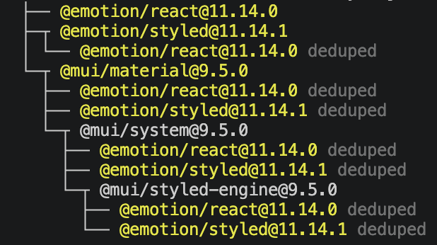
以下是主要城市選單的片段,放在 WeatherDashboard 的查詢設定:
// 前面引入 MUI 元件庫
import FormControl from "@mui/material/FormControl";
import InputLabel from "@mui/material/InputLabel";
import MenuItem from "@mui/material/MenuItem";
import Select from "@mui/material/Select";

// WeatherDashboard 示意片段
<FormControl fullWidth>
  <InputLabel id="primary-city-label">主要城市</InputLabel>
  <Select<CityId>
    labelId="primary-city-label"
    id="primary-city"
    label="主要城市"
    value={cityId}
    onChange={(event) => setCityId(event.target.value as CityId)}
  >
    {CITIES.map((city) => (
      <MenuItem key={city.id} value={city.id}>{city.name}</MenuItem>
    ))}
  </Select>
</FormControl>
說明:
value 決定目前選取值。onChange 更新外層 state。MenuItem 的值是城市 ID。CityId 接在 Select 後面。預設的 outlined 選單需要兩個標籤文字:
InputLabel 顯示標籤Select 的 label 配合邊框外觀。labelId 則對應 InputLabel 的 id,建立標籤關聯。
比較城市與單位則各用自己的 ID。
WeatherPanel 在最上層呼叫 Hook,以下重查與等待部分,省略外層卡片、錯誤與成功區塊的片段:
// 記得要 import MUI 元件

const { weather: visibleWeather, reload } = useWeather(cityId, temperatureUnit);

// WeatherPanel 示意片段
<Card
  component="section"
  variant="outlined"
  aria-labelledby={headingId}
  aria-busy={visibleWeather.status === "loading"}
  sx={{ minWidth: 0 }}
>
  <CardContent>
  {/* 省略片段 */}
    <Button
      type="button"
      variant="contained"
      onClick={reload}
      disabled={visibleWeather.status === "loading"}
    >
      重新查詢
    </Button>

    {visibleWeather.status === "loading" ? (
      <Stack direction="row" spacing={1} sx={{ alignItems: "center" }} role="status">
        <CircularProgress size={24} aria-hidden="true" />
        <Typography>正在載入{city.name}的天氣...</Typography>
      </Stack>
    ) : null}

  {/* 省略片段 */}
  </CardContent>
</Card>
說明:
<Alert severity="error"> 顯示錯誤與重試說明。visibleWeather.data,畫面的分支由 Hook 回傳的狀態決定。外圍使用 Card 與 CardContent 組合,保留 component="section"、標題 ID 與 aria-labelledby。
文字外觀用 Typography 的 variant 調整,HTML 標題明確指定 component="h2"。
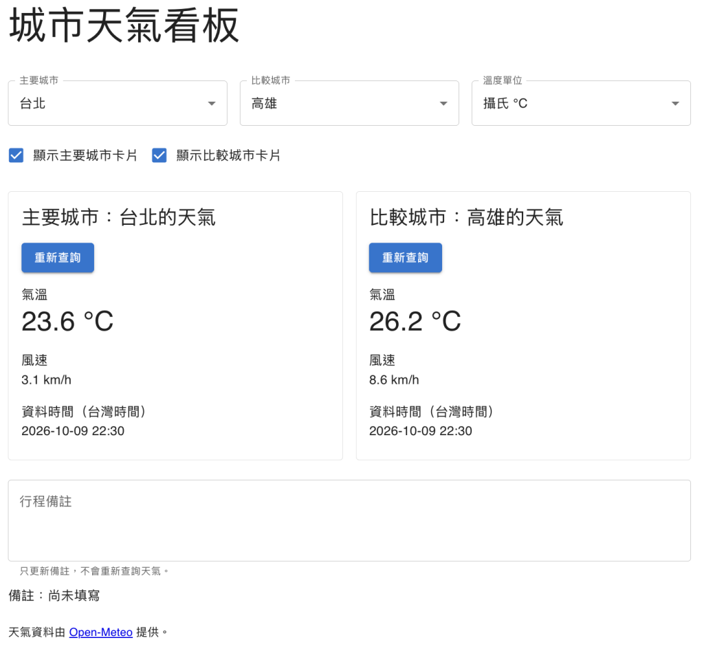
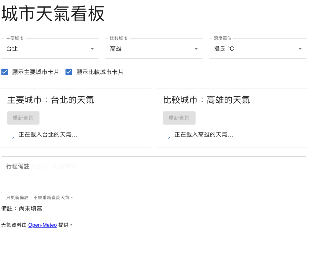
可以看到整形後的不同,同時因為 MUI 提供響應式設定方式,這裡透過 sx 指定窄螢幕一欄、寬螢幕兩欄,版型處理就少了一些煩惱,接著測試功能看有沒有問題:
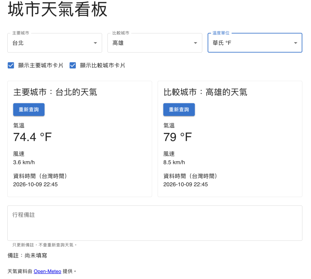
這個畫面分別測試兩個重點:
接著看離線狀態:
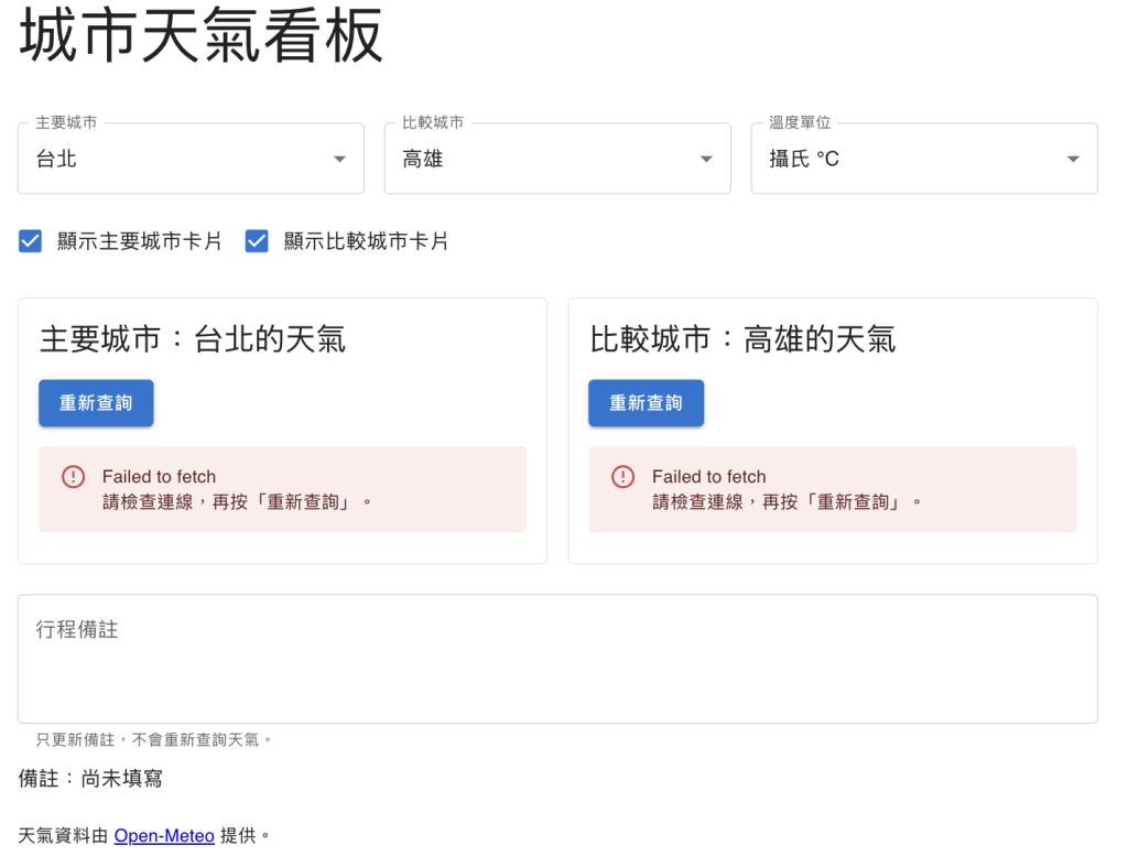
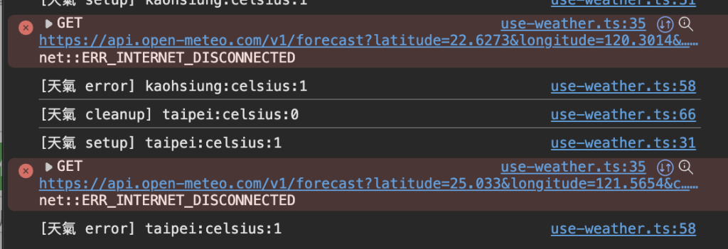
上面提到 RWD,來看看我們是怎麼做的:
兩張卡片可以用 Box 的 sx 排列。以下片段放在原本兩組卡片條件渲染的外圍,註解處放回主要與比較卡片 JSX:
<Box
  sx={{
    display: "grid",
    gap: 2,
    gridTemplateColumns: {
      xs: "1fr",
      md: "repeat(2, minmax(0, 1fr))",
    },
  }}
>
  {/* 主要卡片條件渲染 */}
  {/* 比較卡片條件渲染 */}
</Box>
說明:
這樣就達到縮小寬度的時候卡片是一欄,寬度達到固定值後,就變成兩個等寬。
明天就接續收藏城市、設定對話框與瀏覽器保存,再把 UI 元件接到新的狀態與事件。



 iThome鐵人賽
 看影片追技術