background-attachment是背景固定模式的屬性,而不同的固定方式就能夠有不同的視覺效果,而人類的視覺是很容易欺騙的,適當的利用可以有意想不到的效果。
本篇CSS效果發表於http://ashareaday.wcc.tw/#2013-09-25 (建議使用Chrome瀏覽器)
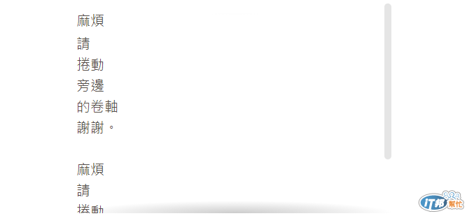
background-attachment是背景固定模式的屬性,而不同的固定方式就能夠有不同的視覺效果,而人類的視覺是很容易欺騙的,適當的利用可以有意想不到的效果。
scroll
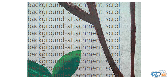
background-attachment: scroll
scroll模式也是預設值,背景圖會隨著外圍頁面滾動而移動。
fixed
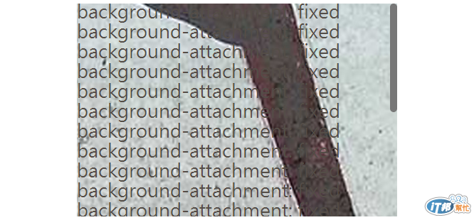
background-attachment: fixed
fixed模式,不管外面、裡面怎麼滾,他都是不會動的。
local (new)
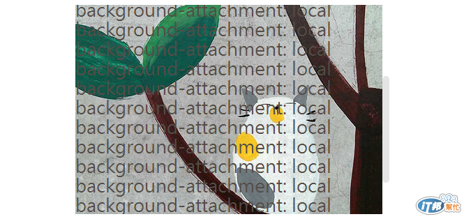
background-attachment: local
local模式,主要的特色就是,自己的區塊內如果滾動時,背景圖也會跟著移動。
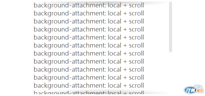
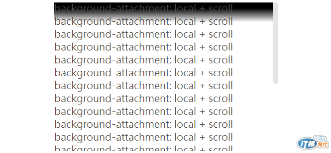
利用local + scroll做出的效果 (想不出名字...)
參考來源:http://lea.verou.me/more-css-secrets/#background-attachment
本篇CSS效果發表於http://ashareaday.wcc.tw/#2013-09-25 (建議使用Chrome瀏覽器)
//css
.class{
	background:
	  linear-gradient(white 30%, hsla(0,0%,100%,0)),
	  linear-gradient(hsla(0,0%,100%,0), white 70%) bottom,
	  radial-gradient(at top, rgba(0,0,0,.2), transparent 70%),
	  radial-gradient(at bottom, rgba(0,0,0,.2), transparent 70%) bottom;
	background-repeat: no-repeat;
	background-size: 100% 40px, 100% 40px, 100% 14px, 100% 14px;
	background-attachment: local, local, scroll, scroll;
	}
在這效果下,我們可以做出向上或是向下未讀完錯覺(請滾動畫面中卷軸),而簡單來說他利用了兩種模式的交叉運用,做出的視覺效果。
Scroll 層
background: radial-gradient(at top, rgba(0,0,0,.2), transparent 70%), radial-gradient(at bottom, rgba(0,0,0,.2), transparent 70%) bottom
	background-repeat: no-repeat
	background-size: 100% 18px, 100% 18px
	background-attachment: scroll, scroll
我們先看scroll層,上下都有著固定的陰影,在那邊不會移動,就算到了最上層及最底層也不會有變化。
Local 層
background: linear-gradient(black 30%, rgba(black,0)), linear-gradient(rgba(black,0), black 70%) bottom
	background-repeat: no-repeat
	background-size: 100% 40px, 100% 40px
	background-attachment: local, local
這一段把local層改成了黑色,可以看得比較清楚,可以發現local層是到了最上層及最底層後才會出現,利用這個方式蓋住上一層。當然到時候要記得改回白色。


 iThome鐵人賽
 看影片追技術