今天是鐵人賽的第15天,終於要進入畫圖表的部分,Python主要有兩個畫圖表的套件
%matplotlib inlineimport numpy as np
import matplotlib.pyplot as plt
%matplotlib inline
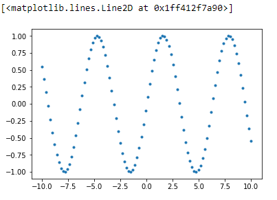
ironman = np.linspace(-10,10,100)
fig = plt.figure() #定義一個圖像窗口
plt.plot(ironman, np.sin(ironman), '.') #定義x,y和圖的樣式
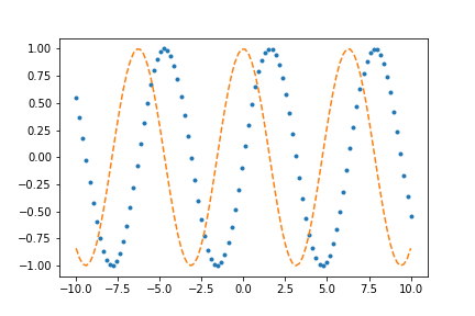
如果想要同時畫兩條線可以使用以下的方式
fig = plt.figure()
plt.plot(ironman, np.sin(ironman), '.', ironman, np.cos(ironman), '--')
將繪製出來的圖表做儲存,之後在放置程式相同的資料夾即可看到day15_01.png這個檔案。
如果想看有哪些格式可以儲存,只要下「fig.canvas.get_supported_filetypes()」這行程式碼。
fig.savefig('day15_01.png')
讀取圖形
from IPython.display import Image
Image('day15_01.png')
plt.style.use('bmh')
fig = plt.figure()
ax = plt.axes() #畫上刻度
控制axes的範圍
plt.xlim(start, end)->控制x的範圍
plt.ylim(start, end)->控制x的範圍
plt.axis([xstart, xend, ystart, yend]) -> 一次設定x和y軸
plt.axis除了可以設定x和y軸也可以設定其他樣式,ex: equal可以讓x和y軸的單位一樣。
plt.axis的使用方式可以參考文件
控制顯示的座標xticks()、yticks()
語法:xticks(location,lables[,rotation]) yticks(location,lables[,rotation])
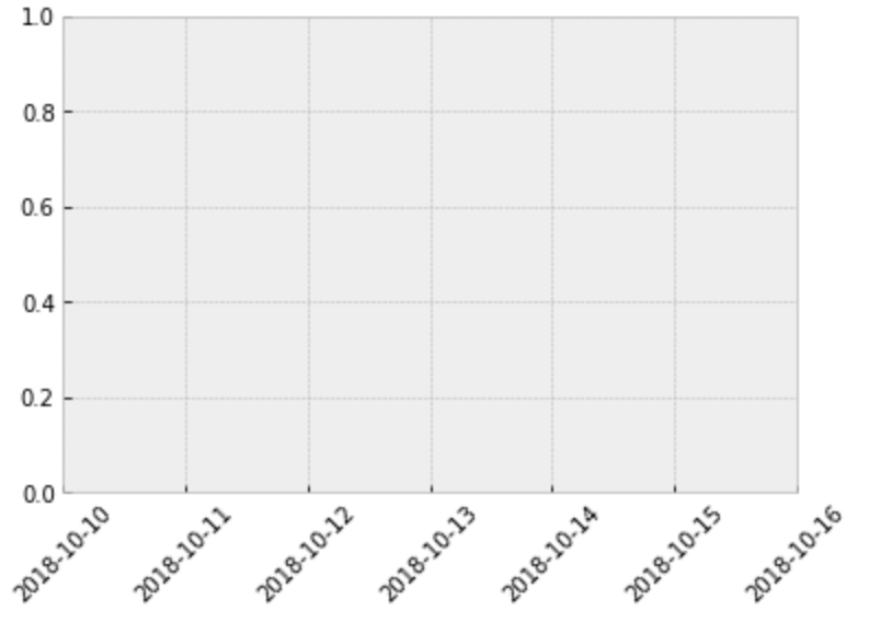
示範用日期來當x軸的座標
fig = plt.figure()
plt.xticks(range(7), ['2018-10-10','2018-10-11','2018-10-12',
                      '2018-10-13','2018-10-14','2018-10-15','2018-10-16'], rotation=45)
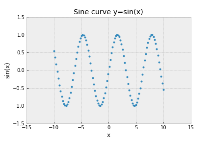
將一開始畫的sin()曲線圖加上線條圖形
plt.style.use('bmh')
fig = plt.figure()
ax = plt.axes()
plt.plot(ironman, np.sin(ironman), '.') #定義x,y和圖的樣式
plt.xlim(-15, 15)
plt.ylim(-1.5, 1.5)
plt.title("Sine curve y=sin(x)")
plt.xlabel("x")
plt.ylabel("sin(x)")
color:color也可以直接簡寫成c,可以填入 16進位編碼(000000 ~ FFFFFF)、HTML中支援的顏色名稱(ex LightCoral)
linestyle:linestyle也可以直接簡寫成ls,可填入的值如以下
| 值 | 描述 | 符號 |
|---|---|---|
| solid | 實線 | - |
| dashed | 虛線 | -- |
| dashdot | 線點 | -. |
| dotted | 點線 | : |
| None | 不畫線 |
| 值 | 描述 | 符號 |
|---|---|---|
| point | 點 | . |
| circle | 圓圈 | o |
| triangle_down | 向下三角形 | v |
| triangle_up | 向上三角形 | ^ |
| triangle_left | 向左三角形 | < |
| triangle_right | 向右三角形 | > |
| square | 正方形 | s |
| pentagon | 五邊形 | p |
| hexagonl | 六邊形 | h |
| plus | 加號 | + |
| x | 打叉 | x |
| diamond | 鑽石 | D |
| star | 星號 | * |
| vline | 豎線 |
linewidth:線的寬度,可以簡寫成lw
繪製誤差圖
語法:plt.errorbar(x,y..)
ironman_error_x = np.linspace(-10,10,50)
ironman_error_y = np.random.randint(-10,10,50)
fig = plt.figure()
plt.errorbar(ironman_error_x, ironman_error_y, yerr=2, fmt='o', color='SteelBlue', ecolor='LightSteelBlue', elinewidth=2)
# ecolor->誤差的顏色  elinewidth->誤差的寬度
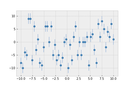
fig = plt.figure()
ironman_hist = np.random.randn(1000)
plt.hist(ironman_hist, bins=20, color='SteelBlue', edgecolor="LightSteelBlue")
#bins 定義有幾個直方圖 color->直方圖顏色 edgecolor->邊界顏色
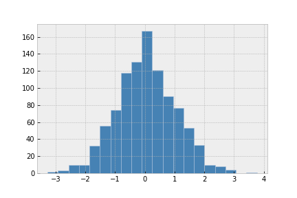
取得直方圖每個柱子的數量,和間距可以使用np.histogram
counts, bin_edges = np.histogram(ironman_hist, bins=20)
print('counts----->', counts)
print('bin_edges----->', bin_edges)
# 輸出
counts-----> [  2   3  10  10  32  56  74 118 131 167 121  90  77  53  33  10   8   4
   0   1]
bin_edges-----> [-3.26928919 -2.91739998 -2.56551077 -2.21362156 -1.86173235 -1.50984314
 -1.15795393 -0.80606471 -0.4541755  -0.10228629  0.24960292  0.60149213
  0.95338134  1.30527055  1.65715976  2.00904897  2.36093818  2.71282739
  3.06471661  3.41660582  3.76849503]
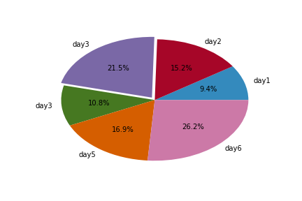
fig = plt.figure()
labels = ["day1","day2","day3","day3","day5","day6"]
word_size = [2000, 3250, 4600 , 2300, 3600, 5600]
explode = [0 , 0, .05, 0, 0, 0]  #0則不突凸出,值越大 則凸出越大
plt.pie(word_size, explode= explode, labels = labels, autopct= "%3.1f%%")
# autopct-->項目百分比的格式