今天是鐵人賽的第16天,持續focus on 圖表的部分,今天的重點放在如何讓圖表更加符合自己想要的樣式。
ax.legend()來顯示數據的名稱,名稱定義在label中| 值 | 描述 | 數字 |
|---|---|---|
| best | 最適宜 | 0 |
| upper right | 右上角 | 1 |
| upper left | 左上角 | 2 |
| lower right | 右下角 | 3 |
| lower left | 左下角 | 4 |
| right | 右側 | 5 |
| center left | 左側中間 | 6 |
| center right | 右側中間 | 7 |
| lower center | 下方中間 | 8 |
| upper center | 上方中間 | 9 |
| center | 最適宜 | 10 |
import matplotlib.pyplot as plt
import numpy as np
plt.style.use('classic')
%matplotlib inline
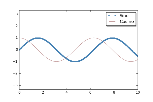
ironman = np.linspace(0,10, 1000) #產生 0~10區間的 等間隔序列
fig , ax = plt.subplots()
plt.plot(ironman, np.sin(ironman), '.', color='SteelBlue', label='Sine')
plt.plot(ironman, np.cos(ironman), '-', color='RosyBrown', label='Cosine')
ax.axis('equal')
leg = ax.legend(loc='upper right', shadow=True)
# loc->名稱放在圖表的右上角 frameon->名稱是否用框框 shadow->是否有陰影...
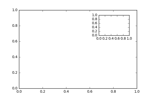
plt.axes([bottom, left, width, height])
fig , ax = plt.subplots()
axe_base = plt.axes()
axe_small = plt.axes([0.65, 0.65, 0.2, 0.2])
接下來示範繪製多個子圖
fig , ax = plt.subplots()
fig.subplots_adjust(hspace=0.4, wspace=0.4) #設定子圖的間隔
for i in range(1,7):
    plt.subplot(2, 3, i)
    plt.text(0.5, 0.5, str((2, 3, i)), fontsize=18, ha='center')
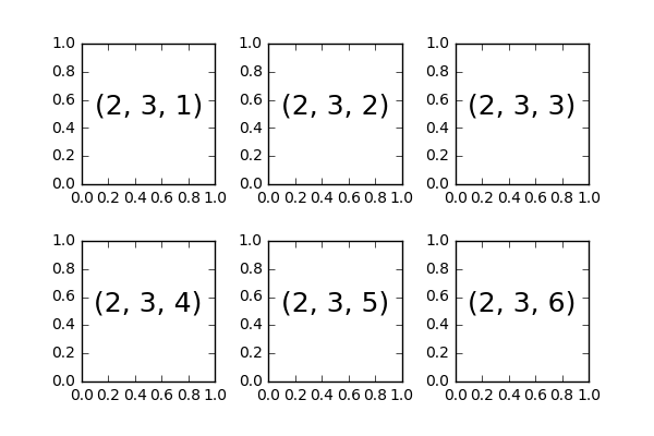
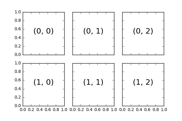
fig , ax = plt.subplots(2, 3, sharex=True, sharey=True)
# sharex->是否共享x軸  sharey->是否共享y軸
for i in range(2):
    for j in range(3):
        ax[i, j].text(0.5, 0.5, str((i, j)), fontsize=18, ha='center')
        #在各個子網格寫上文字
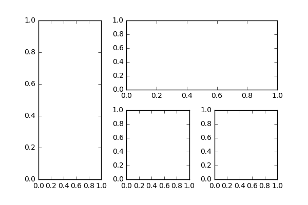
ironman_grid = plt.GridSpec(2, 3, wspace=0.4, hspace=0.3)
print(ironman_grid)
plt.subplot(ironman_grid[:,0]) #all row, 0 column
plt.subplot(ironman_grid[0, 1:]) #0 row, 1之後的所有column
plt.subplot(ironman_grid[1, 1]) #1 row, 1 column
plt.subplot(ironman_grid[1, 2]) #1 row, 2 column
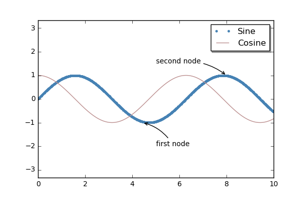
ironman = np.linspace(0,10, 1000)  #產生 0~10區間的 等間隔序列
fig , ax = plt.subplots()
plt.plot(ironman, np.sin(ironman), '.', color='SteelBlue', label='Sine')
plt.plot(ironman, np.cos(ironman), '-', color='RosyBrown', label='Cosine')
ax.axis('equal')
leg = ax.legend(loc='upper right', shadow=True)
ax.annotate(s="first node", xy=(4.44,-1), xytext=(5,-2),
            arrowprops=dict(arrowstyle='->', connectionstyle="arc3,rad=.2"))
# s->標示的文字內容, xy->要標示的數據位置, xytext->顯示的文字位置,arrowprops->箭頭的參數
ax.annotate(s="second node", xy=(8,1), xytext=(5,1.5),
            arrowprops=dict(arrowstyle='->', connectionstyle="arc3,rad=-.2"))


 iThome鐵人賽