在開始之前我要先說一個很智障的事情,那就是長條圖明明就叫做BarChart,但我之前component取名叫LineChart...所以再麻煩大家改一下名字...
今天我們是真的要做LineChart了...

雖然折線圖有三個,但只要做一個component就可以透過傳props的方式從外面傳進去。因此第一步先新增一個LineChart.vue的檔案放在components裡面。
與長條圖相同,先做一個unique id的div、定義drawChart()的method並在mounted時呼叫他:
<template>
  <div :id="`line-chart-${id}`"
       style="position: relative;"></div>
</template>

<script>
import * as d3 from 'd3';

export default {
  name: 'LineChart',
  data() {
    return {
      id: Date.now()
    };
  },
  mounted() {
    this.drawChart();
  },
  methods: {
    drawChart() {}
  }
};
</script>

<style>

</style>
接著訂一些假資料:
const data = [
    {
      value: 10,
      name: '18:35'
    },
    {
      value: 12,
      name: '18:55'
    },
    ...
  ]
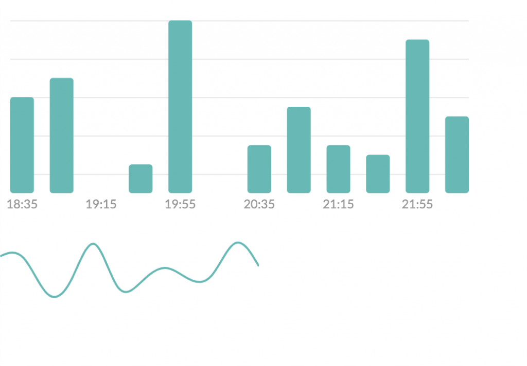
有了長條圖的經驗以後,這邊應該就很簡單了,更何況設計當中的折線圖沒有座標軸,所以我們直接一起實作吧~
先來畫線:
const margin = {
    top: 0,
    bottom: 0,
    left: 0,
    right: 0
};
const chartWidth = 254 - margin.left - margin.right;
const chartHeight = 88 - margin.top - margin.bottom;

const x = d3
    .scaleLinear() 因為想要讓圖表左右對齊邊緣,所以改使用scaleLinear
    .domain([0, data.length - 1]) //以index作為識別
    .range([0, chartWidth]);

const y = d3
    .scaleLinear()
    .domain([0, d3.max(data.map(e => e.value))])
    .range([chartHeight, 0]);

const svg = d3
    .select(`#line-chart-${this.id}`)
    .append('svg')
    .attr('width', chartWidth + margin.left + margin.right)
    .attr('height', chartHeight + margin.top + margin.bottom);

const g = svg.append('g').attr('transform', `translate(${margin.left}, ${margin.top})`);

// 用d3提供可以產生path參數的函式
const line = d3
    .line()
    .x((d, i) => x(i))
    .y(d => y(d.value))
    .curve(d3.curveBasis); // 彎曲的線

g
    .append('path')
    .datum(data)
    .attr('class', 'main-line')
    .attr('d', line)
    .attr('fill', 'none')
    .attr('stroke-width', 2)
    .attr('stroke', '#00BAB6');
接著幫線加上底下的漸層陰影,產生的方式是畫一個線底下的形狀,然後顏色設定為漸層色:
// d3提供生成底下area的函式
const area = d3
    .area()
    .x((d, i) => x(i))
    .y0(chartHeight)
    .y1(d => y(d.value))
    .curve(d3.curveBasis);

//新增漸層圖層
const gradient = svg
    .append('defs')
    .append('linearGradient')
    .attr('id', 'svgGradient')
    .attr('x1', '50%')
    .attr('x2', '50%')
    .attr('y1', '0%')
    .attr('y2', '100%');

//漸層圖層起點位置與顏色
gradient
    .append('stop')
    .attr('class', 'start')
    .attr('offset', '0%')
    .attr('stop-color', 'rgba(0,186,182, 0.4)')
    .attr('stop-opacity', 1);

//漸層圖層終點位置與顏色
gradient
    .append('stop')
    .attr('class', 'end')
    .attr('offset', '100%')
    .attr('stop-color', 'rgba(216,216,216,0.00)')
    .attr('stop-opacity', 1);

// 生成區塊
g.append('path')
    .datum(data)
    .attr('class', 'area')
    .attr('d', area)
    .attr('fill', 'url(#svgGradient)'); //填滿指定為漸層圖層
我們的折線圖就完成囉~ 明天再來加上進場動畫效果。
今天的commit:https://github.com/yuanchen1103/2020ironman-weather/commit/5a43712d4e18c162b8bd4014583cea384a3de05f