倘若不斷向深處扎根,就能茁壯成長 - 出自 RM
在前幾篇我們提到了 CSS 中三種定位的方式,分別是按照 Noraml flow 佈局、按照 Position 定位兩種,剩下的一種是 float,今天要介紹的便是它,在 CSS Page Floats中有提到這麼一段話:
This feature has traditionally been used in print publications in which figures and photos are moved to the top or bottom of columns or pages, along with their captions.
其實 float 本身特色是來自於傳統出版的圖文排版這個概念,希望透過語法實現在 document 上面能達到圖文排版的方式,有了這個概念後我們就來看看浮動吧~!
規範直通車:
Visual formatting model
規範定義:
A float is a box that is shifted to the left or right on the current line. The most interesting characteristic of a float (or “floated” or “floating” box) is that content may flow along its side (or be prohibited from doing so by the ‘clear’ property).
The rectangular area that contains the boxes that form a line is called aline box. When several inline-level boxes cannot fit horizontally within a single line box, they are distributed among two or more vertically-stacked line boxes. Thus, a paragraph is a vertical stack of line boxes.
float 本身代表了 box 會先按照 Normal flow 去定位,接著脫離 flow 並在當前行左移或是右移,特色是文字內容會在其側邊流動,造成圖文排版的現象。 float 元素會減少當前接觸 line box 在 containing block 佔有的寬度,若是剩餘的空間不足,line box 向下移動,並重新計算寬度。當一個元素 float 後,脫離 Normal flow 並且同時為內容創建 BFC,使得內容可以依照此格式化上下文去佈局,除此之外,新建了 BFC 所以不會產生 margin collapse 的現象。
當 float 元素前後有 block-level box 時,block-level box 會相當於直接忽視這個 float 元素進行佈局,相當於浮動元素不存在一樣,這是由於 float 元素本身不在 Normal flow 中,所以 block-level box 會依舊按照 BFC 垂直排列。
line box 本身是由 boxes 組成的抽象概念矩形區塊,一行代表一個線框,若是 <p> 元素有多行,則會形成多行 line boxes,稱為 vertical stack of line boxes,除此之外 line box 的寬度受 containing block 以及 float 元素影響,可能會因此縮減。
Codepen 範例:float
下圖中,我們將在建立三個元素: <p>、<p> (作為區分第二個段落文字為紅色,簡稱 紅<p>)、<img>,並且對 <img> 元素設置左浮動 float: left
<h3>浮動</h3>
<p>Lorem ipsum, dolor sit amet...<img src="https://i.imgur.com/SFMfFhom.jpg" alt="">  amet consectetur adipisicing elit...</p>
<p>Lorem, ipsum dolor sit amet ...</p>
img {
  float: left;
  margin: 20px;
}
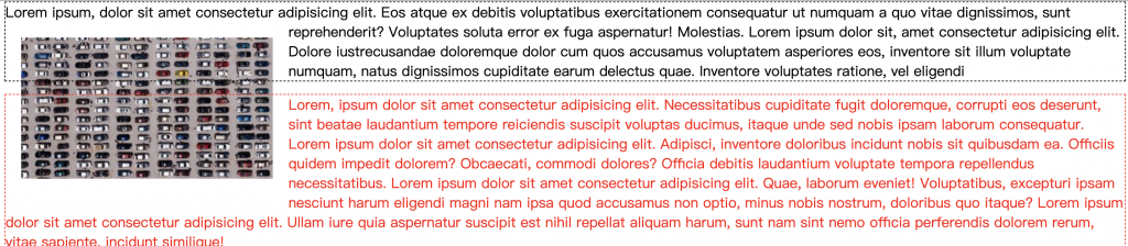
可以看到位於浮動 <img> 前的段落與 float 接觸的當前行與之後的行 line box 寬度都受到了影響,line box 寬度縮減,並且重新計算寬度,除此之外在後方的塊級元素不受浮動影響繼續跟隨 BFC 垂直佈局,不過內容 line box 繼續受到 float 元素影響,減少了寬度。除此之外, float 元素設置 margin 可以與周圍產生距離,且不會產生 margin collapse,對於圖文排版若是需要邊距時可以使用這個特性去設置。
規範直通車:
Visual formatting model
規範定義:
This property indicates which sides of an element's box(es) may not be adjacent to an earlier floating box. The 'clear' property does not consider floats inside the element itself or in other block formatting contexts.
有了 float 後,我們可以對元素去設置 float 進而對周遭文本產生效果,但有的時候我們或許並不希望每個元素都受到 float 影響,這個時候便可以使用 clear 這個屬性,clear 可以使用在 float 元素或是非 float 塊級元素,效果會不同。
表示元素不和較早浮動框的某個方向邊去接觸。
clear: left 表示塊級元素會在之前 float 左側元素的下方。clear: right 表示塊級元素會在之前 float 右側元素的下方。clear: both 表示塊級元素會在之前 float 元素的下方。clear: none 預設值,沒有影響。
Codepen 範例:float
<h3>清除浮動</h3>
<p>Lorem ipsum...<img src="https://i.imgur.com/SFMfFhom.jpg" alt="">amet consectetur adipisicing elit. Dolore iustrecusandae doloremque dolor cum quos accusamus voluptatem asperiores...</p>
<p>Lorem, ipsum dolor sit ...</p>
p:nth-of-type(4){
  clear: left;
/*   對於非浮動塊級元素使用清除 */
}
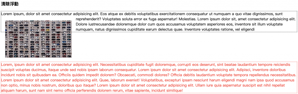
下圖中,我們將在建立三個元素:<p>、<p>(作為區分第二個段落文字為紅色,簡稱紅<p>)、<img>,並且對 <img> 元素設置左浮動 float: left,並對 紅<p> 設置清除浮動,希望浮動元素只對第一個 <p> 產生作用。
可以看到浮動元素對於第一個 <p> 產生了作用,對相鄰 line box 產生了作用影響了其寬度,但是對於原本會影響到的 紅<p> 卻沒有了影響,這是因為對於非浮動塊級元素設置清除浮動會導致元素會在之前浮動左側元素的下方,也就是會跑到 <img> 浮動元素下方,這樣 紅<p> 內的 line box 便不會受到影響。
本篇章中我們提到了浮動,看到浮動對於各個元素的作用與影響,在使用圖文排版時會是個可以使用的利器,除此之外清除浮動屬性除了會對一般的浮動元素產生作用外,也可以對於非浮動的塊級元素設置,這種情況可以使此塊級元素直接移至該浮動元素下方。
CSS Page Floats
Visual formatting model
以上的部分有任何錯誤的地方,歡迎指正呦~非常感謝~~XD

 iThome鐵人賽
 看影片追技術