今天要講兩個簡單的元件,在還沒碰到這兩個元件之前,想要做到開關的效果可能會用到兩個Button來達成,雖然說也能達到功能,也有些設計者比較喜歡Button的效果,不過我覺得接下來這兩個元件可以達到的變化更多,甚至可以設計出獨一無二的樣式。接下來就讓我來介紹這兩個元件的用法及效果:
<LinearLayout xmlns:android="http://schemas.android.com/apk/res/android"
xmlns:app="http://schemas.android.com/apk/res-auto"
xmlns:tools="http://schemas.android.com/tools"
android:layout_width="match_parent"
android:layout_height="match_parent"
android:orientation="vertical"
tools:context=".MainActivity">
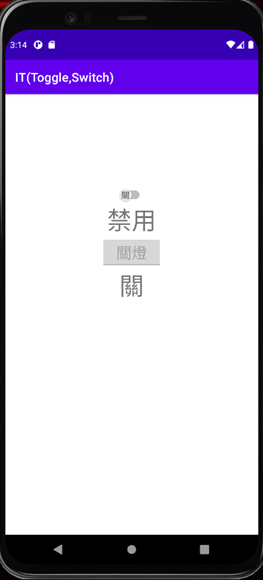
<Switch
android:id="@+id/st1"
android:layout_marginTop="150dp"
android:layout_gravity="center"
android:layout_width="wrap_content"
android:layout_height="wrap_content"
android:showText="true"
android:textOff="關"
android:textOn="開" />
<TextView
android:id="@+id/tx1"
android:layout_gravity="center"
android:layout_width="wrap_content"
android:layout_height="wrap_content"
android:textSize="40sp"
android:text="禁用" />
<ToggleButton
android:id="@+id/tg1"
android:layout_gravity="center"
android:layout_width="100dp"
android:layout_height="wrap_content"
android:textOff="關燈"
android:textOn="開燈"
android:textSize="25sp"
android:enabled="false"
android:disabledAlpha="@android:integer/config_longAnimTime" />
<TextView
android:id="@+id/tx2"
android:layout_gravity="center"
android:layout_width="wrap_content"
android:layout_height="wrap_content"
android:textSize="40sp"
android:text="關" />
</LinearLayout>
接著來看一下開關的功能設定
public class MainActivity extends AppCompatActivity {
private ToggleButton toggleButton;
private Switch st1;
private TextView tx1;
private TextView tx2;
@Override
protected void onCreate(Bundle savedInstanceState) {
super.onCreate(savedInstanceState);
setContentView(R.layout.activity_main);
toggleButton = (ToggleButton)findViewById(R.id.tg1);
st1 = (Switch)findViewById(R.id.st1);
tx1 = (TextView)findViewById(R.id.tx1);
tx2 = (TextView)findViewById(R.id.tx2);
st1.setOnCheckedChangeListener(new CompoundButton.OnCheckedChangeListener() {
@Override
public void onCheckedChanged(CompoundButton buttonView, boolean isChecked) {
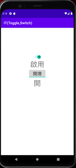
tx1.setText(isChecked?"啟用":"禁用");
toggleButton.setEnabled(isChecked);
}
});
toggleButton.setOnCheckedChangeListener(new CompoundButton.OnCheckedChangeListener() {
@Override
public void onCheckedChanged(CompoundButton buttonView, boolean isChecked) {
tx2.setText(isChecked?"開":"關");
}
});
}
}
這裡有趣的是兩個的開關事件都是透過setOnCheckedChangeListener(),接著用setOnCheckedChange()函數來放置想要的功能,而這裡面放的引數是CompoundButton,而屬於CompoundButton的關鍵是其按鈕功能要是有兩種狀態(選中及未選中),且按鈕按下後會自動變更狀態,而後面的布林變數isChecked便是代表現在的狀態,可以透過此變數來取得現在的狀態後再設定其功能。
今天Switch和Toggle Button就講到這,謝謝大家~


 看影片追技術