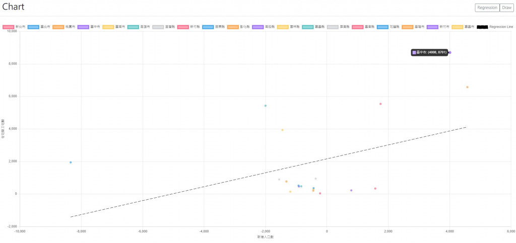
繼昨天畫出XY關係圖後,我們就會進一去想知道XY的關係式,並最好在圖上畫上趨勢線。所以我們需要做迴歸的計算,然後再畫到圖上。
回歸的功能可以使用這個,這是目前找到最簡潔完整的開源,除了線性外,還提供exponential、logarithmic、power、和polynomial,輸入的資料格式為序列對的序列,另外可以設定精準度(.precision)和階數(.order)以及週期(.period):
const data = [[0,1],[32, 67] .... [12, 79]];
const resultLinear = regression.linear(data, {precision: 5});
const resultPoly = regression.polynomial(data, {order: 3});
輸出為物件,包含回歸資料(.points)、轉移函數的function(.predict,回傳XY的序列對)、係數(.equation,係數的序列)、判定係數(.r2)和轉移函數的文字(.string)。其中要注意轉移函數、係數和判定係數都會四捨五入根據設定精準度(預設是小數點下2位),以下是linear的return為例:
    const predict = x => ([
      round(x, options.precision),
      round((gradient * x) + intercept, options.precision)]
    );
    return {
      points: data.map(point => predict(point[0])),
      predict: ,
      equation: [gradient, intercept],
      r2: round(determinationCoefficient(data, points), options.precision),
      string: intercept === 0 ? `y = ${gradient}x` : `y = ${gradient}x + ${intercept}`,
    };
算完回歸的公式後,接下是將結果畫在圖上,我們建立一個給chart的回歸資料組,其中在scatter要連線需將showLine設為true,borderDash為設定成虛線,其中序列中的數值對應有和無的長度,而borderWidth和radius分別是線寬和標記點的半徑,我這邊是分別把它設小一點以及設0讓點不見:
  const newDataset = {
    label: "Regression Line", //data-label
		borderColor: "rgb(0, 0, 0)",
		backgroundColor: "rgb(0, 0, 0)",
		data: [{x: xMin, y: regressParameter[0] * xMin + regressParameter[1]}, {x: xMax, y: regressParameter[0] * xMax + regressParameter[1]}], //data
    showLine: true,
    borderWidth: 1,
    borderDash: [10, 5],
    radius: 0
  }
成果如下: