
今天的 TextField 和明天的 FormControl 都是在介紹跟表單有關的介面和元件,而這主要是 Material-UI 實作的方式,在明天講完後,也會提一下 Ant Design 和 Chakra 是怎麼做的,以及分享一下我個人實作上的經驗、踩過的雷等等。
TextField 在 Material-UI 架構下是幫你定義好 FormControl 這些東西的 Input,但你也可以自己去用 FormControl 相關的元件來自定義。
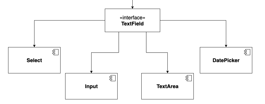
TextField 其實單純是一個可以輸入東西的 Input,但能根據不同的 Props 來 render 不同的元件(如 Select)和情境。
之所以會需要 TextField 是因為長得像 Input 這種樣式的元件 (Input, TextArea, Select, DatePicker )有一些共同的功能可以整合成一個 Interface 來統一管理 API。
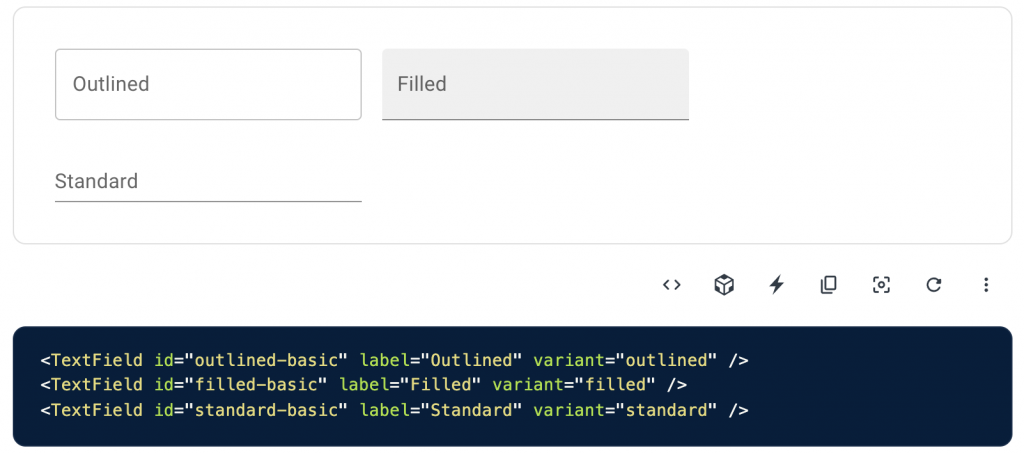
這些功能有表單相關的 required, disabled, helper text, type 以及驗證時的錯誤樣式,另外還有 label, fullWidth 和其他跟 Input 更相關的或是一些常見的使用情境則會包進 inputProps 來傳。
各種使用情境: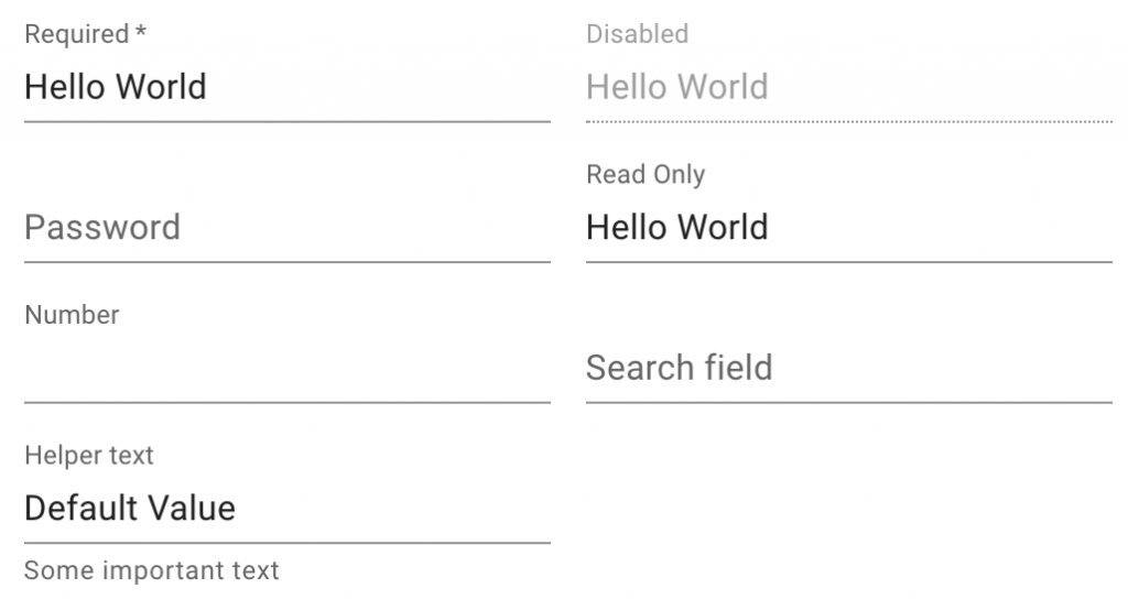
錯誤狀態處理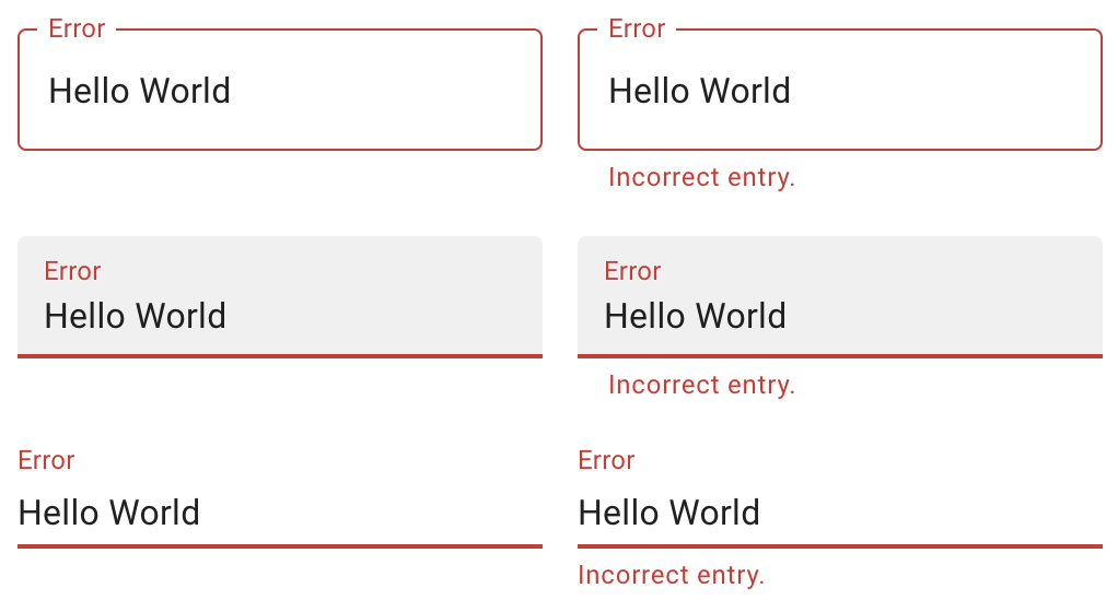
實作方式可以是在這些元件外面都包一層的 TextField,或是把這些元件包進 TextField 裡面,並透過 一些 props 來決定要 render 的元件,以下會在 Select 的地方用程式碼來介紹到這兩者的差別。
那以下會介紹的 Component 都很直覺,我就不再一一介紹使用情境,直接來看看 TextField 是怎麼實作他們的,而底層的實作一樣會在之後的實戰篇再介紹!
其實在 Material-UI 這邊就是被整合成 TextField 的預設型態,就不再多贅述,詳情在 Day22 實作 TextField/Input 的時候會再介紹!
TextArea 跟 Input 的主要差別其實就是 TextArea 是多行的,並可能會有去限制行數、字數等等功能。
上面有提到說會在這邊去介紹用 props 來決定 render 的元件的兩種方式,而這邊就做了一個很好的示範,單單傳了 multiline 的屬性給 TextField ,就可以決定要 render 的是 TextArea 了,進一步還能用 maxRows 來定最多幾行。
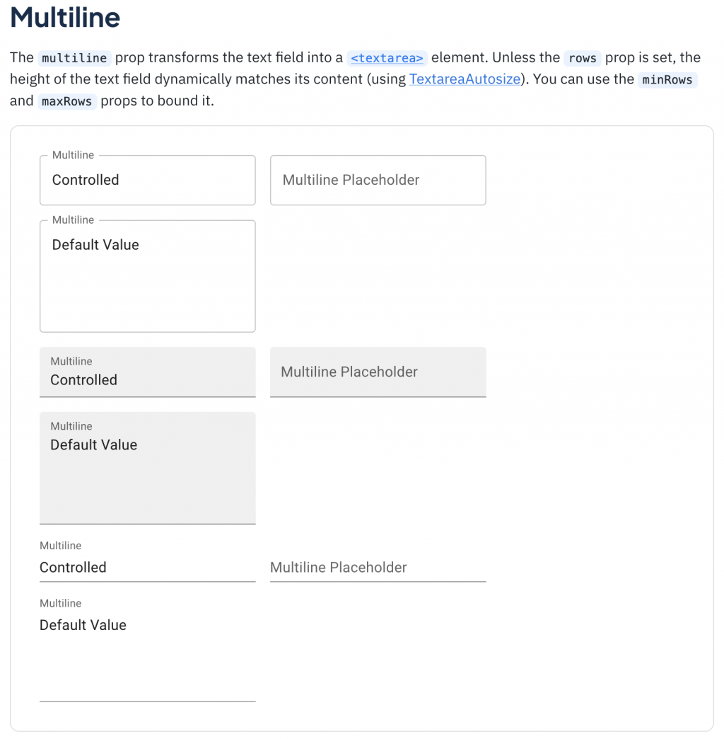
(簡化版)
 <div>
    <TextField
      id="outlined-multiline-flexible"
      label="Multiline"
      multiline
      maxRows={4}
      value={value}
      onChange={handleChange}
    />
    <TextField
      id="outlined-textarea"
      label="Multiline Placeholder"
      placeholder="Placeholder"
      multiline
    />
    <TextField
      id="outlined-multiline-static"
      label="Multiline"
      multiline
      rows={4}
      defaultValue="Default Value"
    />
  </div>
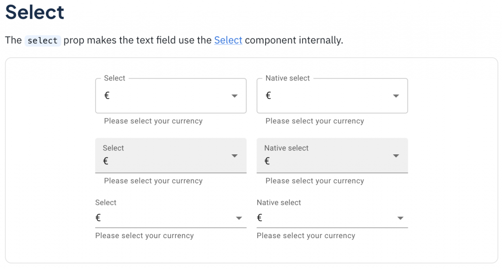
Select 就是在表單中可用來選擇「選項」的元件。
在 Material-UI 中它有兩種作法:
**1. 直接使用 Select **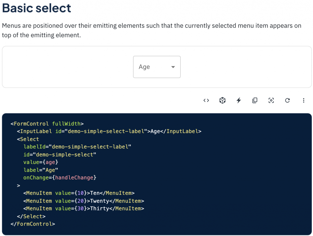
2. 在 TextField 中用 type='select' 來使用
type='select'
<TextField
  select
  label="Select"
  value={currency}
  onChange={handleChange}
  helperText="Please select your currency"
>
  {currencies.map((option) => (
    <MenuItem key={option.value} value={option.value}>
      {option.label}
    </MenuItem>
  ))}
</TextField>
那 Material-UI TextField 的底層實作如下,可以看見有一個 select 的三元判斷式來判斷要 render 的是 Select 還是 Input,同時也能看到 label 和 helperText 也是做類似的事情,由此可以來感受一下 TextField 的方便性。
// Material TextField Source Code
	<TextFieldRoot
    disabled={disabled}
    error={error}
    fullWidth={fullWidth}
    ref={ref}
    required={required}
    color={color}
    variant={variant}
    ownerState={ownerState}
    {...other}
  >
    {label && (
      <InputLabel htmlFor={id} id={inputLabelId} {...InputLabelProps}>
        {label}
      </InputLabel>
    )}

    {select ? (
      <Select
        aria-describedby={helperTextId}
        id={id}
        labelId={inputLabelId}
        value={value}
        input={InputElement}
        {...SelectProps}
      >
        {children}
      </Select>
    ) : (
      InputElement
    )}

    {helperText && (
      <FormHelperText id={helperTextId} {...FormHelperTextProps}>
        {helperText}
      </FormHelperText>
    )}
  </TextFieldRoot>
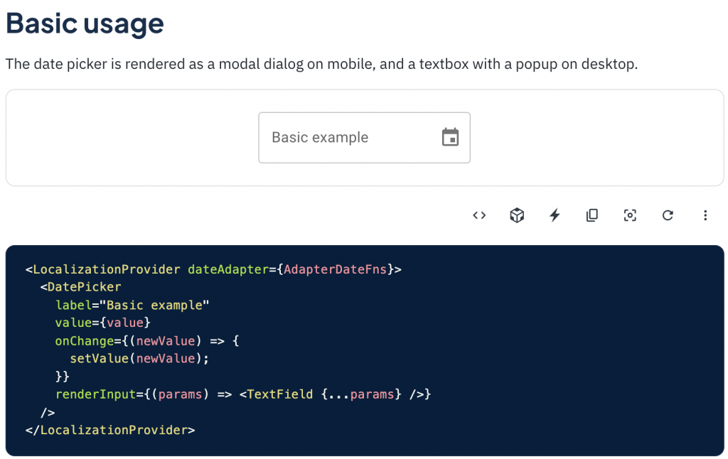
在網頁中要處理跟日期有關的操作時,DatePicker 絕對是首當其衝,但主要是提供選取單一天數的需求,後續其他的格式,可能會再衍伸 RangePicker(選一段時間) 或 TimePicker(選時/分/秒) 等等。
在開頭時有介紹到 TextField 可以像上面講的當作使用的主體,並透過 props 來改變要 render 的元件。
但我們也可以嘗試把 TextField 當成一個可以實現上述功能的容器,並會在各 Componet 底層去引用它,而實際使用時是去使用元件本身,如 . 等等。
直接來看看這種方式的 input 底層可能會是怎樣:
<TextField
  disabled={disabled}
	error={error}
	fullWidth={fullWidth}
	...TextFieldProps
  >
  <input
    {...inputProps}
		value={value}
		onChange={onChange}
		...
  />
</TextField>
獨立使用時:
<Input
  placeholder="please enter text"
  value="Example"
  readOnly
/>
再來看看 TextArea 可能會更理解:
<TextField
  disabled={disabled}
	error={error}
	fullWidth={fullWidth}
	...TextFieldProps
  >
  <textarea
    {...textareaProps}
		value={value}
		onChange={onChange}
		...
  />
</TextField>
獨立使用時:
<Textarea
  placeholder="輸入文字..."
  maxLength={50}
  value="Example"
  readOnly
/>
其實使用 TextField 來抽象化這些元件的方式還有待討論,像是這邊就列出了兩種,而兩種都還是有使用不直覺的問題,那就是 inputProps 的存在,使用 Input 或 TextField 傳 props 還要特別用 InputProps 而不是直接在最上層就取用那些 attribute 其實挺不直覺,或是使用者不會知道說他是在使用包在 TextField 裏的 Input,而不是 input 本身,這件事會不會影響到 API 的直覺程度也會有很大的差別,但老樣子,團隊用起來順手就好,軟體開發很難有一個完美的解法,只有最適合的。
明天我們就要進入跟 TextField 容易搞混的 FormControl ,談談網頁中表單操作的抽象化 Interface,結尾也會稍微講一下除此之外的其他選擇。


 看影片追技術