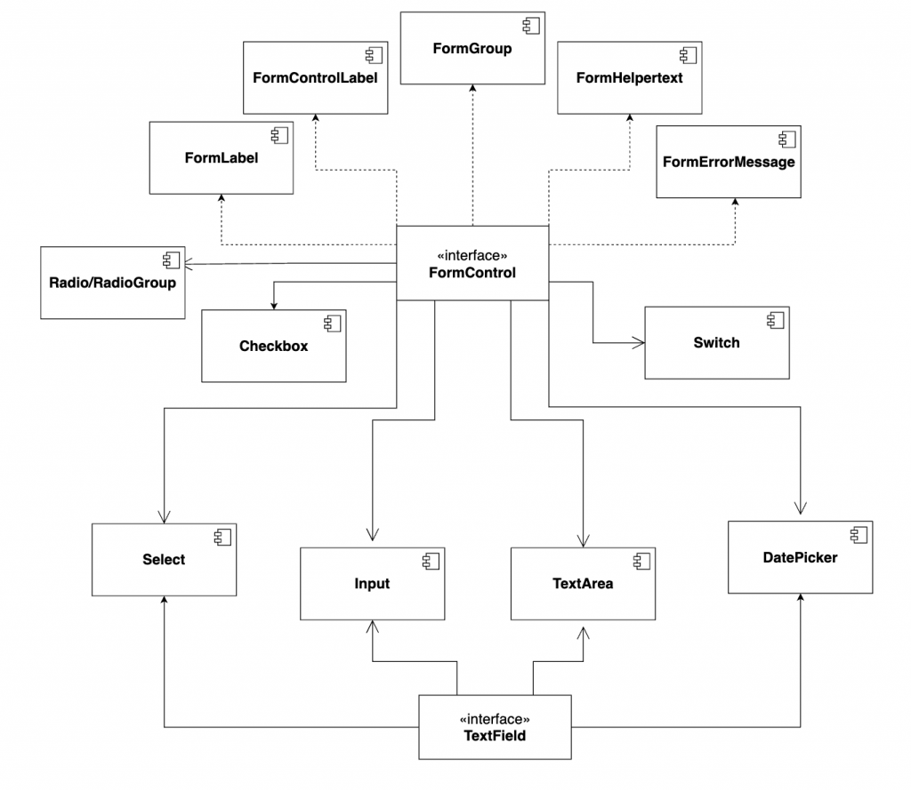
上一章是在講跟 Input 相關的表單元件會使用 TextField 來給定表單會用到的 required, disabled, helperText 以及 label 等,那像是 Radio、Checkbox 和 Switch 這種非 input 樣式的表單元件會如何處理呢?
就是透過今天要講的 FormControl Interface 啦!
因為這些元件彼此沒有樣式的共通性,因此 API 和包裝的邏輯當然也就無法像 TextField 對 input-like 的元件們有那麼高的整合性,所以這邊會拆比較多的元件組裝。
接著就先不囉唆直接在下面看看 FormControl 是怎麼使用的吧!
Material-UI 在 FormControl、FormLabel、FormControlLabel、FormGroup、FormHelperText 的使用如下:
<FormControl component="fieldset">
  <FormLabel component="legend"> 整個 Group 的 label </FormLabel>
  <FormGroup>
    <FormControlLabel
      control={<Componenet1 />}
      label="Component1 的 Label"
    />
    <FormControlLabel
      control={<Componenet2 />}
      label="Component2 的 Label"
    />
  </FormGroup>
  <FormHelperText>底下的附註訊息</FormHelperText>
</FormControl>
簡單來說就是在 FormControl 底下運用 Label、Group 和 HelperText 等等組出表單的樣式。
接著來用 Switch 來看看 FormControl 的實際應用會清楚很多。
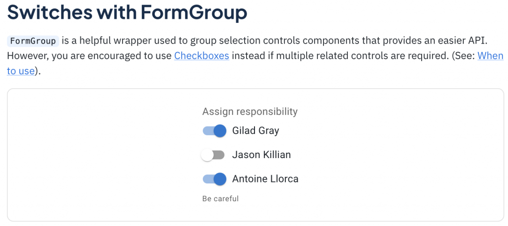
<FormControl component="fieldset">
  <FormLabel component="legend">Assign responsibility</FormLabel>
  <FormGroup>
    <FormControlLabel
      control={<Switch checked={state.gilad} onChange={handleChange} name="gilad" />}
      label="Gilad Gray"
    />
    <FormControlLabel
      control={<Switch checked={state.jason} onChange={handleChange} name="jason" />}
      label="Jason Killian"
    />
    <FormControlLabel
      control={<Switch checked={state.antoine} onChange={handleChange} name="antoine" />}
      label="Antoine Llorca"
    />
  </FormGroup>
  <FormHelperText>Be careful</FormHelperText>
</FormControl>
在使用上,我們可以注意到這段 Code 其實就只是在 FormControlLabel 的 control 放入 ,而表單相關的元素就可以透過 FormControl 這個介面來統一管理,是不是很方便呢?
這邊也補充一下單用 Switch 的話會長怎樣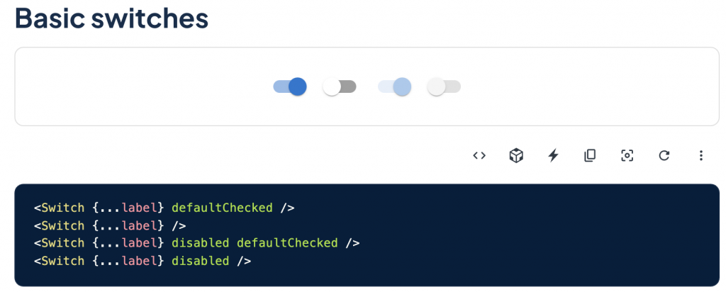
Checkbox 這邊跟 Switch 幾乎一模一樣,所以就只是貼上來讓大家感受一下。
<FormControl component="fieldset" className={classes.formControl}>
<FormLabel component="legend">Assign responsibility</FormLabel>
<FormGroup>
<FormControlLabel
control={<Checkbox checked={gilad} onChange={handleChange} name="gilad" />}
label="Gilad Gray"
/>
<FormControlLabel
control={<Checkbox checked={jason} onChange={handleChange} name="jason" />}
label="Jason Killian"
/>
<FormControlLabel
control={<Checkbox checked={antoine} onChange={handleChange} name="antoine" />}
label="Antoine Llorca"
/>
</FormGroup>
<FormHelperText>Be careful</FormHelperText>
</FormControl>
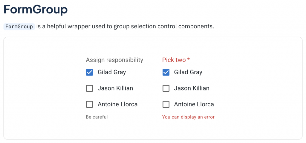
<FormControl required error={error} component="fieldset" className={classes.formControl}>
<FormLabel component="legend">Pick two</FormLabel>
<FormGroup>
<FormControlLabel
control={<Checkbox checked={gilad} onChange={handleChange} name="gilad" />}
label="Gilad Gray"
/>
<FormControlLabel
control={<Checkbox checked={jason} onChange={handleChange} name="jason" />}
label="Jason Killian"
/>
<FormControlLabel
control={<Checkbox checked={antoine} onChange={handleChange} name="antoine" />}
label="Antoine Llorca"
/>
</FormGroup>
<FormHelperText>You can display an error</FormHelperText>
</FormControl>
一樣也補個基本的!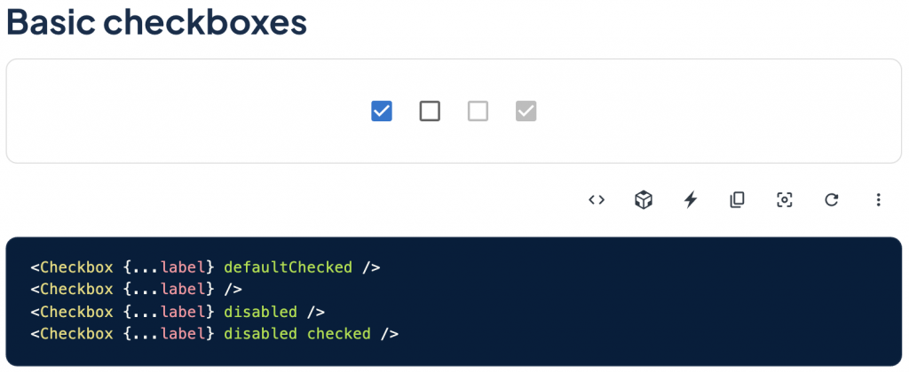
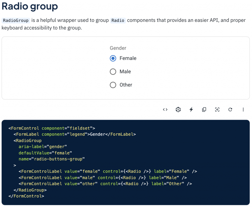
Radio 這邊就比較特別一點了,因為它是單選的選項,不像 Checkbox 是多選,因此實作上會使用 RadioGroup 把 Radio 包起來處理單選的邏輯,而底下的 Radio 一樣是可以被包在 FormControlLabel 裡面的。
講到這邊不知道有沒有眼尖的讀者看到了其實 TextField 底下的元件 其實也有跟 FormControl 連在一起呢?如果照上面所說的 Input-like 是用 TextField,而 FormControl 用在其他的表單元件,那為什麼 FormControl 又會跟 TextField 連在一起呢?
雖然 FormControl 主要是在給非 Input 的表單元件用,但其實給 TextField 用也並無不可,只是不同種來實現表單相關功能的方式而已。
舉例來說,Input 當然可以用 TextField 本身的屬性來給 Label,但也可以在 FormControl 的底下去包 Label!
那接著再來用 Input 的 Icon 情境 來看一下會怎麼做:
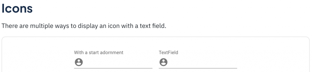
<FormControl>
  <InputLabel htmlFor="input-with-icon-adornment">With a start adornment</InputLabel>
  <Input
    id="input-with-icon-adornment"
    startAdornment={
      <InputAdornment position="start">
        <AccountCircle />
      </InputAdornment>
    }
  />
</FormControl>

<TextField
  id="input-with-icon-textfield"
  label="TextField"
  InputProps={{
    startAdornment: (
      <InputAdornment position="start">
        <AccountCircle />
      </InputAdornment>
    ),
  }}
/>
從上面的範例可以看到我們想要幫一個 Input 加上前面的 User Icon 的話就使用 FormControl 或 TextField 都可以達成同樣效果哦,那如果有我還沒注意到的差別的話再麻煩大家留言告訴我!
補充一下:StartAdornment 是 Material 定義前綴的方式,Start(前)+ Adornment(裝飾),在這邊用來當 User Icon 的 API 接口,而我自己比較習慣的命名則是 prefix,命名也是一大哲學呀!
在這邊先說一下這些表單相關的元件只是很常在表單中運用到我才把他們整合進來介紹,但他們各自都可以脫離 FormControl 單獨做使用的哦!
而 TextField 和 FormControl 是 Material 應對表單元件的方式,除了這種方式還有 AntDesign 統一用 Form 管理的方式,而本系列一直在強調的是「觀念」,關於表單元件我們所需要知道的事就是他們都會共享一些給表單用的功能,而之後的實作方式則只是因應不同的設計理念和使用情境在實作,元件的 API 使用上也是看個人喜歡。
因此,重點不是要把各個系統的實作方式都學起來,而是大局地去掌握了一下觀念之後,其他的都能以一反三,並且在實作上可能會有更適合你當前情境的方式,不用因為他們是 Google 或 Facebook 出的就覺得一定好、一定得這樣用囉!
那在實作上還有一個最重要的關鍵就是「釐清需求」,要先理解自己要做的是什麼,才能決定適合的 Pattern。


 看影片追技術