
前面把有依賴關係的 Component 都講一講之後,今天就來帶過其他的 UI 元件吧,因為想介紹的元件還有點多,因此會區分成兩天,今天主要講的是 Navigation 類型的。
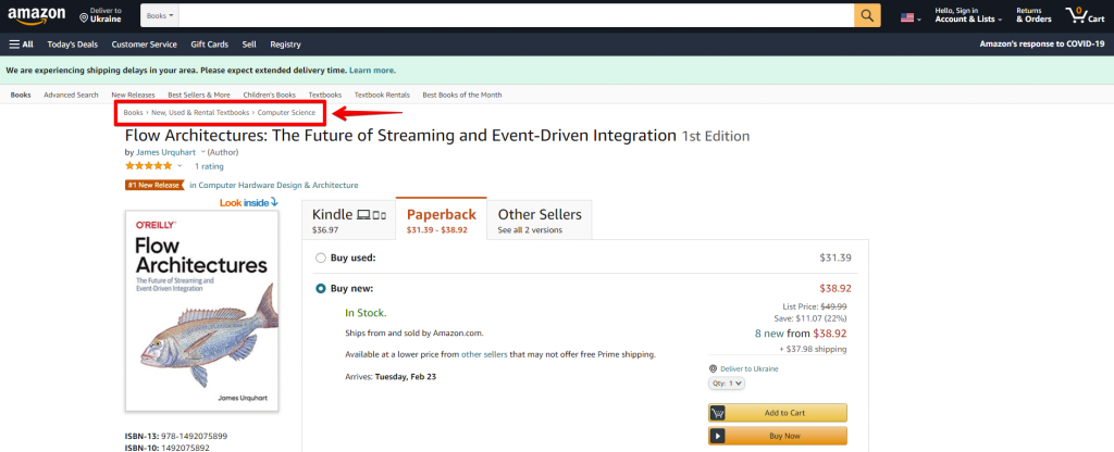
展示當前頁面在整個網頁的層級關係,其實就是把你的網址具現化,並給予更語義化的命名
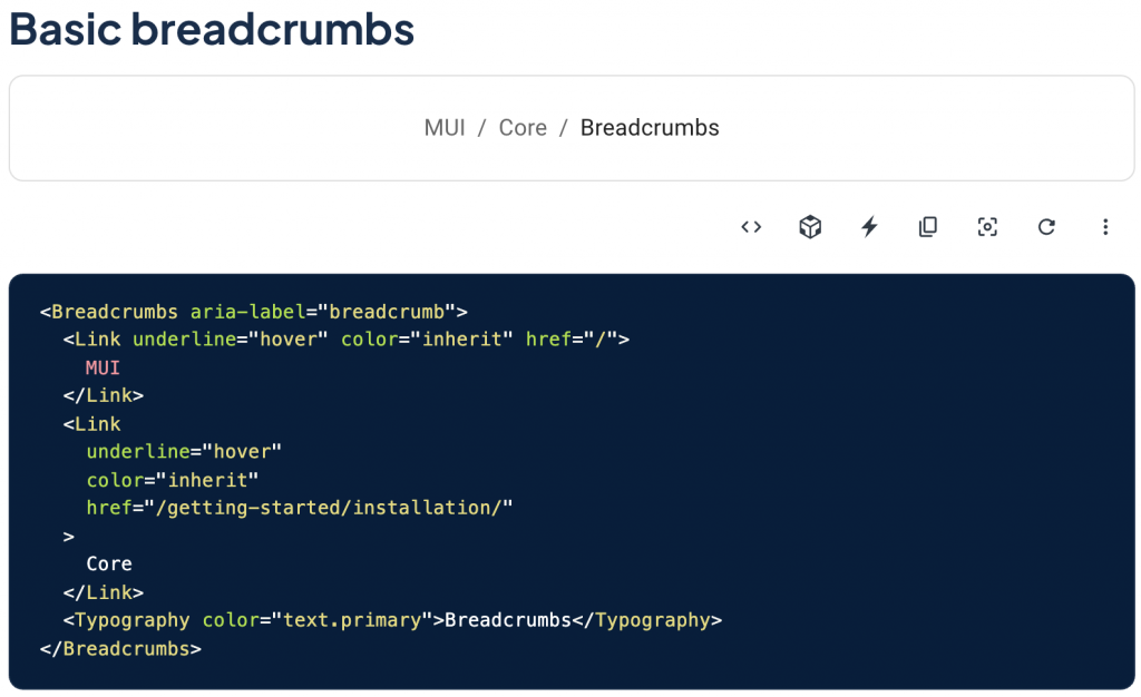
使用起來會像這樣:
冷知識:breadcrumb 這個詞的意思是麵包屑,會這樣取名其實是來自於童話故事「糖果屋」中的兄妹透過灑下麵包屑來找到回家的路,而對應到網頁則是能讓你清楚你在網頁中深入到哪裡了,不會迷失在複雜的路由當中。
網頁中的路由 (Routing) 除了單純的上下層級關係之外,也有很多是「步驟式」的,這時候就可以使用 Stepper (或是 Steps)來呈現!
使用起來也很直覺,通常會定義出 Stepper 作為容器,而在底下把 Step 給 map 出來。
同時可以再透過現在是處於哪個階段來 Render 各階段所要顯示的內容。
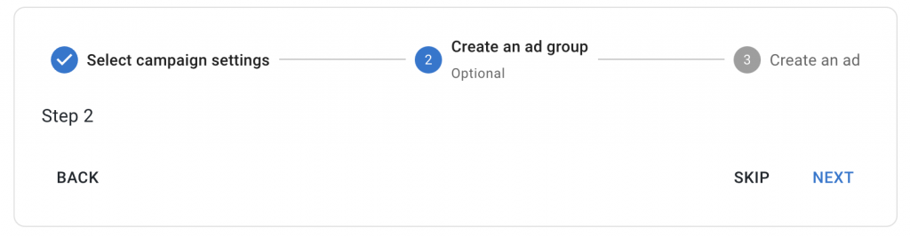
const steps = [
	'Select master blaster campaign settings',
	'Create an ad group',
	'Create an ad',
];

<Stepper activeStep={activeStep} alternativeLabel>
  {steps.map((label) => (
    <Step key={label}>
      <StepLabel>{label}</StepLabel>
    </Step>
  ))}
</Stepper>
// 下略
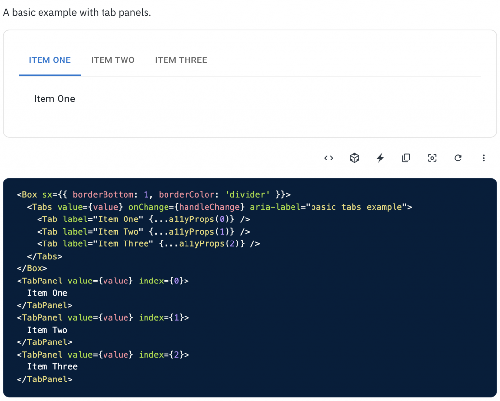
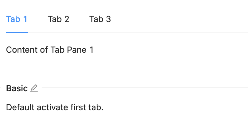
Tabs 通常是在一個東西有多種種類或子項目時可以使用。
而 Tabs 要注意的是如果因應效能考量,希望 Tab Pane / Content 動態載入,而不是只是先被隱藏起來的話,需要做很多處理,也可能沒辦法那麼直覺地使用,API 的開法真的是有不少種,那這邊就先把 Material-UI 跟
Ant Design 的實作方式都列出來,更詳細的脈絡跟實作會在 Day 27 時再跟大家說明清楚!
<Tabs
  activeKey={1}
  onChange={onChangeHandler}
>
  <TabPane
    key="1"
    tab={(<Tab>Tab 1</Tab>)}
  >
    TabPane 1
  </TabPane>
  <TabPane
    key="2"
    tab={(<Tab disabled>Tab 2</Tab>)}
  >
    TabPane 2
  </TabPane>
  <TabPane
    key="3"
    tab={(<Tab>Tab 3</Tab>)}
  >
    TabPane 3
  </TabPane>
</Tabs>
而實際使用 Tabs 的情境可以是如下要來呈現不同的時間狀態:
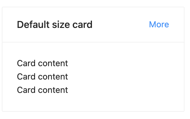
Card 其實沒什麼好說的,挺簡單也挺直覺的,就是像卡片一樣用方形去呈現你的資訊,像這些都是卡片的使用情境:
<Card title="Default size card" extra={<a href="#">More</a>}>
  <p>Card content</p>
  <p>Card content</p>
  <p>Card content</p>
</Card>

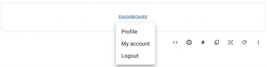
Menu 其實也可以說是一個底層的 Component,它如其名就是選項的「菜單」,是用來呈現選項的 UI,而會用到 Menu 的有 Dropdown(下拉式選單)、 Select 和 SideMenu 等等。
<div>
  <Button
    id="basic-button"
    aria-controls="basic-menu"
    aria-haspopup="true"
    aria-expanded={open ? 'true' : undefined}
    onClick={handleClick}
  >
    Dashboard
  </Button>
  <Menu
    id="basic-menu"
    anchorEl={anchorEl}
    open={open}
    onClose={handleClose}
    MenuListProps={{
      'aria-labelledby': 'basic-button',
    }}
  >
    <MenuItem onClick={handleClose}>Profile</MenuItem>
    <MenuItem onClick={handleClose}>My account</MenuItem>
    <MenuItem onClick={handleClose}>Logout</MenuItem>
  </Menu>
  </div>
今天主要就是介紹導航相關的和幾個額外的 UI 元件了,沒什麼好總結的,明天會接著把我認為在網頁中應該要知道的 UI 元件也介紹完。
那就明天見啦!


 看影片追技術