

今天我們要來做動態時鐘 ♪(^∇^*),搭配上背景的黑白兩色切換,因篇幅較長(ㄟ看到這就不想看了),會分成「上」、「下」兩篇來講解
| 知識點 | 使用說明 |
|---|---|
| transition | 切換背景時,讓顏色有個過渡 |
| transform | 讓元素置中 |
| letter-spacing | 調整文字間距 |
| 知識點 | 使用說明 |
|---|---|
| new Date() | new一個時間物件實體 |
| getMonth() /getDay()/getDate() | 取得日期相關資訊 |
| getHours() / getMinutes() /getSeconds() | 取得時間相關資訊 |
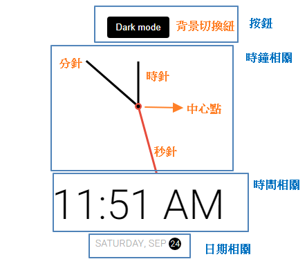
<!-- 按鈕 -->
<button class="toggle">Dark mode</button>

    <div class="container">
    <!-- 時鐘相關-->
        <div class="clock">
            <div class="needle hour"></div>
            <div class="needle minute"></div>
            <div class="needle second"></div>
            <div class="center-point"></div>
        </div>

        <!-- 時間相關 -->
        <div class="time"></div>

        <!-- 日期相關 -->
        <div class="date"><span class="circle"></span> </div>
    </div>
大局配置
body {
  margin: 0;
  padding: 0;
  display: flex; /*讓內容水平垂直置中*/
  justify-content: center;
  align-items: center;
  height: 100vh;
  overflow: hidden;
  transition: all 0.5s;
}
全域變數
在這一系列的賽project中,被我們用到爛的的變數ヽ( ຶ▮ ຶ)ノ 一來可以一目了然專案中的顏色代表含意,二來是較利於維護,更改顏色直接改變數就好。一般全域變數會設置在:root底下,搭配-- 自訂義名稱,使用時用var()來替代屬性值
:root {
  --primary-color: black; /*主色*/
  --secondary-color: white;/*輔色*/
}
背景切換,搭配JS才看得出效果
[小補帖] CSS 有兩種方法可以定位HTML 文檔的根元素——:root偽類和html選擇器。它們彼此非常相似,但:root的權重會高於html。
html {
  transition: all 0.5s ease;
}
html.dark {
  --primary-color: white;
  --secondary-color: gray;
  background-color: #111;
  color: var(--primary-color);
}
背景切換按鈕
.toggle {
  background-color: var(--primary-color);
  color: var(--secondary-color);
  border: 0;
  border-radius: 4px;
  padding: 8px 12px;
  position: absolute;
  top: 100px;
  cursor: pointer;
}
.toggle:focus {
  outline: none;
}
外部容器
.container {
  display: flex;
  flex-direction: column;
  align-items: center;
  justify-content: space-between;
}
時鐘部分
.clock {
  position: relative;
  width: 200px;
  height: 200px;
  background-color: #f0f0f0;
}
/* 指針 */
.needle {
  background-color: var(--primary-color);
  position: absolute;
  top: 50%;
  left: 50%;
  height: 65px;
  width: 3px;
  transform-origin: bottom center;
   transition: all 0.5s ease;
}
/* 時針 */
.needle.hour {
  transform: translate(-50%, -100%) rotate(0deg);
}
/* 分針 */
.needle.minute {
  transform: translate(-50%, -100%) rotate(0deg);
  height: 100px;
}
/* 秒針 */
.needle.second {
  transform: translate(-50%, -100%) rotate(0deg);
  height: 100px;
  background-color: red;
}
/* 時鐘的中心點 */
.center-point {
  background-color: red;
  width: 10px;
  height: 10px;
  position: absolute;
  top: 50%;
  left: 50%;
  transform: translate(-50%, -50%);
  border-radius: 50%;
}
.center-point::after {
  content: "";
  background-color: var(--primary-color);
  width: 5px;
  height: 5px;
  position: absolute;
  top: 50%;
  left: 50%;
  transform: translate(-50%, -50%);
  border-radius: 50%;
}
時間&日期
.time {
  font-size: 60px;
}
.date {
  color: #aaa;
  font-size: 14px;
  letter-spacing: 3px;
  text-transform: uppercase;
}
.date .circle {
  background-color: var(--primary-color);
  color: var(--secondary-color);
  border-radius: 50%;
  height: 18px;
  width: 18px;
  display: inline-flex;
  align-items: center;
  justify-content: center;
  line-height: 18px;
  transition: all 0.5s ease-in;
  font-size: 12px;
}
js的部分請看下一篇
50 Projects In 50 Days - HTML, CSS & JavaScript

 iThome鐵人賽
 看影片追技術