

當初在挑選主題的時候,覺得這個好酷,可以玩到 CSS 3D transform ヽ(✿゚▽゚)ノ
| 知識點 | 使用說明 |
|---|---|
| 3D/2D transform | 用到了 skewX() 、skewY() 、rotateZ() 去製作立體和翻轉效果 |
| transition | 讓翻轉的效果更自然、平滑 |
| position | 使用 fixed 將按鈕固定在上方 |
| letter-spacing | 調整字母語字母間的距離,而非單字間(word-spacing) |
| pseudo-element (::) | 利用 ::before :after 去作出陰影效果 |
| 知識點 | 使用說明 |
|---|---|
| createElement() | 創建4x4的格子們 |
| classList.toggle() / add() appendChild() | 在外部容器的末尾處加入子節點(4x4的格子) |
class="boxes big" 的 big,之後要刪掉,並用JS的classList.toggle()去切換,先寫好是為了等等設置樣式時可以看到自己設了甚麼 <button id="click" class="click">Click Me ! </button>
<div id="boxes" class="boxes big">
<div class="box"></div>
<div class="box"></div>
<div class="box"></div>
<div class="box"></div>
<div class="box"></div>
<div class="box"></div>
<div class="box"></div>
<div class="box"></div>
<div class="box"></div>
</div>
大局配置
* {
  box-sizing: border-box;
}

body {
  background-color: #fafafa;
  /* background-position: center center;
  background-size: cover; */
  margin: 0;
  padding: 0;
  display: flex; /*讓內容水平垂直置中*/
  justify-content: center;
  align-items: center;
  flex-direction: column;
  height: 100vh;
  overflow: hidden;
}
按鈕
.click {
  background-color: darkseagreen;
  color: white;
  font-weight: 600;
  border: 0;
  border-radius: 3px;
  font-size: 20px;
  padding: 12px 20px;
  cursor: pointer;
  position: fixed;
  top: 2px;
  letter-spacing: 1px;
  box-shadow: 0 3px rgba(144, 188, 143, 0.5);
  z-index: 100;
}
.click:focus {
  outline: 0;
}
.click:active {
  transform: translateY(-2px);
}
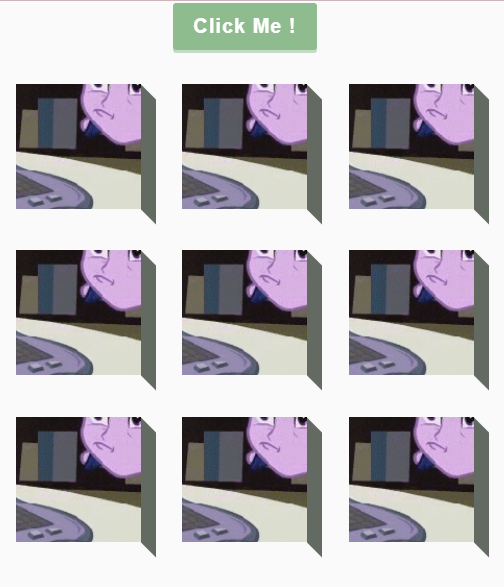
按鈕設定好,呈現如下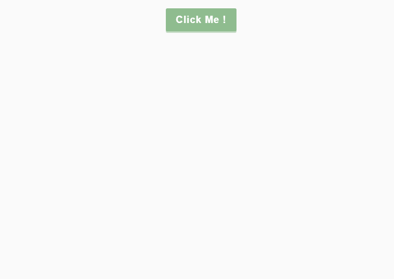
接下來我們的目標是要切成底下這樣(這裡只截圖靜態畫面)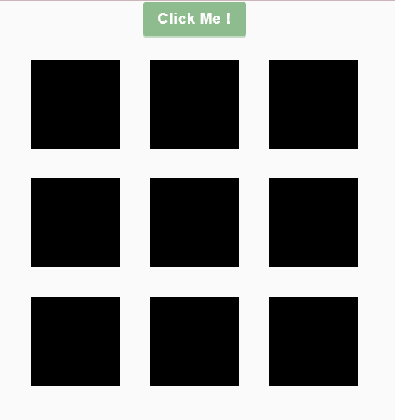
4x4 的格子
.boxes {
  display: flex;
  flex-wrap: wrap;
  margin-top: 20px;
  justify-content: space-around;
  height: 500px;
  width: 500px;
  transition: all 0.4s;
}
.box {
  margin: 10px;
  background-color: black;  //示意用
  height: 125px;
  width: 125px;
  transition: all 0.4s;
}
/*底下要等到js加入才會有效果*/
.boxes.big {
  width: 600px;
  height: 600px;
}
.boxes.big .box {
  transform: rotateZ(360deg);  //這裡的rotateZ會透過click按鈕點下並旋轉360度
}
完成後,把background-color: black;替換成 background 的速寫形式並加入圖片、圖片位子和大小等,呈現會如底下這張圖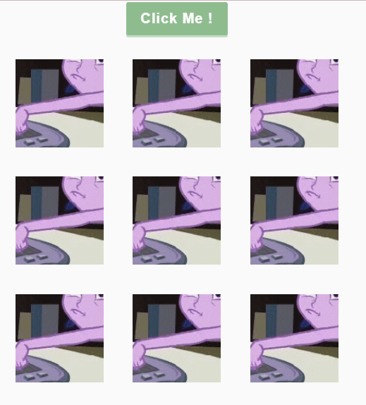
background: url("...") no-repeat center / 500px 500px; //500代表boxes容器的寬和高
接下來我們要製作每個正方形旁邊的陰影,為了製造出3D的效果,這裡使用虛擬元素 ::after和絕對定位來設置陰影位子
.box::after {
content: "";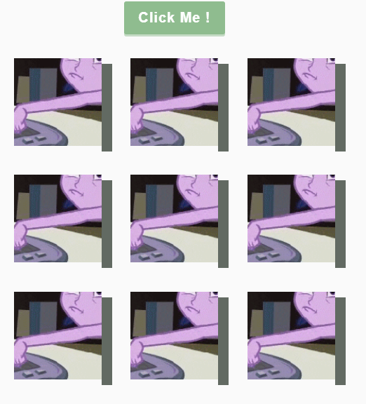
background-color: rgb(98, 106, 98);
position: absolute;
top: 8px;
right: -15px;
height: 100%;
width: 15px;
}
設定好後,呈現如下,看起來很平面,那可以加上甚麼去讓他變得更立體看起來有三維效果呢 ?
可以利用 skewY() 向Y軸傾斜45度角
transform: skewY(45deg);
Magic
接下來我們要做X軸的陰影,呈現會如圖下這樣,可以怎麼做呢?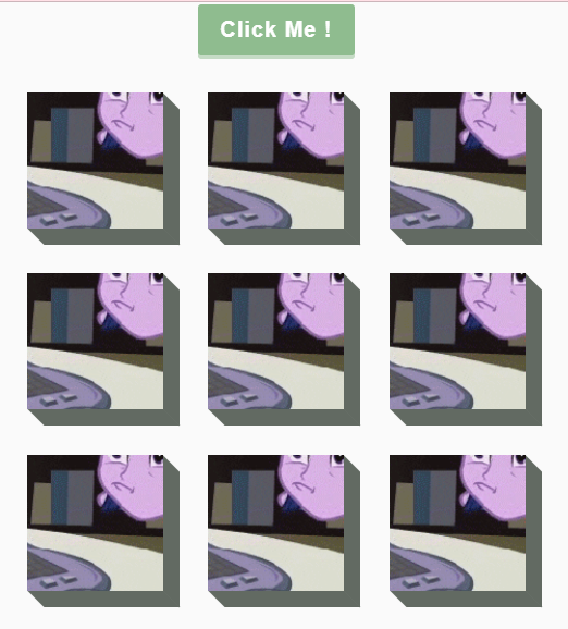
我的作法是改成::before,位子一樣是 absolute ,不過 left、bottom、height、width 的值就不一樣,我在程式碼下方附上一張醜醜的自製圖
.box::before {
  content: "";
  background-color: rgb(98, 106, 98);
  position: absolute;
  left: 8px;
  bottom: -15px;
  height: 15px;
  width: 100%;
  transform: skewX(45deg);
}
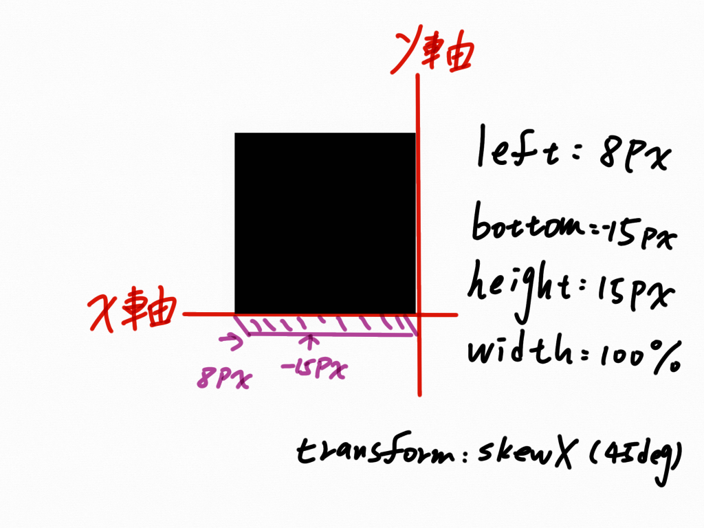
真的好醜><
 <button id="click" class="click"> Click Me ! </button>
 <div id="boxes" class="boxes big"></div>
變數宣告
const boxesContainer = document.getElementById('boxes')
const btn = document.getElementById('click')
創建4x4的格子
function createBoxes() {
  //3行與3列
  for (let i = 0; i < 3; i++) {
    for (let k = 0; k < 3; k++) {
      const box = document.createElement("div");
      box.classList.add("box");
      box.style.backgroundPosition = `${-k * 125}px ${-i * 125}px`;
      //box.style['background-position']

      boxesContainer.appendChild(box);
    }
  }
}
createBoxes();
上面這段程式碼,條列成以下幾點來說明:
createElement 去創建 div 元素,並用 classList.add("box")加上 box 這個類別box.style.backgroundPosition ,如果 CSS 屬性名稱中有 - (例如 background-color),可以用 [] 或將屬性名稱改成駝峰式的寫法${-k * 125}px ${-i * 125}px 這部分是因為background-position 可以設兩個值,代表( x , y )的座標,左上角為( 0 , 0), 負數代表元素會往左靠攏,不然原本是有空隙存在的一鍵切換按鈕
clickBtn.addEventListener("click", () => {
  boxesContainer.classList.toggle("big");
});
附上codepen連結 https://codepen.io/hangineer/pen/LYmrgrX?editors=0010
若有解說不夠詳盡或是錯誤歡迎指教,感激不盡!那明天見囉
50 Projects In 50 Days - HTML, CSS & JavaScript

 iThome鐵人賽
 看影片追技術